At a Microsoft blogger’s event last week, Techgoondu and several local bloggers walked home with copies of Windows 7 beta. I decided to give the newly-minted OS a test-run on my 2-year-old Macbook and the results were much better than I thought.
First impressions were favorable: Windows 7 beta installs much faster than Vista. Installation time was approximately 20 minutes, compared to roughly 45 minutes when I first installed Vista Ultimate on my Intel Core 2 Duo 2GHz machine with 4GB of RAM. The installation process has also been streamlined into five steps. The only problem I had was with the license key which the Microsoft folks presumably forgot to provide. There is a simple workaround for this, thanks to this Lifehacker tip.
Windows 7 is speedier than Vista in a few ways – faster boot times and more memory efficient and the result is a much sleekier experience. In fact, Microsoft claims that Windows 7 even supports netbooks. I don’t have a netbook with me now, but if anyone has tried running Windows 7 beta on any netbook, please share your experience with us!
If you’re seeing Windows 7 for the first time, it’s likely that you wouldn’t notice many enhancements, which are mostly under the hood. The most obvious cosmetic difference with Vista, however, is the newly designed taskbar. Some folks may find the new taskbar confusing, depending on how you look at it.
For starters, the new taskbar operates somewhat like the Dock in Apple Mac OS X. Applications can be launched through shortcuts that you drag onto the taskbar, which now also includes icons of running applications. When you mouse over an icon, you’ll get a preview of application windows. Now, this is the confusing part: you can’t tell the difference between running applications and shortcuts on the taskbar.
![]()
Microsoft has also introduced Jump Lists in Windows 7. What it does is to embed some functionality of an application within the app launcher. For Windows Live Messenger, for example, you can set your online status with the Jump List by right-clicking on its icon on the taskbar. In Internet Explorer 8, you’ll get a list of previously visited websites.
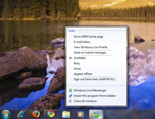
Jump Lists have to be supported by application developers, otherwise you’ll only get a default list of tasks: open an app or close it. You can also bring up a Jump List by holding on to the left mouse button and dragging the mouse cursor upwards over an icon on the taskbar.
In previous iterations of Windows, you could open new windows for an application such as Firefox just by clicking on its icon anywhere. In Windows 7, if you click on the icon of an app that’s already running, you will merely minimize the app window. To launch another new window, you need to use the Jump List – not exactly the most intuitive thing to do.
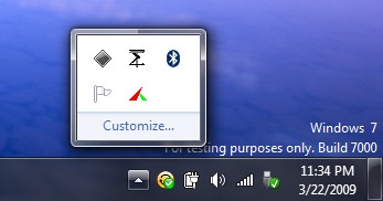
Microsoft has also redesigned the Windows notifications tray to make it look less cluttered especially if you run many applications in the background. You have three options with regards to notifications: show icon and notifications, hide icon and notifications, or only show notfications. That means power users would now have to do manually enable items in the notification tray to see what’s consuming their system resources.
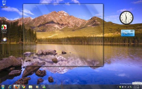
On the right edge of the notfication tray lies the “Aero Peek” vertical bar that displays an outline of open windows and gadgets on your desktop once you roll your mouse over it. Not sure how useful this will be to people who don’t run gadgets. But if you click on the bar, the desktop shows up, thus acting like the Show Desktop icons in previous versions of Windows.
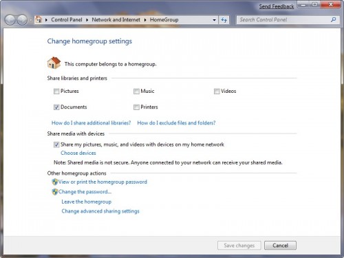
Home networking has also been simplified in Windows 7 which is seeing the debut of Homegroups. You assign a password to your Homegroup, and other PCs can simply join the network using the same password to access shared documents, music, videos and pictures. But here’s the catch: all PCs have to run Windows 7, leaving older Windows machines out of the party.
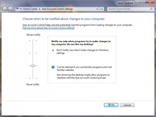
Those who have been peeved with annoying pop-ups from Vista’s User Accunt Control (UAC) asking you for permission when system changes are made will get some reprieve in Windows 7. You now have the option of turning off those pop-ups altogether, though Microsoft doesn’t recommend doing that lest you have rogue programs lurking around in your PC that you’re unaware of. There are some new middleground UAC options, such as choosing to be notified only when programs make changes to the system, and not when you change Windows settings.
Microsoft seems to have addressed the performance and system resource allocation issues that plagued Vista. Overall, Windows 7 beta feels more stable and smoother than Vista, though the redesigned taskbar may not sit well with some folks. The new taskbar doesn’t necessarily reduce the number of mouse clicks to switch to a running application. In Windows Live Messenger, you have to mouse over the Messenger icon to switch to an open chat window. Before the use of icons, you could simply switch to the open chat window right away from the taskbar.




I’m pretty much impressed with the stability of Windows 7. It is better than windows Vista which hogs my memory and cpu..:;
that’s really a good article that give a general idea about the new invention of microsoft
Hi Aaron,
Great article to introduce Windows 7, I hope you are enjoying the beta. Apologies for not providing the license key for you, definitely an oversight on my part, so I am glad you got it in the end.
Let us know if there is anything else you want to delve in to.
Thanks
Matty H