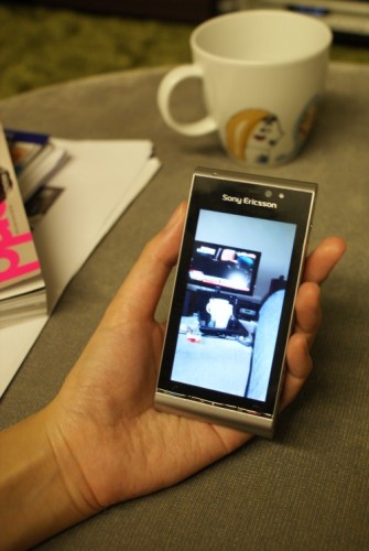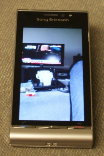
It was first called the Idou, when unveiled earlier this year at the 3GSM Mobile World Congress cellphone show. Then came the name change to Satio, and the world-beating specs: 12-meg Cybershot camera, 3.5-inch screen and a new Symbian S60 OS with touch UI.
So, after such a long wait, how does this much-touted flagship smartphone from Sony Ericsson feel in the hand? After testing it for a week, I’d say it’s a mixed bag. So much of the Satio is so desirable – the beautiful screen, for one; yet, much of this same shiny handset is also annoying.
I’ll start with the good points. The first I have to mention is the beautiful screen, which is surely one of the best 360×640 screen I’ve seen for its size (sorry, the picture here doesn’t do justice to the Satio).
The contrast shows through when you view well-taken photographs, which are a world away from the usual washed-out condition synonymous with the small screens on other phones.
The same Satio screen shows off some excellent videos that you can transfer from your PC to the small gadget. Where once you’d have to squint to see the details, now you can see movies clearly and, dare I say this, with good contrast.

That’s not all. The Cybershot camera, mounted on to the back of the phone like a backpack, comes packed with a real punch. If previous Sony Ericsson Cybershot phones offered the best mobile cameras, then the Satio is a sure bet for the best in its class now.
Beyond just capturing more pixels with a 12-meg lens, it comes with a handy auto-focus feature that takes the guesswork out of snapshots. With it, you’ll avoid some of the annoying shots that have the wrong things in focus.
The sharpness is there for all to see, as well as a really handy Xenon flash, which acts like a real flashlight on a regular camera. If you are taking snapshots in relatively good lighting, you’ll be hard pressed to do better with a dedicated digital camera.
I also like the way the Satio handles music. The big minus here is a lack of a 3.5mm audio jack on the phone – you’ll need an adapter (supposedly supplied in the retail set, but not in our review sample) that lets you hook up your own earphones via the still-proprietary Sony Ericsson jack (have you heard of USB yet, SE?).
Other than that, the music tracks are neatly lined up in the media gallery software that comes with Sony Ericsson phones, which is a good thing. I particularly like the good, old TrackID, which goes to the Net to identify a song that you hear on the spot.
Using the phone’s mic to “listen” to an U2 track playing on my hi-fi at home, I could find the track name accurately on the Satio. And I could send the details over to a friend or to my own e-mail should I want to buy the track later.
In short, the “brand-name” technologies – Cybershot and Walkman – do really well here on the Satio.
What I’m not so sure about is the bulk that comes with this phone. If you are a gearhead who doesn’t mind a little girth (actually, it’s quite light for its size at just 126g), that’s still okay with you.
But I suspect many users who have tried out the Apple iPhone or HTC Hero – both of which, to be fair, cannot compare in terms of music or photo quality – will find the Satio a little on the pudgy side.
The Symbian S60 OS will be another bone of contention for users.
Sony Ericsson’s enhancements to the staid OS – for example, a nice film-like photo preview app – appear quick enough for me. But Symbian has always been a bit of a bore and too business-like, especially on Nokia smartphones.
Though Sony Ericsson appears to have put some thought into making this entertainment phone more fun, you still find the little Symbian quirks peering out once in a while.
The main menu screen, for example, requires you to click several layers deep to get to a map. Why aren’t these things on the start screen?
And when it comes to e-mail, I actually had the mail application crash several times while synchronising with Gmail’s Imap server. I’d try to open a message and it’d just kick me out of the app and onto the main screen while it’s downloading.
Still, by far the most annoying thing on the Satio is the lock “slider” on the left of the phone. With the screen going into a power-saving blank screen ever so fast – including when a webpage is loading on the browser (more on that later) – you’ll be trying to unlock the screen ever so often.
If that’s not enough, you actually have to slide the spring lever not once but twice. You see, sometimes the first action only brings you to a dimmed but still locked screen – you’ll need to unlock things once more to “free up” your screen.
The irony is, the thing doesn’t work at all if you leave the phone in a trouser pocket, as thousands of users will. The loose camera cover simply slides open and starts taking pictures of your inside pocket, wasting battery all the same!
The final thing that I have to mention is the Satio’s online capabilities. I’d advise you, first of all, to install an Opera browser instead of the rather dated-looking Symbian browser. My 1.5-year old HTC Touch Diamond already lets me zoom in and have a column of text neatly “optimised” to fit the screen, so I don’t need to scroll left or right to read, say, a long BBC football report.
Not on the Satio’s default browser. Text too small? Zoom in and you are made to scroll left or right to read the rest of the page. I’m talking about regular webpages here, of course, which are becoming more popular with powerful browsers on the iPhone and Android-based phones (and even my old HTC Windows Mobile 6.0-phone running Opera!).
Yet, the Satio seems to still pine for websites that detect a mobile browser and display scaled down webpages (like Techgoondu or BBC, for example) to show things neatly on screen. It doesn’t do as well for regular webpages.
Sony Ericsson also needs to up its game when it comes to mobile downloads. I’m one who thinks that the iPhone App Store is way over-hyped (just ask the Japanese if downloading software onto their phones is such a new thing).
But the Satio, as a flagship model, does need to have some content to download directly to the phone. I surfed briefly to Sony Ericsson’s PlayNow website, which was linked from the phone, and was greeted by some S$3.15 music tracks. Way too expensive, folks.
Once upon a time, you only had to come up with a phone that was solidly built with the best useful features packed in, and the masses would come. Today, you’d at least have to have some useless content for users to download for fun on the go.
All this boils down to one thing: the Satio will split opinion. To users who have loved Sony Ericsson for its camera prowess and excellent music capabilities, the company’s new pack-in-the-sink flagship phone continues in that good tradition. However, if you are looking at an iPhone- or HTC Hero-beating phone for online features, this is not it.
The not-so-bad news is that the street price now is a competitive S$628 with a two-year plan with SingTel Shop. I’d check out the Satio if I were in the market for a new phone, though I’d make sure to see the HTC Hero as well as the Nokia N97 mini.


