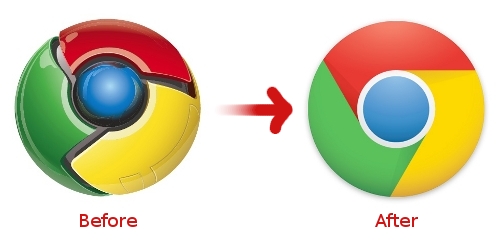
Does a new logo herald the launch of the new Chrome OS soon?
Google unveiled a new logo for its browser yesterday, and gone are the shiny metallic plates and the shimmering blue light in the middle. Instead, Google adopted a design which abandons the robotic look and flattens the logo into a more 2D aesthetic.
This could mean more than a simple re-design. Google has always been a brand-conscious company, and they don’t often alter designs without a reason. The Google homepage, for example, looks almost identical to its original one more than a decade ago.
Looking closer, it seems that the new Chrome logo is closely aligned with the individual app logos for Google Apps. This could be a coincidence, but could this point to a launch of Chrome OS soon? Maybe Google is simply unifying the visual aspect of its products before the launch.
Although Chrome is less than three years old, it has already garnered 16.54 percent of the browser market share, according to the most recent global stats from web analytics tracker Statcounter.
This increase is largely at the expense of Microsoft’s Internet Explorer (IE). Although IE is still the big incumbent at 45.44 percent currently, its market share has fallen about 22 percentage points from 67.16 percent in September 2008, when Chrome was launched. Besides Chrome, IE also lost market share to Firefox and Safari.
Chrome’s speed and simplicity won the minds of regular Joes, while frequent updates attracted power users who loved the bleeding edge features.
For example, Chrome took one month to get from version 9 to its latest version 10. In comparison, it took Microsoft more than two years to revise Internet Explorer from IE8 in 2008 to IE9 in 2011.
But Chrome’s growth might not be sustainable.
Microsoft officially launched Internet Explorer 9 two days ago, their latest attempt at regaining browser dominance. Snapping at its heels, Firefox 4 has hit release candidate status and its final version will be released on 22nd March.
The logo change might not be a big deal, but sometimes people do react violently to logo changes. For example last year’s iTunes logo debacle, where CEO Steve Jobs had to defend a logo change to enraged fans.
So tell us, readers, what do you think of the new Chrome logo? Let us know in the comments!


Yes! Great logo. It’s very nice to see Google unifying all Google products. Lots of subtle changes in the last weeks, and it’s going towards Android and Chrome OS.
I would not download chrome if the logo was the current one…
不要脸。
It’s just no good.
666 you have to be kidding
No. Just No.
NOOO I like the old one!!!!