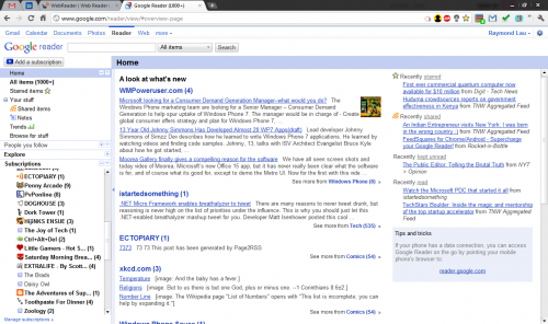
If you subscribe to a large number of RSS feeds and use Google Reader to read them, then you know what I mean when I say Google Reader’s interface is downright ugly. Although the search giant has rolled out gradual improvements over the years, the Reader is still an undeniably eyesore. Really, just look at the first screen that greets you when you sign in:
Fortunately, there exist third-party apps which seek to make your reading experience a more pleasant one. I stumbled upon WebReader yesterday, and although it is still in beta, it has enough features to make the web-based Google Reader envious. Let’s take a look!
WebReader runs on Adobe AIR, ensuring that it will be compatible with Windows, Mac and even Linux. Once you install it and run it for the first time, you’ll be prompted to sign in with your Google account. WebReader appeared to be unresponsive after I clicked “Sign in with Google”, but the sign in proceeded without a hitch. I just had to wait patiently while the app works. A “loading” animation is needed here to let the user know that the app is still running and didn’t hang!
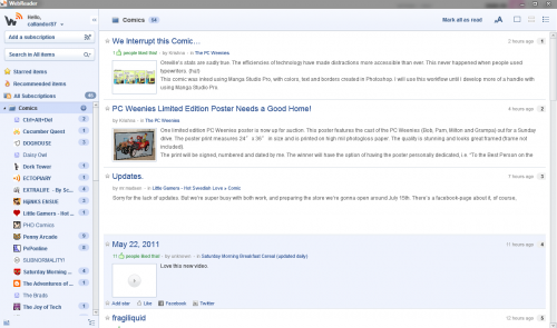
Once you get that out of the way, and all your feeds are imported, you’ll see this:
The minimalistic layout is indeed eye-catching. A navigation panel on the left, reminiscent of the iTunes navigation bar, lets you pick which feed you want to read. One click hides the navigation bar, providing you with an uncluttered reading experience.
On the top bar, you can access a number of quick tasks, including toggle all feeds as “read”, change font sizes, and switch between three different types of view, such as headlines only, summaries, or full posts.
My feeds and articles loaded quickly enough, and the general experience was pretty snappy. To prevent yourself from being overwhelmed, as it can happen fast if you subscribe to a large volume of feeds, you can set WebReader to notify you at longer intervals. I have mine set at 30 minutes, and a tiny notification pops up on the bottom left corner of my screen whenever new posts and articles come in.
Want to share a particularly humourous post with your friends on Facebook and Twitter? WebReader lets you do that easily. Just mouse over a headline and the relevant links will appear. This is a nice touch that is not present on the web-based version of Google Reader.
Unfortunately, an unsightly right panel full of Google Ads takes up the right side of the app. I would gladly pay a small price to get rid of it, and the developer’s Twitter page has confirmed that a paid version is in the works.
Another complaint I have is instead of loading some articles and posts in the client itself, WebReader fires up your browser and makes you read them there instead. Of course, whether to allow the full article to be pulled in as a feed is entirely up to the site owner, but perhaps WebReader can add browser rendering into the app so that we don’t have to keep switching windows.
Overall, WebReader is a great Google Reader client that is worth a look if you’re into RSS feeds. There’s a good chance of the app improving by a long shot, seeing that the current beta already runs smoothly, and is in active development. Give it a shot, and let us know what you think of it in the comments!


Looks interesting but I think I’ll be sticking with Chrome extension minimalist google reader. A quick keystroke and the top is hidden and ctrl+u hides the left panel so all I have are the feeds.