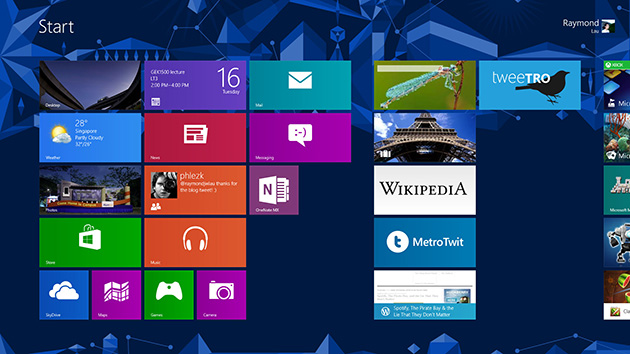
Windows 8’s Start screen, featuring the new finger-friendly tiles.
In just over a week, Microsoft will release its latest and greatest PC operating system into the wild. Along with Windows 8 comes a slew of new devices with fantastical shapes – including the hotly anticipated Surface tablet – the majority of them packing in a touch screen for those big finger-friendly tiles.
But what does it feel like actually using Windows 8, and should desktop/laptop users with no touch monitors lying around upgrade? To find out, I popped an RTM copy Windows 8 Pro — obtained from my MSDN subscriber friend — into my Dell XPS15z and took it for a spin.
After weeks of using it on a daily basis, I can happily say that my laptop has never felt more alive. Windows 8 is definitely an excellent upgrade even for non-touch PCs.
Installing Windows 8
The process of installing a new copy of Windows over an existing one has vastly improved with each version, and Windows 8 brings further improvements.
I popped the DVD into my laptop one fine Sunday afternoon, chose my preferred settings (in this case, I opted to keep all my Windows settings, personal files, and apps), and in under than an hour colourful tiles were flipping and flashing on my screen.
Before proceeding with the upgrade, however, Windows 8 identifies software that it won’t be able to run, and ask that you uninstall them before you continue. To avoid complications later on, the installation will not continue unless you uninstall these programmes.
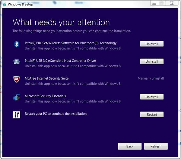
(Photo credit: Mashable)
This is a nice feature, but could pose a problem if your hardware manufacturer doesn’t have Windows 8 drivers ready at the time of installation, so be sure to check on the relevant websites for Windows 8 drivers before continuing.
That said, Windows 8 does try its best to find the relevant drivers for your hardware, and mostly succeeds. On my Dell laptop, there are only a couple of pieces of unidentified hardware that I can’t do anything about until Dell releases its own drivers.
To be on the safe side, I highly recommend installing a new copy instead of upgrading. Such a massive upgrade may run into problems, especially if you, like me, have thousands upon thousands of files and programmes already on the disk.
In my case, my games refused to run, and lagged badly when they did. Right-clicking on the Desktop just to change my wallpaper somehow took forever, even crashing a few times.
So within two hours of my first Windows 8 installation, I embarked on my second. This time, I backed up all my files and wiped my hard disk clean for that fresh new PC feeling.
The process was a lot faster this time. Windows 8 didn’t have to work around hundreds of gigabytes of my personal files and I was up and running in less than half an hour.
A tale of two UX
The default view when you boot into Windows 8 is the new Metro user interface (or Modern UI, as Microsoft likes to call it these days, but I’m just going to use Metro in this review). The tiles are big and friendly, and flashes information at you once you’ve got your accounts set up.
The good ol’ desktop user interface is still there, but it’s useful to think of the Desktop – with the task bar, file manager, and toolbars – as an app within Windows 8 with its own tile. From the Start screen, click on the Desktop tile and the environment with everything as you remember them in Windows 7 flips open.
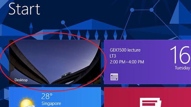
In Windows 8, think of the Desktop as an app.
Well, not exactly everything. Microsoft has replaced the Start button with the entire Start screen. Instead of bringing up a small menu on the bottom left corner of your screen, hitting the Windows key now brings you back to the Start screen, where you can immediately start typing to search for the programme you want to launch.
The Desktop’s design has been flattened. You won’t see any fancy glass windows casting shadows on your wallpaper. Except for the taskbar, which is only slightly translucent, all windows and menus are now flat and opaque. But you can still see remnants of Windows 7’s bubbly design coming up every now and then, such as the default icons and the buttons in Windows Media Player.
On a laptop with no touch screen, I pretty much spend my entire time in the Desktop. All the familiar programmes such as Photoshop, Steam, and Google Chrome ran just fine (as long as you’re running Win 8 Pro and not RT) and you won’t notice any difference from Windows 7 save the 2D aesthetic that characterises Metro.
I can imagine myself using Metro apps if they bring a better user experience. For example, I’d definitely prefer to read my news in Flipboard (if it ever arrives on Windows 8) than Google Reader’s website. An uncluttered Facebook app would also be much appreciated over Facebook on the web.
But most times, a website’s interface is more powerful than an app, so I don’t think I’ll be using Metro apps much unless they’re unique. I’m also a fan of some casual games, so those apps would be nice to have, too.
Metro on a non-touch machine is thus less appealing than it would be on, say, a tablet. But it’s slick, fast, and is like the icing on the cake: an extra layer of functionality on top of what you’re used to. As the Windows Store starts to fill up with apps, Metro will definitely be a great addition to Windows even on a non-touch device.
Your new best friends: right-click, hot corners, and charms
Windows 8 is built chiefly for touch, and the functionality of your mouse cursor has been improved to better navigate the new interface. To get around Windows 8, you’ll have to make three new friends: right-click, hot corners, and the charms bar.
The right-click works as it always did on the Desktop, and in the Metro environment, it’s the key to accessing more options. The built-in Mail app, for instance, looks very sparse and minimalistic. In the “compose new mail” screen, there are no buttons except the “send” and “close” buttons.
Only through right-clicking can you access options such as font and formatting, which will pop up on a bar from the bottom of the screen. On a touch screen, however, you can simply swipe up from the bottom bezel to see them.
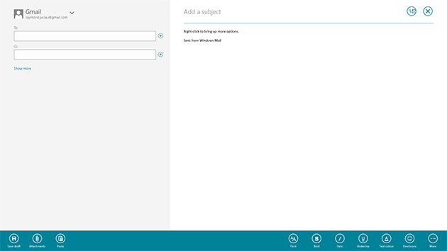
Right-click brings up more options at the bottom. (Click here for full-res image)
Hot corners are the mouse cursor-equivalent of swiping from the side bezels. The top left corner cycles between your open apps, and sliding your mouse cursor down from the top left along the bezel brings up a sidebar of all recent apps.
But this does not include your Desktop apps such as Microsoft Office. Remember that the Desktop itself is considered an app in Windows 8, so programmes which run within the Desktop won’t show up in the multitasking sidebar.
The bottom right corner brings you back to the Start screen. You can also slide your mouse cursor up from the bottom left corner to bring up the multitasking sidebar, or use the keyboard shortcut Win + Tab.
Both corners to the right of the screen call up the charms bar, a set of five un-changing icons that allows you do execute different commands depending on the app you’re in.
The Search icon, for example, lets you search for different things in various apps. On the Desktop or Start screen, you may search for apps, settings, or files. In the Store app, you can search for other apps to download, and so on.
It’s a bit confusing in the beginning. I kept asking myself, “Where is the search button in the Store? How do I search for e-mails? There’s no search button in these apps!”
Over time, I came to like this approach. It’s one less icon to clutter up app interfaces, and whatever app I happened to be in I know the search function is never more than a click away.
The Settings and Share icons also work like Search. The former lets you access the settings of any app you happen to be in just by clicking that icon, plus other general adjustments such as brightness and WiFi, and the latter helps you share any content that can be shared in the app, such as sharing photos to SkyDrive.
To help connecting to other gadgets more easily, the Devices icon is here to help. But so far I’ve never used it for anything more than connecting to external displays.
The charms bar can be called up with Win + C.
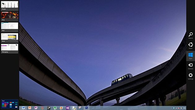
The multitasking bar on the left and charms bar on the right. (Click here for full-res image)
Other points of note
There are a few other interesting ways of navigating within Windows 8 which are not immediately evident to the user.
How do you close a Metro app? There’s no big red X anywhere, and going back to the Start screen leaves it running in the background. It’s actually quite slick: you move the mouse cursor to the top of the screen, click and drag the app down to the bottom of the screen, let go and it’s killed. One can imagine how easy it is on a touch screen to just “throw away” an app that you no longer want to use.
Another feature worthy of mention is Semantic Zoom, one which app developers are encouraged to take advantage of. As a side-scrolling user interface, Metro can get tedious if you have to pan for a mile before finding what you’re looking for.
To get around this, Metro lets you zoom out to get a bird’s eye view of everything that the screen encompasses. For example, if you have more than a hundred programmes installed, you can zoom out in the “All Apps” screen to get to an index view. This feature is great for condensing large amount of information into one single screen for faster navigation.
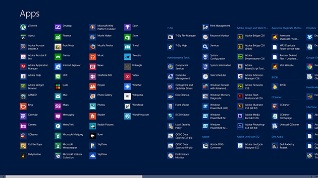
Before Semantic Zoom. (Click here for full-res image)
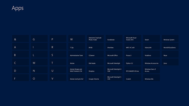
After Semantic Zoom. (Click here for full-res image)
On a touch screen, two-finger pinching will do the trick. On a non-touch machine, you can hold down Ctrl and use your mouse’s scroll wheel to toggle Semantic Zoom, or use the keyboard shortcuts Ctrl+ and Ctrl-.
The ability to run apps side-by-side is also fantastic. In the Metro environment, you can snap an app to the side of another app, so you can, say, listen to music while playing a game. This means that on top of snapping two Desktop apps side-by-side, you can snap an additional Metro app to the left or right of the Desktop, letting you really multitask!
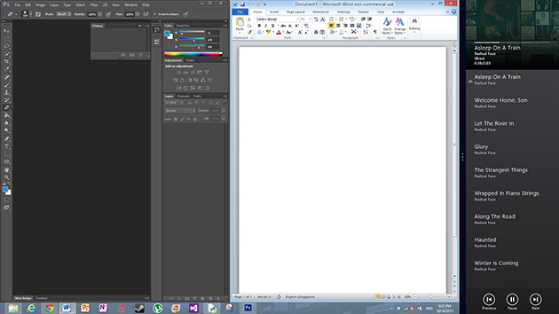
Running apps side-by-side. (Click here for full-res image)
Wrap-up
There are many other new features, such as a cool new Task Manager, the ability to mount and run ISO and VHD files natively, cloud syncing through your Microsoft account, the handy Metro apps bundled with the OS, a revamped file explorer … But going through all of them would make the article ten times longer than it is.
The main point is that Windows 8 does bring significant new features that is worth the upgrade, whether you have a touch screen at your disposal or not. Even if you decide that you’re never going to use any of the Metro features, an upgrade may still be beneficial, as I’ve noticed the OS responds faster in general, and battery life has received a small boost. It’s noticeable enough that I can’t go back to Windows 7 without feeling just a bit impatient at it.
Microsoft is sweetening the deal further by selling Windows 8 at a low price of US$40 until the end of January next year.
Sure, Windows 7 is still an excellent OS, and will stick around for the near future. Plus, many may prefer to get Windows 8 only with a new PC, which makes a lot of sense as new hardware will likely come with touch screens that will really help Windows 8 shine.
But with all things considered, Windows 8 makes for an excellent upgrade over Windows 7, even if you are not using a tablet.


So they made everything more difficult to understand and accomplish, and you are loving it? Fantastic!
Looks like Microsoft is converging to the “iOS” app interface!