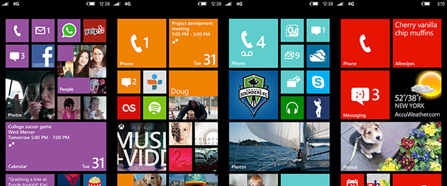
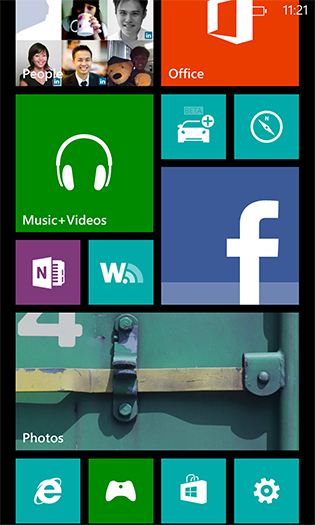
At first glance, you may not notice anything different about Windows Phone 8 compared to its previous version. Well, except for its obviously different Start screen, which now sports tiles of three different sizes.
But Windows Phone 8 is as much a departure from Windows Phone 7 as Windows Phone 7 was from Windows Mobile 6.5 in one important a way: it’s a completely new version of Microsoft’s mobile operating system that is not backwards compatible with its previous version.
This means that apps written especially for Windows Phone 8 will not work in Windows Phone 7, which of course has left many current users unhappy. Still, in the grand scheme of things, I suppose Windows Phone 7’s user base is pretty insignificant compared to the hulking market share of Android and iOS.
Windows Phone 8 puts a focus on refining its distinctive style and features, and has reached a stage of maturity which may just give it a fighting chance this time round.
Live tiles and live apps
Live tiles in Windows Phone 7 were plugged as a way to glance at updated information without having to dive deep into apps. The first lines of your upcoming appointments, number of missed calls, emails and SMS’s etc. are immediately available at one look when you unlock the screen.
These tiles are now more flexible in Windows Phone 8, and can be resized into one of three sizes. Add to that the ability to pin specific parts of apps on to the Start screen and the user can really customise each phone into a uniquely personal experience. (Pictured above)
Don’t really use your smartphone as a phone? Shrink the phone app and throw it into a corner to give space to other things you care about. Social media junkies can place the expanded People tile right smack on top to keep track of their friends’ activities. Gamers may want to fill up the screen with their favourite games, while sporty users can pin their favourite teams to Start.
All the information important to you can be placed front and centre, and you can get a gist of what’s happening without having to go into four or five apps. It also reflects your personality, and what kind of things you’re interested in.
“What’s the big deal?” Android users may be asking, pointing to their home screen widgets. Indeed, Android widgets are more powerful than simple tiles, and in some cases can even be interacted with by the user, but Windows Phone 8’s approach has an undeniable elegant simplicity.
Ten different Android apps probably come with ten different widget designs, which can be an eyesore. The beauty of the Live Tiles lies in its consistency of form and function, something which design-inclined users will appreciate.
And while Android carves out one section of the OS for widgets and a separate one for app icons, Windows Phone 8 integrates the app icon with widget functionality into one screen. It’s a compromise which admittedly results in less information displayed than Android widgets, but improves the overall look and feel of the OS. All things considered, it’s the most flexible and versatile of home screens I’ve used on a mobile platform.
Lock screen
The “live” theme extends to the lock screen, which can be automatically updated by certain apps.
For example, you can let Facebook display random photos from your albums on your lock screen, or set Bing to push its beautiful daily images as your lock screen wallpaper. When music is playing, the background also changes accordingly. This functionality can be taken advantage of by apps, so your wallpaper can enjoy infinite variations without having to manually download each one.
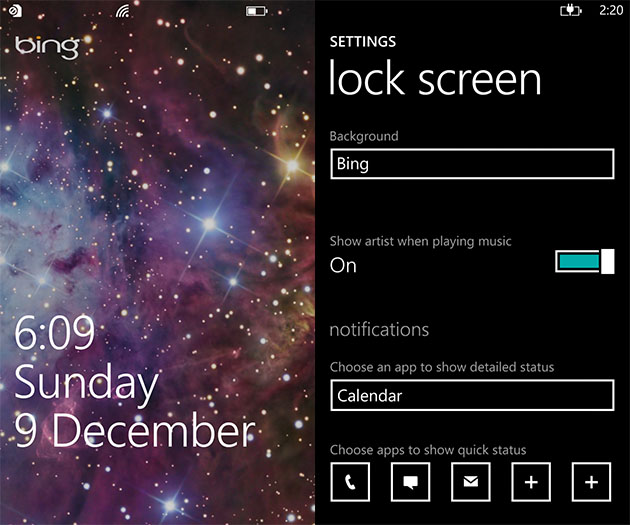
Up to five apps can be chosen to display notification counts on the lock screen, an improvement from the only three uncustomisable icons on Windows Phone 7.
On top of that, you can allow one app to display more detailed more information instead of notification counts, another touch of personalisation that should be useful to different people. Users with a busy schedule can choose to display upcoming appointments, for instance.
On the downside, these features seem to need data connection, as they refused to work or update when I wasn’t connected. I don’t think it will suck up a lot of bandwidth, but those with tight data subscription plans may want to be more cautious.
Groups and Rooms
Windows Phone has always billed itself as a people-centric OS, with integrated information of your friends and contacts from Facebook, Twitter, and LinkedIn, where their tweets, status updates, and photos can be pulled down and viewed on your phone without needing to install additional apps.
The “groups” feature remains pretty much the same. You can group contacts together into a mini-hub of their own, quickly accessing only their updates and information. If you already have groups set-up with your Microsoft account — likely though Windows Live Messenger — they’ll be automatically set up once you log in.
These groups can be pinned to the Start screen to get live updates from group members. You can also send an SMS or email to all group members with just one tap.
In Windows Phone 8, Groups is supplemented with a new feature called “Rooms” under a new section called “Together” in the People hub. Rooms are like supercharged groups, letting members share private information such as their calendar, notes, photos, and send group messages.
But don’t look to Rooms as a replacement for any of your group communication apps such as WhatsApp. Full functionality of Rooms can only be obtained through Windows Phone 8 devices, and I highly doubt most people have more than one or two friends using Windows Phone 8 at this point in time. You should be able to get the shared calendar working in any smartphone, and group messages can be accessed through Windows Live Messenger, but unless Microsoft creates a Rooms app for Android and iOS, it’ll remain pretty much useless.
Kid’s Corner
It’s not uncommon to see children absorbed in playing with iPhones or iPads at the coffee shop these days. But children are not the gentlest of creatures, and you wouldn’t want them messing around with your system settings or work-related apps.
Windows Phone 8 introduces a sandboxed part of the OS which can be customised for children called Kid’s Corner. Parents can restrict what content their children may access in Kid’s Corner, including apps, music, and video.
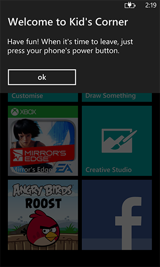
Kid’s Corner can be accessed from the lock screen by simply swiping left, while the rest of the OS is safely locked up behind your PIN should you have set one.
If you don’t have children, Kid’s Corner can be useful too. It’s effectively a guest mode for your smartphone, and this is a great feature for all guests who ask to use your phone so you can keep your personal information secure.
Camera and lenses
The camera is an important part of Windows Phone, and the dedicated camera shutter button will be a breath of fresh air if you’re frustrated with soft camera buttons found today in virtually all smartphones.
However, you still don’t get a lot of shooting options, and camera tweaks are limited to basic ones such as white balance and ISO value. There are no extensive options such as in the HTC One X, where you get additional features like burst shooting. There’s no choice but to rely on third-party apps for those.
Microsoft has taken a new approach to camera apps. “Lens” apps act as plug-ins to the Windows Phone camera and lets users enhance what it can do. A handful of Lens apps demonstrated at launch include Bing Vision (camera-based search), and FXSuite, which lets you add effects and filters.
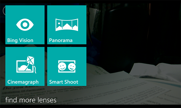
This builds on Windows Phone’s level of integration between apps, and is rather effective. Instead of looking through all your apps to find specific camera-related ones, you can first launch the camera then pick from a list of only camera-related apps.
New Maps
While it’s still nowhere as comprehensive as Google maps, the maps app in Windows Phone 8 are vastly better as it now incorporates data from Nokia Maps. Windows Phone 7 relied on Bing Maps, which was virtually devoid of points of interest outside of the US.
Using Nokia’s mapping solution also has an added benefit: the graphics are vector-based, similar to Apple Maps, which means they download faster and eat up less data.
Maps can be downloaded for offline access, but there are some strange lapses. Tokyo, for example, is one of the major cities of the world, but there is no downloadable map for it.
There is no built-in turn-by-turn navigation, unless you’re on a Nokia device that comes with the free Nokia Drive. Thankfully, Nokia has promised to release Nokia Drive to all Windows Phone 8 devices further down the road, although we don’t know if it’ll be as comprehensive as the exclusive version, and if it’ll be free of charge.
Information on traffic or public transit is also a hit or miss depending on your location, and not always accurate. In any case, it’s best not to grow too reliant on these digital maps as they all have their own quirks.
Wallet
Paying with your mobile phones is a rising trend that government authorities and payment companies are keen to push, so it comes as no surprise that Windows Phone 8 has a wallet built in.
Similar to Google Wallet, you can add multiple credit and debit cards into your phone, and use them to pay for products and services with NFC. The app can also help you find deals near-by.
This feature doesn’t seem to be fully operational in Singapore at the moment, and there are no local deals to speak of. We’ll have to wait to see if any of the local telcos or virtual payment companies decide to hop on to the platform like they did for Android.
But even if they do, there’s no telling if the companies will want to plug into the Wallet app, or create their own payment and deals app. Hopefully, an integrated wallet feature will convince them to do so and make things simpler for the user.
Office and OneNote
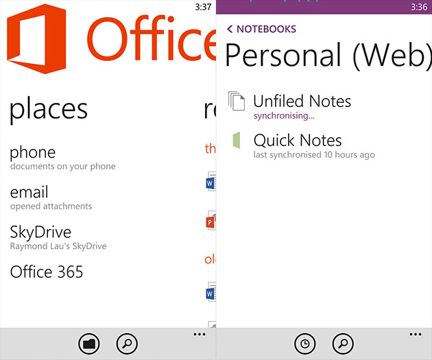
Office, as always, is an enormous selling point on Windows Phone. Minor tweaks here and there has resulted in a more refined user experience. And as always, formatting consistency in documents is unrivalled.
OneNote has grown up and left the office hub, taking up the position of an app in itself. It’s a great note-taking app that painlessly syncs your notes to SkyDrive, letting you access them everywhere. And with SkyDrive having 7GB of free storage, it could be a better deal than competing apps such as Evernote.
In fact, everything in the Office hub can be synced seamlessly to SkyDrive, and it’s one of Windows Phone’s best features.
Internet Explorer
IE in Windows Phone 8 is bumped up to version 10, and is fast and fluid even though it may lack some power features.
The browser rendered all of the sites I went to without problems, including desktop versions. There is no chrome to speak of save a small URL bar at the bottom. I don’t know why other mobile browsers haven’t followed suit, but having the URL bar at the bottom is a fantastic UI tweak. No matter how big your screen is, your thumb will have no problem reaching the bar at the bottom for more options.
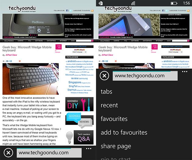
Like IE 10 on the desktop, the mobile version comes with SmartScreen Filter for protection against malicious sites and the option of sending a Do Not Track request to websites.
However, IE is not based on webkit, which means it’s stuck with ugly mobile sites with none of the polish you see on iOS or Android, as these sites were coded specifically for webkit. This issue plagues other mobile browsers which don’t use webkit, such as Mozilla’s Firefox, and it’s going to take a while to sort out, if ever.
What else is missing?
There are other small but important additions to Windows Phones, such as micro SD card support,
Despite the numerous improvements, Windows Phone 8 still has its drawbacks, including one very big one: the lack of a notification centre. The smartphone has become central to our daily communications: always on and always connected. But you can’t stare at the phone all day waiting to catch notifications as they come. You need to be able to refer to a list of all notifications you missed since you last touched your phone.
No brainer, right? But not on Windows Phone 8. Despite calls for a notification centre since version 1.0 (or should I say, version 7.0), that feature is still missing from the OS. The only way you can be notified is through Live Tiles, which naturally means those apps must be pinned on to the Start screen.
If a notification comes to a lesser-used app buried in your all apps menu, then you’re not going to see it until the next time you launch the app.
The app gap is still very much there, despite the Windows Phone Store boasting its collection of more than 120,000 apps. The key ones such as Facebook and WhatsApp are there, but many official apps and games are still not present on the platform.
Unfortunately, Windows Phone 7 devices will not receive the Windows Phone 8 update, even the newer ones like the Lumia 800 and 900. These will have to settle for Windows Phone 7.8, an upgrade which includes only minor improvements such as the new Start screen with resizeable tiles. Microsoft would of course like to push as many of its users on to Windows Phone 8 as fast as possible, but this is still a poor way to treat early adopters who put their faith into the platform in its early days.
Wrap-up
As a Windows Phone 7 user, I found Windows Phone 8 a very worthy update. Microsoft did not really introduce anything particularly groundbreaking with the new OS, but it’s packed with many little refinements and new features that further bring out the unique character of the OS.
Windows Phone 8 presents a genuinely interesting alternative to Android and iOS that is at the very least worth checking out. And just in time, too: if it flops, Microsoft may find it impossible to gain another foothold against Android and iOS.
On the upside, it’s getting a lot of positive attention on its unique features and, paired with some very distinctive launch devices, may just be Microsoft’s ticket out of mobile misery.


Though I am going to be upgrading to WP8 as it is, this article is fantastic. Outlining the important and highlighting the magnificent. Great editing.
Thanks Justin! Glad you liked it.