Over the last couple of years, e-mail has become an essential part of our everyday lives and the slew of email service providers have us spoilt for choice.
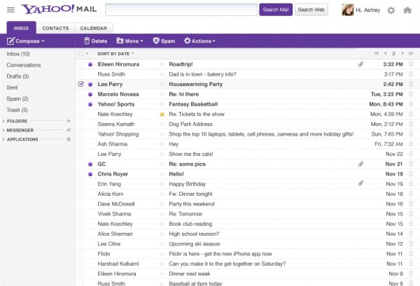
Just last week, Yahoo has further sweetened the deal by concentrating on what users want in an e-mail experience, offering up a new, revamped Yahoo Mail with a considerably sleeker interface.
On the Web platform, Yahoo has cut down on the clutter and reduced the number of buttons on the page, making it intuitive as well as easier to navigate. It has to buck up because Google and Gmail have become the default tool for many users of Android, the most popular smartphone operating system now.
The new, sleek Yahoo Mail Web interface
According to Vivek Sharma, general manager of Yahoo Mail and Messenger, the new Yahoo Mail offers 40 per cent faster access from the logon screen to inbox while composing messages is now 10 to 15 per cent faster than before.
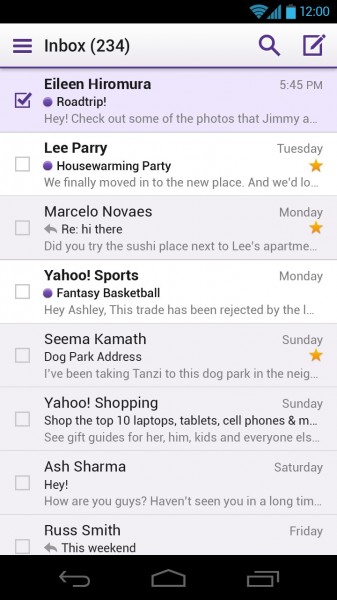
For phones, Yahoo has launched new, native apps for the iPhone/iPod touch and Windows 8, as well as upgraded the Yahoo Mail app for Android. A simple swipe allows users to quickly star important messages, file e-mails to folders and mark e-mails as spam from the inbox. Best of all, the user interface across all the platforms is consistent, ensuring that users can have the same experience regardless of the device they access Yahoo Mail from.
Yahoo Mail interface on Android
More information on the new Yahoo Mail can be found in Sharma’s blog post here as well as in this post by Marissa Mayer, Yahoo’s CEO.


The new yahoo. mail is not any good for me would like the version you had 5 years ago. If I can’t get that anymore I guess it is time to change email. sachu89110@yahoo.com