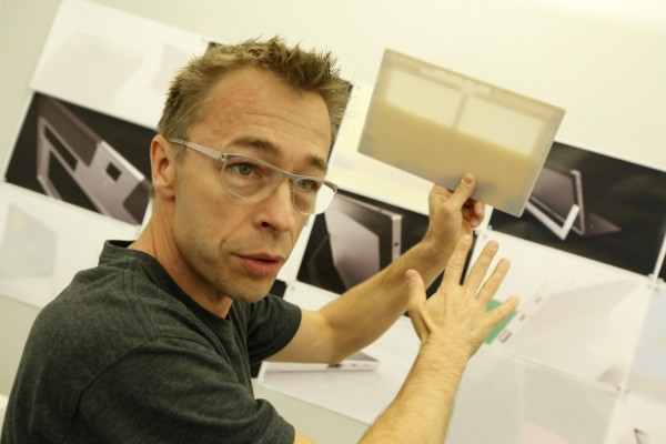
Ralf Groene, creative director of the Microsoft Surface
A little while ago, Techgoondu managed to catch up with the creative director of the Microsoft Surface, Ralf Groene, for a conference call about the design of the tablet.
Check out some of the questions posed to Ralf and his answers from the interview below.
On the beginnings of designing the Surface:
Ralf: When we started out, we looked at the very beginnings of the Windows 8 software, a touch-first interface which is a continuation, but to some extent a departure from what has been done so far with a graphical user interface and a mouse and keyboard.
For the first round of work, we looked at different screen sizes and slate form factors, and we felt that the slate wasn’t enough to bring to life what Microsoft could bring to the market.
If you take a look at what Microsoft is from the past and now, it is very strong in the space of productivity. On the other hand, you have Internet Explorer and gaming, in the Xbox space, so there’s another end of the Microsoft experience that is very strong in the entertainment space.
We wanted to create a product that bridges between the spaces. People may start to read the news on the couch, and then they might read their e-mail and then maybe start writing an e-mail. Productivity and entertainment become intertwined. We wanted to create a product that walks with a person through the day.
The important part of the Surface is to create a product that transitions from productivity to entertainment through different stages of the day with the user. We spent a lot of time “idea-ting” around what is the right screen size and the right interaction, to find the right mix of software and hardware to bake it together.
One of the guiding principles was that we wanted to step back and bring the software to the foreground. The metal housing must be a stage for the software to come alive.
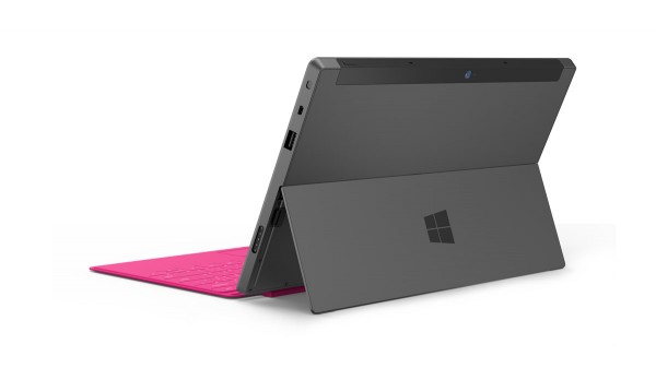
The Surface’s integrated kickstand
And then we came across the kickstand and keyboard cover. They’re really not there when you use the product as a tablet but they come into play when you want to be more productive.
We designed the kickstand to be fully integrated, always there and always away at the same time. We gave people a way to snap in these different covers. On the device itself we innovated quite deep on making the material, the magnesium-based housing. We created the product to be as thin, light and as sturdy as possible.
We spent time perfecting the kickstand and the typing experience, making a quality product but at the same time moving all unnecessary elements away so as to not clutter the experience, to make software the main act of the experience.
All the elements that you find on the product are very connected.
What were some initial design concepts that didn’t make it into the final product?
Ralf: We have literally hundreds. The one way that is very convenient for us to work, is the use of 3D printers. Every idea that we come up with, we would mock it up in CAD (computer aided design) software within hours and print it in 3D.
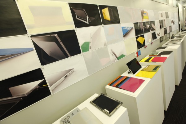
Studio prototypes of the Surface
We could literally print our ideas in 3D and we could touch them and draw on them. As for the ideas that didn’t make it – well basically, think of the Surface as the centre of the map and around it there’s lots and lots of different ideas.
They span from different screen sizes, different profiles for ergonomics, different bezel sizes, different locations for buttons and connectors, different ideas for how the keyboard would attach. We had to find a balance that we really like.
What feedback have you and your team has received for the design of the Surface? For example, the kickstand is not very lap-friendly, and the angle cannot be adjusted, making it slightly troublesome. Are these things that you will take into consideration?
Ralf: We get a ton of feedback. As a designer, to see how people actually end up using the product is fascinating. You have to make a set of assumptions and decisions in terms of how to balance out your ideas and trade off certain things with each other.
We wanted to make a tablet first. And in the “idea-tion” process we came across the fact that if you had an integrated kickstand, it makes it very useful. It’s much better than a normal tablet.
People drag a product that they like into all kinds of situations, and they would wish for this or that. When I grab my laptop at home, I’d think that it’s heavy, or that it gets really hot on my lap, or that it doesn’t have a touchscreen. And when I read the news on a laptop, it’s like the media is further away from me than if it were at my fingertips.
It’s an interesting tradeoff. We had to find the balance, and the balance at the time was that we wanted to make sure that the kickstand and the hinge has a great performance. We were looking at different hinge mechanisms and user experiences.
We decided to make something that gives you one good angle that works really well, is reliable and easy to use versus giving you a variety of options that come with added complexities and a thicker product.
Obviously the trade-off is that people want different angles and it might not work as well in certain situations than you’d want it to.
We constantly prototyped and came up with different ideas. We’ve also received feedback from people that they loved having a kickstand on their tablet. I love it when people are passionate about the product, and there’s always an interesting insight from the feedback.
Apart from the kickstand, was there any other feedback that stood out, or surprised you?
Ralf: Reading the feedback and seeing people using the RT and Pro as the only product they have is very rewarding for the design team of course, because it’s a new architecture, right? It requires vision and dedication to come up with a new architecture versus making something that exists. But to see it unfold in someone’s life, that’s pretty cool.
Another thing I get from reading reviews is that people really enjoy having the Touch cover. It’s a piece of innovation that take the mechanical workings of a typewriter one step further into the digital space.
It might take a learning curve, to learn to type on it if you’ve been using a scissor key or old style keyboard, to let go and trust that this keyboard performs as well. To see people really embracing it, it’s really encouraging feedback for us.
There are also people recording their YouTube videos on the back camera using the kickstand and users showing us what else they can do with the Surface. Seeing a product in real life and people putting it in these situations is very interesting for me.
Will there be other types of keyboards, say a wide version or Bluetooth version? Are you looking into making a dedicated Bluetooth keyboard that you could maybe stick onto the Surface when you’re not using it?
Ralf: I can’t make any comments on future products, of course. There’s a bunch of Bluetooth and peripheral products out there, be it Bluetooth or Wi-Fi or USB where you can just clip in and work that way.
We have actually quite a bit of interesting configurations, we have people using a Surface Pro and attaching their old-school keyboards because that’s the keyboard that they love. So that’s possible, of course.
There’s an ecosystem of peripherals out there that you can use.
How about a keyboard dock for the Surface?
Ralf: Of course we could do something like this. The principle that we follow is to make something that’s always there and never in your way.
When we make our keyboards we spent a lot of time thinking how these keyboards, when not in use, can be stored. There’s an accelerometer on the keyboard that turns the keyboard off when it’s tilted at a certain degree.
The Surface keyboard covers can be easily folded back when not in use
We want to make something that’s compact and not in your way, and we try to aim for these solutions that aim to give a better experience. That’s why our keyboards are a cover when you don’t use them, they can be folded back and turned off.
Is it possible to create a Surface which is in the middle of the RT and Pro in terms of weight? Perhaps with an Intel Atom processor?
Ralf: Processor architecture is not really my area of expertise. You find yourself at a vector in time where you have to think about where technology is and you have to make a trade-off.
When we were making the Surface, there was a certain technology available or a certain technology that we could develop to push the envelope. Who knows, in the future we might have wafer-thin products that are really fast but right now this is where the technology is.
There are chosen areas where we make these trade-offs and again, for next generation technology. It comes back to the question of the kickstand angle, is this the best angle ever? To some people it’s clearly yes, but to some other people they wish we would have changed it.
And to make the Surface Pro that pro for a tablet, that you would clearly enjoy once you use it, was one of the choices that we made, because we really wanted that product.
As for next generation products which might be faster and lighter, if you look at where technology is pushing, everyone is pushing in that direction. We would certainly take advantage of those technologies when they become available.
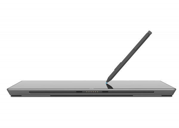
What is the design philosophy of the Surface Pen?
The idea is that once you have a tablet, you also have a sketch book.
We were experimenting in the beginning with the Surface kickstand and keyboard, and we found that it would be awesome if we could also jot down thoughts and notes. And then we mocked something up, and we discovered a few things.
You generally have people falling into two camps, usually a writer or sketcher. It was important to us to create a pen that was pressure sensitive, you want to really feel like you can put a thought onto the pixels and it’s not hindered by a crappy pen experience. This led to the technology we used in the Pen.
To make this happen, the Pen has technology inside it and comes in a Surface size. On one hand, we wanted to make a product that’s as thin as possible, and a Pen that’s as great as possible.
The experience that you can have is something like the Sketchbook Pro that you can get free on the app store. If I were to do a design sketch, I would get quite a nice result. For people who write more, you can just write your thoughts down.
The Surface Pen
So how do we bring this pen along? Obviously if you make a product that is as thin as possible there’s no room to put a pen inside it. So we wanted to make it such that it’s like any other pen, where people would just bring it along.
You can clip the Pen on the keyboard, there is a magnetic clasp which you can plug into the port. That’s the idea of the Pen. I think the insight is something beyond touch and keyboard, and the Pen is something worth having on devices like this.
Compared to Apple, which has a very minimalistic concept, is Surface taking a different route of trying to fit in as much as possible?
Ralf: If you use a tablet, which is just a tablet (not the Surface), do you also have a laptop? The answer’s probably yes.
If you have a tablet, in the classic sense, it’s mostly a consumption device that you need to hold up with both hands and it’s a touch device. If you do just this, you have the ability to do just this, very simple.
But if you zoom out from the singular product and you look at your life, if you go on a business trip for example, you would probably also stash a laptop with you as a second power product, and it would weigh probably twice as much as a Surface. While a singular device is rather simple, the sum of your devices is rather complex.
That is on one end of our thoughts, and on the other end is the options versus solutions. If you take a look at the Surface, there are a lot of options on one hand, but it’s not a “let’s just put as many things” on the Surface as possible.
I think we were pretty thoughtful about what people use in their lives. For example, if you were a photographer, and you want to download the images, you have a USB connector. If you have the Surface Pro you have the USB 3.0, and if you were a professional photographer, you could download your 70 MB picture within fractions of seconds.
If you want to share documents or get a document from your buddy, you can do that with a memory stick. We put one full USB port on the Surface, not two and not three because we could, but one because it’s exceedingly useful.
We have the ability to quickly present in a meeting, and while you can run Powerpoint in the Office suite, you also have a very easy way to connect to the projector. That’s why we have monitor outputs on our Surface.
We were very thoughtful about what type of output you have and how we can keep it minimal and simple but at the same time, very useful.
There was a big debate on a microSD card slot, but we have it tucked into the kickstand. It’s like if you open the hood of your car, there’s some extra stuff that you see that’s the second layer of the experience.
When you get really into the product and you use it in a combination of entertainment and productivity, or if you take a Surface RT on a long business trip, you can watch movies non-stop by just downloading your movies on an SD card and sticking it into the Surface.
There’s no full-size SD, and that’s the trade-off because if we have a full-sized SD card, the product becomes thicker.
We had a lively debate on what elements enter our stage, we don’t do it because we can. It is always important for us to find the right balance and combinations.
You go through a series of trade-offs with many of these complex products, and we were trying to make one set which we felt great about. And when the products gets into the lives of people and people use it in a way which we would not have imagined, it inspires us to maybe do something different in the next product and push our thinking forwards.
Techgoondu: Can you tell us a bit about the two Surface keyboard covers? Why two covers, and not just one dedicated keyboard cover?
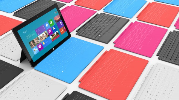
Ralf: We wanted to make a tablet you can be productive on, so we made a cover which turns into a keyboard as you open the product. It is 3mm thin, and when you fold (the Touch cover) to the back, it really feels like a cover, you don’t realise that it could have been a keyboard.
The various colours of the Surface keyboard covers
We spent so much time developing the sensor and the algorithms. We studied different people’s hand sizes and different typing styles and developed custom algorithms for every key to make sure the typing performance is the best we could achieve.
We set off to be meaningfully better than typing on screen, and now we’re almost as good as a real keyboard. If you give it a couple of days and learn how to type on the Touch cover, you would be amazed at how fast you can get.
We loved this product because it gives you a minimal, unobtrusive way of having a keyboard with you and not having a keyboard with you when you don’t need it.
The Type cover started out by wanting to make the best keyboard out there. I would say that this keyboard is better than the keyboard on your laptop because it uses the most modern and state-of-the-art scissor key mechanism that you would find on some of the newest laptops.
Yet, it’s so much thinner than any laptop because it doesn’t have to sit on any battery or housing, so the ergonomics you get when having it on your desk is much better than you would find in any laptop.
We made a keyboard where people are flying when it comes to typing performance, so if you type a lot you would probably use this product a lot more than the other one, but there are other people who want to type as well who might choose the Touch cover.
Since there are different types of people out there, and we have the ability to just click in and let them make a choice with these keyboards, that’s what we chose. And there are also the colours, which lets them bring a little bit of personality into the product.
Check out our hands-on impressions of the Surface Pro and Surface RT. What do you think of the two tablets?
