When the Lumia 925 was first unveiled, it seemed that Nokia has finally heard my pansy complaints that the Lumia 920 could do with some weight-loss training.
At 8.5mm thick and 139g heavy, the Lumia 925 is indeed thinner and much lighter. However, I wasn’t immediately attracted to the way it looks compared to the striking polycarbonate uni-bodies of previous Lumias.
So how did the smartphone hold up after two weeks of use? Let’s find out.
Hardware
As I said, I didn’t think much of the Lumia 925’s design at first when photos started to surface on the web.
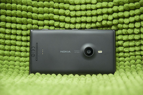
It had none of the Lumia 920’s seamless polycarbonate uni-body, for one, of which I’m a huge fan. I thought of it as an undesirable mismatch of metal and plastic, with an unsightly camera bump at the back to boot.
But all those thoughts fled when I picked one up. The Lumia 925 felt fantastic in my hands.
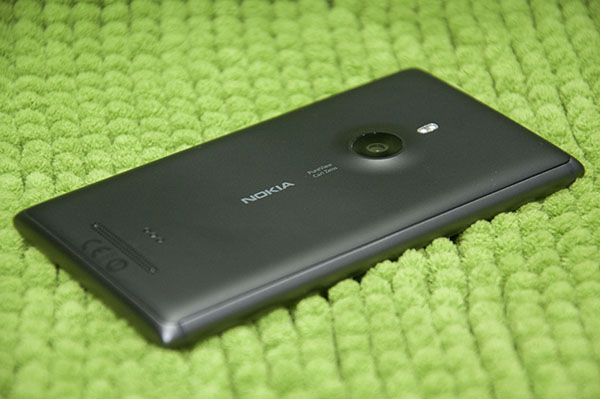
Sure, there’s no hiding the sore gap between the smooth matte plastic back place and the brushed aluminum sides, but the tactile feel of both materials is so similar that the body still feels like one cohesive whole. It may not look as seamless as the 920, but it’s no less tightly constructed.
And if I had my way, every single phone in the world would have rounded sides like the Lumia 920/925, which is still the most comfortable way to fit a phone into human hands.
However, the design is not without its nagging problems.
For one, the rounded sides sharpens off into stiff corners, which occasionally stabbed quite painfully into my hip if I squatted or knelt down. Someday, the phone is going to drop corner-first right onto someone’s foot like a bunker buster, and it won’t be pretty.
I also don’t like the way the camera protrudes out of the rear, which raises fears that the camera lens will be scratched somehow if you’re not careful.
But of course, the good news is the stories are all true. The Lumia 925 is much sleeker and lighter than the 920, due chiefly to the removal of one key feature: wireless charging.
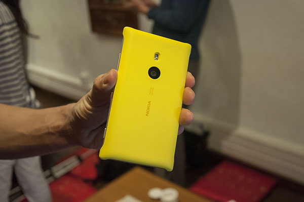
Though an important selling point of the 920, Nokia has decided to make wireless charging optional for the 925. A snap-on plate can be purchased separately to bring that functionality to the Lumia 925. That’s a good move, since it probably helped to lower the launch price of the phone. The plate is also designed to fit perfectly around the camera bump, so that the phone’s rear is flat.
But while these plates come in the fun colours that characterised past Lumias, the Lumia 925 itself only has white, grey, or black colour options. The all-black edition is an easy choice for my favourite. I just can’t get behind the mix-n-match look of the white/grey coupled with silvery metal.
Underneath that sleek exterior is a list of familiar specs: a 1.5GHz dual-core Snapdragon processor, 1GB of RAM, and 16GB of storage. It may not be bleeding edge, but Windows Phone 8 runs flawlessly on it.
Unfortunately, 16GB is the one and only storage configuration you’ll get over here in Singapore. That’s hardly enough for media junkies. I imagine it wouldn’t be difficult to slap in a higher capacity chip, so it’s only a question of whether Nokia wants to do it.
Software
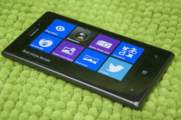
The Lumia 925 ships with Windows Phone 8, which I reviewed back in December 2012. Though the core operating system remains unchanged, Nokia has as usual bundled in many of its own apps and firmware enhancements.
The latest update is named “Amber”, with which the Lumia 925 ships, and brings several software cool software additions to stock Windows Phone.
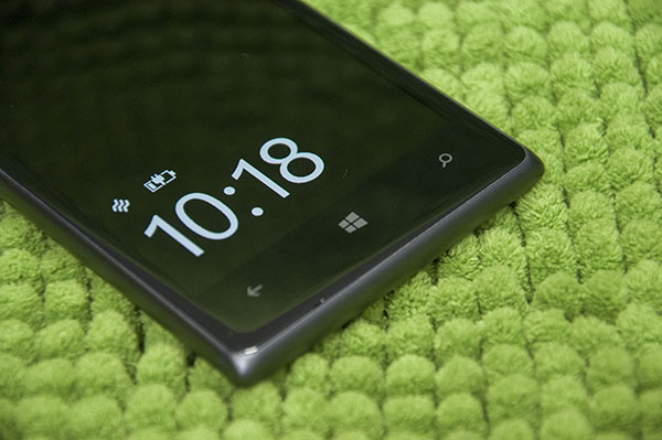
There’s no official change-log lying around since the software hasn’t been officially released, but the Lumia 925 provides a glimpse into what’s coming. The first thing you’ll note is the persistent clock display even when your screen is locked. I found this “Glance Screen” a lot more useful than I thought it would be, as it also tells me when my phone is on silent, and if it’s charging.
Based on recent leaks, you’ll also get a couple of new apps, including a data usage monitoring app, an FM radio, and new camera apps (more on that later). It’s safe to assume most other tweaks will be under the hood (i.e. fixes and optimisation) and in the settings menu, which is jam packed with options piled on top of the standard Windows Phone 8 settings.
Of course, it would be remiss of me not to mention a whole bunch of exclusive apps that are available only on Nokia’s Windows Phone, beginning from the company’s suite of excellent navigation apps to news and games. In particular, Nokia’s free turn-by-turn navigation app is the best I’ve ever tried on a smartphone, and I’ve tried quite a few.
These apps are real differentiating factors for those considering which Windows Phone to buy. It’s clear that Nokia puts a lot of effort into expanding the platform, and no doubt there’s more to come.
Display
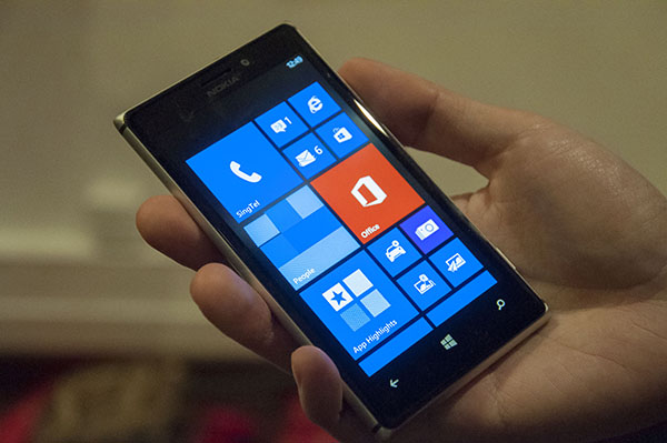
The Lumia 925’s display is, similar to the 920, curved around the edges to embrace the aluminum frame, a marvellous complement of materials.
Full AMOLED glory returns to the Lumia 925’s 4.5-inch display (1,280 x 768), something that I sorely missed from my Lumia 900 days. On the Lumia 925, the blacks are deep and the colours rich and vivid, which fit perfectly with Windows Phone’s aesthetic.
It does look over-saturated, as AMOLED displays are wont to do, but the good news is you can actually do something about it. Buried in the phone’s settings menu is Nokia’s own display tweaking settings, which lets you choose the colour profile you prefer. Presumably this will also come to other recent Lumias in the Amber update.
Sunlight readability may just be the best I’ve seen on a phone. No matter how bright the sun, I never had any problems reading text or looking at pictures on the phone.
The super sensitive touch and high frame rate (PureMotion) introduced in the Lumia 920 is also present in the 925, making this one marvellous display and one of the best features of the Lumia 925.
Camera
The PureView camera is the star of the show for Nokia’s recent smartphones, and it’s no different on the Lumia 925.
It’s a very similar camera to the 920 — the same 8.7-megapixel sensor, and same floating lens technology to stabilise your image and videos — with one key improvement: its lens has 6 elements instead of the typical 5, which will supposedly capture sharper and brighter images.
I know this has been said over and over, but you really have to see the power of image stabilisation on Lumias 920 and 925 to believe it. The sensor is capable of soaking up light in scenes that you think are too dark to shoot in. Home videos seem to be devoid of the extreme shakiness that plagues smartphone productions.
The only complaint about the camera is, again, that small gap between the glass and the plastic. Dust gets in easily, and it’s not easy to clean out. Fortunately, this doesn’t affect image quality, but seeing dust trapped visibly in the tiny space can get on your nerves.
Software-wise, Nokia has a bunch of photography apps both new and newly updated to help users get the most out of their camera.
The latest Smart Camera app captures up to 10 images at one go so that you can choose the one you like most after the shot (such as the one where everyone’s eyes are open), remove undesirable objects, or compile them all into a single “action shot”.
There is an option to launch Smart Camera directly from the physical camera button instead of Windows Phone 8’s stock camera app, but I wouldn’t recommend it as the former is noticeably slower than the latter.
On top of that, a new Pro Camera app will be heading its way over to the 925 and 920, having made its debut on the new Lumia 1020. Pro Camera gives users a more powerful shooting interface, such as control over shutter speed and ISO. Other camera apps include Creative Studio, which lets you add effects and filters.
What about the 920?
If you’ve made it this far into this review, you’ve probably noticed that I made a lot of references to the Lumia 920. That didn’t happen by chance. The Lumia 925 is in reality a very similar phone to the Lumia 920, so there’s no need to kick yourself if you just bought the latter a couple of weeks ago.
They may look different, but except for a different body and a slightly better camera, the Lumia 925 is virtually identical to the Lumia 920.
I would still recommend the Lumia 920 for those looking for the biggest bang for their buck. It comes with everything, including wireless charging and more storage. Sure, the 925 has a slightly better camera, but that becomes less compelling when you remember that all the fancy new photography apps will trickle down. Plus, Nokia is right now giving away free charging pads with every 920 sold, so what more could you ask for?
If, however, you’re willing to trade off some features for a sleeker body, the Lumia 925 is a great choice. And at S$799, it’s is even cheaper than the 920 at launch, due to its modular design.
The best Windows Phone you can get, for now
Without a doubt, the Lumia 925 is currently the best Windows Phone on the market. It combines solid hardware with Nokia’s relentless push to enhance software.
However, it ties very closely with the Lumia 920. If you passed up the chance to get a 920 at launch to see what else Nokia could come up with, the 925 will not have made your choice any more apparent.
Of course, let’s not forget that the Lumia 1020, king of kings among Windows Phones, will be making its way over here shortly. It’s not going to be easy deciding if you should buy now, or continue to wait and see.
But the wait never ends, does it? If you’re in the market for a new Windows Phone right now, there’s no better pair to choose from than the Lumia 920 and 925.
