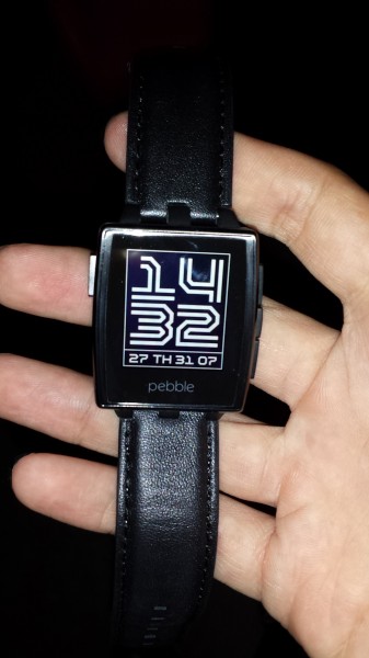
Barely two months after the Pebble smartwatch reached Singapore, Pebble Steel, its premium sibling, looks set to make its local appearance tomorrow for a cool S$359.
Pebble Steel melds the best of the Pebble with a sleeker design that more closely resembles a classic timepiece. You will find the same 1.26-inch e-ink screen with great sunlight legibility that lasts for five to seven days between every charge.
That screen, however, is now reinforced with Gorilla Glass for protection against drops and scratches and comes with an LED charging indicator. Together with its 5ATM water resistance rating, this is one watch that can stand up to the elements.
Like many smartwatches, the Pebble Steel will still serve you notifications from e-mail, SMS, WhatsApp and other social networks. It comes with sensors like an accelerometer and a magnetometer, all powered by an improved 120MHz Arm Cortex-M3 processor.
The smartwatch taps into the same Pebble App Store with over 1,000 apps and 10,000 watch faces. New companies have thrown their weight behind the Pebble brand and you can now look forward to controlling, among other things, Sonos wireless speakers and GoPro cameras with the smartwatch.
The pursuit of beauty is not without its price however, as the Pebble Steel’s switch to a metal body has increased its weight to 56g. That figure balloons to 99g if you were to swap its leather strap out for the metal variant.
In comparison, the Pebble is nearly 20g lighter at about 38g despite its bulkier appearance.
During my quick hands-on with the Pebble Steel during its Singapore launch event today, the increase in heft is noticeable when I strapped the smartwatch onto my wrist with a leather strap. I can imagine that being even more pronounced with the metal strap.
While its weight can be felt, the Pebble Steel is still comfortable to wear around and feels a lot less geeky than the polycarbonate Pebble. It also looks svelte in comparison to other smartwatches, like the LG G Watch and Galaxy Gear 2. Buyers of any smartwatch will definitely have to consider whether they prefer form or function.
The interface on the Pebble Steel, much like the one on the Pebble, is pretty much foolproof. A middle button on the right functions as the menu and enter key while the two buttons flanking it let you scroll the menu up and down. A sole button on the left acts as the back and home key. Kudos to Pebble for the intuitive design.
At some demos today, I was able to change the songs played and the volume on some Sonos speakers and managed to change the colour of the light on a Philips mood lamp using the Pebble Steel.
While such developments represent baby steps towards a connected home, the concept will remain a novelty until manufacturers actively adopt such smart wearables for their connected appliances. I would not activate an app just to control one lamp in the bedroom.
As part of the Singapore launch, the first 500 buyers of the Pebble Steel will receive a custom-made pouch and silicone sports strap (and a well-crafted one at that, I must say).


