There’s nothing like some tough but honest feedback to keep you on your toes. That, reader Danial Helmi definitely gave us when we asked what readers liked and disliked about our website revamp over the week.
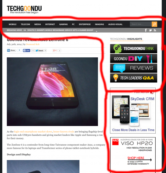
With marked-out screenshots to make his point, Danial said there was a lack of focus in the main homepage, with too many elements competing for attention. He also grabbed a screenshot from popular tech site The Verge, for comparison.
Another great point he made was the use of pictures in portrait orientation, which leaves a lot of blank space on a webpage that makes the design look unpleasantly awkward. We will aim to fix this in future stories.
For his critique, we’d like to present Danial with a Xiaomi Redmi Note phone, a prize we’d say we give to the best feedback from a reader earlier in the week.
His suggestions, like many really good ones from other readers, will help us improve the site in the months ahead. Though we cannot implement all the changes, we would like to make Techgoondu as reader-friendly as possible.
We’re happy that many readers had kind words for us too! The mobile version of the site was well-liked, as was the fresher design. On our Facebook page, Edward Khoo praised the geeky mascot and icon we used on the social media network, while Lee Sze Yong found the local Singapore perspective in our DIY stories and commentaries useful.
Here, we would like to thank everyone for giving us some great suggestions and for your kind words for the relaunch. This is just a start, of course. We hope to have even better stories in future.
And yes, there will be giveaways of some awesome gadgets for the next few weeks, including one specially for Singapore’s National Day. Do look out for them at our Facebook page. Thanks for reading Techgoondu!


