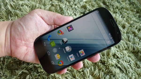
The YotaPhone 2 is one of those gadgets that will always surprise when you show it to someone for the first time.
With two screens on either side – a regular colour screen and a greyscale e-ink display – it offers flexibility like no other smartphone does in the market.
Yet, the ingenuity goes beyond that one trick. It has to do with how the YotaPhone 2 looks more like an accomplished gadget than a beta version of some new technology demo.
Indeed, the update to the original YotaPhone that burst onto the scene in 2013 looks like any regular smartphone. And a very-well polished one at that.
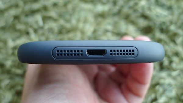
Despite packing in both a 4.7-inch e-ink display and a 5-inch Full HD colour screen, the YotaPhone 2 is no heavier than a regular model. The 145-gram magnesium chassis is both minimalist and sleek.
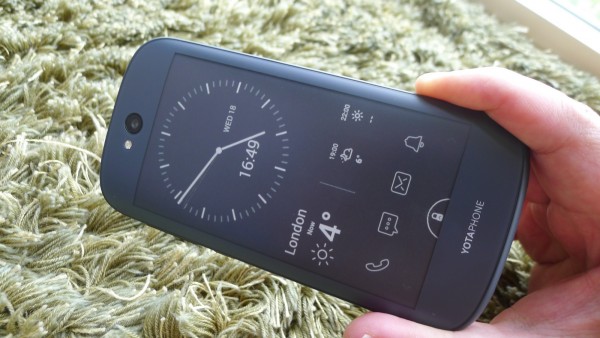
Folks who like the Google Nexus 5, for example, will find similarities in the neat, function-first design.
What impresses are the single-panel front surface made of glass-fibre reinforced plastic, as well as a smooth back-screen that is curved to make the phone seem slimmer.
Even the packaging is top-notch, with a neat, modular design for items such as cables and power adapter.
Under the hood, the YotaPhone 2 packs in some handy hardware as well. The 2.2GHz Qualcomm Snapdragon 801 processor, for example, is no slouch at all.
Also useful are the built-in 32GB storage and 2GB memory. Plus, there’s 4G or Long Term Evolution (LTE) included for quick mobile broadband connections.
The good impressions continue when you power up the phone for the first time. You’ll find a neat interface free from useless junk software. The Android 4.4.3 operating system here is what you’d expect from a clean Android setup.
The dual-screen setup is thankfully seamless as well, involving me just flipping the phone over a couple of times to get the necessary settings in place.
Say, if the e-ink display’s apps require more information, you’ll be prompted to flip over to the colour screen to key that in. To access e-mail on your e-ink display, for example, you’d first have to set up your Gmail or other e-mail accounts.
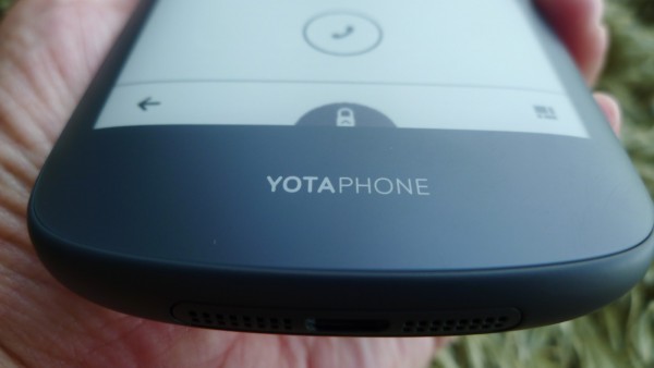
What I also like is how Yota Devices, of Russia, has made the switching between the screens so easy. Once I flip over to the e-ink display and unlock the e-ink display, the colour screen goes off, so I won’t accidentally fire up any apps.
The e-ink display has its own apps, which include interesting ones such as chess and Suduko and of course, e-books. They will come in handy on a long plane ride, when you want to conserve power with the e-ink display.
There are customised apps that let you make calls or send messages from the e-ink screen, while personalised information such as the time and location, can be included for quick reference.
What’s also impressive is how easily you can run regular Android apps, such as Spotify or WhatsApp on the e-ink screen, as long as you mirror them over.
You do this by simply holding the home button and selecting a mirror icon on the left when using an app on the colour screen. The app is then transferred to the e-ink screen. That’s handy when you want to, say, surf the Web for quick information like a restaurant’s phone number.
The point is to rely less on the power-hungry colour screen and turn to the “always-on” e-ink screen that sips, rather than drinks, battery juice.
Having left the e-ink on for two days, I still got about 70 per cent of battery left during my test. Yes, that’s with the e-ink constantly taking power from the modest 2,500mAh power pack.
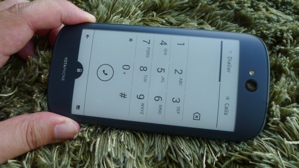
But more than just power saving, you literally see the value of the e-ink display when you are staring at it on a hot, sunny afternoon in Singapore.
High-contrast and sharp, it is the best display to show off the most important information on a bright day, like the dialpad and incoming messages. The brightest colour screens don’t come close. And there’s no glare here.
Because the e-ink screen is always on, it’s useful for, say, reading incoming SMS messages, looking up my calendar or just checking the time.
Its capacitive touch feature is still not as zippy as the regular colour screen. But to be fair, it’s meant for reading information instead of constant interaction. I’d stick to the regular screen when using Google Maps.
The main screen is pretty sharp as well, but obviously lacks some of the vibrant colour and brightness of the best-in-class Super AMOLEDs from Samsung, for example.
But that’s not why you’d be buying the YotaPhone 2. It’s for folks who want a feature-packed device that still gives them days of battery life, as long as they stick to the e-ink screen for some of the mundane tasks.
At S$899, the YotaPhone 2 isn’t cheap. In comparison, the new LG G Flex 2 costs only about S$100 more and it’s got a curvy, red body to go with a Full HD screen and a faster processor.
But not everyone likes flashy gadgets. It you want something more practical in a truly innovative way, then the YotaPhone 2 will impress you.




The only innovative phone to hit the market in a long time. Nice review.