At Apple’s yearly show-and-tell this week, fans got their first glimpses of the new phones and software coming their way this year.
The iPhone 6S and iPhone 6 Plus, two phones that looked like last year’s edition but has new features like a new 12-megapixel camera touted as the best out there.
There were also updates to the Apple Watch OS, called watchOS 2, the latest Apple TV, which now supports the App Store. But the most interesting for me is the productivity-centered tablet, iPad Pro.
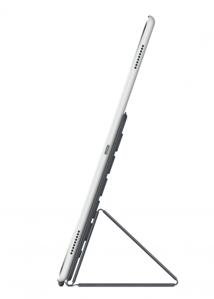
Coming in slightly heavier than the original iPad (713 grams vs. 680 grams), and only slightly thicker than iPad Air 2 (6.7mm vs 6.1mm), the iPad Pro arrives at a time when iPad sales are hurting.
Apple’s enterprise collaborations with the likes of IBM and Cisco demonstrates its plans to make a dent in that market. So if you’re one of those who shrugged about a larger iPad, it’s because you probably left yours at home, and you’re not exactly the demographic.
Apple’s “Pro” market are likely those who carry their iPads with them for various uses at work and use them daily. And it’s telling why iOS 9 is looking more and more like a desktop operating system.
There’s a strong emphasis on multitasking features like split screen apps running side-by-side, and the ability to attach files from the Mail app (frustratingly, you could only share photos or files from the apps themselves previously, never initiated from the default email app itself).
And even as iOS 9 gives you more desktop-like capabilities it’s clinging on to the simplicity of iOS.
Steve Jobs once spoke about how Apple observed that users who learn how to use computers take to certain tasks very quickly, tasks like browsing the Web, but once they are faced with the prospect of searching for their files, they’re lost.
iOS is meant to simplify that experience for everyone. In the Pro market, that simplicity means the ability to access certain files on the device when they need it.
Apple is supposedly giving users this capability, by opening that option to view files in an iCloud Explorer, which can be turned on as an option (this was revealed in a version of the beta–it may not meet the final build, which will become available to the public on September 16.
iPad Pro
So, what can the iPad Pro do that your iPad Air 2 can’t? For one, it’s got a 12.9-inch screen with a resolution of 2,732 x 2,048 pixels (264 pixels per inch), and its footprint nears that of a 13-inch Macbook Air (MBA), though the MBA weighs a lot more at 1.35kg.
With the larger screen, I can have Microsoft Word and a Web browser next to it, so I can fact-check. And with my aging eyesight, the larger screen makes split-screen productivity a comfortable experience.
Apple says the iPad Pro delivers almost twice the performance of iPad Air 2, courtesy of the new 64-bit A9X chip and an M9 motion coprocessor.
The new pro tablet is capable of doing things like creating and rendering 3D designs, or even editing 4K video, something that desktops still struggle with.
The new tablet also features faster flash storage for improved read and write speeds. Yet as always, Apple’s pretty stingy with storage, with the base model featuring 32GB and the highend model coming in at 128GB.
There’s neither a 64GB or 256GB option, a head-scratcher considering the Pro moniker.
A productivity device, the iPad Pro also features two pairs of stereo speakers on each end. As with the iPad Air 2, it comes with an 8-megapixel rear camera that also shoots 1080p video and a front camera that remains at 1.2 megapixels and shoots 720p.
While the new iPhone 6S models feature a new version of Touch ID, Apple made no mention about the Touch ID on iPad Pro being the newer version.
Incidentally, iPad Pro also features Wi-Fi 802.11a/b/g/n/ac, dual channel LTE at 2.4GHz and 5GHz, HT80 with MIMO and Bluetooth 4.2. Bluetooth 4 made its first appearance on Apple’s latest iPod Touch 6.
The Singapore pricing for iPad Pro isn’t out yet but retails in the United States for US$799 for 32GB (WiFi), US$949 for 128GB (Wi-Fi), and US$1,079 for 128GB (LTE). There’s no 32GB option for the cellular model.
Apple Pencil
Much has been said about the irony of Apple introducing a stylus when Steve Jobs famously boo-booed it in the past.
But much of these, even those coming from tech journalists, is derived from poor analysis of the context in which those words were said.
Jobs said those words at a time when no consumer device featured multi-touch screens. Phones with touchscreens weren’t capacitive in nature.
In that context, the simple act of interacting with your phone requiring a stylus was indeed awful. It was, in Jobs’ words: “Yuck.”
Apple has since seen many users, like myself, who use the iPad not just for word processing and other types of work, but painting.
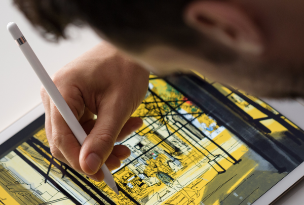
As a painter and illustrator, I use the iPad a lot for producing these works. To paint with my finger is possible, but a stylus is more natural.
And while I’ve used many different styli over the years, even though there’ve been some good ones, none match the power and precision of tools that professionals use, a Wacom tablet for example.
A comparable product would be the Wacom Cintiq, a product that not only requires tethering to a computer, but costs thousands.
The most portable of these is the Cintiq 13HD, a bulky tablet that’s hardly ideal for carrying around daily.
The US$99 Pencil may be good for writing on the iPad Pro, but it looks like it’s going to be great for those with a creative bent. It’s going to give artists an edge to produce art no matter where they are.
With a sensor in the tip, the Pencil can sense pressure like a real pen or brush does. Press lightly to draw fine lines, or press hard to draw darker lines, and so.
And because it senses the tilt of the pencil, your brush strokes will reflect that too. These are nuances that artists will appreciate.
It also features a removable cap to reveal a Lightning port. You plug that into your iPad’s Lightning to charge it, and it lasts 13 hours of use.
If you’re in a rush, Apple says you can get up to 30 minutes of use with just 15 seconds of charging.
Smart Keyboard
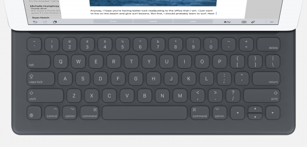
Much like Microsoft’s keyboards for its Surface tablets, the iPad Pro has its own–the Smart Keyboard. Unlike other keyboards, this one doesn’t require Bluetooth.
Take a closer look at the new iPad, and you’ll notice three nubs on the left side. These connect to the keyboard, and provide power and data transfer.
While it may drain the iPad’s power, users won’t have to faff around with pairing the keyboard with the tablet, which is a nuisance that tablet users will be glad to be rid of.
With the keyboard and iOS 9, users can plow through apps with time-saving shortcuts, which iOS previously supposed only in limited fashion. Now, you can do things like press on Command+Tab to switch between opened apps.
The keyboard features full-sized keys, which Apple describes as similar to the ones featured on the new Macbook, so don’t expect a lot of tactile feedback–we’ll update this when we get to try out this device. The Smart Keyboard is priced at US$169.
Should you get it?
The iPad Pro definitely has a place for die-hard iPad users. But it’s starting to get a bit complicated.
Users have a few options from which to choose. Do they buy an ultrabook for this price?
Just looking at Apple’s own products, the 13-inch Macbook Air is just under S$1,328 for the base model featuring 128GB of storage. The iPad Pro at 128GB (Wi-Fi) coupled with Smart Keyboard is going to be more expensive than that.
The next comparable product is the Microsoft Surface Pro 3. The 128GB, Intel i5 model costs S$1,348 and comes with a stylus. And oh, it runs a full-fledged desktop operating system.
Ultimately, what you choose has to be based on what apps you use, and what you do. For some users like me, the apps found on the iPad are extremely powerful and they fit our professional lives. For others, they may want desktop versions of Photoshop, for example.
None of these new devices from Apple are perfect. But they are going to provide one more option for users on the go.
