If you’ve always been a smartwatch fan, long before the Samsungs and Apples came about with their models, then you’d be familiar with Pebble.
Well known for its successful crowd sourcing projects, the company has improved on previous designs with its latest smartwatch – the Time.
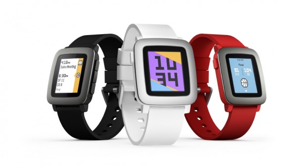
It’s clear from first impressions that the Time exudes is a bit of fun with its red, black and white plastic shells. each fastened by a silicone strap.
The watch is meant to be on the wrists of fashionistas and it shows by having easy-to-remove watch straps. You do this through an innovative design that allows a quick change of the colour strap to suit your outfit of the day.
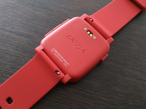
There’s a lever for you to press down on the spring bars to dislodge the straps from the watch without using any tools. Really nifty!
The Pebble Time now comes in a colour e-paper screen, a step up from the black and white screen of the first generation of Pebble models.
Although it doesn’t have a touchscreen, having the four buttons for navigating around is fine by me. Some will find that to be a little more work, to be sure.
But there’s an upside. These saving features contribute to the Pebble Time’s “stamina” that helps provide a promised seven days of usage before recharging.
Yet another improvement from before is the water microphone, which is now water resistant. It can be submerged for 30 metres now, down from the Pebble Classic’s 50 metres, but then again, who brings a smartwatch into such deep waters?
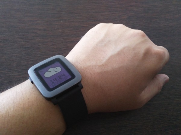
Getting the smartwatch up to speed with my smartphone is also a fuss-free affair. During a quick test last week at the Pebble Singapore launch, I could pair the new smartwatch with my phone and navigate around within minutes.
Almost as quickly, I got notifications from my phone. I was able to activate apps on the smartphone for example, to read articles that I was notified on. I could even change the watch face without much trouble as the user interface is really intuitive.
It’s not a standalone product, for sure. The Time can also link up with Jawbone and Misfit fitness apps to provide timely information on your fitness milestones too. Unfortunately, I didn’t get to try this out last week.
What Pebble has done extremely well in is its interface. Its timeline presentation of a user’s activities for the day is easy to understand.
After linking the Time to my phone, I could see what activities I would be having in the next few hours or even days ahead.
Of course, Android Gear has something similar but Pebble Time’s implementation is much more straight-forward and easier to follow.
Pebble hasn’t got everything perfect, to be sure. For someone who likes a bit of heft for a watch, I found the Pebble Time very light in comparison to other models. It’s almost toy-like.
The Pebble Time Steel version, slated for arrival towards the end of the year, would be a better bet although that will probably cost more.
I personally find the screen on the Time too small when compared with, say, the Motorola 360, LG G R Watch and Samsung Gear S2. To make things worse, the watch bezel from on the Pebble smartwatch is quite wide, making the screen look even smaller.
When it comes to the screen brightness, the Time looks really subdued even when used in a darkly lit environment. I didn’t try it out in the hot Singapore sun, but you worry that the screen won’t be clearly visible.
Out now in Singapore, the Time isn’t cheap at S$329. And that’s with a rather small screen without a touch interface.
At the end of the day, I guess it will appeal to folks who like a watch that can last longer than usual. Having fewer features, after all, helps save battery life. A smartwatch is only smart if it’s powered on.
