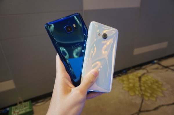
Following last month’s unveiling, the HTC U Ultra and U Play have been officially announced in Singapore. The U Ultra is HTC’s flagship phone for 2017 (although not necessarily the only flagship from them this year), whereas the U Play is a more affordable mid-tier offering that promises the same premium feel as the U Ultra.
I had the opportunity to fiddle with both devices yesterday, and here are my first impressions.
HTC U Ultra
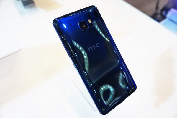
Undoubtedly the more interesting of the two phones, the 5.7-inch HTC U Ultra is the first phablet from HTC since the 5.9-inch HTC One Max in 2013.
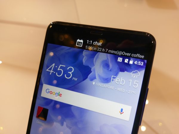
As I pointed out previously, the U Ultra at first glance looks like a cross between the Samsung Galaxy S7 Edge, with the glass back and square rear camera, and the LG V20, with the 2.0-inch secondary display at the top.
As a huge fan of HTC metal unibody designs which it pioneered in 2013, I was disappointed to see the switch to glass and a design that looks so similar to competitor devices.
Chang Chia-lin, the global head of HTC, said that they decided to make a radical change in design because the consumer electronics industry is not very understanding towards incremental designs, and considerations were already being made in 2015 (in the wake of the badly received HTC One M9) to change up their designs.
Unfortunately (or thankfully, in my case), they did not have time to implement the changes for 2016, which is why the HTC 10 still stuck to their previous design philosophy.
This is a fairly reasonable explanation, but that did not really make me any happier to see the ‘copycat’ design of the U Ultra.
With that said, having finally had a chance to hold the device in my hand, I have to admit that it is a beautiful phone. The liquid surface on the back that HTC boasted about is not just marketing speak.
The back of the phone really does remind you of liquid. HTC said that they curved the glass not only at the four sides of the phone, but at the four corners as well, giving it a 3D effect.
However, the liquid surface back has one issue: it is a nightmare to photograph. The 3D effect makes the phone extremely reflective, making it near impossible for me to get a good shot of it without seeing myself in the reflection (which is why all of my photos of the device are taken from an angle).
No amount of photos will do the phone justice, and I highly recommend looking at it in person to fully appreciate its design.
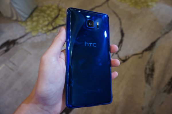
While it may look similar to other devices, HTC has managed to give the U Ultra a much more distinct feel than the Galaxy S7 Edge.
Despite both devices having glass backs, the U Ultra is less slippery and easier to grip than the Galaxy S7 Edge, thanks in part to its lack of ‘edges’ on the front screen. In fact, the U Ultra actually feels as easy to use with one hand as my HTC 10, despite being much bigger in size.
HTC has always been renowned for its sound quality, and Boomsound is still available on the HTC U Ultra in the form of a tweeter at the top and a woofer at the bottom.
However, the same cannot be said for the 3.5mm headphone jack. In what looks to be a worrying trend for smartphones, HTC has decided to ditch the headphone jack on the U Ultra.
Chang said they had two reasons for removing it. The first is aesthetics. Unlike the Galaxy S7 Edge, which has a thicker width at the top and bottom of the metal frame surrounding its body, the U Ultra is symmetrical in width at all angles because the glass back curves in all directions.
While the end result was an extremely stunning-looking phone, it came at a cost: the metal frame surrounding the U Ultra’s body became too thin for a 3.5mm headphone jack.
This leads to the second reason: sound quality. HTC claims that they wanted to push the boundaries of the sound output of their phones, especially through the earphones. As such, they focused on creating a pair of USB Type-C USonic earphones for the U Ultra.
Combined with their software, the USonic earphones can analyse your inner ears with a sonar-like pulse to create a personal sound profile just for you. It even has microphones on the earbuds to optimise the sound quality and volume based on the surrounding noise.
I was given the opportunity to try out the USonic earphones, and I have to admit that it works very well. To create a profile, all I had to do was put the earphones in and hit a button to start optimising the sound. After a series of tones, the profile was complete, and the frequency of the music that was playing changed to produce a louder and clearer sound for me.
I will need to test out the earphones more extensively, but right now I would still prefer it if HTC had made the phone slightly thicker to accommodate the headphone jack.
The USonic earphones do not provide the same convenience as normal earphones that can be plugged into any device. To make matters worse, the USonic earphones only work on the U Ultra and U Play. When I plugged a demo set into my HTC 10’s Type-C port, it did not even register the earphones.
At the bottom of the Quad HD (2,560 x 1,440) resolution screen of the U Ultra is a capacitive fingerprint scanner that doubles up as a home button. Just like the HTC 10, it unlocks the phone extremely quickly.
With the HTC 10 having one of the best performing cameras of 2016 according to DxOmark, the HTC U Ultra is determined to take it a step further.
It does so with the same 12MP UltraPixel , f/1.8 aperture camera and optical image stabilisation (OIS) from last year, except with added phase detection autofocus (PDAF) to accompany the laser autofocus sensor.
This should theoretically mean the U Ultra would produce similar (but probably better), quality photos as the HTC 10, with much faster autofocusing.
I will need to conduct more tests with the camera, as the lighting and background of the event area was less than optimal, but it seems to capture and focus much faster than my HTC 10 when I tried it out.
At the front is an upgraded 16MP camera that also has an UltraPixel mode which allows you to take brighter selfies in low light settings.
The most disappointing aspect of the U Ultra would probably be its 3,000mAh battery. With the same screen resolution and battery capacity as the HTC 10, I have my doubts that it would have better battery life due to its much bigger screen, even if it has a more power efficient 64-bit quad-core 2.15Ghz Snapdragon 821 processor.
Chang said there will never be such a thing as a big-enough battery, which is why HTC is instead focusing on power optimisation through software tweaks and artificial intelligence (AI). Their aim, he said, is to at match the battery life of the HTC 10 on the U Ultra.
My HTC 10 still gets me about five hours of screen on time, so I would be pretty satisfied, and impressed even, if the much bigger U Ultra can match that.
Speaking of AI, HTC Sense Companion can be found on the U Ultra. Its aim is to help personalise your phone just for ‘U’, by learning about your habits and offering you suggestions based on what it knows. I did not get a chance to try it out, so I will need to wait for a review unit.
However, HTC said the Sense Companion will be available on the Play Store at the end of this month or the beginning of March for the HTC 10. So if you own a HTC 10 and want an AI assistant in your life, you can try it out soon.
The best feature of the U Ultra, however, might be its price. The 64GB/4GB model will be available from all telcos and online store Lazada from February 25 for $898. This is much cheaper than the Galaxy S7 Edge ($1,098) and the LG V20 ($998) at launch.
In fact, it is even cheaper than the the US price of USD749 (S$1,066). For a flagship phablet in 2017, this is a pretty good price for fans of HTC. Oh, and it comes in Sapphire Blue, Brilliant Black, Ice White, and Cosmetic Pink.
If you require more durable model with more internal storage, there is also a ultra-hard, sapphire edition version of the U Ultra with 128GB of storage. However, no pricing or availability has been given for that.
HTC U Play
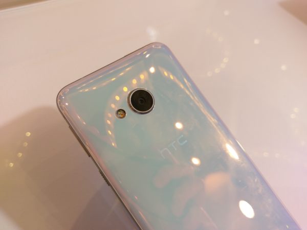
Moving on to the smaller sibling, the HTC U Play, one can expect it to be a watered down U Ultra. A quick run-through the specifications: the U Play comes with a 5.2-inch Full HD (1,920 x 1,080) resolution screen. It is powered by a weaker MediaTek Helio P10 processor, has 64GB of internal storage, 4GB of RAM, and an alarmingly tiny 2,500mAh battery.
For photography, it has a 16MP rear camera equipped with optical image stabilisation (OIS) and phase detection autofocus (PDAF). At the front is the same 16MP camera that the HTC U Ultra has.
For a mid-tier phone, the HTC U Play feels exceptionally premium, thanks in part to its shared design DNA with the U Ultra (which means it is also a pain to photograph). Despite having the same 5.2-inch screen size as the HTC 10, it feels even more compact and pleasant to hold.
Another thing it shares in common with the U Ultra is the lack of a headphone jack. Thankfully, it supports the HTC USonic earphones as well.
Software-wise, it also comes with HTC Sense Companion. What is different however, is its software version. The U Play is running Android 6.0, compared to Android 7.0 on the U Ultra. To me, this is unacceptable for a phone being released in 2017, especially when it is part of a new line of products.
For the average consumer, however, the software version might not matter, given that it costs a much more affordable $548. It will be available from all telcos in March, though no exact date was provided.
Just like the U Ultra, the HTC U Play comes in four colours: Sapphire Blue, Brilliant Black, Ice White, and Cosmetic Pink.




htc is good