Placed on a shop display among rival phones, the LG G6 doesn’t catch the eye like a star gadget. That title belongs to the more attractive Samsung Galaxy S8, with its curved edges and slimmer profile.
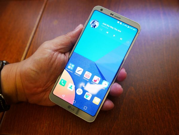
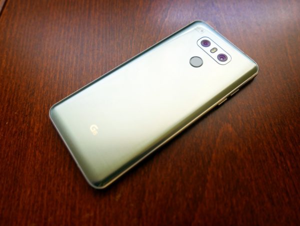
To be sure, the G6 doesn’t look bad at all. With a glass unibody, a metallic frame and shiny chamfered edges, the new LG flagship does exude a certain confidence and elegance.
The main issue is that it looks a little similar to other phones at a shop, until you look a little more closely. It takes more than a brief glance to notice one of the main features that LG is touting – practical, everyday utility.
The longish display (18:9 instead of the usual 16:9) means there’s more to see on the screen without making the phone fatter. It makes sense for some apps, like your Web browser, for example.
The other thing is the thin bezel by the sides. Through its own usability research, LG is arguing that people prefer a thin edge on the side – instead of Samsung’s bezel-less offerings – so they don’t accidentally tap on the screen.
Having used the Galaxy S7 edge for a year now, I can say this is true. I do tap on the edges accidentally from time to time. Is it annoying enough for me to junk the pretty-looking phone for a G6 this year? I don’t think so.
Still, it’s practicality that LG is touting this year in its G6. Instead of the modular G5 last year or the leather-backed G4 in 2015, the new flagship is supposed to win over users with real-world advantages.
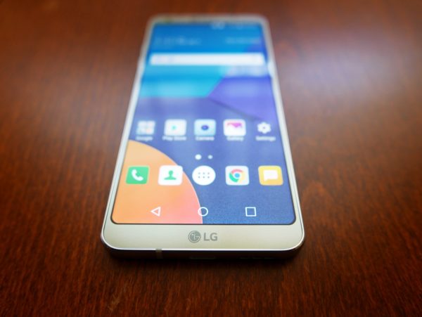
The 5.7-inch display offering 2,880 x 1,440 is pretty large, yet the phone remains easy to handle, especially in one hand. The fingerprint sensor at the back is still more accessible than having it out in front.
The only time I might feel a little awkward is when I’m trying to reach the top of the longish screen using my thumb. It’s a bit of a stretch, though fortunately still not at great risk of dropping the phone.
Even the curved corners of the display, which may not be apparent until you take a careful look at them, have a reason for existence. Instead of sharp corners, the rounded ones are more likely to survive a drop, according to LG. I didn’t drop the phone during my tests so I can’t say I can prove or disprove the Korean firm’s claims.
What I might be more concerned about is the glass backing. The mint review phone suffered a minor scratch at the back even though I had only been using it sporadically over a couple of weeks. So, this is a phone you have to take care of, despite the added toughness of water resistance.
One other thing to note is that the 3,300mAh battery, which lasts me easily past a day on average usage, is embedded. So, unlike before, the Korean phone maker isn’t touting a removable power pack. Perhaps people don’t care for that these days.
More importantly, it has the hardware to run demanding apps. No surprises to find a Qualcomm Snapdragon 821 processor, along with 4GB of RAM, from a flagship Android today.
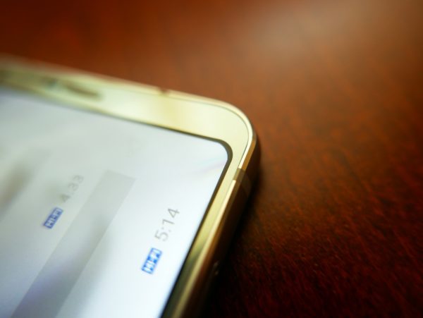
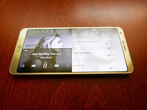
One thing that stands out for me is the focus on audio quality. Like on the LG V20 last year, you get the Hi-Fi Quad DAC (digital-to-analog converter) that uses a well-liked ESS Sabre chip to produce superior sounds over many smartphone rivals.
Trying out a pair of Beyerdynamic Xelento earphones, for example, I found the G6 providing a lot more clarity, detail and control than the run-of-the-mill offering on my Galaxy S7 edge.
The new Galaxy S8 is said to have its audio components tuned by headphone maker AKG, so this is one area shaping up for an interesting battle.
I haven’t tried the Samsung flagships yet, so I’ll say the G6 is as good an option today as you like if you seek a phone that plays back your tracks with more quality. It could even mean doing away with a separate portable audio player for your daily commute.
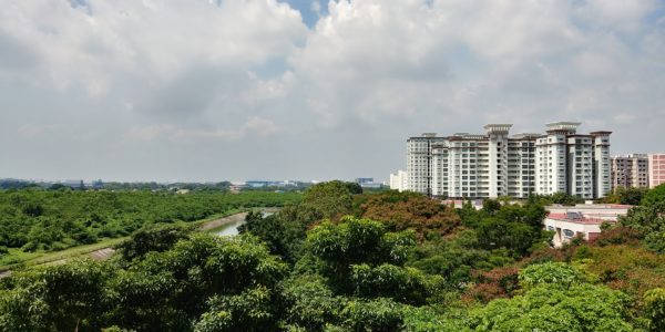
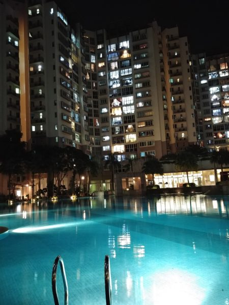
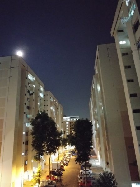
The G6’s camera isn’t shabby, either. In terms of picture quality, the dual-lens system for the main camera impresses with high-contrast shots and its wide-angle capabilities.
It’s debatable whether the dual 13-meg camera system is better than Huawei’s P10 or Samsung’s upcoming S8 – two phones leading the way today – but everyday images certainly look decent.


The wide-angle option is useful for taking scenery shots during a holiday, but you have to be wary of the warped edges. LG says the fish-eye lens effect has been reduced in the G6, but it can still be apparent.
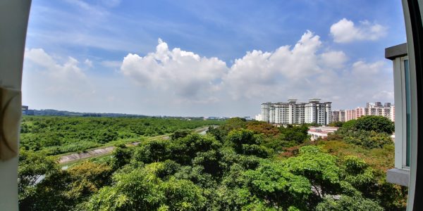
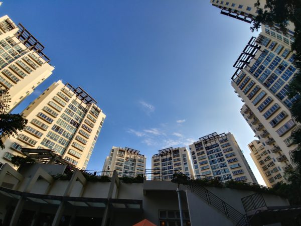
For many casual photographers, the software features might appear more important than the hardware. One of these is a new Square mode, which lets you immediately compare a shot with the one you have just taken to see which is better.
It also comes with a useful collage maker that lets you instantly take four shots, say, of your baby, and have them put together automatically without a third-party app.
One thing I find handy is the Guide Shot feature. This lets you use a template to guide you into framing a nice shot, say, of a bowl of ramen. For folks who can’t take a nice Instagram-worthy shot of their food – like me – this is a handy feature to have.


There’s also a special Food mode that ramps up the vibrancy of a shot automatically, without even the trouble of putting it through a filter. It does make some pictures look more eye-catching but may not be to the liking to purists who prefer their colours to be neutral. Still, food pictures are often prettier than the real thing, aren’t they?


The biggest problem I have with the new camera features is that they can be hard to access. The Square mode features come in a menu within a menu, so you’d have to get used to the G6 interface to get them up and ready fast for a shot.
What I do like is the amount of customisable features. One of the easier-to-access ones goes with the 5-megapixel front selfie camera. Firing this up, you slide a scale to adjust the skin tone on the fly. So, no more being too pale or dark in a selfie with the G6.
I can’t complete a review of an LG phone without mentioning its software interface. What LG has done on top of the basic Android 7.0 software is easy to pick up and intuitive. It’s also fast to switch between screens, with information density and design coherence making the G6 a a pleasant experience throughout.
The default LG interface has an Apple-style put-everything-onto-the-home-screen look, but you can bring back the Android app drawer with an update. This way, you only have apps you want on the main screens, which is neater to me.
On the whole, the G6 is a great flagship to have. In terms of everyday features that make a difference, it offers a likeable, intuitive experience with all the gadgetry you expect on an Android flagship.
Despite the G5 and G4 both breaking new ground in the past two years, LG has struggled to get out of the shadow of fellow Korean manufacturer Samsung in the phone space.
This year, the S$988 G6 is priced competitively, compared to the Galaxy S8+ (S$1,298) and S8 (S$1,148). LG’s new flagship is not cheap but there’s a lot of useful stuff packed in.
It can even be a sleeper hit if enough people take the time to try it out at shops. The big challenge is catching their eye after they have fixed their gaze on a sleeker rival.

