Once a powerhouse in the smartphone industry, HTC has become a shell of its former self.
At one point, its market share plummeted to less than 2 per cent, and tough competition has caused HTC to pull out of the low-end market in an attempt to streamline its portfolio to salvage its presence in the mid- and high-end markets.
This year, in addition to a more focused line-up of devices and more aggressive marketing, HTC is seeking a comeback with a brand new design philosophy. It is replacing the metal designs the Taiwanese company is famous for with glass designs.
The HTC U Ultra is the company’s first flagship offering of 2017, and it encapsulates the new direction and design that HTC is heading towards.
Design and build quality
There is no avoiding the elephant in the room: the HTC U Ultra looks like a mash-up of the LG V20, with an identical two-inch secondary display, and the Samsung Galaxy S7 Edge, with the glass back and square rear camera.
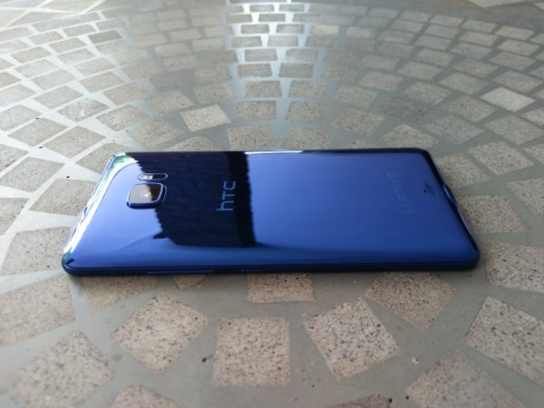
I was disappointed to see this design, which is missing the originality that past HTC designs had. It is one thing to switch from metal to glass, which is something I have brought up previously. But to put out such an uninspiring and similar design to competitors? That is something I cannot agree with.
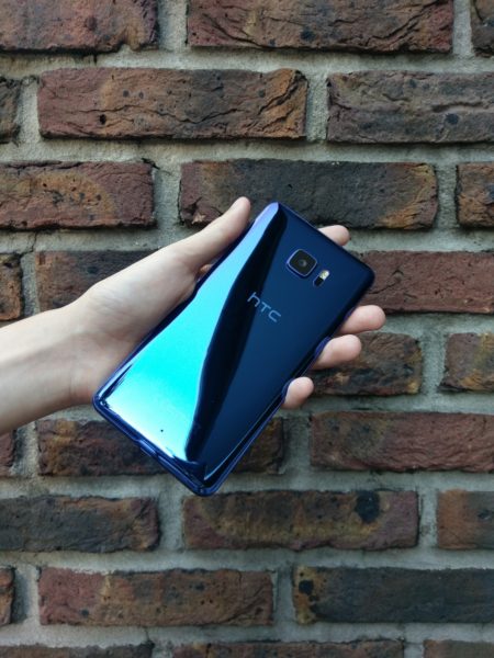
Nonetheless, I will admit that the ‘liquid surface’ design on the back of the U Ultra is extremely gorgeous. The subtly curved corners and edges gives it a 3D effect, and makes it extremely eye-catching when light reflects off the device.
HTC said the U Ultra was designed to “reflect the best U”, which sounded extremely corny when I first heard it. But it is actually pretty cool to see different designs and landscapes reflect off the back of the U Ultra.
Having said that, the glass back is the most reflective design I have ever seen, and it is an absolute fingerprint magnet. It can also be pretty slippery, although it isn’t quite as slippery as the Galaxy S7 Edge.
HTC obviously realised this would be an issue, and they include a free minimalistic transparent case in the box, which is a nice gesture.
The rear camera on the back, however, is extremely unsightly due to the huge camera bump. The bump seems really unnecessary, especially when you consider the other flaws of the phone which I will discuss later on.
The front of the U Ultra is nowhere as attractive as its back. It has a 5.7-inch Quad HD (2,560 x 1,440) LCD display, which has really vibrant colours and excellent brightness levels that allow for great outdoor visibility.
Like the HTC 10, the U Ultra has capacitive navigation buttons and a fingerprint scanner at the bottom of its screen.
I prefer capacitive buttons to software buttons, but the implementation on the U Ultra is pretty uncomfortable. Just like the HTC 10, the buttons and fingerprint scanner are too low, and not vertically centered on the bottom bezel (which is pretty big). Due to the massive size of the U Ultra, it is pretty uncomfortable to stretch for the buttons.
The U Ultra isn’t very difficult to handle, but it starts to feel really unwieldy over time because it is so tall and wide. It could be a challenge when used with one hand.
On the flip side, the fingerprint scanner is extremely fast, and I like the fact that HTC did not make it a physical button that needs to be pressed down.
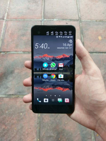
At the top is the 2.0-inch secondary display, which is extremely similar to LG’s implementation on its V20 smartphone.
You can do various things such as adding app shortcuts and contacts to it, playing your music or setting up a reminder. It can even show you the weather forecast and your upcoming schedule.
When you pick up the U Ultra, the secondary display will also turn on to give you a quick glance at your notifications, which is pretty convenient. I also liked being able to see the time and battery level on the screen when playing games or watching full-screen videos.
To be honest, I did not make use of the secondary display all that much. Nonetheless, it is nice feature to have, and some people might actually find it to be more useful.
The U Ultra has the same speaker setup as the HTC 10, with a tweeter at the top and a woofer at the bottom. Surprisingly, HTC was able to make the speakers on the U Ultra much louder and clearer than the HTC 10, which was already better than most of the competition.
In fact, it sounded almost as loud as the front facing speakers on older HTC models.
If you love blasting music from your phone, the U Ultra will definitely impress you.
However, if you prefer to listen to music with headphones, the U Ultra will definitely disappoint you.
HTC has decided to remove the 3.5mm headphone jack because 1) in their quest for aesthetics, they made the phone too thin to accommodate a jack, and 2) they wanted to create better sound output via their USB Type-C USonic earphones.
The first reason is extremely annoying, because HTC could have easily made a thicker phone that can accommodate a headphone jack, which would also reduce the size of the camera bump on the back.
The second reason is also questionable. The USonic earphones that are included in the box are definitely amazing. By analysing your inner ears with a sonic pulse, the earphones will create a personal sound profile for you. The end result is definitely impressive, with beats being really loud and clear for me.
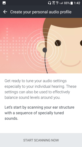
I could adapt to not having a headphone jack with such impressive earphones, except for one huge issue: the USonic earphones do not work at all with any other devices. Forget about customising the sound output, the earphones do not even play any sound used with other devices.
When I plugged in the earphones to my HTC 10, I got a notification informing me that the earphones are incompatible. This makes the USonic earphones akin to Apple’s proprietary lightning EarPods, except HTC does not have the clout to remove the headphone jack and not take a huge hit to its sales. Apple was also courteous enough to provide a headphone adapter, something that HTC did not provide.
To make matters worse, the U Ultra does not have wireless charging or water-resistance (although it is splash-resistant). For reference, the Samsung Galaxy S8 and the LG G6 have these features, while retaining a headphone jack. Apple also included waterproofing for its iPhone 7 by removing the headphone jack.
It is also worth noting that those devices are all much smaller than the U Ultra as well (the S8 and G6 even have similarly big screens despite their smaller frames), so HTC does not really have an excuse for all of its compromises.
Personally, these are not essential features for me. But when the U Ultra is being marketed as a flagship phone, it cannot afford to not have these increasingly basic features that its competitors are flaunting.
On the whole, the HTC U Ultra looks pretty, but it is sorely lacking in quality of life features compared to its competitors.
Software
If there is any area that the U Ultra excels in, it is in software. It comes pre-loaded with Android 7.0 and HTC’s Sense user interface (UI).
Sense UI continues to be one of the cleanest and lightweight versions of Android, and this results in a very snappy experience. I am quite a huge fan of the pure, unadulterated Android experience, and I am glad that HTC does not stray far from it.
However, fans of the more feature-rich variations of Android such as Samsung’s may find Sense UI to be rather bland.
HTC is also trying to hop onto the artificial intelligence (AI) bandwagon with its new HTC Sense Companion. It is supposed to be something like a personal AI assistant that offers you suggestions and information, such as advising you to charge your phone or to bring an umbrella, based on your usage habits and location.

It certainly sounds promising, but unfortunately the Sense Companion in its current form is rather lacking. Over the one and a half weeks that I have been using my review device, I have only gotten two or three suggestions advising me to charge my phone. I have not gotten any other suggestions thus far, which is pretty disappointing.
Sense UI might be one of the most minimalistic versions of Android out there, but it does not really have any standout feature that separates it from the competition. Sense Companion is also disappointing at the moment, and it is unlikely to be a convincing reason to pick up the U Ultra.
It is also pretty disappointing that the U Ultra comes with Android 7.0 instead of 7.1.1, which was officially released late last year.
Performance and battery life
The U Ultra performs just as well as any other flagship smartphone. It comes with a 2.1GHz Snapdragon 821 processor, which is more than capable of handling any task you throw at it.
Specs enthusiasts may be disappointed that it does not come with the latest Snapdragon 835 processor, but this really isn’t a big issue. As I noted in my Xiaomi Redmi Note 4 review, specifications do not always matter, and the majority of the processors in new smartphones this year provide plenty of performance.
The U Ultra handles games well, with no perceivable dropped frames. Coupled with the lightweight Sense UI, the overall user experience of the phone is really positive, with no lag or annoying jagged edges.
The 4GB of RAM is also sufficient for multitasking. The RAM management of the U Ultra isn’t very aggressive, and it can easily keep most of your applications open in the background.
The phone also does not get too hot when running heavy games and applications, thanks in part to the glass back. It does get a little warm, but nothing that should concern or hurt you.
Battery life was an initial area of concern for me. The U Ultra comes with a 3,000mAh battery, which is pretty small given its large 5.7-inch display. For comparison, the HTC 10 comes with the same battery size, despite having a much smaller 5.2-inch display.
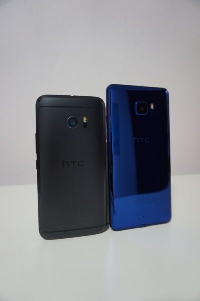
It was therefore a pleasant surprise for me to find that the U Ultra is able to match, and even exceed, the battery life of the HTC 10.
Over the course of my review period, I was averaging 5 hours and 40 minutes of screen-on time (SOT). Getting to the end of the day without charging was not an issue at all.
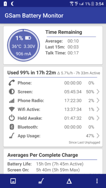
This is with some gaming, photo taking, and plenty of social media usage. It is important to note that I usually leave Bluetooth and location services off when not in use, so your SOT might differ if you do leave them on.
Despite the pretty good battery life, I could not help but wonder how much better it could have been if HTC had fitted a much bigger battery inside the U Ultra.
A bigger battery would mean a thicker body, which would allow for a smaller camera bump and a headphone jack to be included. It could also have been a huge selling point that separates it from flagship competitors.
The U Ultra is so big in comparison to its competitors that I cannot help but be disappointed at the modest size of its battery, despite it having decent battery life.
Camera
The HTC U Ultra has a very similar rear camera to the HTC 10. It has the same 12MP UltraPixel camera with an f/1.8 aperture and optical image stabilisation (OIS). However, HTC has thrown in phase detection autofocus (PDAF) to accompany the laser autofocus this time around for faster focusing.
It therefore isn’t a surprise to see that the U Ultra is able to produce really pleasing photos out of the box when set to the default Auto HDR (high dynamic range) mode.
In outdoor daylight scenarios, the U Ultra is able to capture great shots that are not overly sharp or saturated. Dynamic range is also excellent, with skies and clouds being captured clearly.


However, the U Ultra does struggle a little in capturing macro shots of bright red or white objects, such as flowers. Reds often appear more pink than they actually are, and white objects tend to get overexposed in close up shots, resulting in lost details.


In low-light scenarios, the big 1.55µm UltraPixels and the OIS help to reduce noise significantly, while still retaining enough details. Objects still lose out a little sharpness though, which can result in soft-looking edges. Light sources also tend to flare up quite a bit.


In night settings, the light flares are even more prominent, and sometimes floating light artefacts can be seen. I am not sure if the artefacts are a result of light reflecting off the back of the U Ultra, or if it is a software issue.
Still, the U Ultra does a pretty good job in producing bright photos at night, with plenty of details preserved.
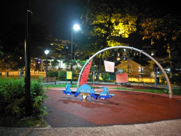
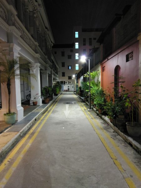
Indoor low-light shots are pretty similar to outdoor low-light shots in terms of colour reproduction. The U Ultra does a good job capturing colours and details, although it overexposes a bit too much at times which can result in brighter than normal colours. Sharpness levels in indoor low-light settings are also pretty good.
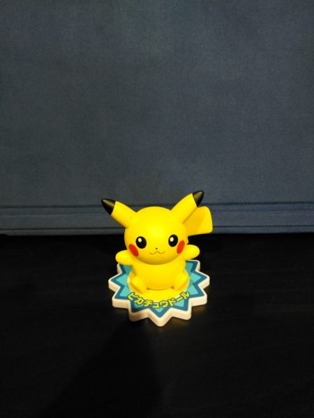

At the front, the U Ultra has a 16MP camera, allowing it to produce really good selfies. The colour reproduction and detail levels are really good for a front facing camera, and at times the photos may actually look better than those captured by the rear camera.

The U Ultra also has a UltraPixel mode, which uses software to capture 4MP photos that sacrifice details in exchange for brighter shots in low light scenarios.
This actually works pretty well, and the UltraPixel mode definitely produces brighter photos. However, regardless of which mode you choose to shoot in, there still tends to be quite a lot of visible noise in low-light settings. The inability to tap to focus on the front camera also contributes to this, and resulting in much softer photos.


On the whole, the U Ultra’s cameras can definitely hang with the best, and provide one of the few bright spots on this phone. However, almost every flagship phone has a very good camera, and the U Ultra’s cameras, however good they are, are unlikely to make it stand out amongst the competition.
Conclusion
The HTC U Ultra is a conundrum in itself. It is not a bad phone by any means. I am even willing to say that it is a good phone. However, in today’s saturated smartphone market, good is not enough, especially at the premium flagship level.
The HTC U Ultra (S$898) may be cheaper than competing flagship devices like the Samsung Galaxy S8 (S$1,148), S8+ (S$1,298) and LG G6 (S$988), but it also offers very few standout features in comparison, while making unnecessary and questionable compromises at the same time.
HTC claims it is seeking a new direction in 2017. But if this is the direction that they are going, I am afraid that they stand to lose more ground to their more prominent competitors.
I was extremely positive about last year’s HTC 10. This time however, I simply cannot say the same of the HTC U Ultra. Maybe next time, HTC.
