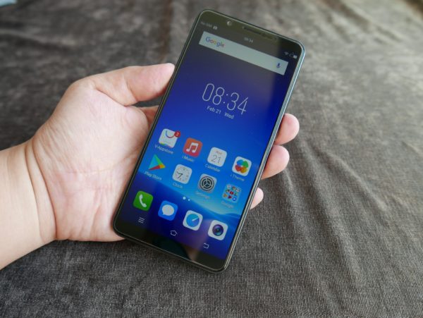
After China and India, Singapore was the next market that Vivo wanted to get into with its bang-for-buck V7+.
So, earlier this month, we saw the Chinese manufacturer release it here for an attractive S$469. For that price, you’d be hard-pressed to find fault with its more-than-decent design.
Place the phone next to the latest flagships, like LG’s V30+, for example, and you can see how close it pushes the competition that costs twice as much.
The “full-view display” on the V7+ does away with physical buttons at the front. There are narrow bezels of just 2.15mm around the 5.99-inch screen and the phone’s 7.7mm slim profile makes it feel sleek to hold.
Unfortunately, the good early impression is marred when you fire up the phone for the first time. It’s strange why Vivo went with the screen on the V7+.
With a resolution of 1,440 x 720, it is clearly less sharp than even phones at this segment, which now regularly come with 1,920 x 1,080 displays today.
The colours also come across a little drab and unattractive. I’m not expecting a highly saturated palette like on a Samsung flagship, but Vivo could have tuned the V7+ screen to be more vibrant. Or picked another screen.
That’s a pity because the rest of the hardware seems well put-together. The Qualcomm octa-core chip (listed as a Snapdragon 450 in some reports), 4GB of memory and 64GB onboard storage are what you’d expect at this segment.
When I fired up a racing game, the phone ran smoothly and didn’t stutter or slow down. Quickly firing up the usual everyday apps like the Chrome browser and going through the menus reveal a zippy interface.
The problem is that this Funtouch interface from Vivo, based on Android 7.1, is a little too much like Apple iOS.
While other Chinese phone makers like Huawei have tried to move away from copying the iPhone, the interface on the Vivo V7+ is still too similar, right down to the animation when swiping through home screens.
It also has made some unusual modifications to standard Android. Instead of swiping down a menu to get into settings like Wi-Fi or sound mode, you have to swipe up from the bottom. This is different, I know, but why?
I haven’t come to one of the main selling points on the V7+, which is the two cameras onboard. Unlike other phones, the main camera here is the front, selfie camera which shoots at 24 megapixels. It offers details in your selfies that many others don’t.
The rear camera, at 16 megapixels, is decent as well. I captured a few images in the evening and the f2.0 aperture ensured there was enough light for good exposure. More than decent is what I’d call the camera performance.
There are other familiar features like Portrait Bokeh, which blurs the background to make a portrait shot more dramatic, as well as a “beauty mode” that takes away blemishes on your face for a selfie fit for Instagram.
Besides camera features, the phone also has a “Hi-Fi chipset” based on the AK4376A from AKM that promises cleaner and more dynamic sounds.
There’s some good hardware packed into a decent design at an attractive price. That makes the decision to place a low-res screen on the V7+ even stranger.
It’s a key issue you have to look past if you want to like the otherwise well-poised budget phone. Unfortunately, I suspect many users might just move on after seeing the screen.


