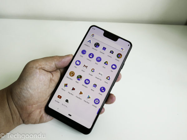
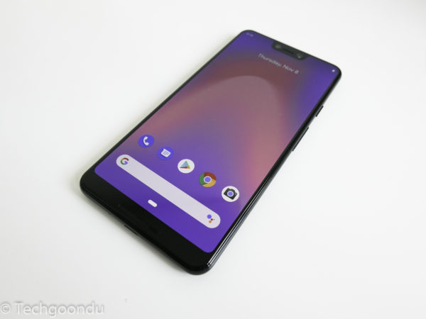
I know it had been brought up even before it was launched, but it’s hard not to talk about the notch on the Pixel 3 XL, Google’s latest flagship phone.
Reaching both long and deep into the otherwise slim-edged display, the little area that holds a speaker and two camera lenses in the front is clearly too large to ignore.
Try as I might, over the past few weeks of using the Pixel 3 XL, I just couldn’t bring myself to like the look and feel of the new Google phone.
Its design is simply uncompetitive, to put it kindly, when placed next to other similar flagships from Samsung, Huawei or Xiaomi.
Sure, Huawei also features a notch in its latest flagships, but at least, it isn’t as thick and intrusive as what you get on the Pixel 3 XL.
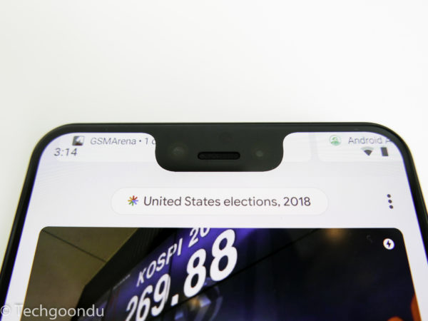
Since the notch is so big on the Google phone, you also have to think twice about applying a black bar to hide it. That’s because you could end up blacking up a large part of the 6.3-inch OLED screen.
Apple, which pioneered the notch, wanted to have face ID as the only way to unlock the phone. And it at least kept the rest of the screen relatively neat, with thin bezels.
Why is Google doing this, then? There’s a fingerprint sensor that works well at the back of the phone. And on the Pixel 3 XL, you get a huge chin at the bottom as well. So, the notch isn’t necessary here, you could argue.
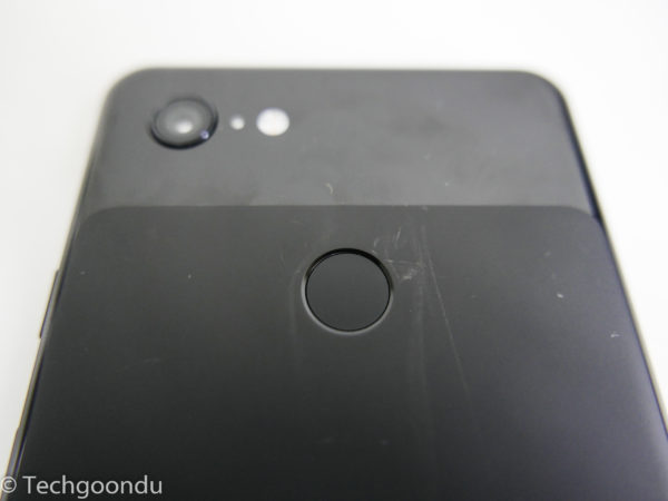
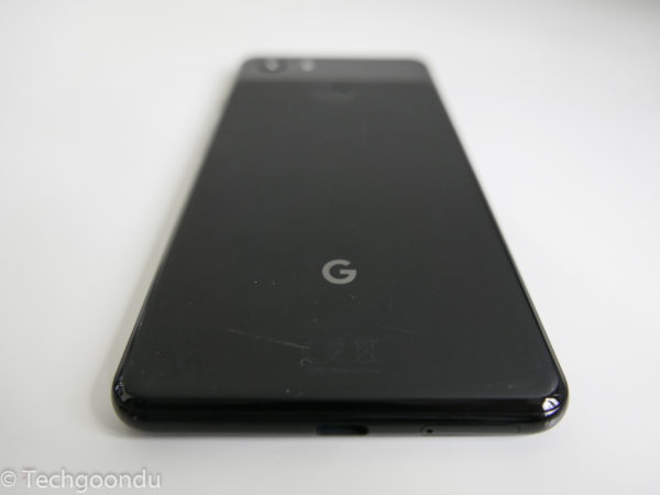
To Google’s credit, the two-tone finish at the back, though already looking dated by last year’s standards, at least has some utility to it.
The matt, smooth surface offers a good grip so you won’t have the phone sliding down a table. Only problem: it scratches easily so you’d have to be careful handling the phone.
I’m spending so much time on the looks because first impressions count for many users looking for an attractive phone today. For these potential buyers, you suspect they won’t give the Pixel 3 XL a second look.
That’s a pity, because the phone has the latest and greatest that the Android operating system can provide today. You just have to look past the ugly duckling to find the swan within.
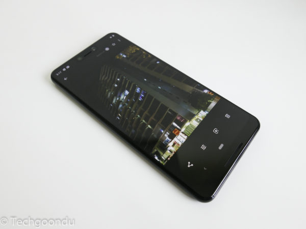
Indeed, the stock Android 9 “Pie” on the Pixel 3 XL is smooth, zippy and uncluttered. It’s just buttery smooth when you fire up apps and switch between a dozen of them.
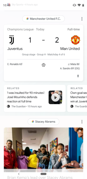
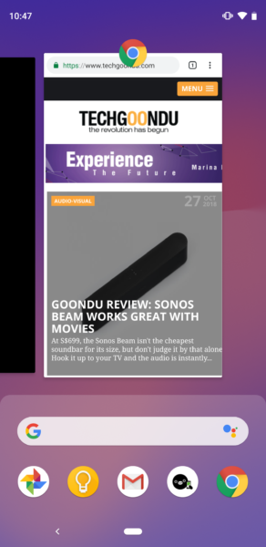
One change is the need to slide up to show a number of options, such as the row of home screen buttons in the past. It’s not difficult to get used to and actually I feel that the interface is less cluttered this way.
If you like the clean interface that Pixel and Nexus phones of the past offer, it will also be the main reason why you are looking at the Pixel 3 XL. Thankfully, no Bixby like on Samsung phones.
It helps too that you always get the latest security updates and newest features that Google is pioneering on the Pixel 3 XL.
On Gmail, you get prompts for text you are likely to type – say, no, I’m not available when you reply to an invitation over e-mail. You just have to swipe right instead of typing out the words.
The other big attraction of the new Google phone would be its camera. Last year’s Pixel 2 XL offered a powerhouse of a shooter and the new Pixel 3 XL is no different. It sports an excellent camera.
Despite using just one lens, instead of two or three on rival Android phones, the Pixel 3 XL takes reliably good photos in both bright and dim situations.
The 12.2-megapixel, f1.8 main camera on the back is helped by some highly capable post-processing magic. This appears to bring more light to dark scenes while keeping noise down to a rather acceptable level.
At the same time, pictures look natural and not “over processed”. If you are taking a picture of a person’s face, for example, the phone can detect it and automatically calculate how to fill it with light. This is like a photographer using a flash that is deflected onto the face for a natural look.
Google has built such a solid algorithm here to essentially control light as well as it can. This is rather like how I used to “dodge and burn” a piece of photo paper in a photo lab back when I was in school.
The aim is to darken some parts and “lighten” others, as you’d do in Photoshop now, except this is done automatically on the Pixel 3 XL. No need for post-processing because images look fine right after you snap them.
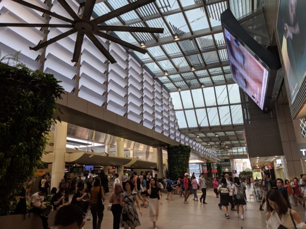
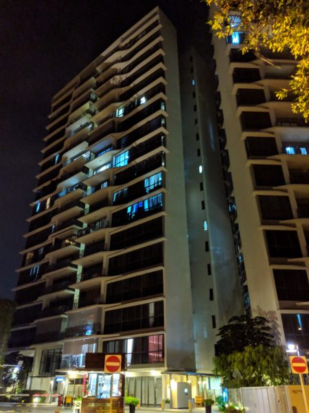
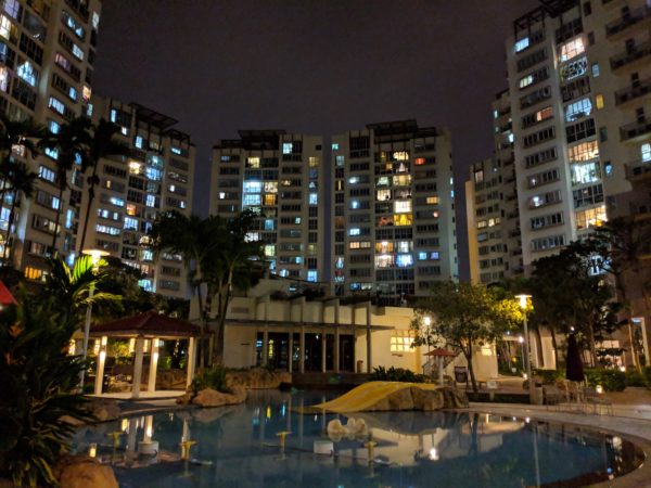
Take a challenging scene where there is a small bright light source shining through a window but where the foreground is too dim. The Pixel 3 XL is able to balance the two, exposing parts that need more light and dimming those that risk overexposure.
If there’s any doubt that software will play an outsized part in picture quality in future, you only have to look at the Pixel 3 XL to see how far the technology has advanced.
One thing that Google seems to have improved from last year is Lens, which helps identify items that you point your camera at.
This time, I scanned a wine label and sure enough, Google looked up the right one. Okay, not a big deal, I guess, since wine apps such as Vivino also do that.
But generally, the Pixel 3 XL seems to get many things right. A local dessert, a gula melaka pandan cake, was beyond its grasp, but at least the phone recognised it as a cold dessert.
Speaking of software smarts, yes, you can also squeeze the phone at the sides and activate Google Assistant. In other words, you don’t even have to search for a button to fire it up. Good for finding the best chicken rice stall nearby, perhaps.
Unfortunately, all these software smarts have a hard time justifying the price that Google is asking for the Pixel 3 XL. It is just too expensive to be attractive.
At S$1,399 for a version with a measly 64GB of storage and a princely S$1,549 for a 128GB version, the Pixel 3 XL is being priced out of the market. Don’t forget you don’t get a microSD card slot to add your own storage, either.
Sure, Google is giving free cloud storage for your photos and it has never favoured local storage anyway, but even so, it can’t be pricing the Pixel 3 XL higher than many more competitive rivals.
That’s not even counting the lowly 4GB of memory, which is what you get on a budget phone these days. Not even with a speedy Qualcomm Snapdragon 845 chip onboard can Google ask for so much, surely.
For comparison, a Samsung Galaxy Note 9, expensive as it is at S$1,398, is actually cheaper if you consider that it has 128GB of storage and a bit more memory (6GB). Its camera isn’t shabby too and it looks way better.
You can argue, perhaps, that you don’t need all that much memory or storage since the Pixel 3 XL runs so smoothly. But that is missing the point. You still can’t explain why the phone costs as much as others that pack in more.
Despite a great camera and improved software, the many gaps here are just too glaring to ignore for a highly priced flagship. Yes, that includes the unsightly notch that you first have to get past.
