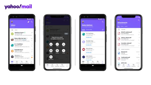
I can’t remember the last time I came across a Yahoo e-mail address, but a recent overhaul to its mobile e-mail app might revive your interest in the purple camp.
Not only is the new app design cleaner and more visually attractive, it also introduces much needed features to help manage inbox clutter.
E-mail has become central to our personal lives, but close to half of all e-mails sent globally are spam. Add to that a never-ending parade of newsletters and marketing e-mails that you just can’t seem to unsubscribe from, and it’s easy to see why many of us have developed a love-hate relationship with our inbox.
Over the years, free web mail service providers have rolled out features to help us deal with the tsunami of e-mails so Yahoo is admittedly playing catch-up in this respect.
However, Shiv Shankar, director of product management for Yahoo Mail over at Verizon Media, is keen to point out that Yahoo approaches its app design from a completely consumer-centric perspective, as opposed to companies like Microsoft and Google, who might be more motivated to design e-mail features for businesses and corporations.
This translates to new common-sense categories called “views”. In the new Yahoo Mail mobile app, your e-mails are automatically sorted into lifestyle-specific views such as “receipts”, “travel” or “subscriptions”. The last one proved to be particularly useful in getting me off pesky marketing mailing lists.
All of this makes perfect sense for the modern e-mail user, allowing us to cut through the clutter and quickly get to what matters most.
Just had an online shopping binge and expecting a series of parcel deliveries over the next week? Or have an upcoming holiday with a bunch of flight and hotel bookings made on different sites? They’re all easy to find in the new Yahoo Mail app.
Compare this to Gmail, for example. While it also attempts to help users sort through their e-mail clutter, Google takes a more hands-off approach, preferring to group e-mails into broader categories like “Social”, “Promotions”, and “Updates”.
Outlook is even more laissez-faire, grouping your e-mails into one of only two categories: “Focused Inbox” and “Other”.
After a few weeks of use, I find that the new Yahoo Mail app does seem to deliver on its promise to help me make better sense of my inbox. Thanks to its sorting and prioritisation features, I no longer have to wade through dozens of e-mails just to find that shopping order from a week ago.
But what about search, you ask? Sure, I could just search for what I need, but that is not without its problems.
First, I have to know what to search for, which is often not so clear cut. Second, searching often returns many results that I still have to scroll through to find that one single e-mail I need. Overall, Yahoo Mail’s approach still works better in getting me where I need to go in a shorter amount of time.
It is important to note that these new categorisations are not actual folders in themselves. They are simply a different way of pulling out relevant e-mails and displaying them in relevant categories.
All of the traditional folders that you might be used to are still there. A tap on the “Inbox” icon will bring up folders like “Sent”, “Drafts”, or “Trash” so you can hop into them within two taps.
Here’s the million-dollar question: should you switch?
Luckily, you don’t have to. The new Yahoo Mail app finally works with other major e-mail providers as well, so you can just as easily sign in to your Gmail or Outlook account to give the new app a spin.
If you happen to like the app, you can then consider giving your e-mail a fresh start by signing up for a new Yahoo Mail account directly from the app.


too late for Yahoo…