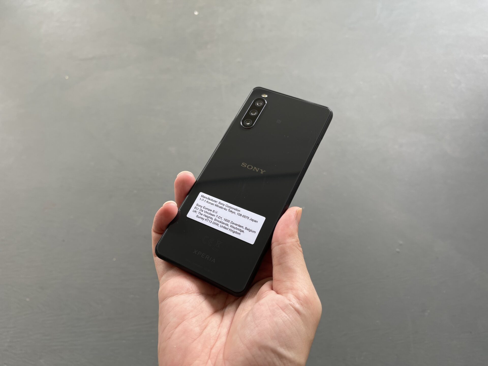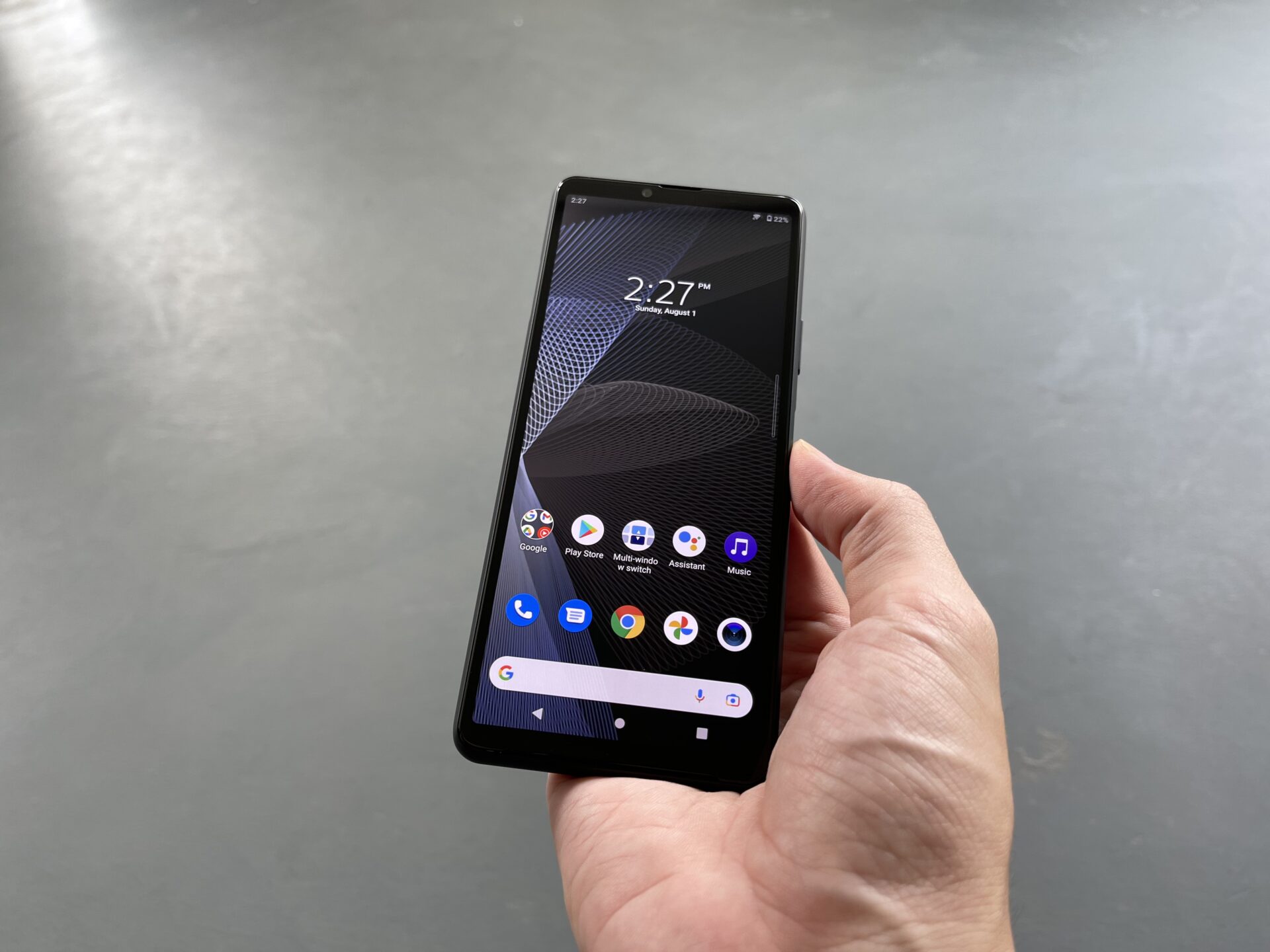
The Sony Xperia 10 III. (PHOTO: Esmond Xu)
Sony has refreshed their mid-budget offering from last year with the Xperia 10 III. Little has changed in terms of design from its predecessor, with the exception of some sanding down of dimensions.
Inside, the Xperia 10 III retains its water resistance while getting a little of a processor boost. Its battery, notably, sees a 20 per cent increase to 4,500mAH. How does this S$649 mid-budget device compare to rivals in a crowded market segment?
Design
Sony has kept to a familiar, consistent design language across its smartphones for a while now. They have a nondescript outlook, with a simple, unstated elegance. Attention is paid to ergonomics, which makes the device comfortable to hold and use.
The Xperia 10 III continues this tradition. The review unit loaned to us comes fully black, with rounded matte corners that blend perfectly with the Gorilla Glass 6 front and back. The edges do not cut into the flesh of your palms at all.
Carrying a medium-sized screen (yes, a 6-inch screen is not large by today’s standards) helps the Xperia 10 III remain diminutive. Its size is 154 x 68 x 8.3 millimetres and it weighs just 169 grams.
This is a little heavier than the Xperia 10 II, but remains very manageable given the overall compact frame compared to many 6-plus inches devices today.

Very clean back, and a joy to hold. Pity the large glossy surface is a fingerprint magnet. (PHOTO: Esmond Xu)
It is difficult to describe how perfect the device feels in the hand. The matte rounded corners are such a joy to grip, the size is just right for one-handed use.
The weight balance of the Xperia 10 III is just about perfect as well. It just remains in your grip and does not tip over in any way even while you’re tapping or manoeuvring around it.
The sense of satisfaction from using the Xperia 10 III reflects a refinement on the very minute things that go beyond the specification sheet. Combined with the premium feel and finish at a mid-ranged price, they reflect the industrial engineering expertise of an established brand.
My gripe is that the soft-touch matte treatment on the sides of the Xperia 10 III should have been applied to the rear as well. It is nice and wholesome to look at, until you inadvertently leave your mark on them all the time.
Also, in keeping a consistent design language, Sony has had to make sacrifices on bezel size across the entire range – Probably needed that bit of flexibility so a similar frame can fit multiple interior layouts. Kudos too, to the team for shrinking the bezels on the Xperia 10 III by a further millimetre on all sides over its direct predecessor.
Still, these bezels continue to stick out against the competition. Sony opted against a pinhole camera cut out. The design is cleaner, but likely necessitated a bezel of similar size on the bottom of the Xperia 10 III because of the design language. The side bezels are also not as narrow as they should be.

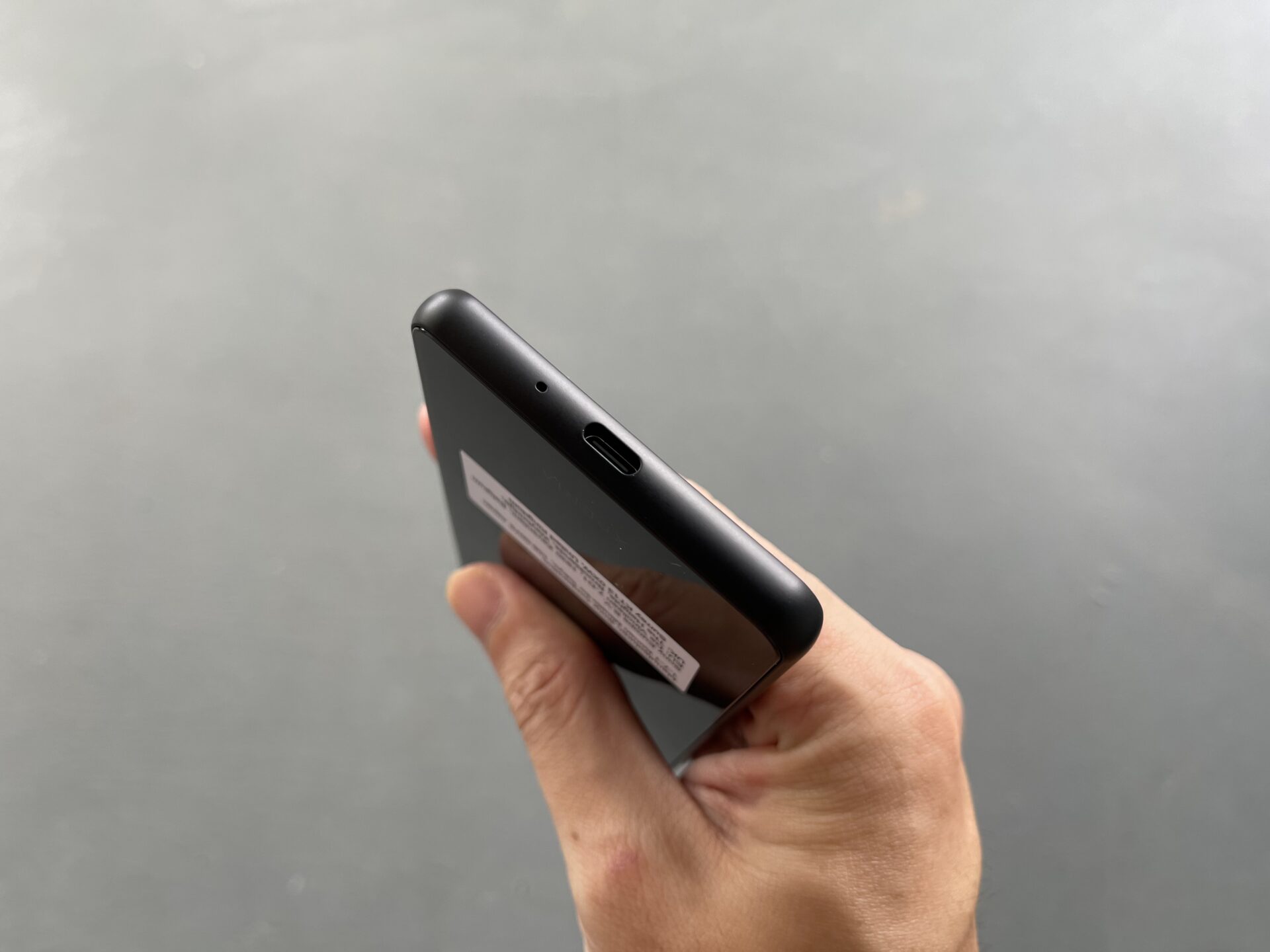
A sole USB-C port for data and charging adorn the device’s bottom, together with a microphone inlet. (PHOTO: Esmond Xu)
Screen
The display on offer here is a 6-inch Full HD+ (1080 x 2520 pixels) OLED affair. The resolution is sufficient for its size, and is good for battery life. The refresh rate is 60Hz. Not unexpected, but it is notable to add that 90Hz displays are not rare on devices at the same price point.
Colours are vibrant as expected of an OLED panel, and visibility under sunlight is excellent. I notice a certain (software-managed?) mutedness to the gamut, however, so colours do not “pop” like they do on Samsung devices. This is despite me selecting the vivid colour profile.
Viewing angles are okay, though the colours shift into hues of blue and pink more noticeably than some others. The muted colours and shifting does remind me of Pixel 2 XL screens from a couple years back.
To be sure, the issue is not exactly deal-breakingly bad. Do have a try and see how you find it.
Also note that Sony is using a 21:9 aspect ratio screen. I personally find them noticeably narrow, especially at a 6-inch screen size, though it probably helps make the Xperia 10 III so nice to hold.

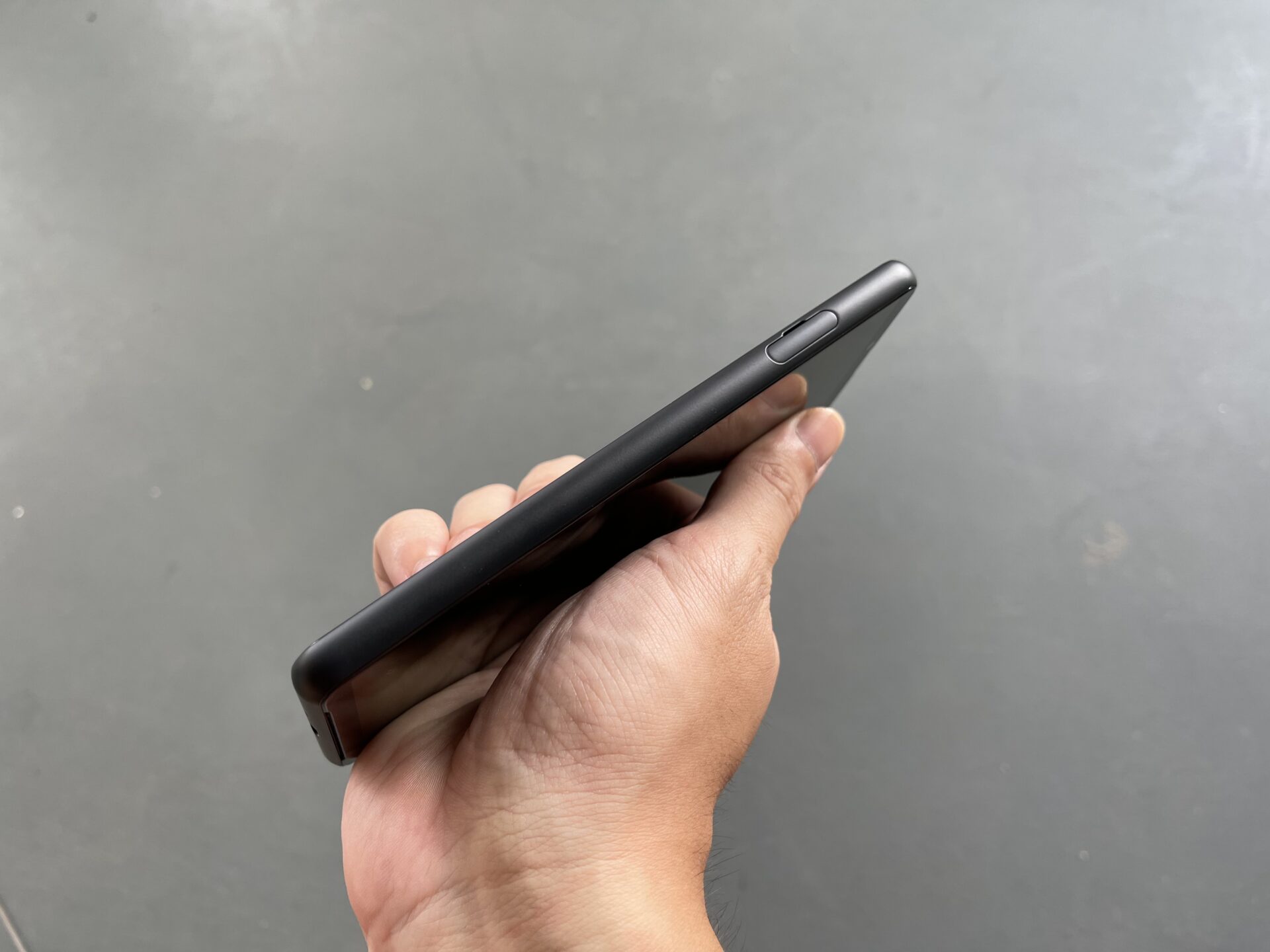
The SIM card tray is on the left of the device – No eject pin needed, in typical Sony fashion. (PHOTO: Esmond Xu)
Usage
The Xperia 10 III is powered by a Qualcomm Snapdragon 690, a firmly middle-of-the-road processor which packs 5G support into a chip with the equivalent horsepower of a Snapdragon 730.
The latter is used in lower-priced competitors like Pixel 4A 5G. The Sony phone is complemented with 6GB of RAM, and 128GB of non-expandable storage.
The Japanese electronics maker is usually light with tweaks to the Android operating system, and I have come to like their approach. The Xperia 10 III is generally responsive as I thumbed around the menus and apps one expects to use daily.
As expected with a moderately-powered processor, expect short pauses while heavier webpages load, or when a particular app menu requires some computing.
Videos play well, but the letterboxing is pronounced on 16:9 content.
The device opts for an Adreno 619 graphics core. Firing up a game of Asphalt 9: Legends, I’m reminded to the dial down of graphics quality to keep things playable.
Cutscenes need some time to load, as expected of the processor. The experience is serviceable, once you get past the fact that some quality is sacrificed to keep things that way.
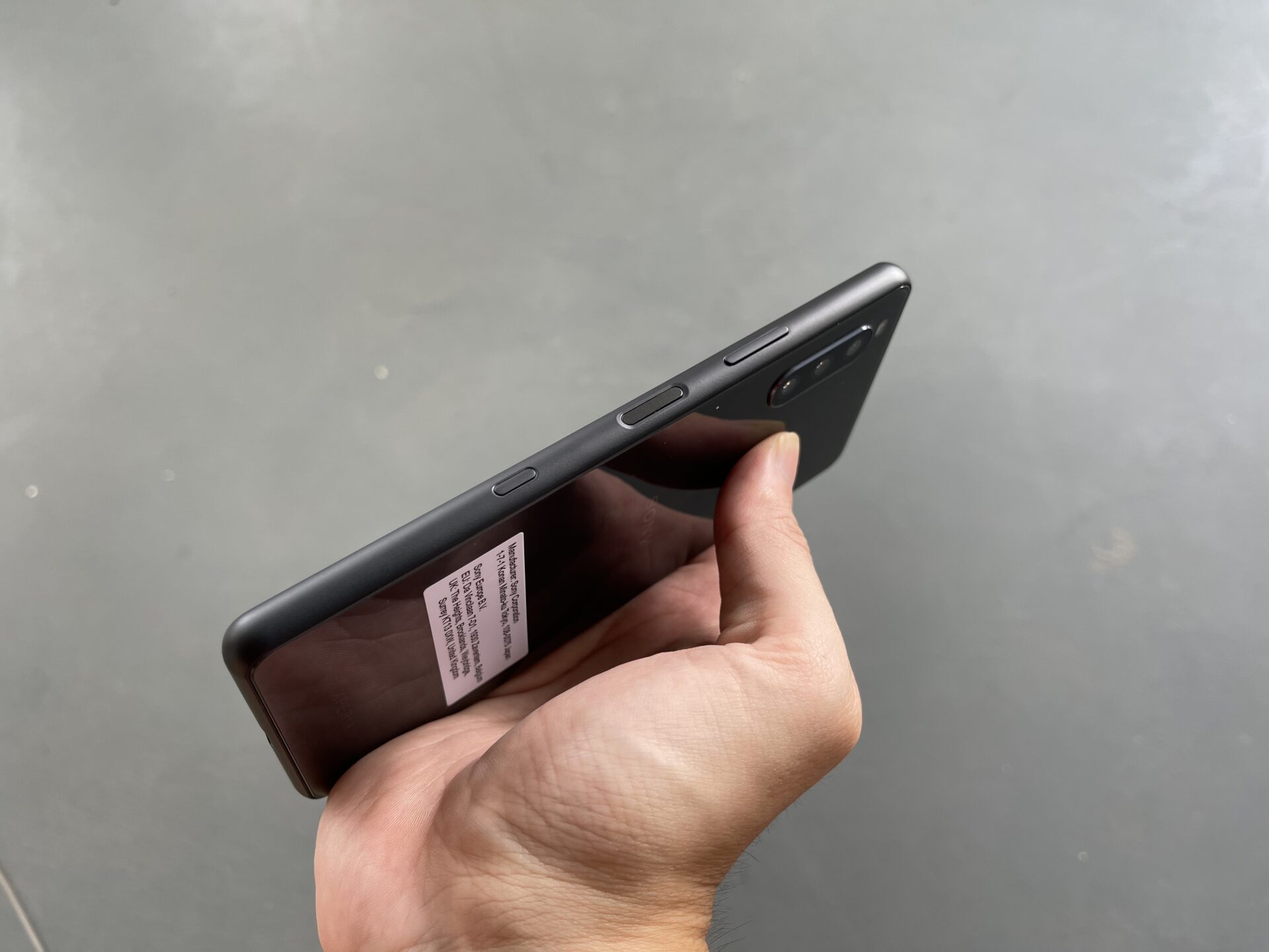
The Xperia 10 III builds its fingerprint reader into the power button, like many mid-budget devices. It is located on the right of the device, and works flawlessly in my tests.

From left to right, the Google Assistant button, fingerprint reader and power button, and the volume rocker. (PHOTO: Esmond Xu)
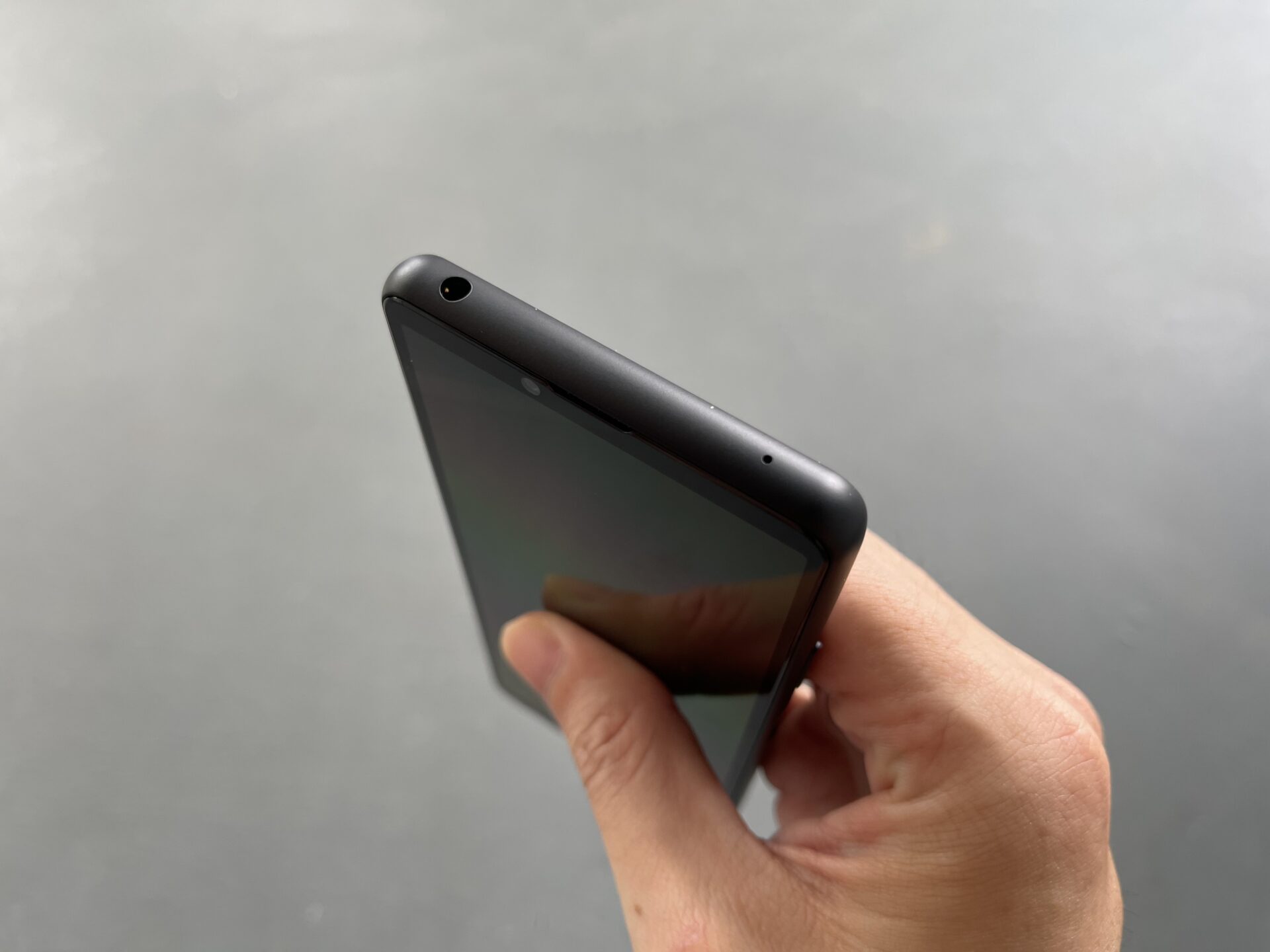
It is also interesting to note that the Xperia 10 III retains a headphone jack on its top left. This is very useful for users who still have great wired earphones and don’t fancy switching over to Bluetooth earphones yet.

The headphone jack is on the top of the device, with another microphone inlet. (PHOTO: Esmond Xu)
Battery life is great given the 4,500mAH cell capacity, a battery sipping processor, and a Full HD screen that is not humongous. I end a day of messaging, photo taking, scrolling Facebook and some YouTube with 40 over per cent of charge left.
Charging will probably be laughably slow with the bundled 7.5-watt charger. I swopped that out with my own 15W USB-C Power Delivery compliant charger, but this still took upwards of two hours to reach a full charge.
The Xperia 10 III is IP68 dust and water resistant, which is rare among value-flagship handsets. Combined with its understated glass construction and decent screen, this will be a go-to for those who are not power-users, but seek a well-built product.
Camera
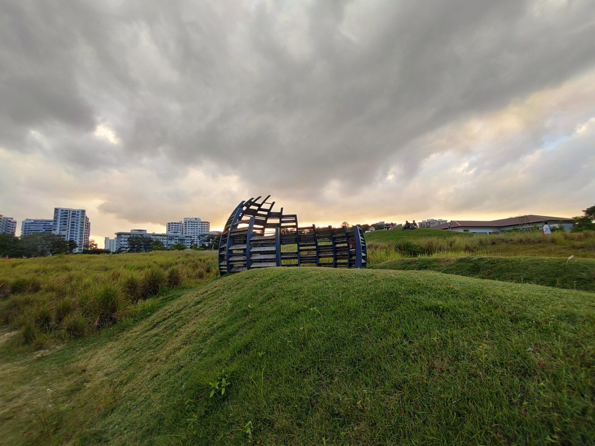
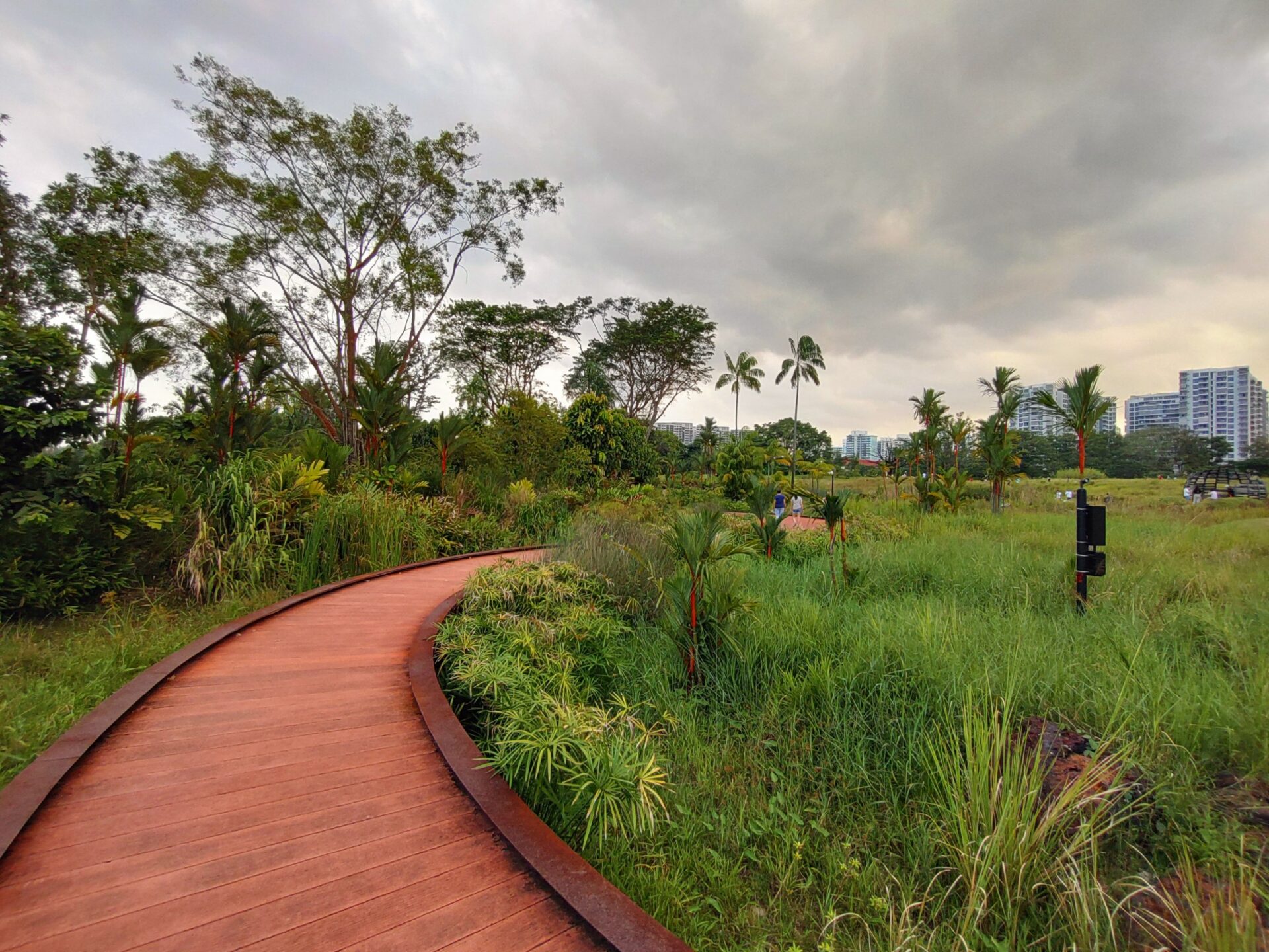
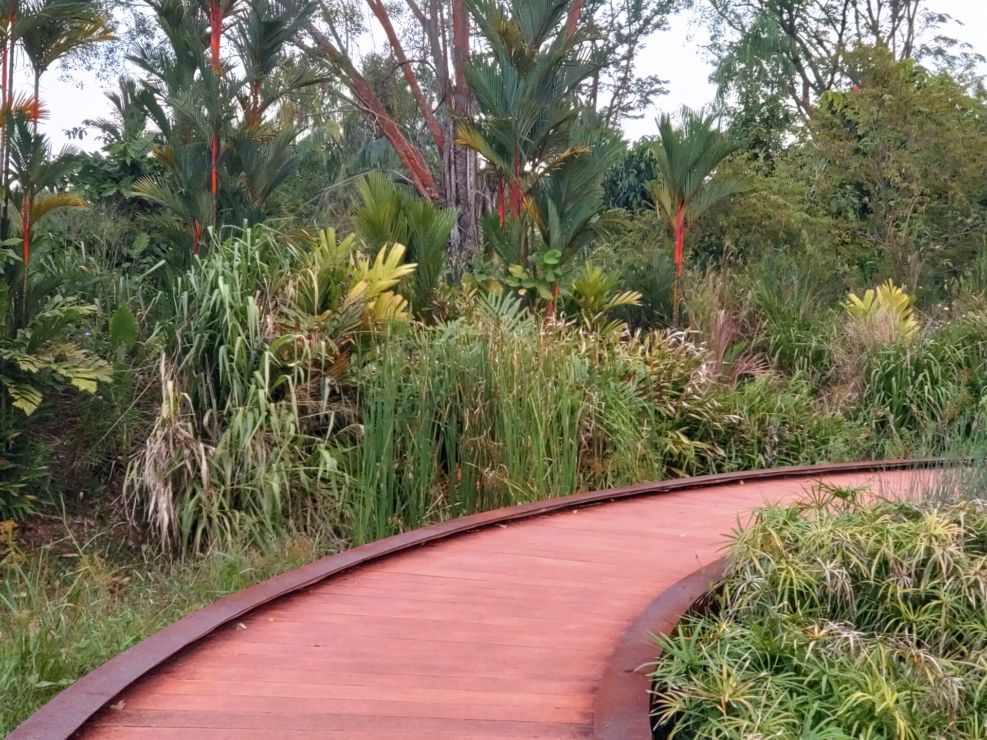
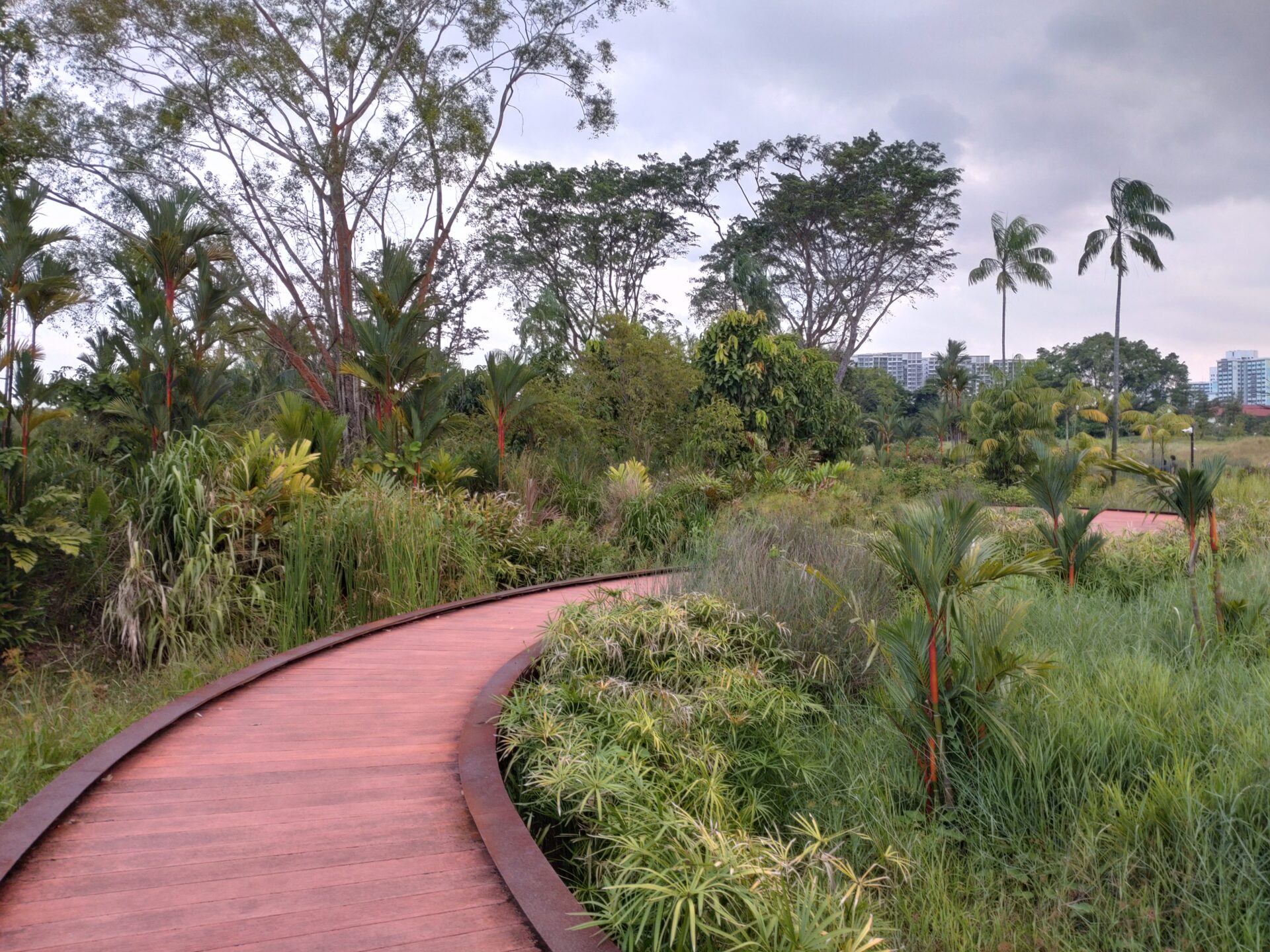
The Sony Xperia 10 III enjoys improvements to focal lengths on the wide and telephoto, and a slightly larger aperture on the wide. It is also refreshing to know the triple-array camera features a wide-ultrawide-telephoto arrangement, instead of swopping any of the latter two for a special-purpose lens.
Wide – 12 MP, f/1.8, 27mm, 1/2.8-inch, phase detection auto focus
Telephoto – 8 MP, f/2.4, 54mm, 1/4.0-inch, PDAF, 2x optical zoom equivalent
Ultrawide – 8 MP, f/2.2, 120-degree field of view, 16mm, 1/4.0-inch

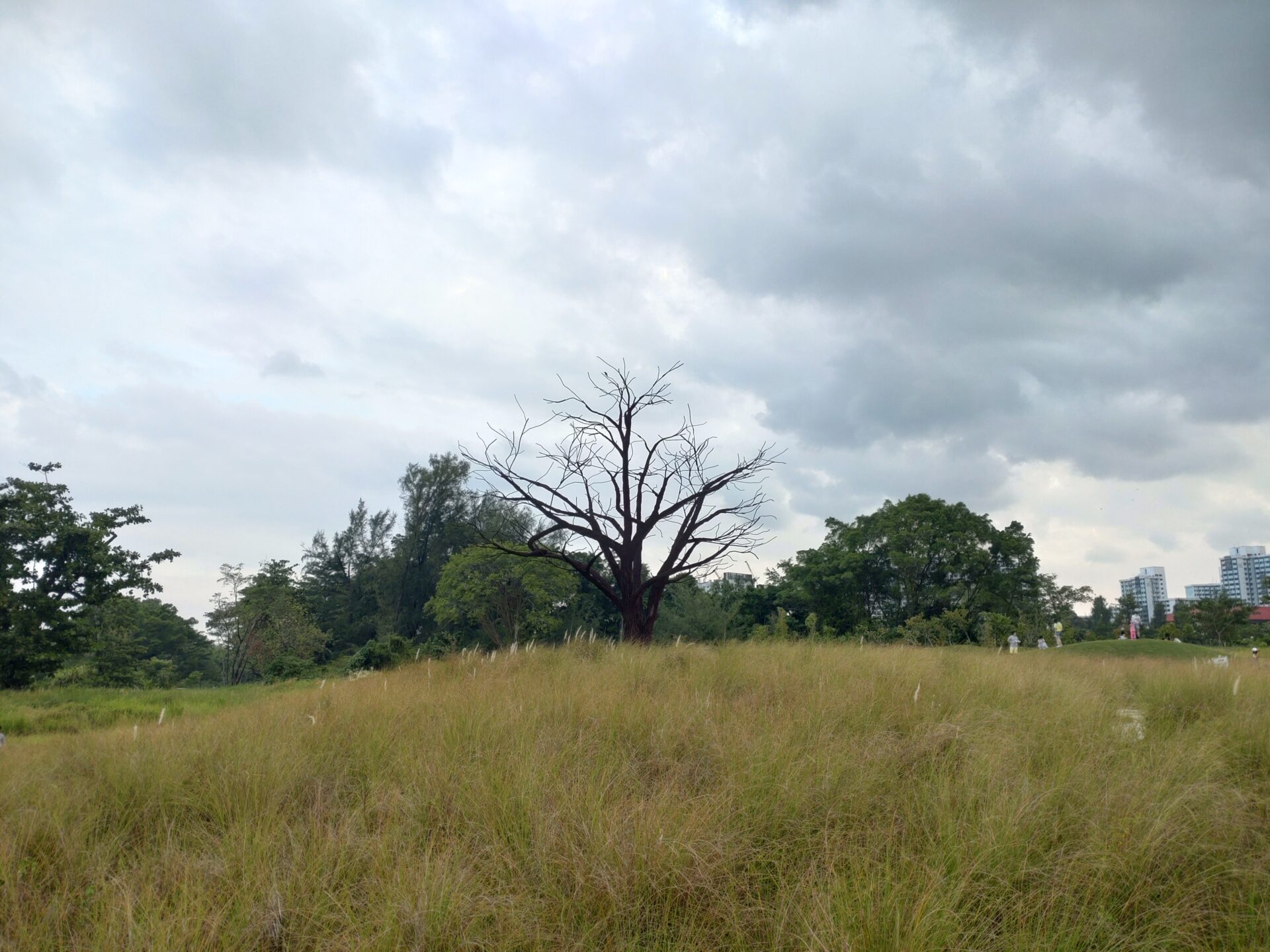
This shot of the lone tree, captured with the wide camera in late sunset, makes the scene look darker than it was. Things look a little soft, but at least nothing is blown out. (PHOTO: Esmond Xu)

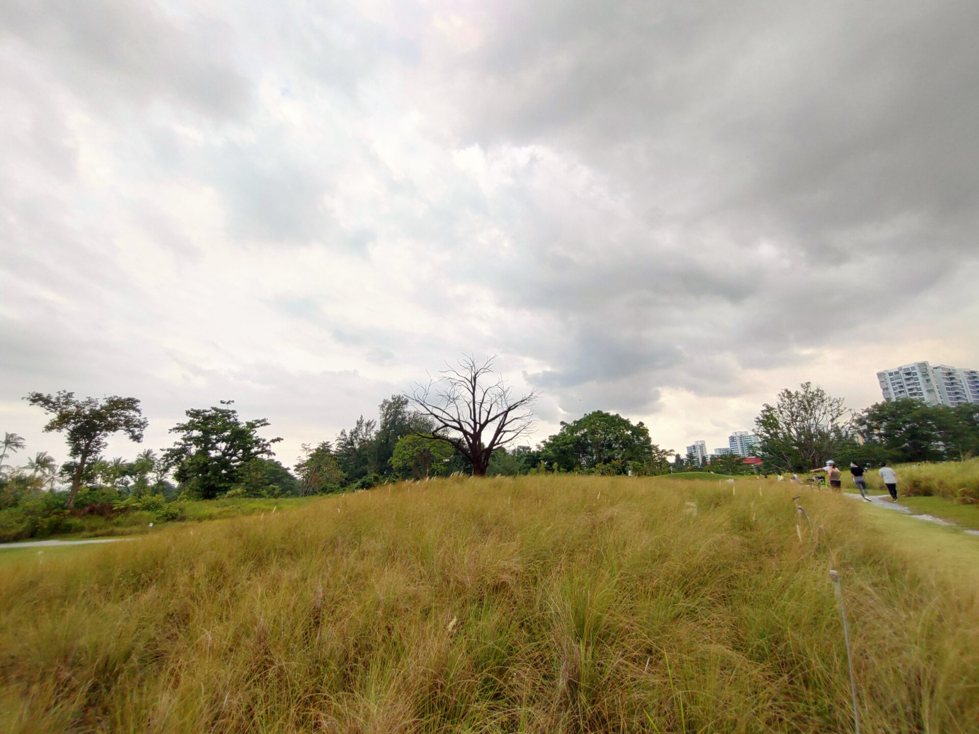
The ultrawide lens gets the lighting right, but with some loss of detail and a slight yellow tint. (PHOTO: Esmond Xu)

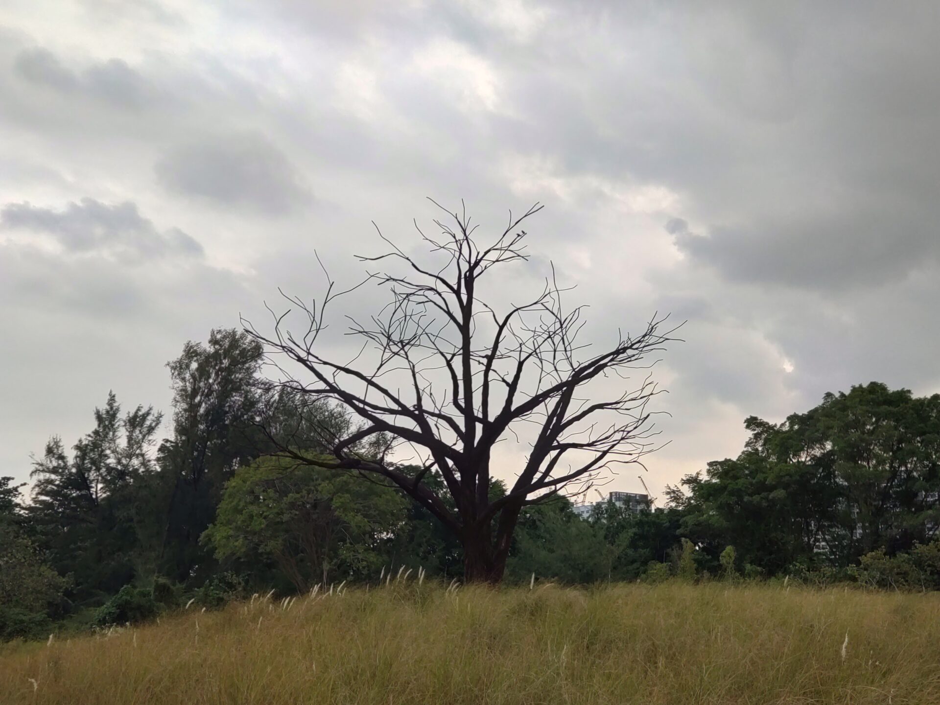
The telephoto shot is darker, and a little more washed out. (PHOTO: Esmond Xu)

Earlier in the evening, I thought the wide lens did a pretty good job with the challenging sky against the darker foreground. Just tweak the brightness manually and the shot is decent. (PHOTO: Esmond Xu)

The sensor again prioritised the preservation of the details in the sky in this telephoto shot. Details are decent, though some manual brightening is in order. (PHOTO: Esmond Xu)

The ultrawide sensor felt at home, getting the correct exposure and detail with this shot. It is one of the rare times where a secondary camera does better than the wide-angle one (PHOTO: Esmond Xu)

Taken on the ultrawide, colours are again vibrant, but the sensor clearly struggles with the branches against the sky. The purple fringing is bad. (PHOTO: Esmond Xu)

I thought this telephoto shot revealed the limits of its sensor, as colours were dull, and details blurry. (PHOTO: Esmond Xu)

The main lens did a finer job overall. There is still some purple fringing, but it is tolerable. (PHOTO: Esmond Xu)

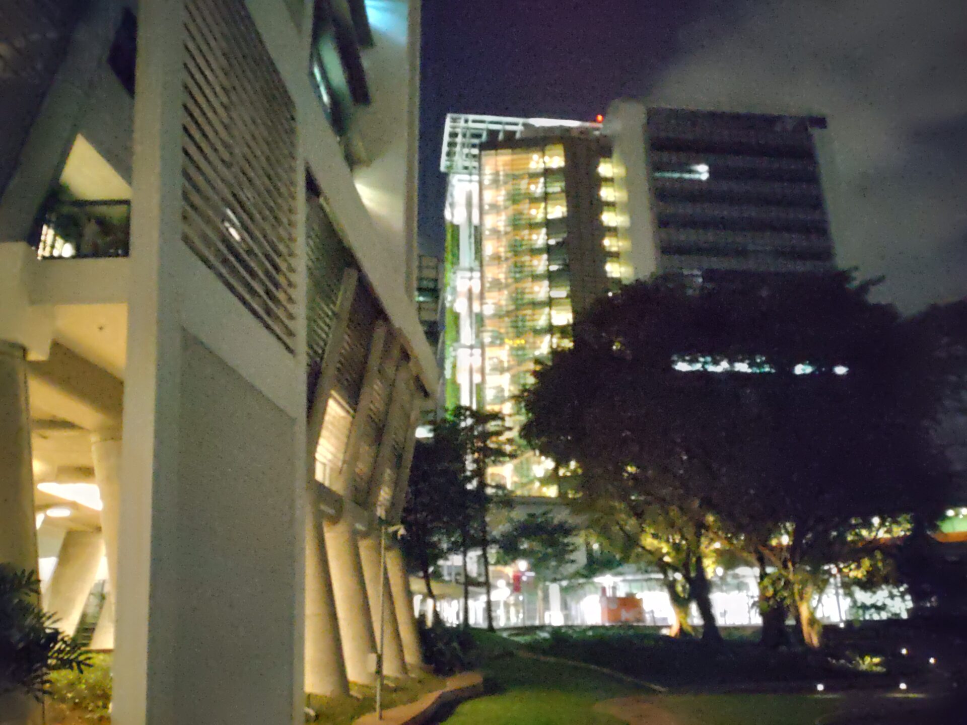
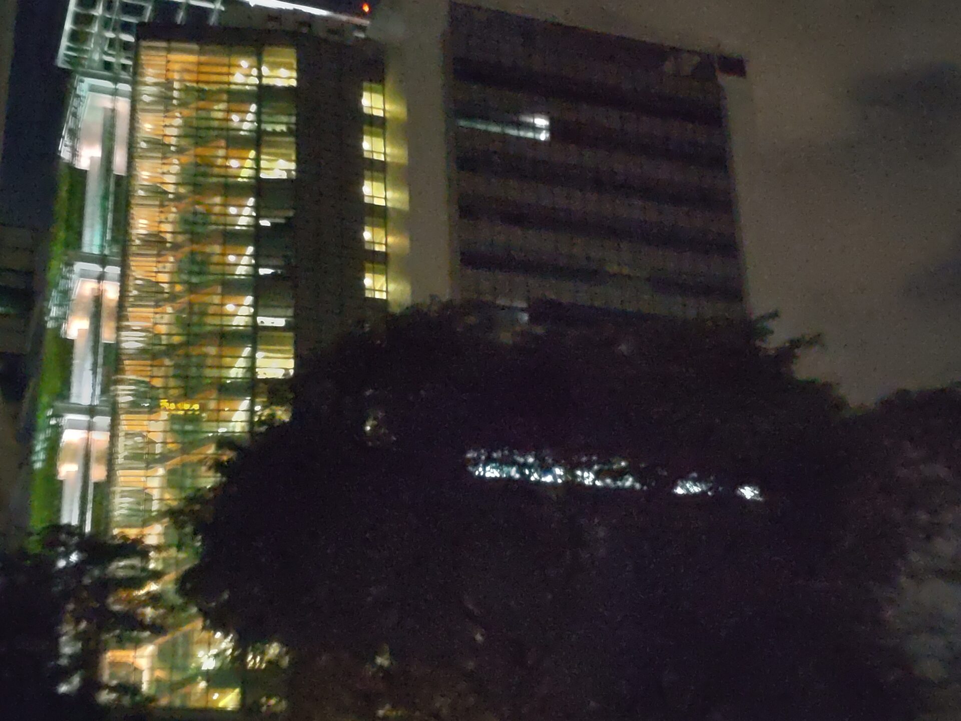
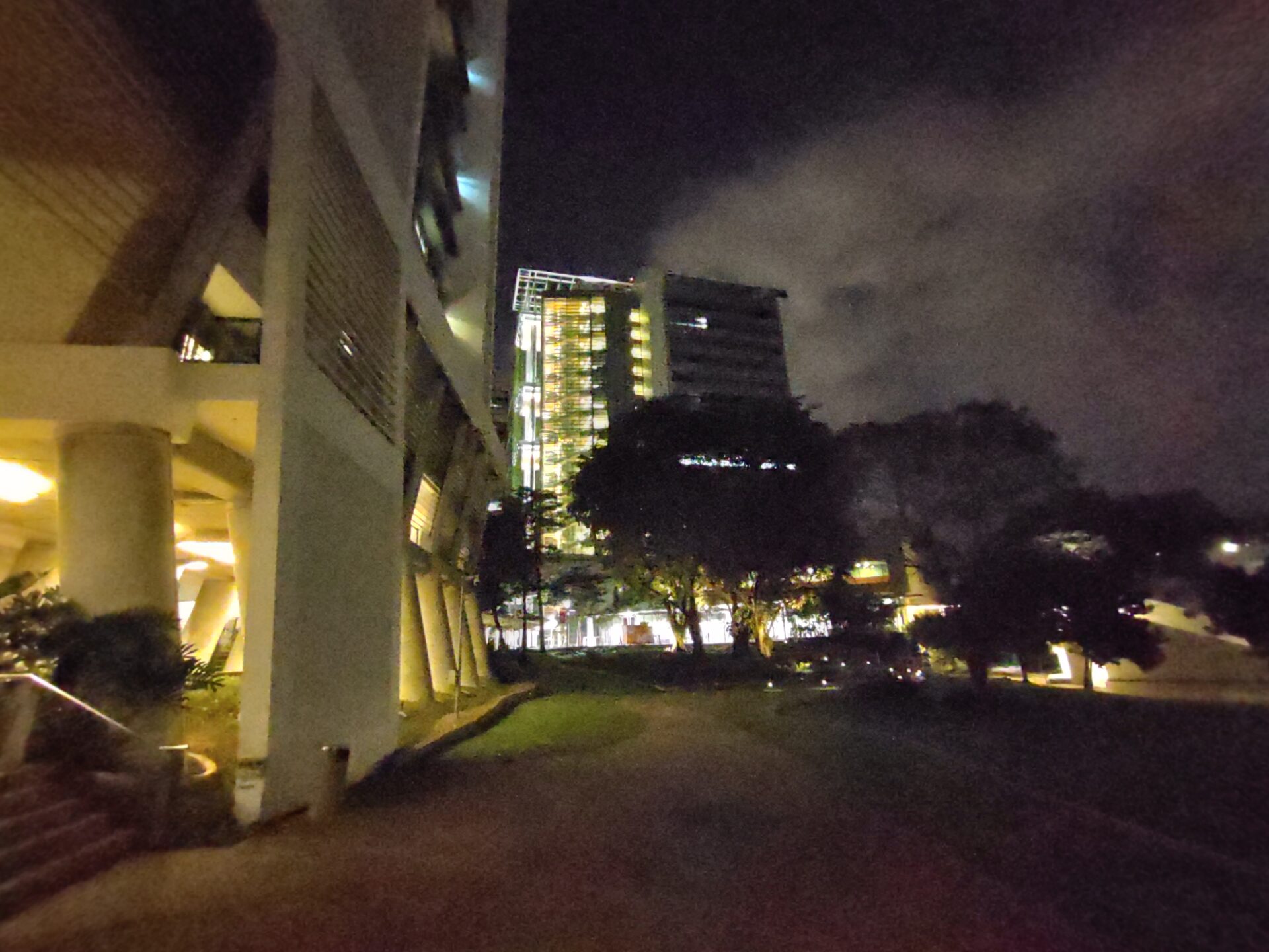
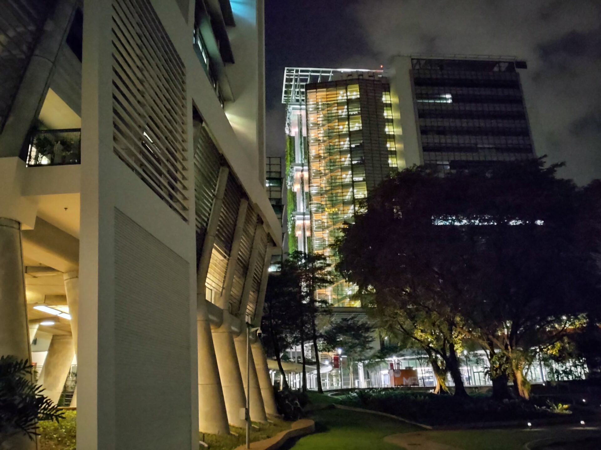
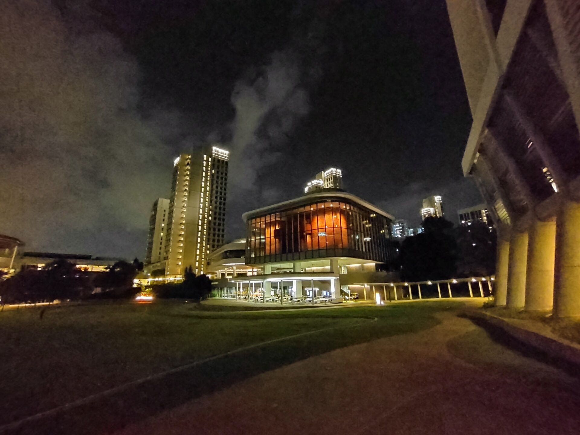
The camera sensors clearly run into their limits at night. This is the first set of three shots taken without Night Mode. This is meant to reveal the raw power of the imaging hardware, or in this shot taken by the wide lens, the lack thereof. (PHOTO: Esmond Xu)

No comments on this shot captured by the telephoto. (PHOTO: Esmond Xu)

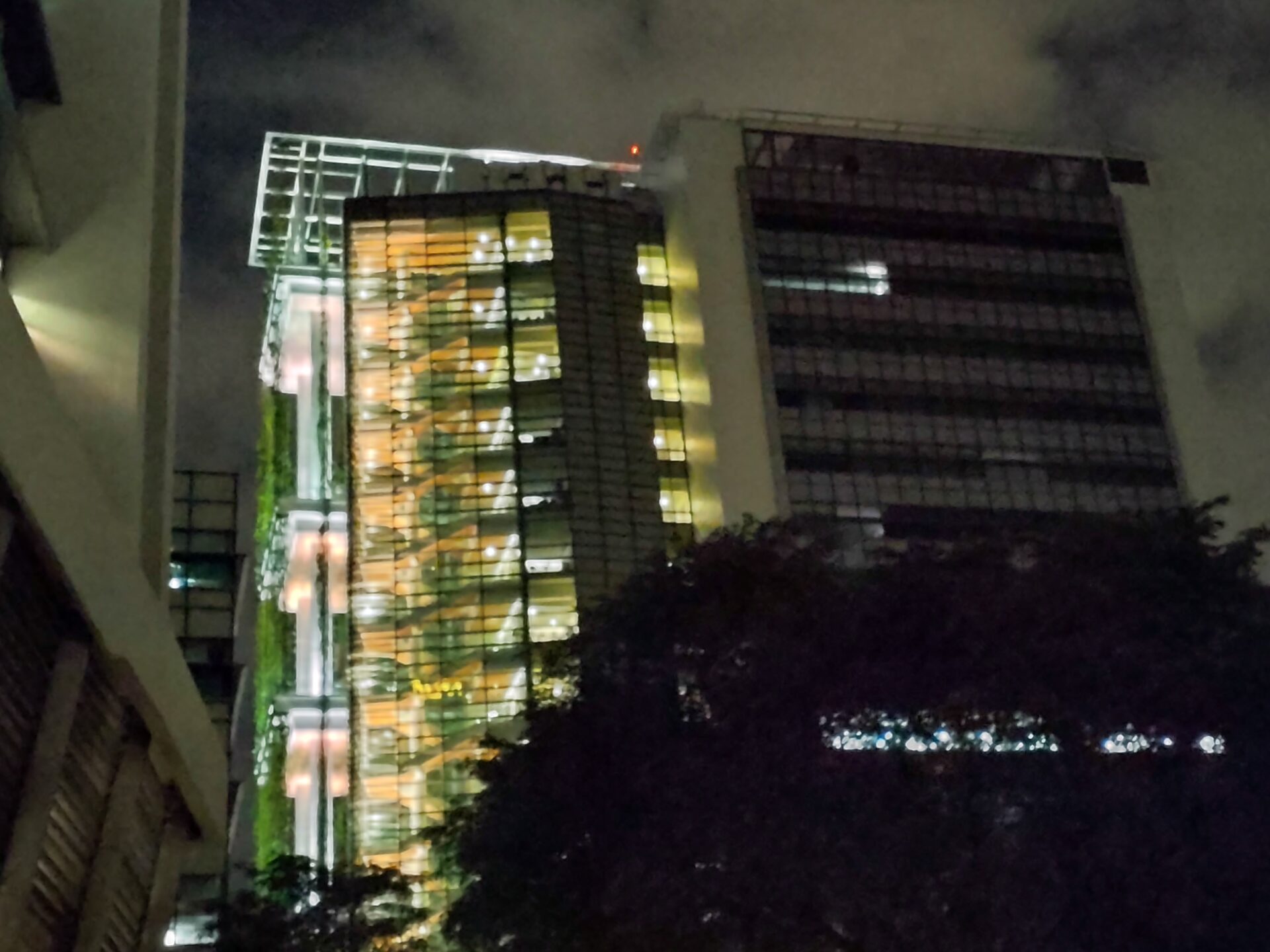
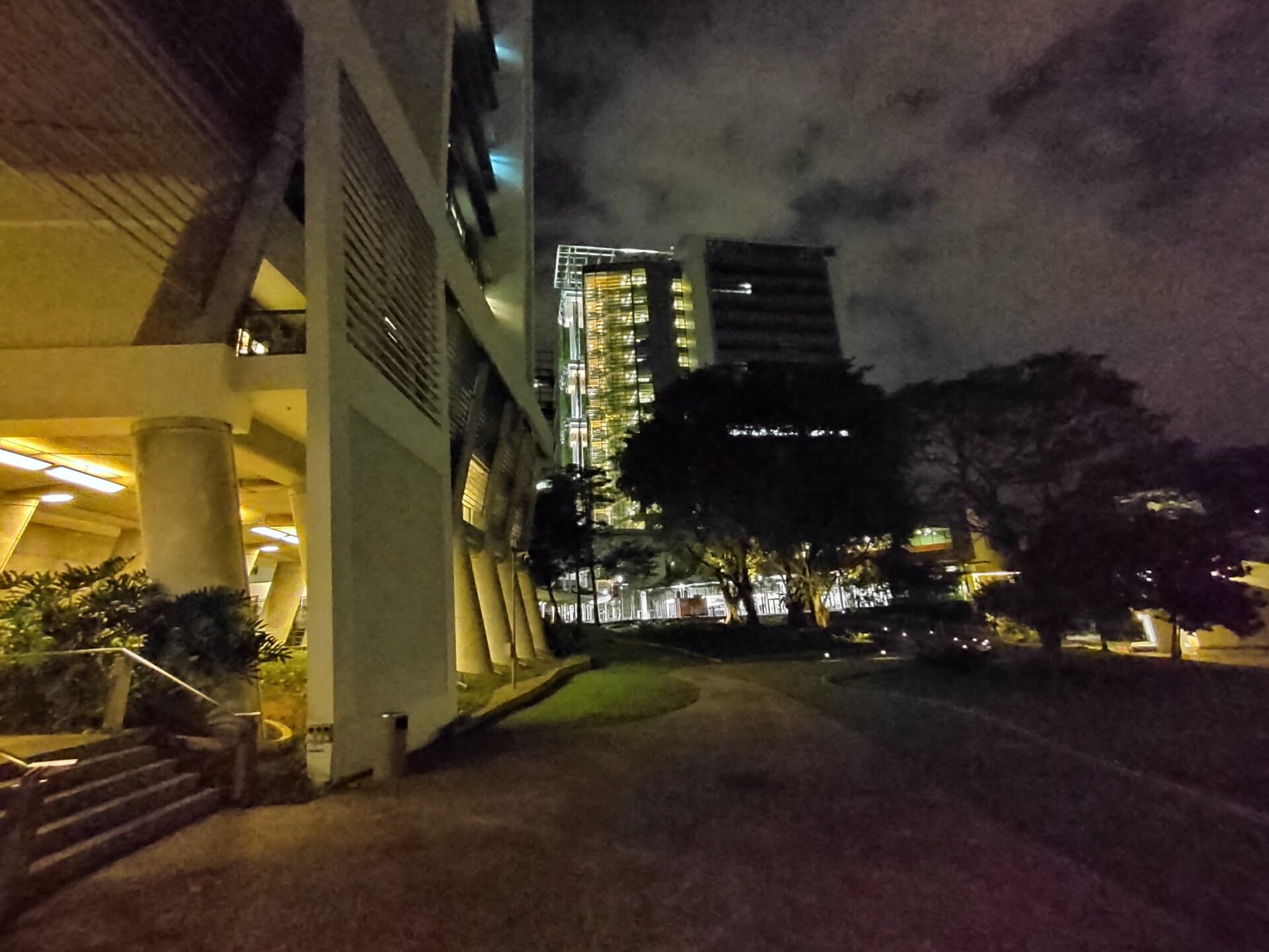
The dark parts of the outline of the building in the background has disintegrated into graininess. And why are the corners purple? (PHOTO: Esmond Xu)

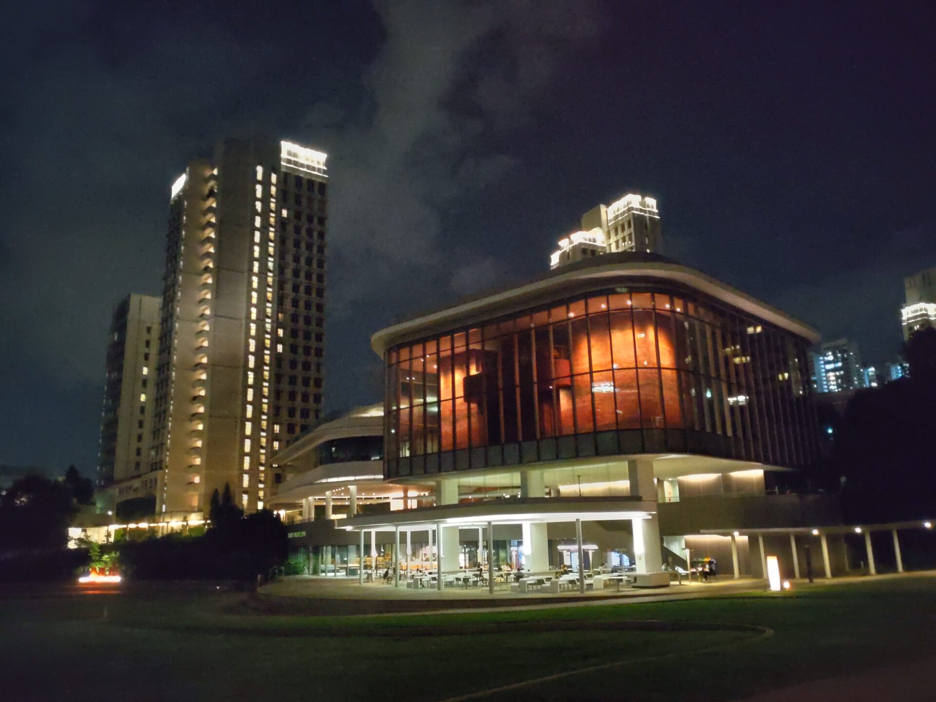
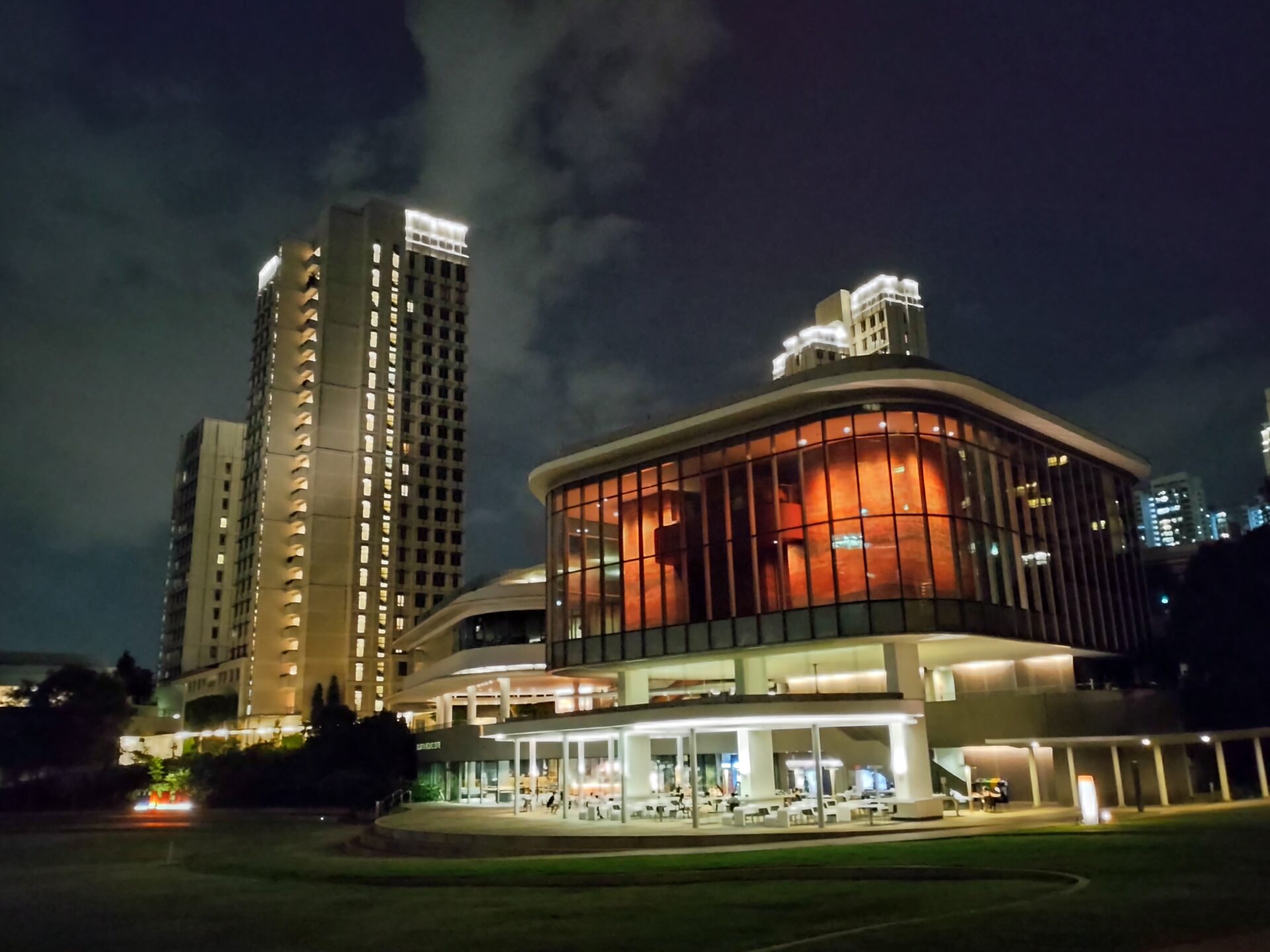
Night Mode makes a valiant save on the wide lens! This shot is at least minimally serviceable, but it is unclear (pun intended) if there is sufficient detail to improve the shadows. (PHOTO: Esmond Xu)

I compared, and this Night Mode enhanced telephoto shot is noticeably better, but still not serviceable. (PHOTO: Esmond Xu)

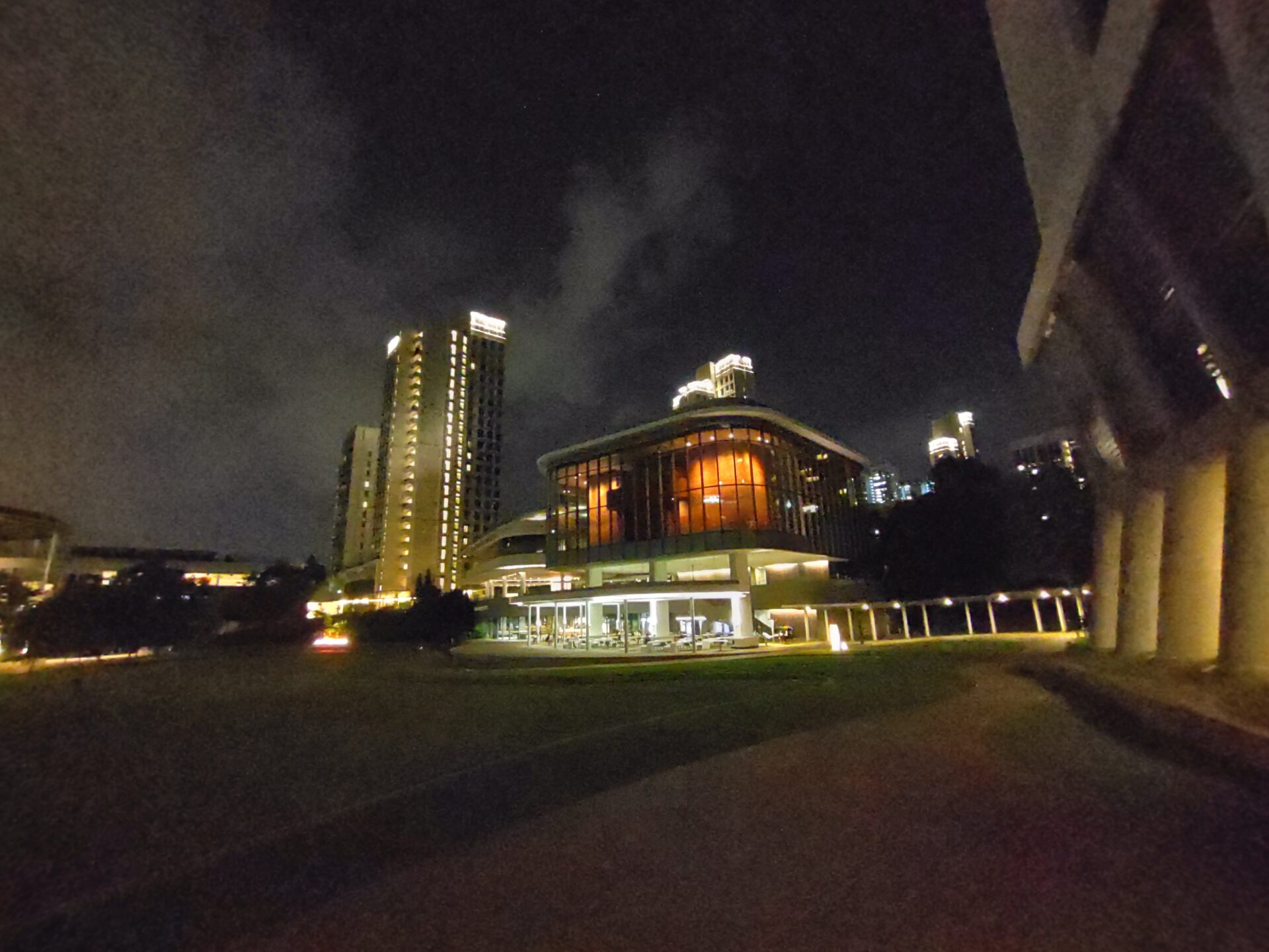
Night Mode resolved the details in the lit parts of the shot, but the purple tint in the darker corners spoils things. (PHOTO: Esmond Xu)

On this ultrawide shot without Night Mode, the purple fill again rendered the shot unacceptable, though parts with light resolved okay. (PHOTO: Esmond Xu)

A poor outing by the telephoto. (PHOTO: Esmond Xu)

This image taken by the wide camera is washed out, but at least looked better than the telephoto. (PHOTO: Esmond Xu)

Night Mode did not do much for this ultrawide capture. (PHOTO: Esmond Xu)

This telephoto shot is less blurry overall, but still not enough for prints. (PHOTO: Esmond Xu)

A decent shot with the wide camera, albeit a little grainy. (PHOTO: Esmond Xu)
Conclusion
The Sony Xperia 10 III is well-crafted, that’s for sure. It reflects Sony’s expertise at making products with a razor-sharp focus on understated, elegant designs and good ergonomics, without paying heed to the latest fad.
Above-average battery life and water resistance are big pluses for this value flagship. The OLED screen is pleasant, but does exhibit some idiosyncrasies. Daytime camera performance is decent, while dusk shots are typically unacceptable, unless with the main camera on Night Mode.
The device will deliver sensible performance for users looking to consume social media feeds and videos. Gamers, or those who require any sort of crunching on their mobiles, may find their experience clipped.
What counts against Sony is the high and fat bezel, which may turn off some potential buyers in the tough mid-range segment.
The Xperia 10 III makes the most sense for users willing to cough out a slight premium for a mid-range phone with quality build and battery stamina.
