Nothing is, in literal essence, a blank slate for its founder Carl Pei. A second stab at creating a standout mobile brand after leaving OnePlus, which was known in its earlier, headier days for scarcity marketing and flagship phones at a bargain price.
The new Nothing Phone (2) comes exactly a year after the inaugural (1), a second on second, if you will. The second is also more precious, for the Phone (2) goes for S$999 with 256GB of storage, and S$1,099 for the 512GB flavour. These prices are meaningfully higher than the S$798 on Phone (1).
The more princely price tag upgrades the device to a “vanilla” flagship. I’d say that’s like a basic Samsung Galaxy S23 or Apple iPhone 14, without the Plus or Ultra features thrown in.
Packed into the Phone (2) are a Qualcomm Snapdragon 8+ Gen 1 chip rather than a mid-range Snapdragon 770s, 12GB of RAM, a 6.7-inch OLED display with 120Hz refresh rate, and dual-rear cameras.
Design
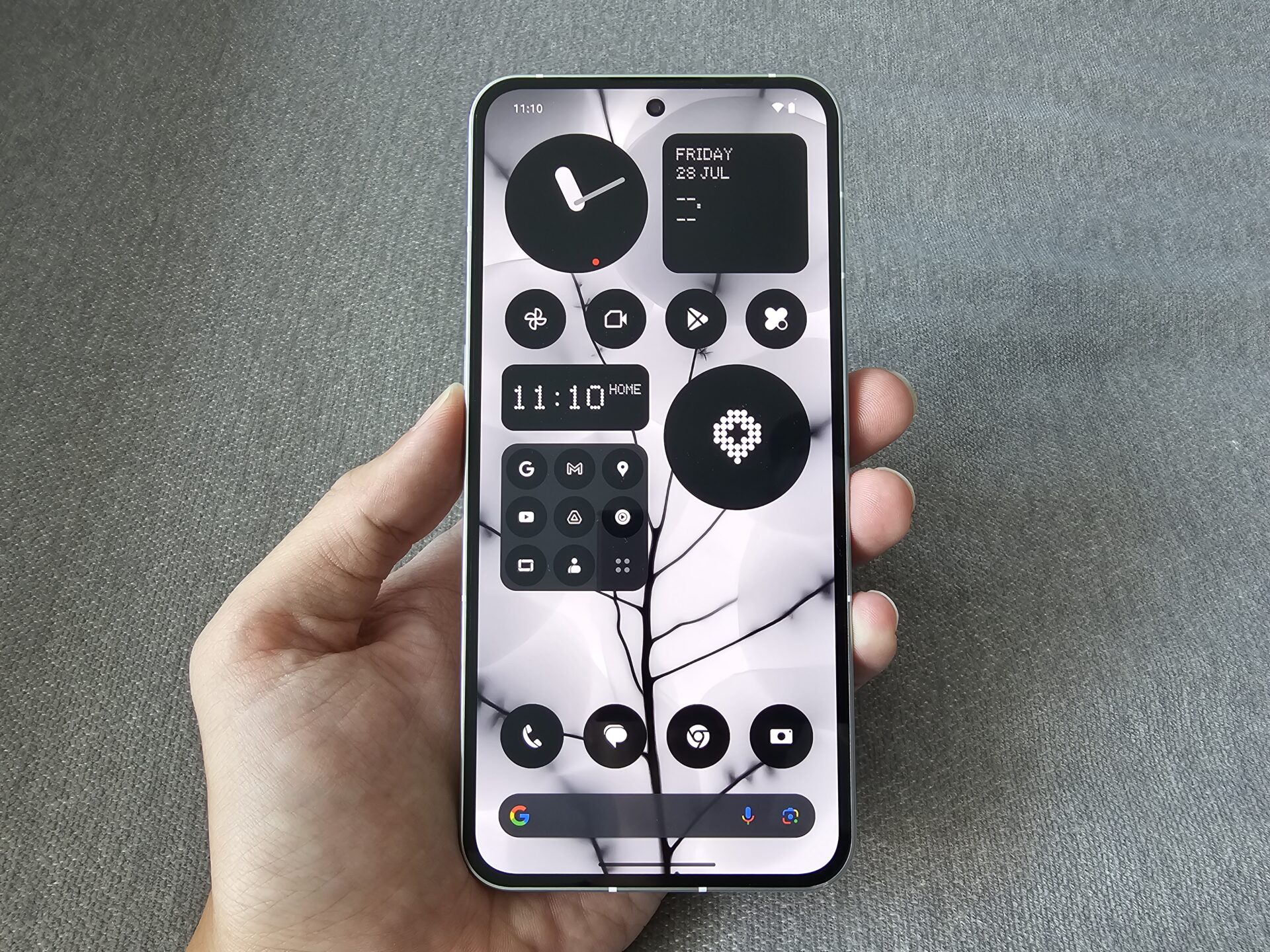
Nothing has staked its image on a consistent, monochromatic, dot-matrix, dystopian-futurist identity that pervades its packaging, device colour options (in black, or white – our review unit is in the latter), the Nothing OS skin, and complementary Glyph interface.
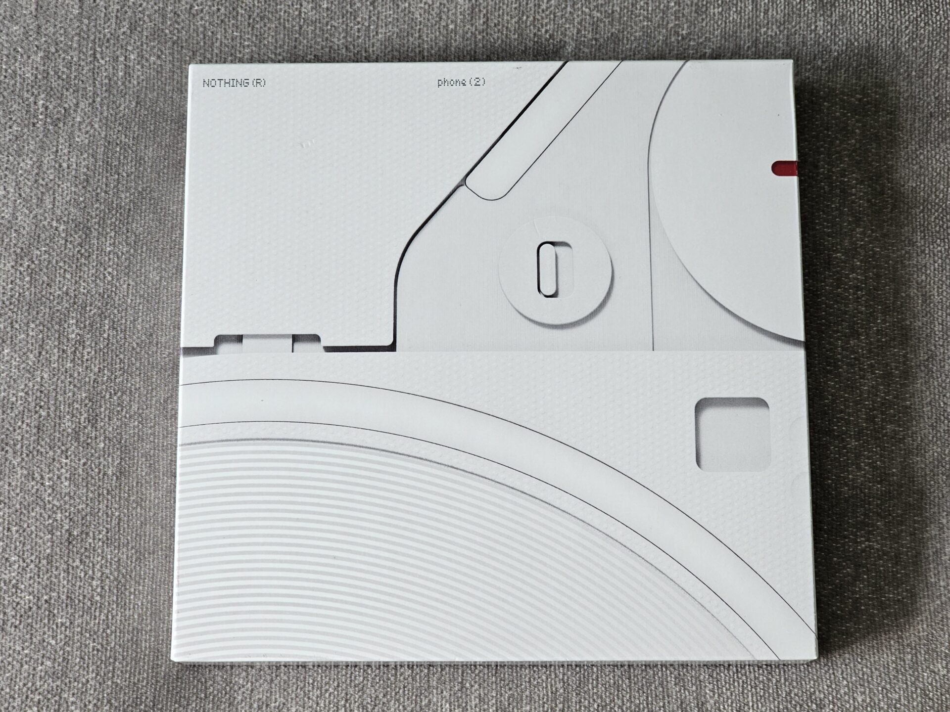
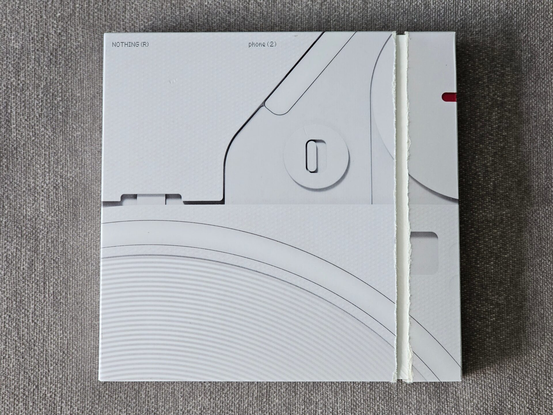
The new phone arrives in a smooth cardboard box with black and white print, interrupted by a red-coloured perforated tear resembling what one pulls when opening, say, Kinder Bueno.
Getting past the outer layer, you find a textured rough paper box with a similar design. It opens up to reveal the device and its barebones accessory accompaniment (charging cable, SIM tray eject PIN, regulatory printouts). The motif on the packaging shares obvious similarities with the back of the Phone (2).

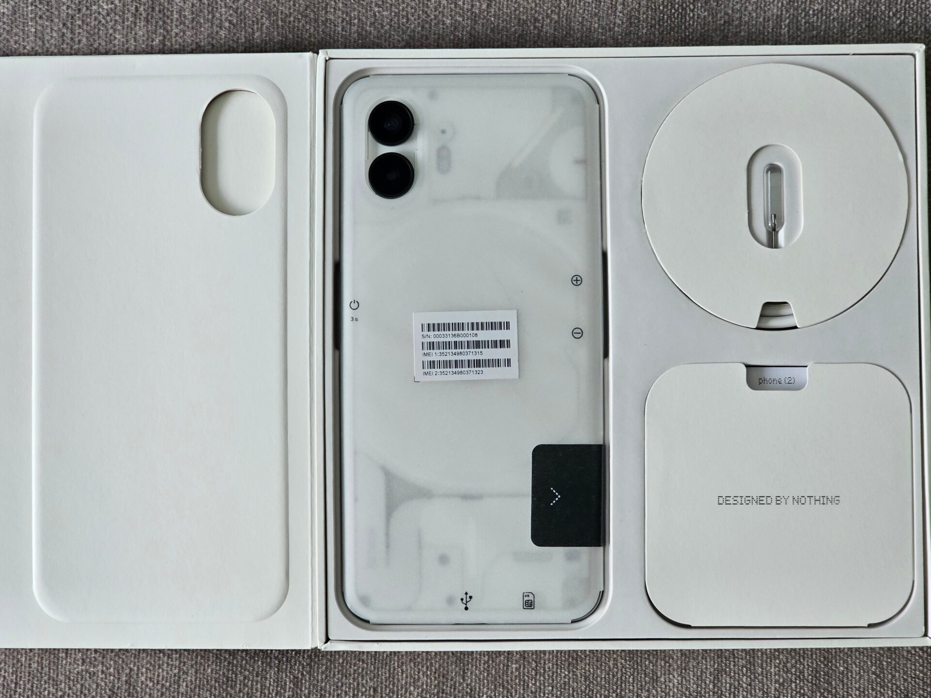
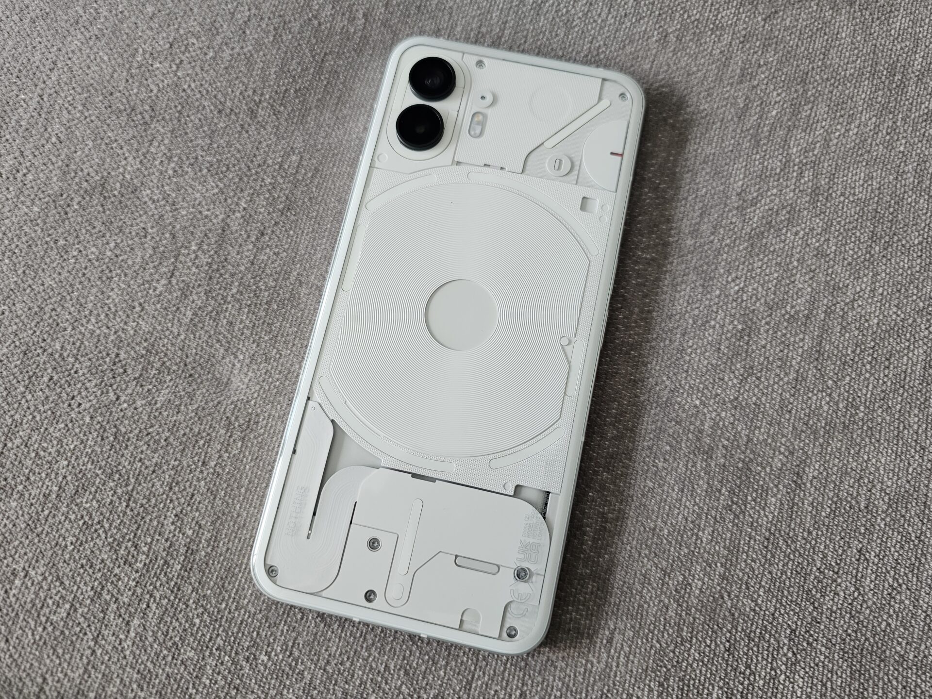
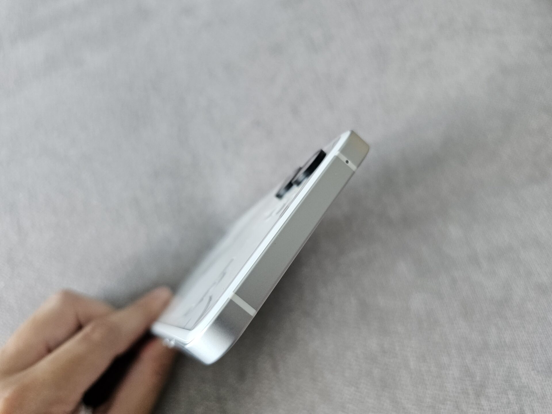
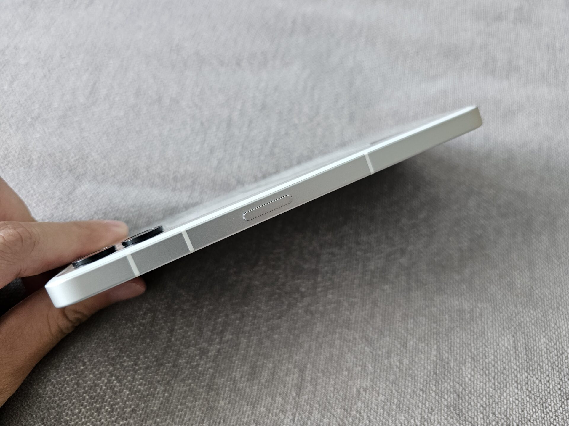
The Nothing Phone (2) measures 162.1 x 76.4 x 8.6mm and weighs 209g. It actually weighs less than the competition. While its sides are in matte aluminium (bar the plastic antenna bands), its iconic clear plastic back bares sections of its innards, reducing weight and facilitating its trademark Glyph interface.
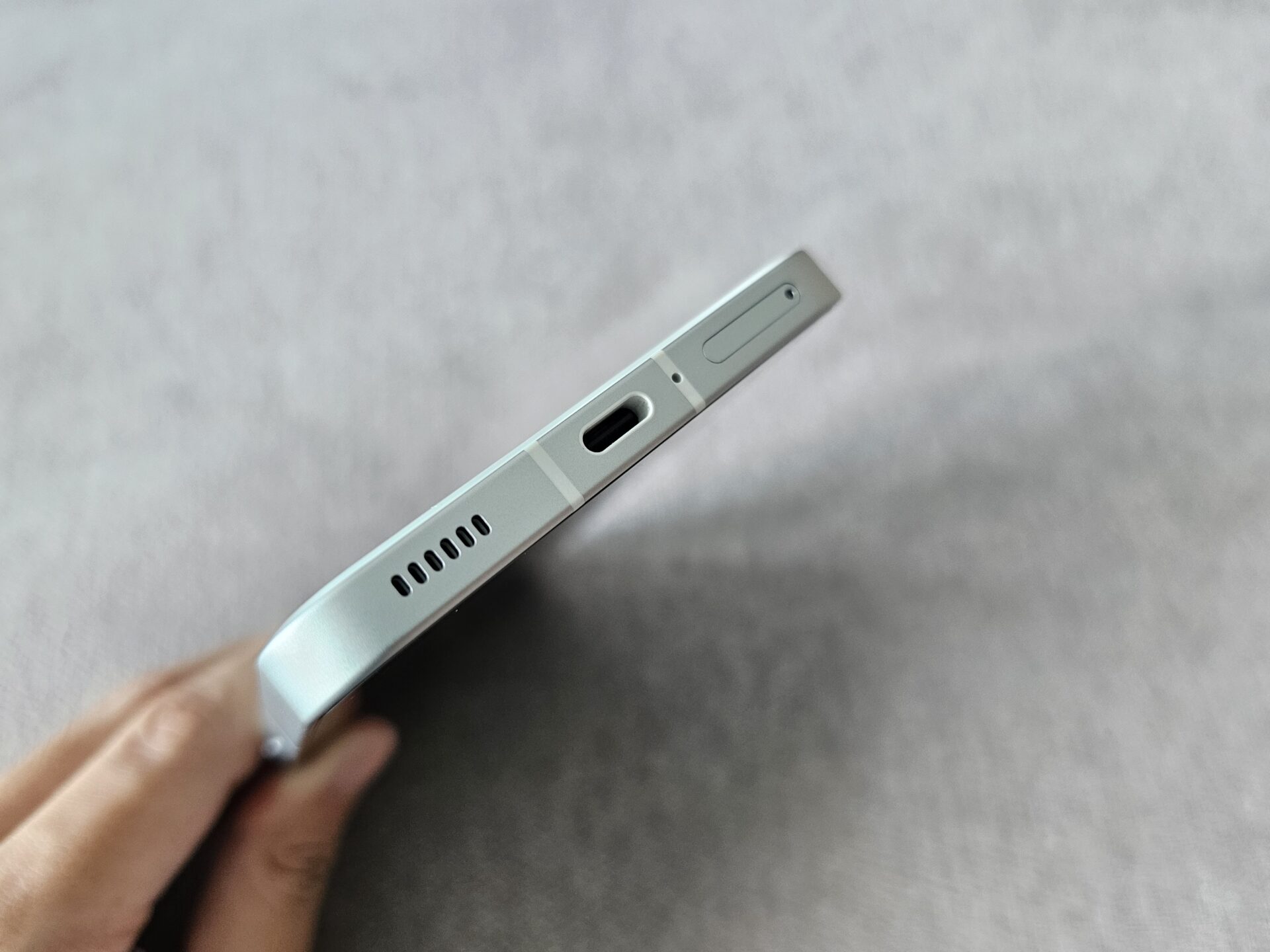
The sides of the device are flat, with rounded edges so they do not cut into palms. The rounded corners of the display, together with the sides, look and feel premium. I secretly wished the sides and corners were not so iPhone-inspired.
Glossy plastic is a fingerprint magnet, but the fingerprint legibility is less of a concern due to the Glyph lighting and inner frames on display.
I am more concerned about durability, as the phone is more likely to be exposed or protected with a thinner transparent case. After all, slapping a thick case on the Phone (2) may prevent you from taking advantage of the Glyph interface.
Glyph
Glyph is Nothing embedding LED lighting in various circular and linear geometric forms on the device’s rear. They work together to create different symbols that can be customised to denote different messages.
For instance, you may program a specific lighting pattern for messages and/or calls from different contacts. The glyph may also serve as a visual countdown timer, and can dance in different patterns to different ringtones.
Given how bright the LED array can become (its brightness is adjustable through settings), the Glyph interface is also effective fill lighting for photography and videography. It appears like an improvement over the single LED lamp that most phones have on their rear camera array.
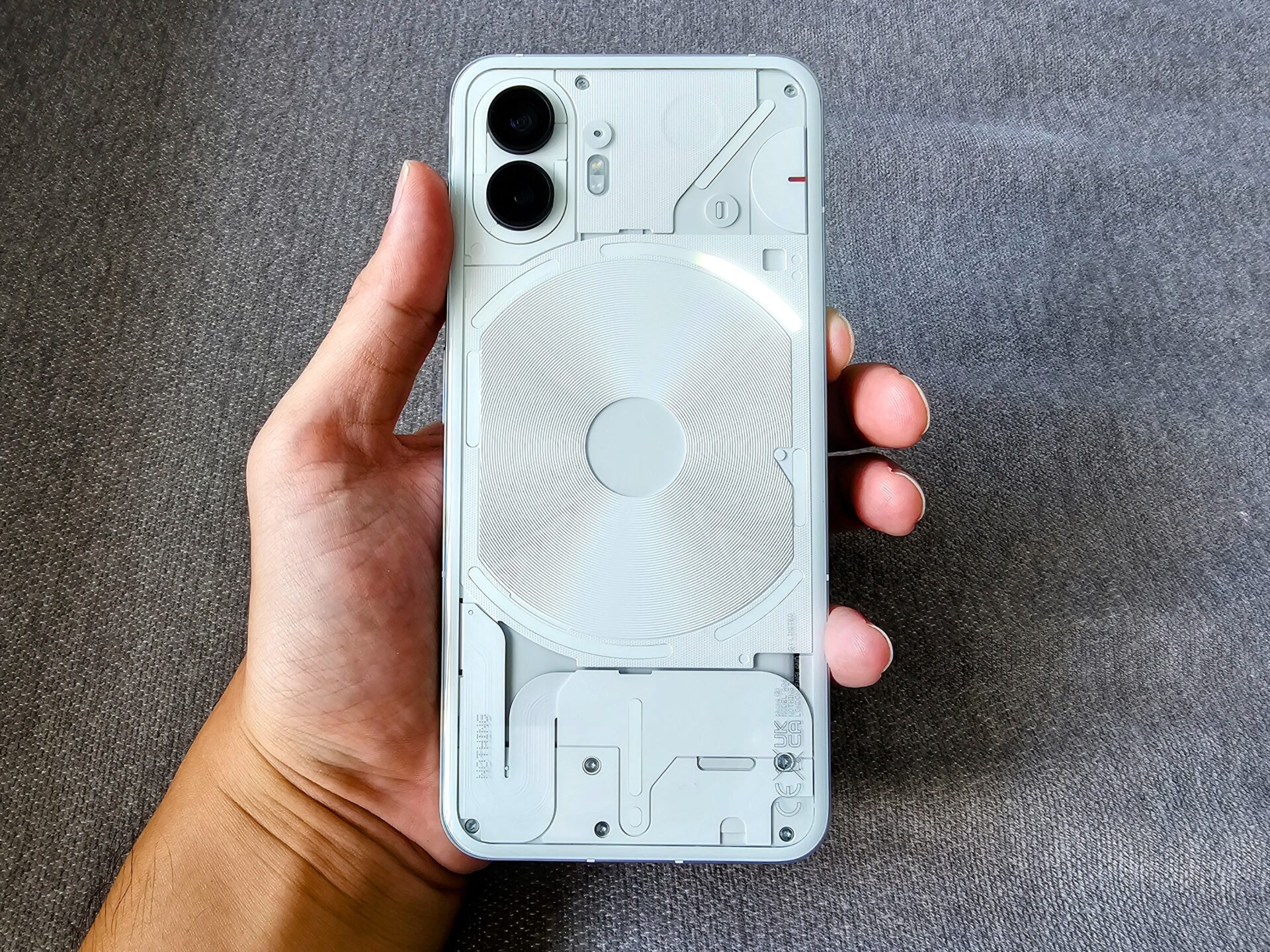
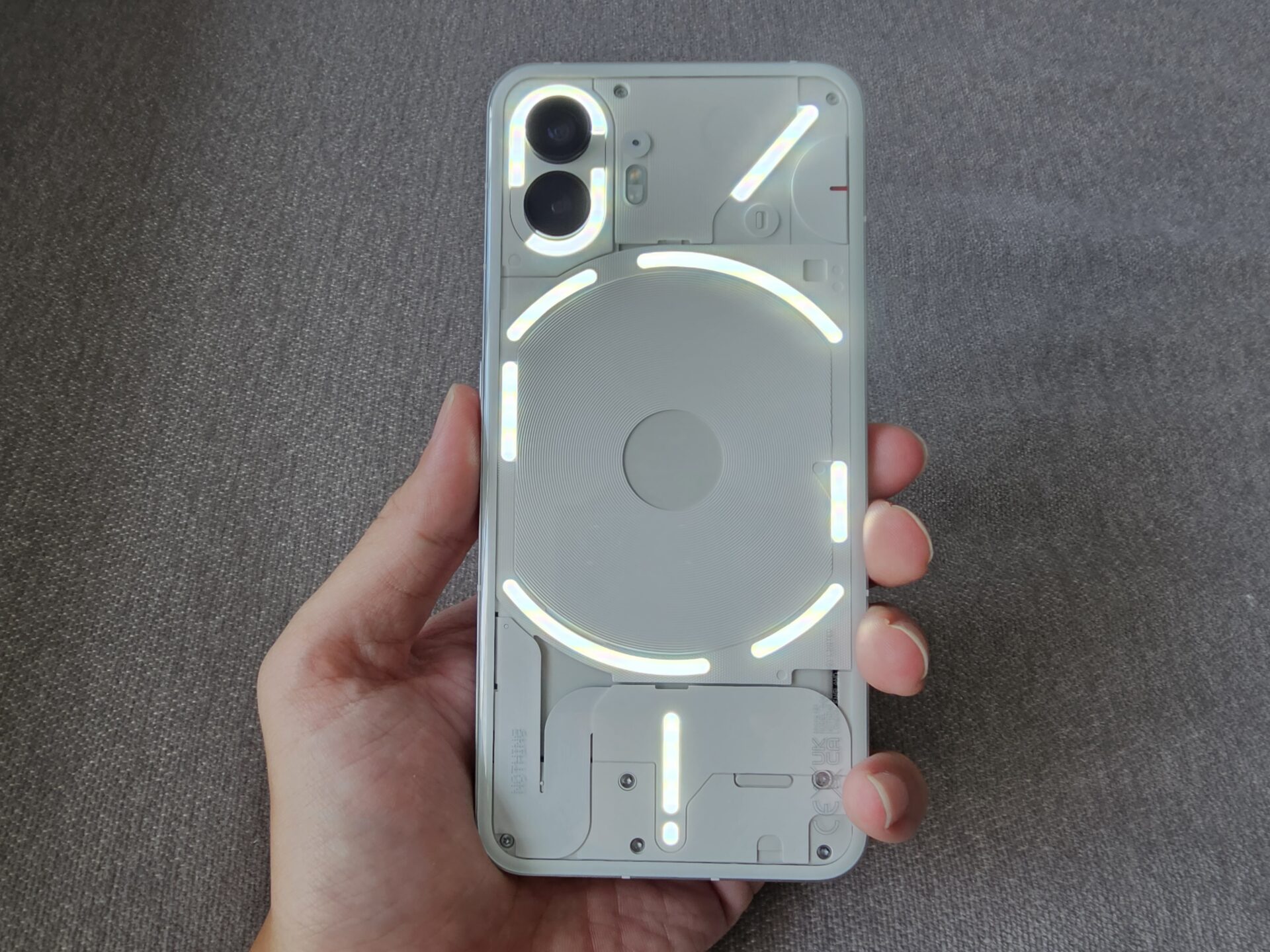
In my opinion, Glyph is an elegant way to differentiate the Phone (2) from competitors without gamer-esque RGB lighting, while keeping things functional.
I tested the array for some low-light photo and audio, and while it is good enough to brighten things up in a dim, small room, do not expect magic for night landscapes.
Screen
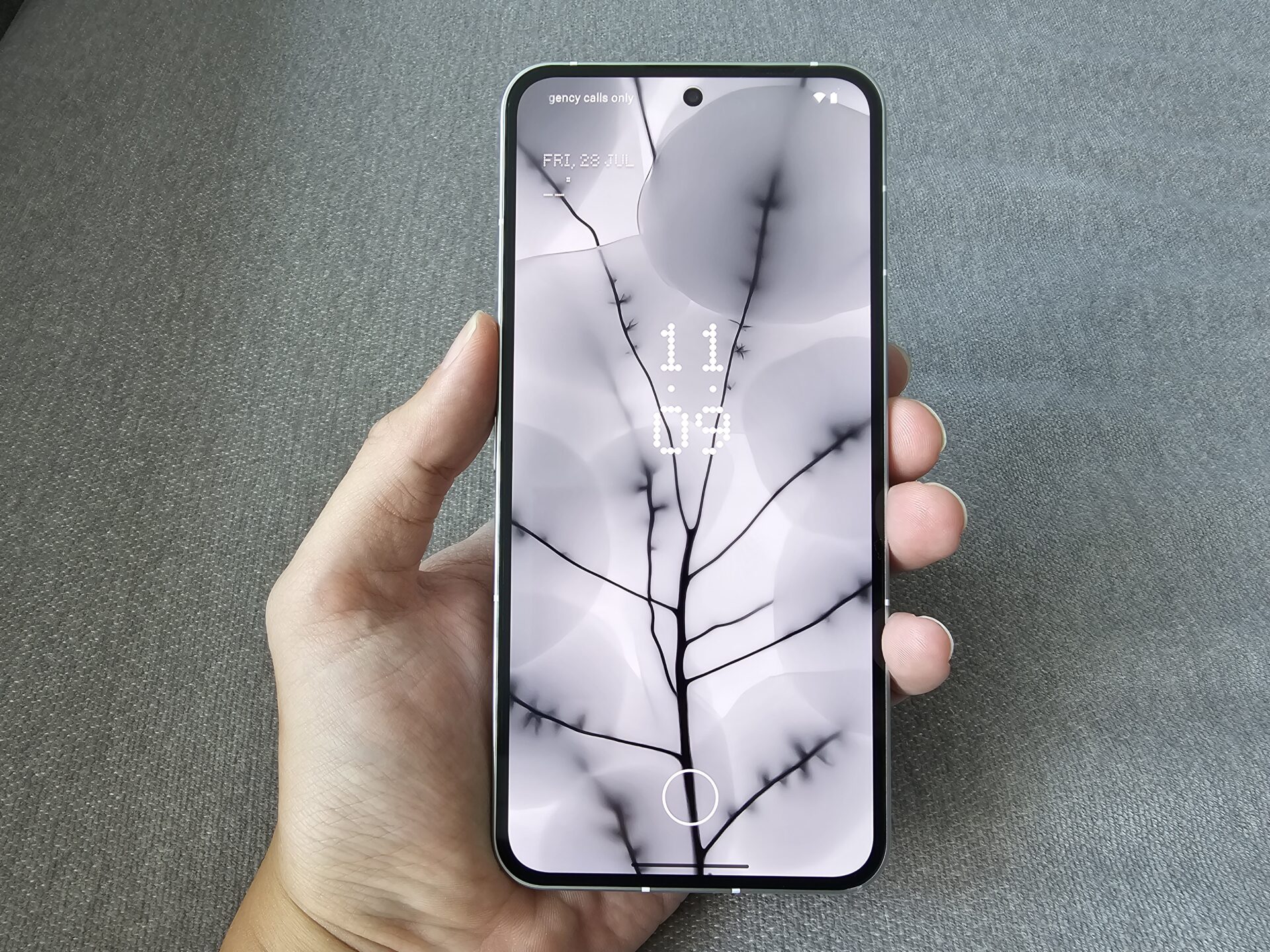
The Nothing Phone (2) has a 120Hz, 6.7-inch LTPO OLED display of 1,080 x 2,412 (Full HD+) resolution in 20:9 form factor. It has HDR10+ support and vanilla Corning Gorilla Glass protection.
I’ve always preferred Full HD screens for battery longevity. On the screen, colours are pleasant and vibrant without being artificial. Sunlight legibility is fine, though better with adaptive brightness (which I usually turn off). There isn’t ghosting nor obvious blue shift.
The refresh rate remained at 120Hz most times even when set to Dynamic. It dropped to 90Hz for browsers and YouTube, and 10Hz only on very static screens like the home screen, to save power.
The display promises peak 1,600-nit brightness. In our tests, we measured 960 nits after manually adjusting the brightness slider to the maximum, and 1,670 nits when the device is left to automatically manage luminosity on a bright day. It will be nice if the manual brightness slider allowed users to push the brightness up higher, as reflections can get in the way.
Performance
The Qualcomm Snapdragon 8 Gen 1+ processor onboard is a competent processor, if now the second best to the Gen 2 version. At least, it is made on a TSMC 4nm process that is more power conscious than the non-plus brethren.
I used PCMark 10 for Android’s Work 3.0 Professional benchmark to simulate day-to-day performance workloads like browsing the Web, editing photos and videos, and writing and manipulating data. The score averaged 15,075.
To test its graphical prowess, I fired up Asphalt 9: Legends. Cutscenes were smooth and the resolution was crisp, though there were plenty of jaggies, which suggested the anti-aliasing was not running at full tilt from lack of raw performance.
3DMark for Android (Wild Life Extreme), which tests a device’s handling of commonly-used game rendering engines, threw up a score of about 2,750 on the new Nothing phone. Framerates ranged from a modest 12 to 20 fps, given the demands of the test.
The fingerprint sensor is an optical unit under the display. I find it accurate and quick, but the positioning, at the bottom 15 per cent latitude of the display, made it feel like a home button. It is placed rather low.
Unfortunately, there is no 3.5mm headphone jack on offer, nor any microSD storage expansion. On the plus side, the Phone (2) can hold two nano SIM cards.
There are two speakers – one on bottom right of device, and the other purposed out of the handset speakerphone on the top of the device. The speakers get really loud, which is good, and are timbre-focused (that is, the shrill notes really travel into your eardrums).
The Nothing Phone (2) is IP54 rated for water and dust resistance. This beats midrange smartphones with no official ingress ratings, but not enough to compete with many a vanilla flagship. Those mostly carry a IP68 rating for stress-free pool use.
Battery
Battery life from the 4,700mAh cell is excellent. I calibrated the screen to 200 nits brightness, and ran the PCMark 10 for Android’s Work 3.0 Battery Life test with Wi-Fi running throughout.
With the screen on adaptive refresh, the Nothing Phone (2) lasted 17 hours 15 minutes averaged over three tests. This is about two hours longer than competing flagships.
The Nothing Phone (2) supports 45W wired charging on the USB Power Delivery standard, neither slow nor stand out. There is no charger included within the box, unfortunately.
Good news is, the Phone (2) supports 15W wireless charging, and can do reverse charging with Battery Share turned on. The Glyph interface will light up to indicate reverse charging is active.
Cameras
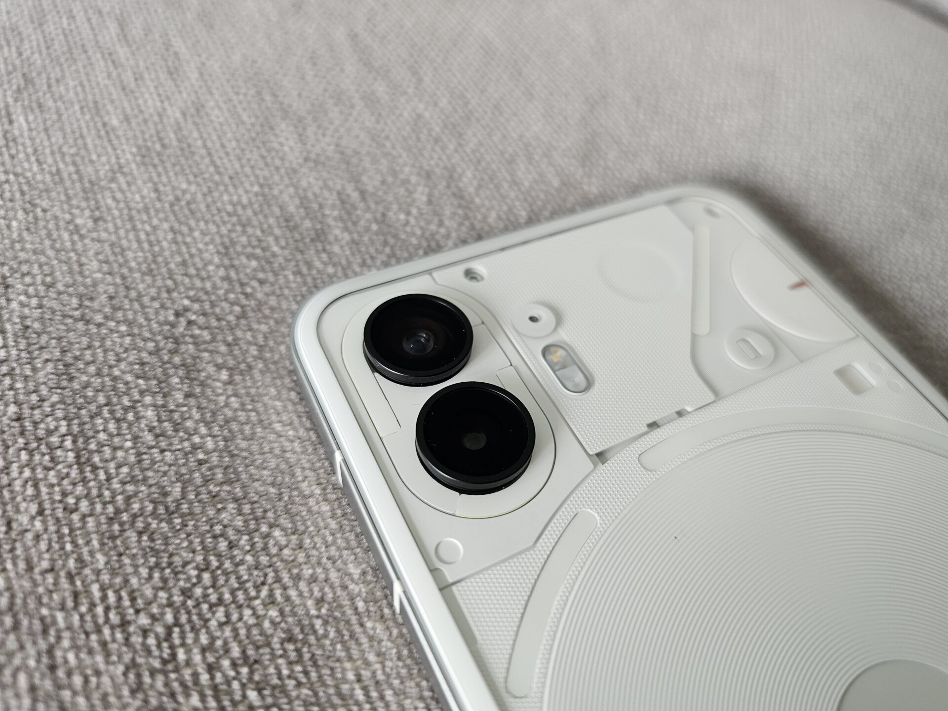
In the rear, the Nothing Phone (2) carries the same camera array as the Phone (1). The setup is competent, if a bit of a missed opportunity for an upgrade. The front shooter is upgraded to a 32-megapixel unit, still without autofocus, though.
A wide-ultrawide camera array means the device is competitive with the vanilla variants of the Apple iPhone 14 and Google Pixel 7. It also helps that the image quality from the Phone (2) is flagship grade.
Unfortunately, night mode works only on the wide shooter, in my view, quite the oversight on a device priced as a vanilla flagship. Make no mistake, the night shots are in focus, but the small sensor does not provide enough material to improve the shot without extended exposure.
- Wide: 50 megapixels, f/1.9, 24mm, 1/1.56″, 1.0µm, phase detect autofocus, optical image stabilisation
- Ultrawide: 50 megapixels, f/2.2, 114˚ field of view, 1/2.76″, 0.64µm, autofocus
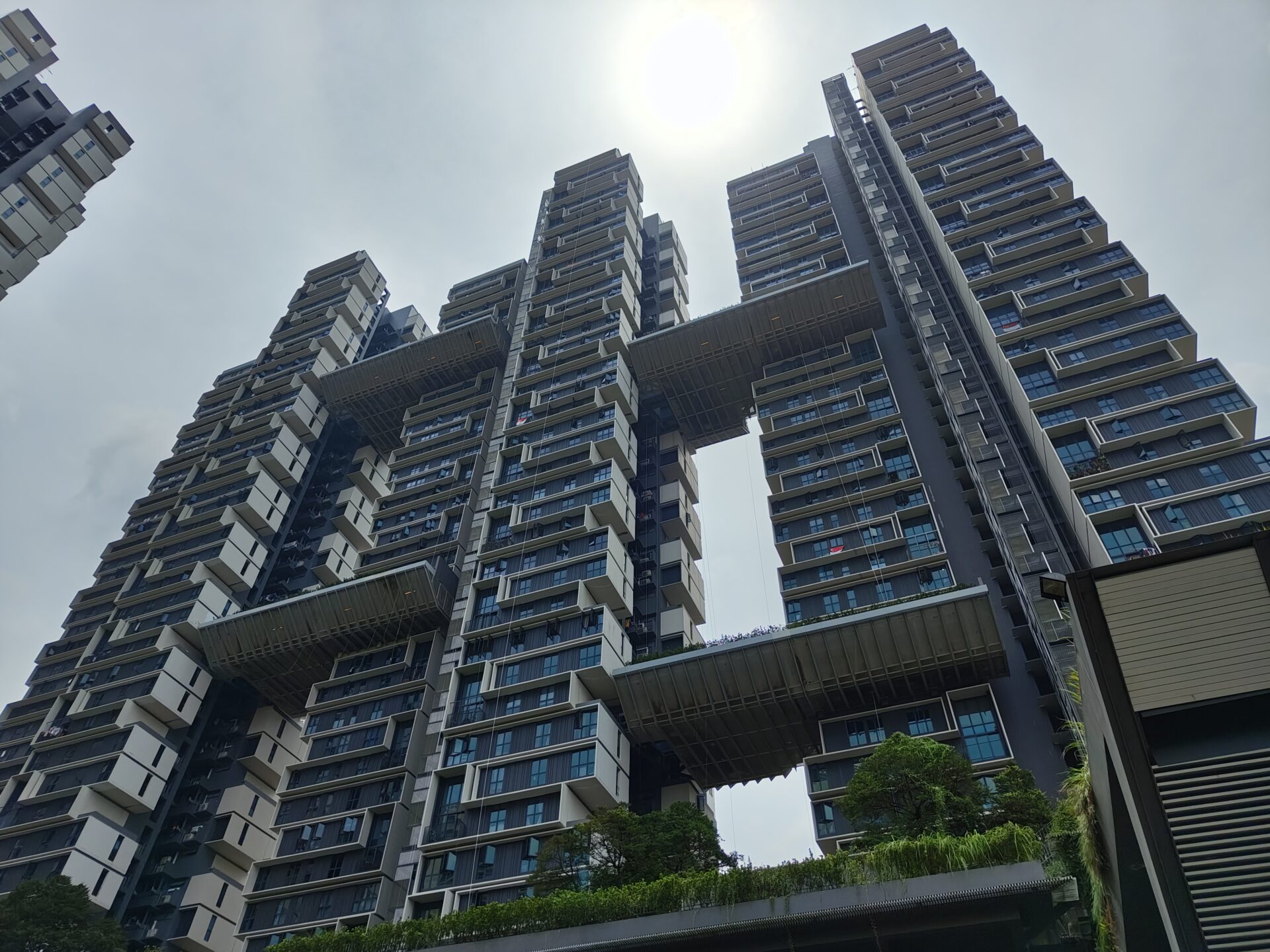
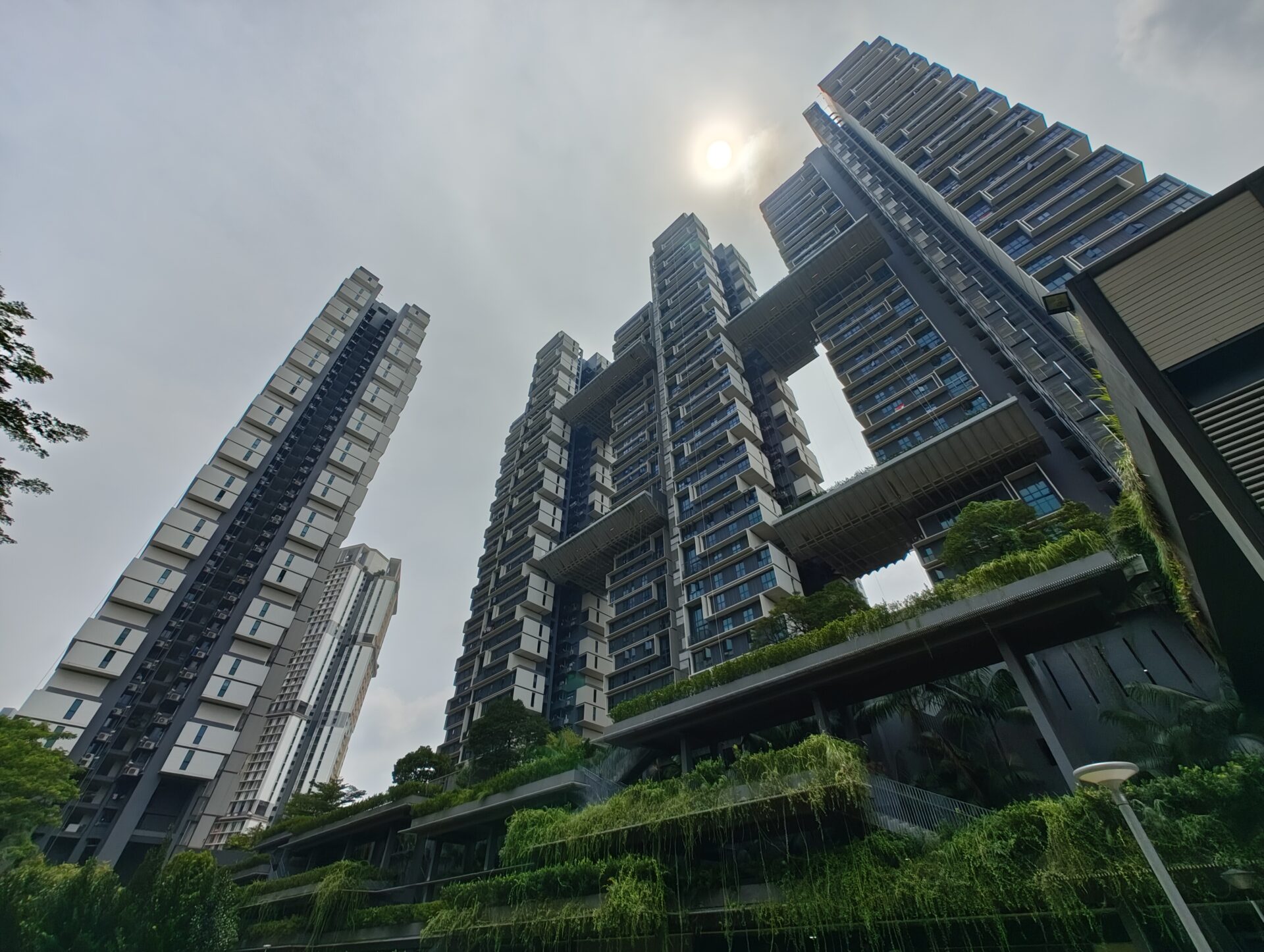
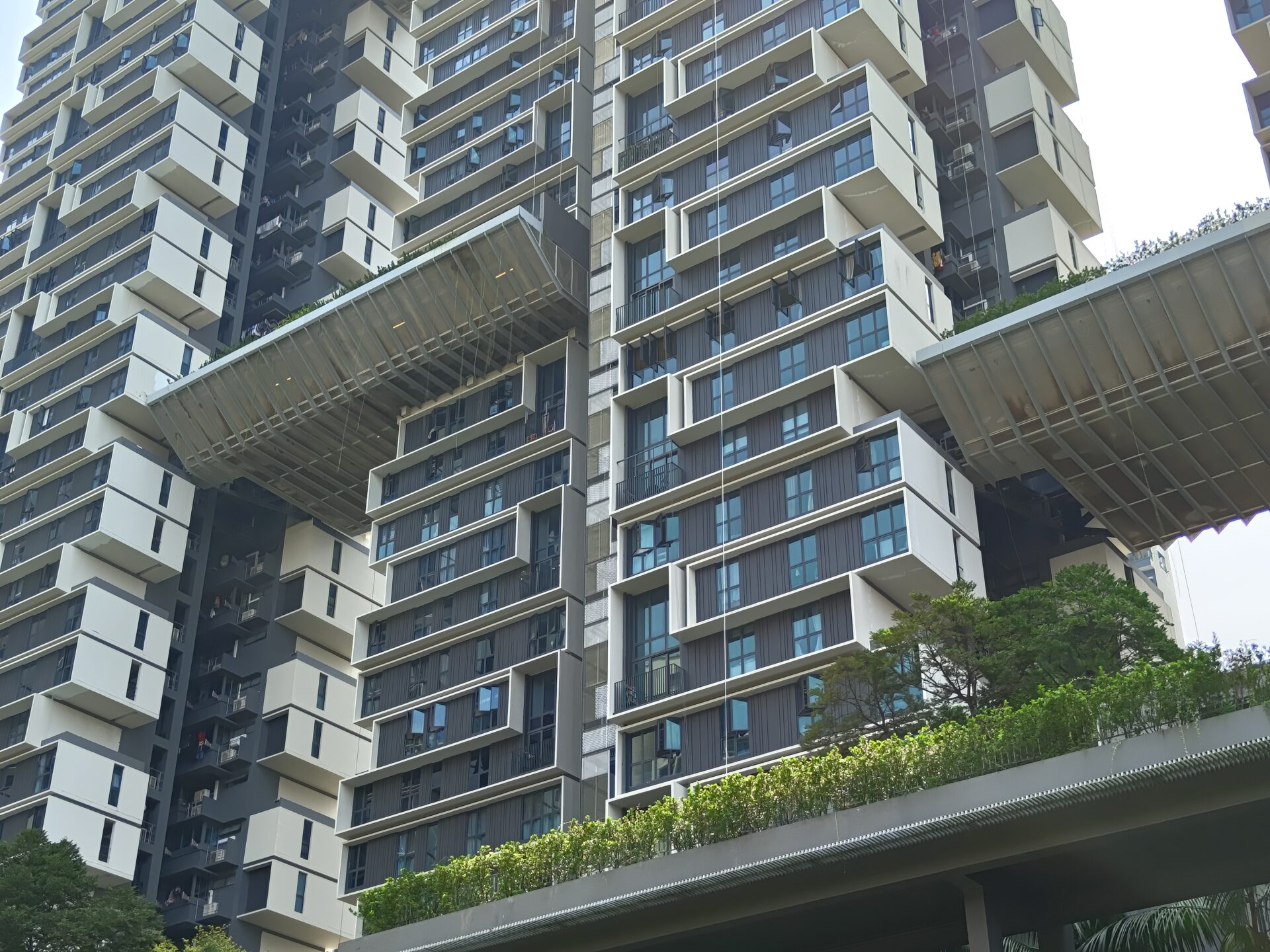
Skyscraper Homeland: The wide shot retained good detail despite the mid-afternoon sun threatening to blow out the brightness. The ultrawide has less detail and a little more blown out, but still decent. I provide a 2x digitally zoomed shot for comparison – there is little loss of detail, though it does magnify the overexposure from the sunlight overhead.
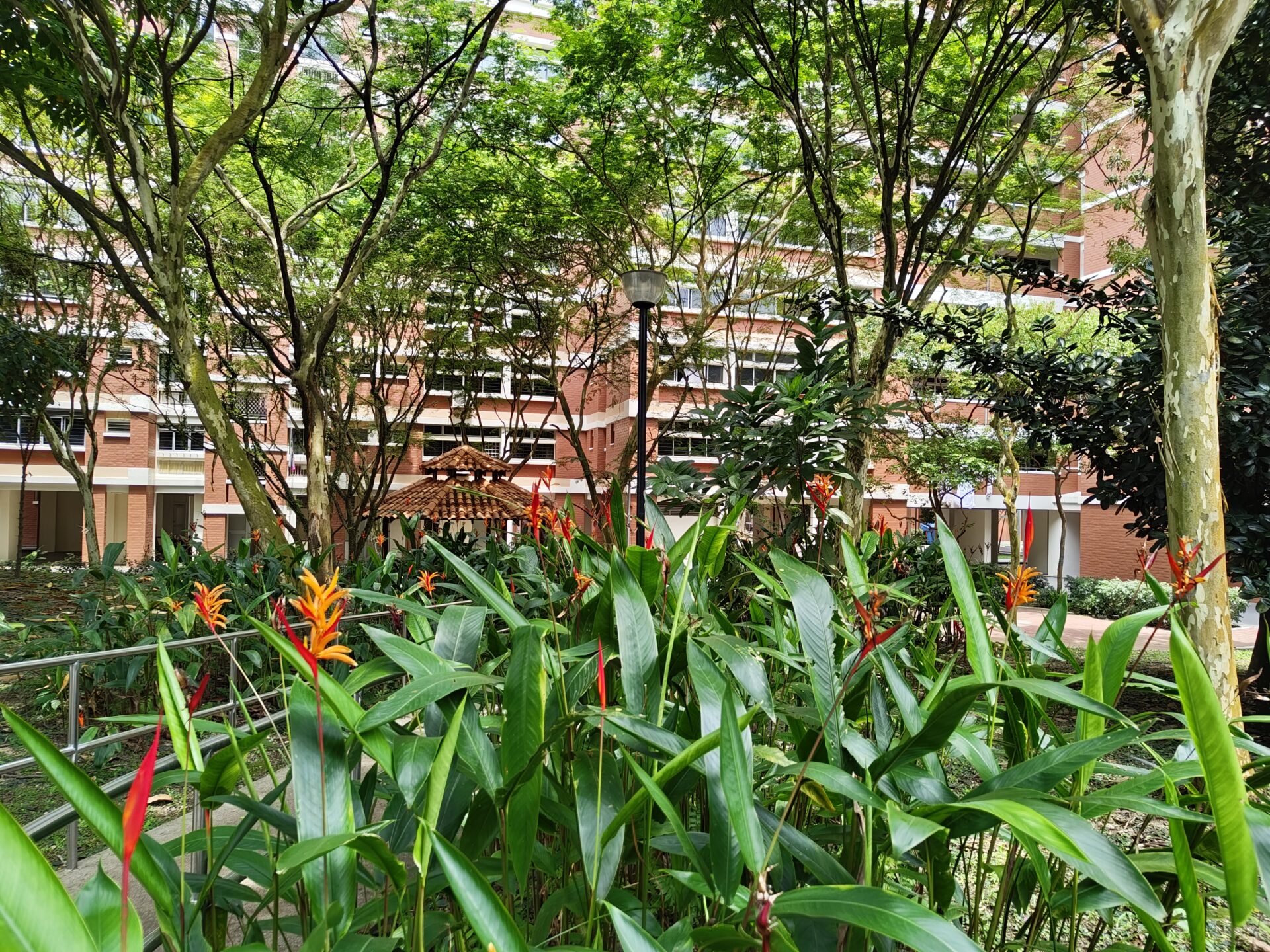
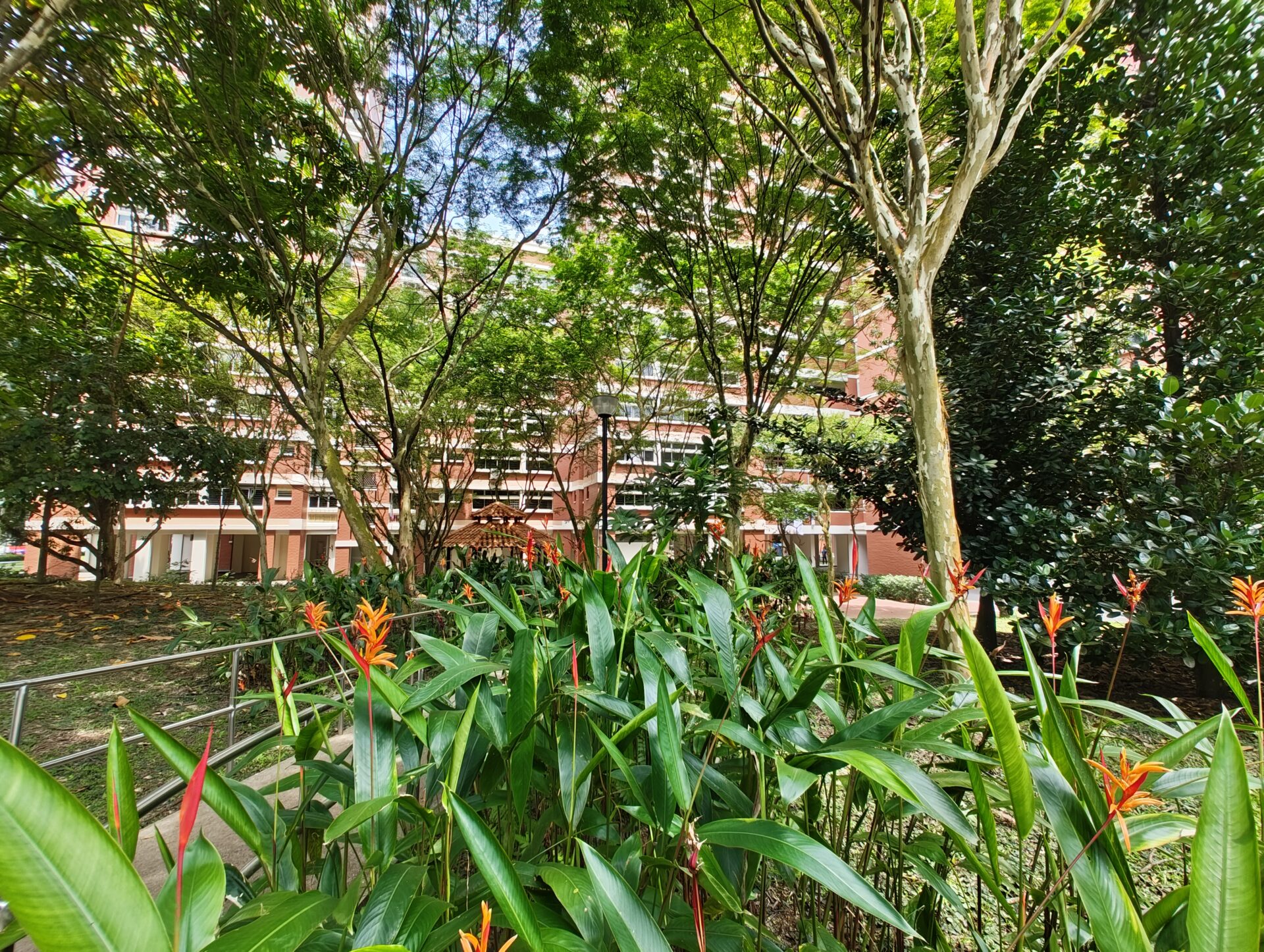
Shady Shrubbery: Both the wide and ultrawide shots are crisp and colourful with very little purple fringing, despite extensive shadow and detail in the image.
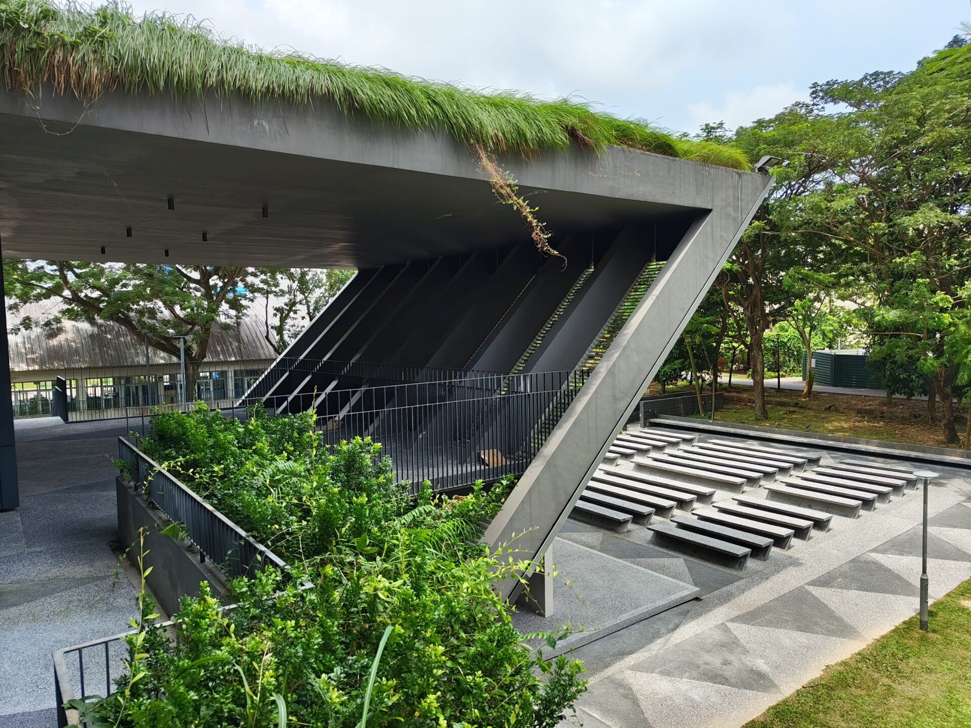
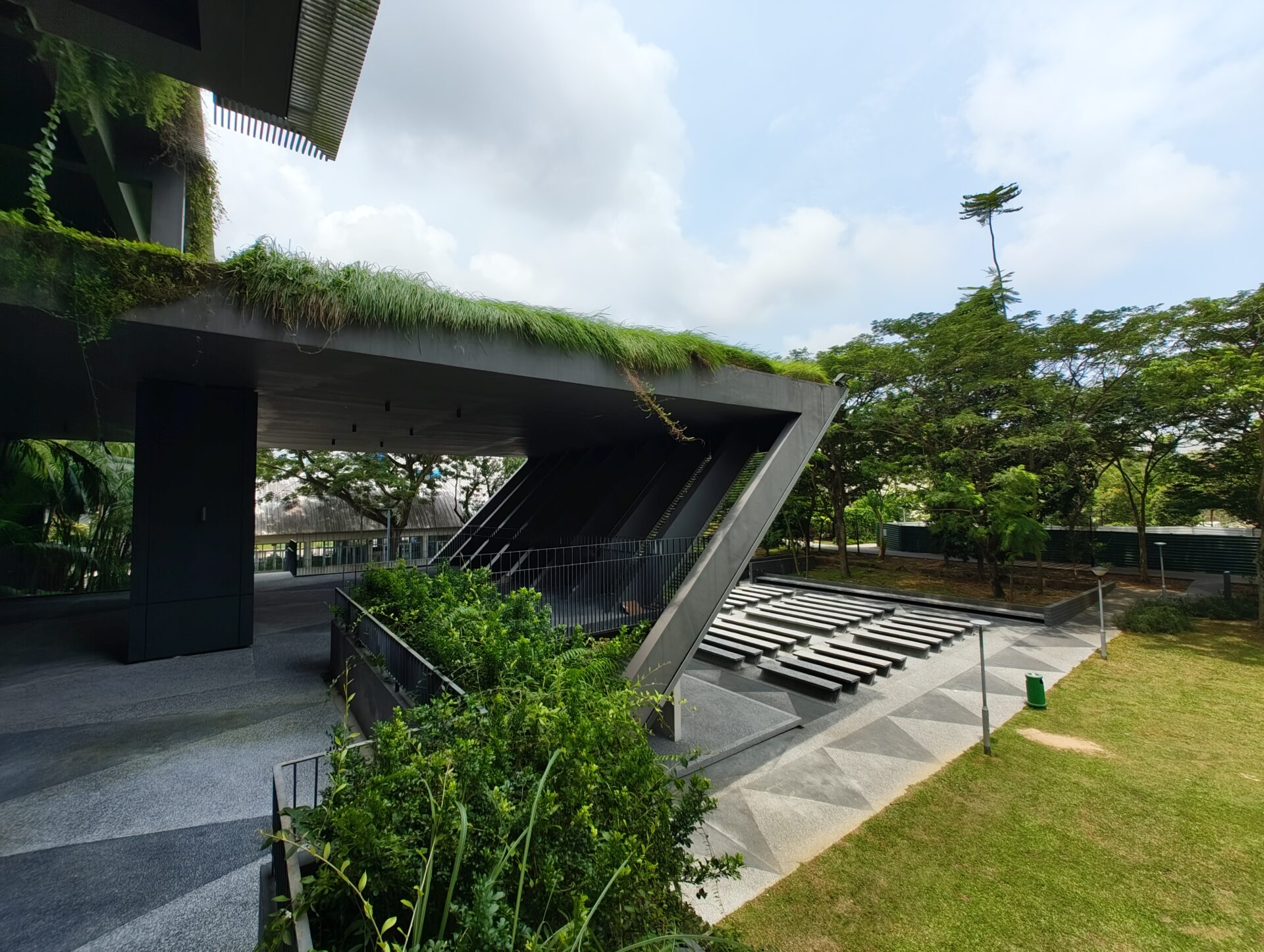
Geometric Shades: The wide shot is clearly brighter than the ultrawide. There is also some detail loss and fringing of trees on the right backdrop of the ultrawide image. Both are good shots, though.
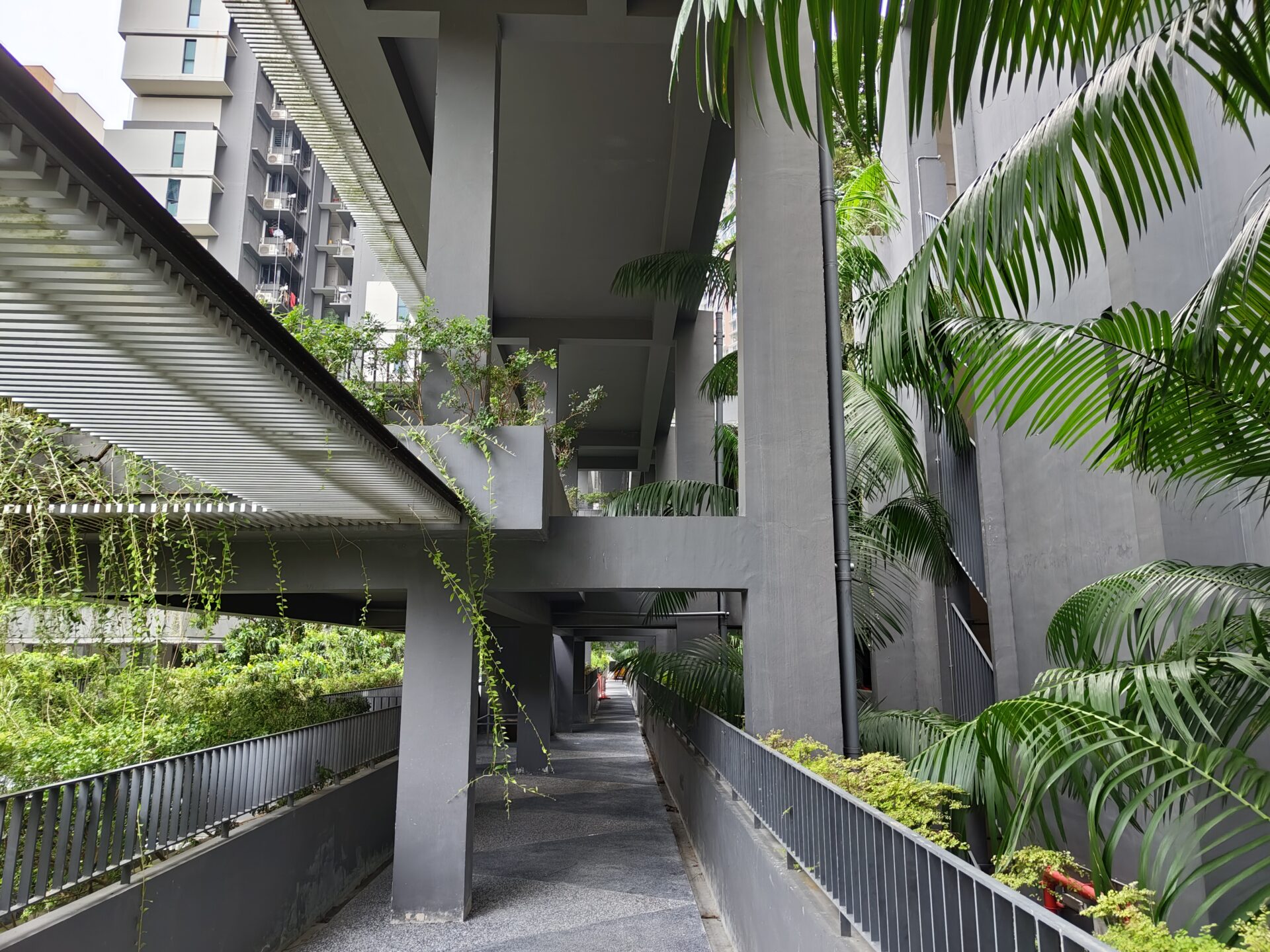
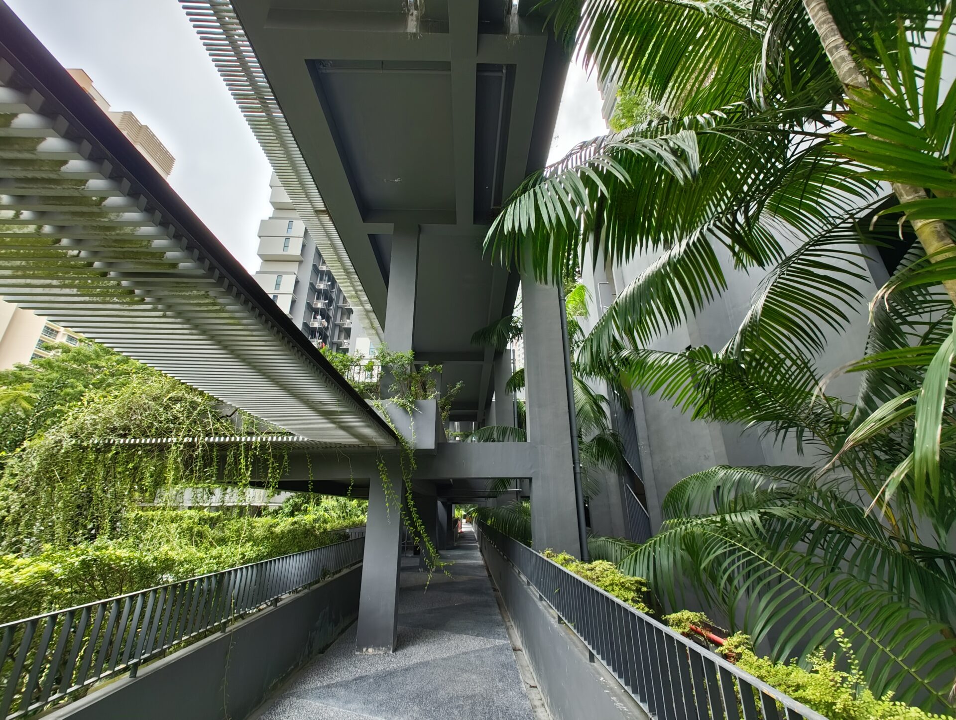
Highland Green: Both shots are again detailed and in focus, except the ultrawide has a slight yellow tint.
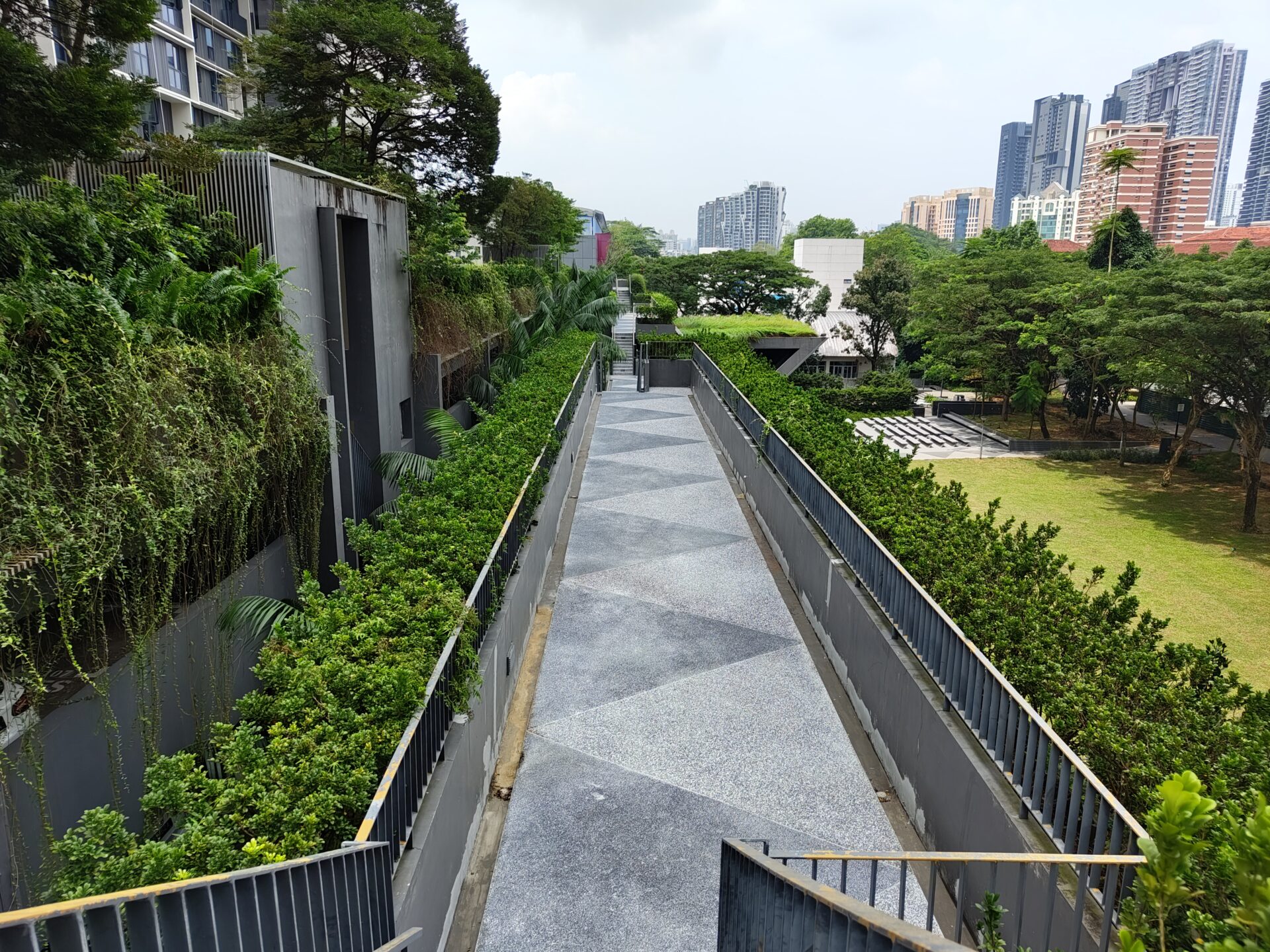
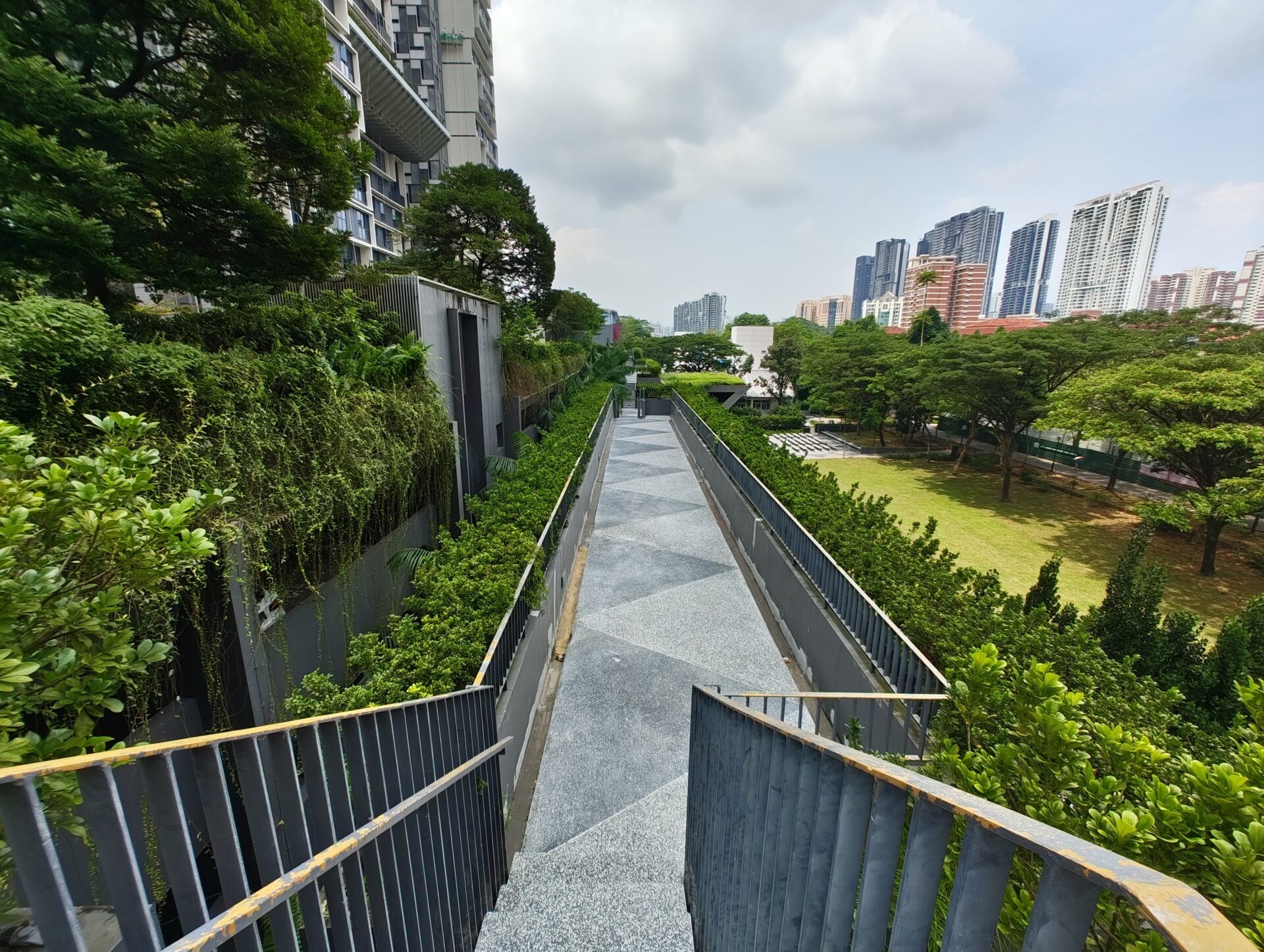
Green Highway: Both shots are again very decent, but the wide expectedly does a better job with detail, especially with the shrubbery on the left.

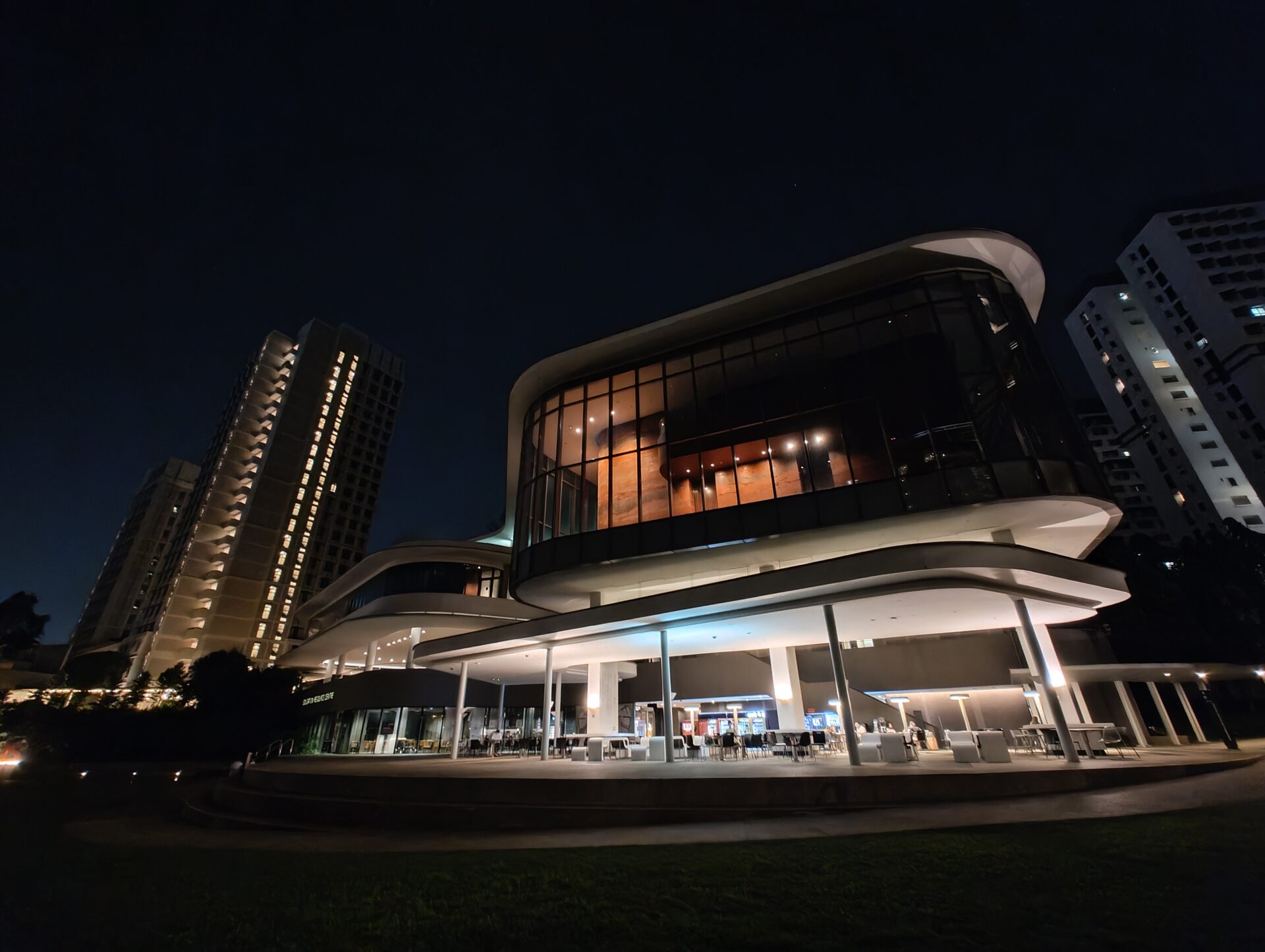
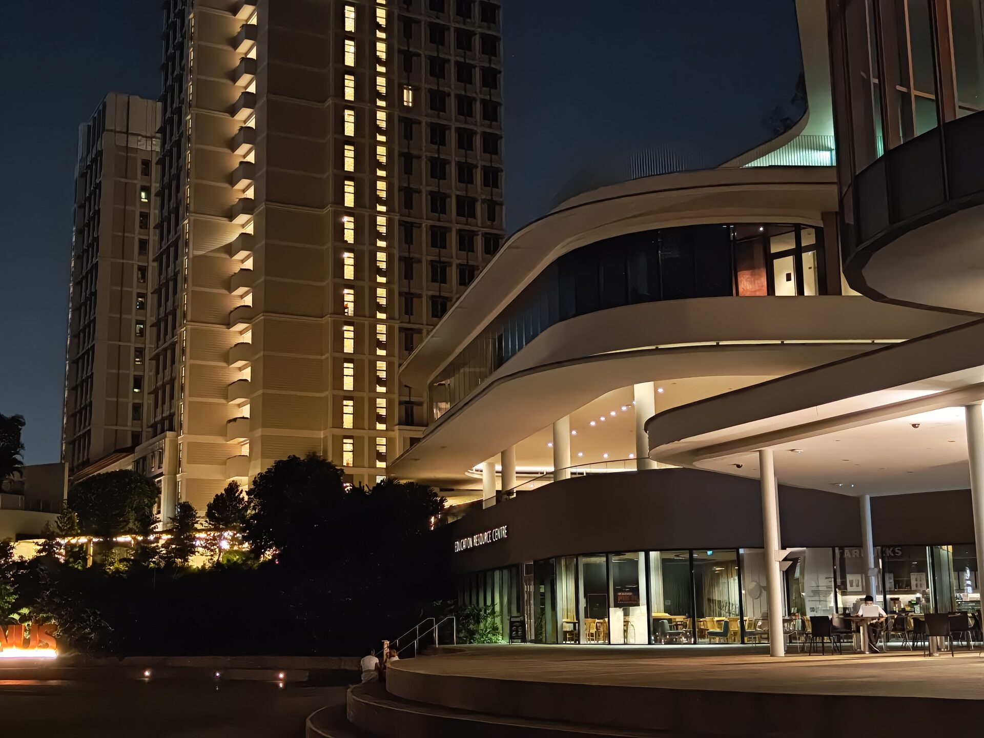
Midnight Oil: Nothing Phone (2)’s Night Mode do not work with ultrawide shots, and the resulting image is dark and areas with light can lack detail, even if still in focus. The algorithmic magic happens only in the wide shot, where there is good detail, colour and sharpness – flagship-grade.
We include a 2x digitally zoomed shot for analysis of its software extrapolation capabilities. Good enough to not require a dedicated 2x telephoto.
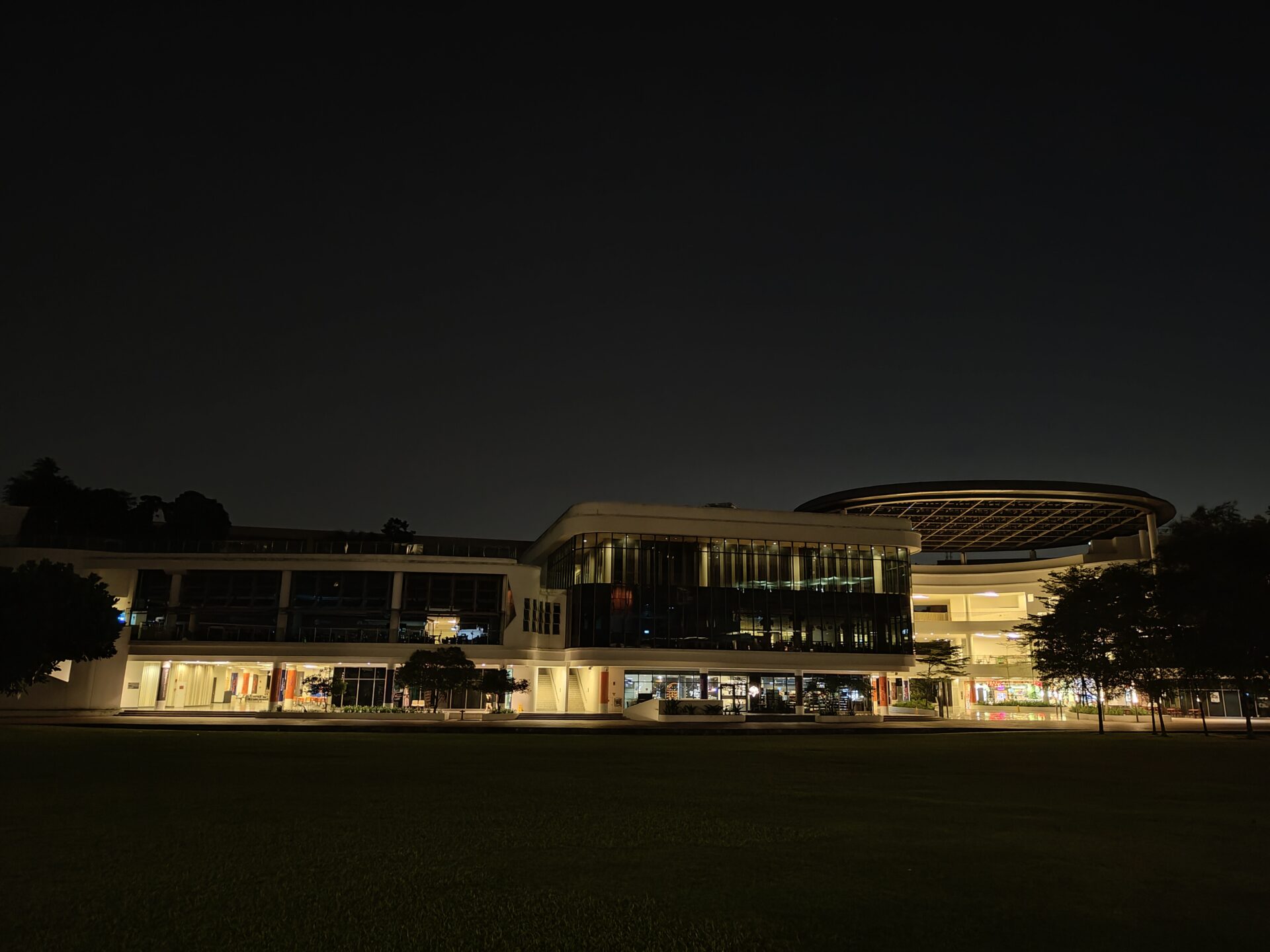
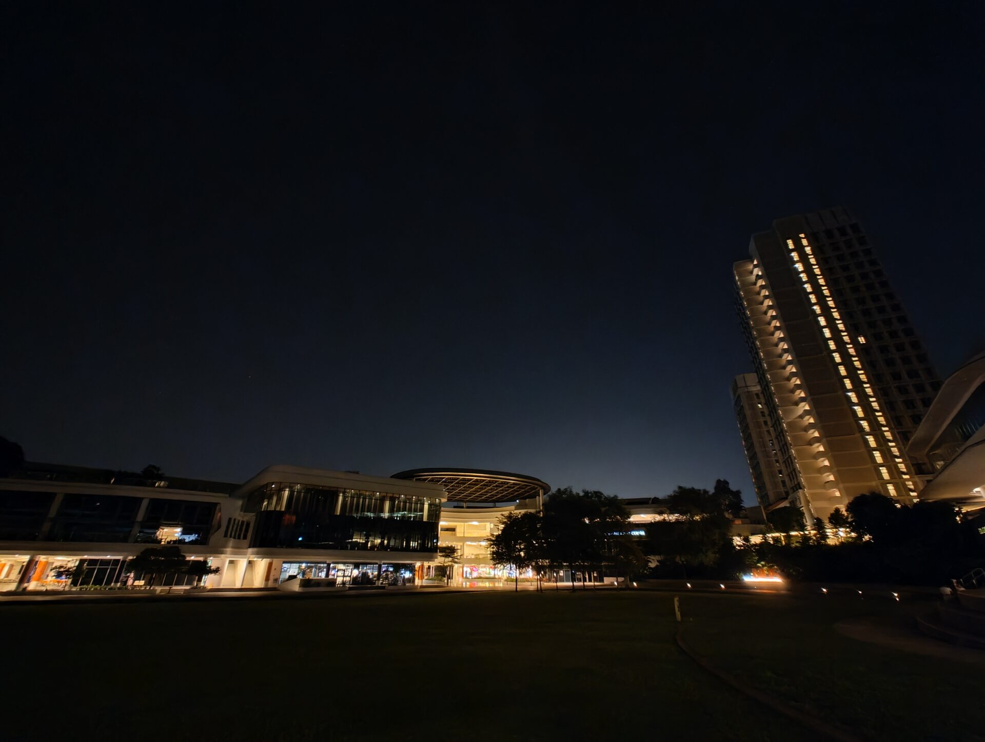
Twilight Green: The wide shot managed detail in the lit areas of the shot without blowing out the colours, but is overall dark and presented a yellowish tint. The ultrawide shot is in focus, though just as yellow and has blotches where the trees are.
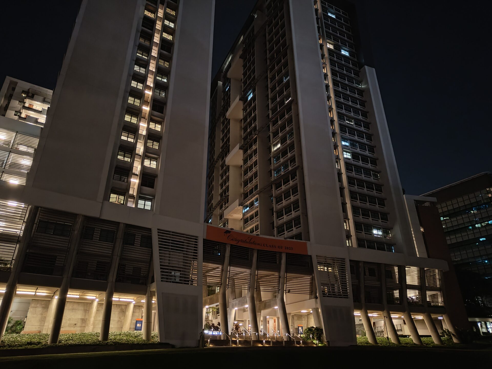
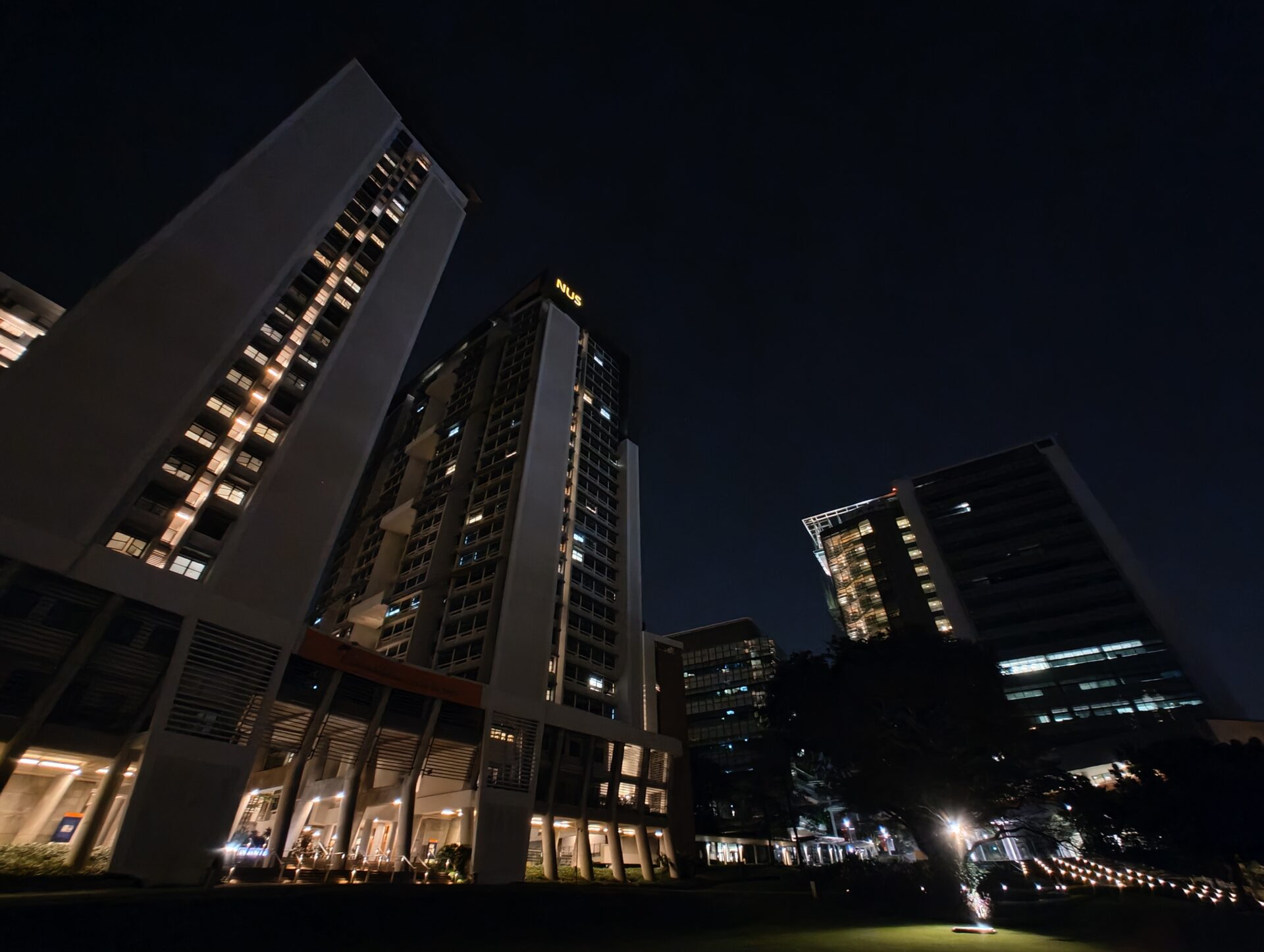
Twilight Talls: Comments are generally similar as the other night shots. Given how every ultrawide shot is pretty much in focus despite the lack of night mode, I just feel the setup has so much more potential if the ultrawide camera is allowed to use light data from a few additional seconds.
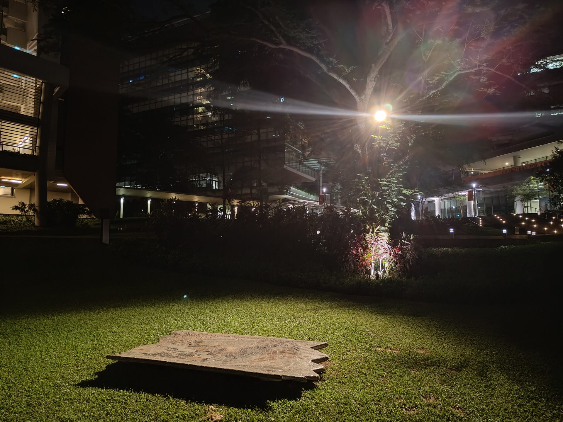
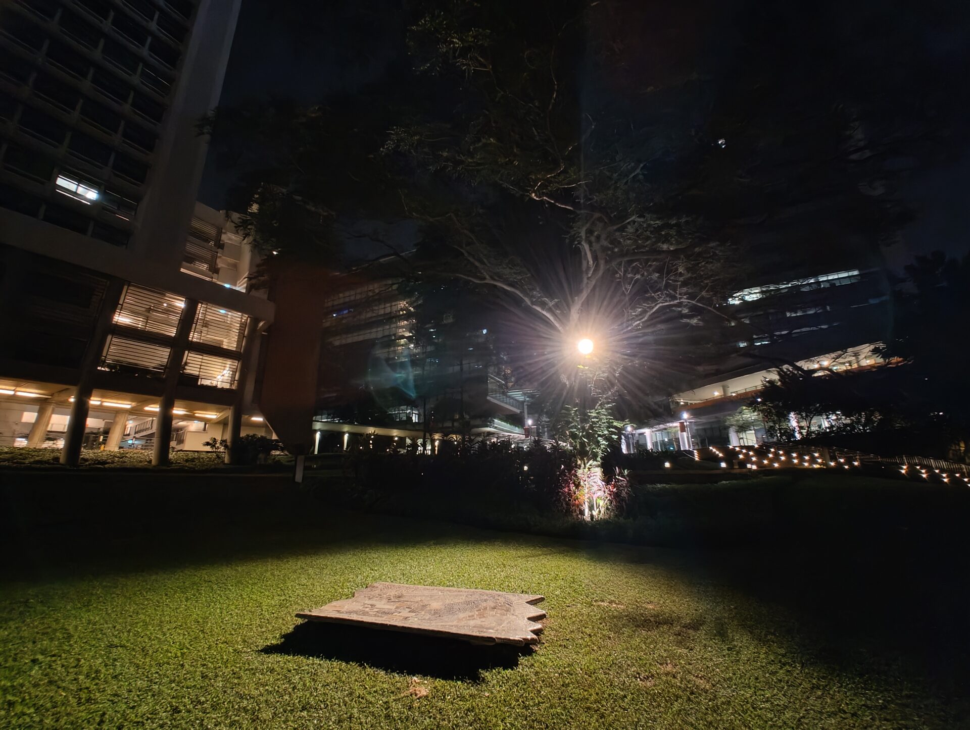
Sampan of Knowledge: In the presence of light, both cameras do great work keeping detail in and with good focus, while maintaining the brightness balance.
Conclusion
The Nothing Phone (2) is a very competent vanilla flagship. The screen is well made, battery life excellent, software well executed, speakers loud.
Its imaging unit works great in the day and is decent at night. While one can live without the Glyph interface, it is an effective imaging illuminator and a handy visual notification tool.
At the same time, the Nothing Phone (2) has a few obvious gotchas. A S$999 device should support night mode on both its cameras. The adaptive brightness is not granular enough.
Plus, ingress protection is midrange rather than flagship grade. These are not showstoppers, but the phone is priced in a competitive segment.
The pros make the phone an easy recommendation, but I will probably buy the Nothing Phone (2) if I can get it for less than the recommended retail price. Or, if and when the ultrawide shooter gains night mode, so you have two competent cameras for the darker half of the day.

