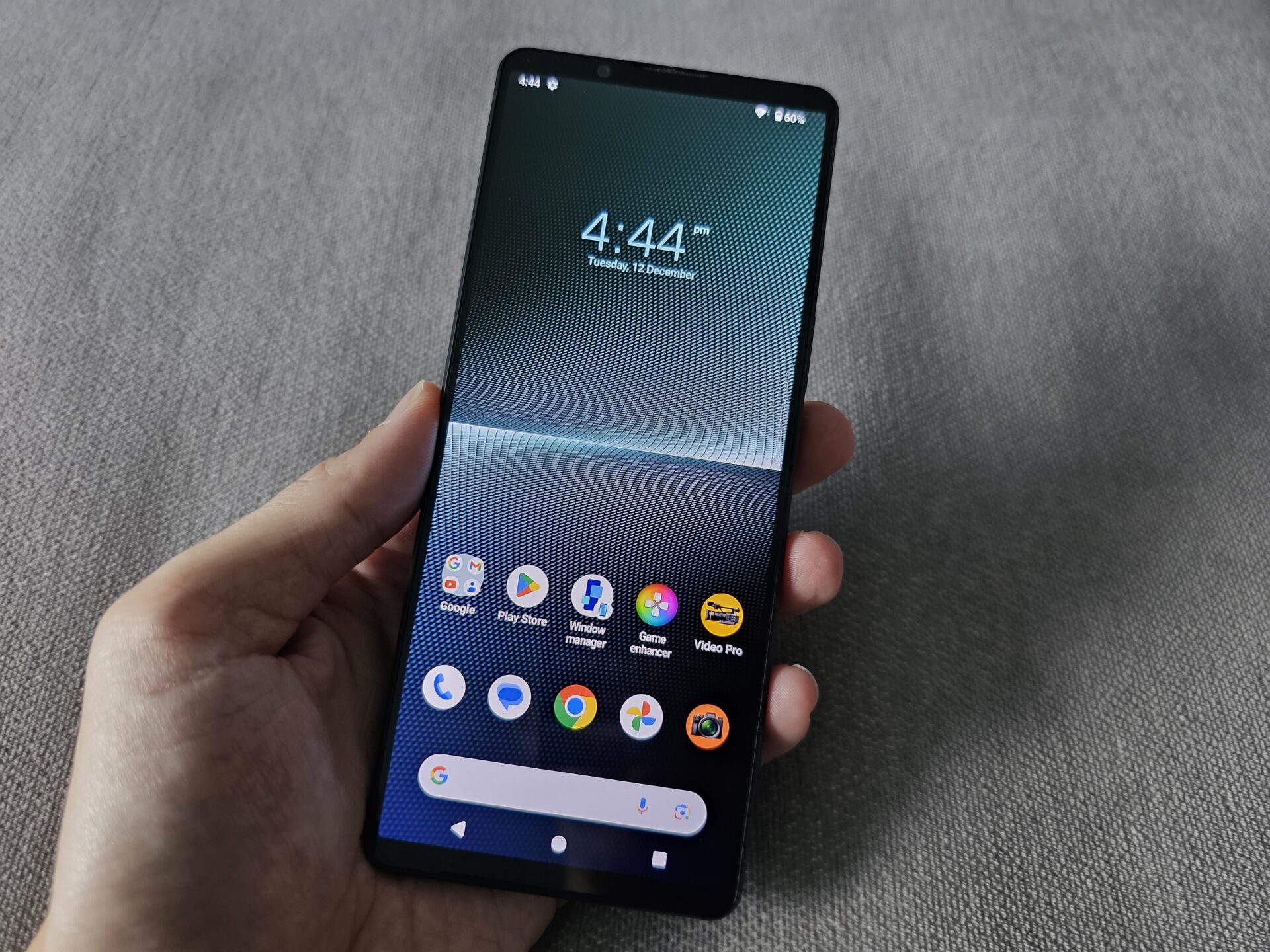
Sony has been at it with their smartphones for a while now – new year, new Xperia, small evolutionary design change, and the same entry-, mid- and high-end series with a different Latin alphabet.
So here I am, looking at the top-of-line Xperia 1 V, going for a stratospheric S$1,939 for 256GB storage (unchanged from Xperia 1 IV).The device gets a whole new textured body that is fingerprint resistant, yet premium and nice to hold.
Standard 2023 flagship internals apply here. You get a top-end Qualcomm Snapdragon 8 Gen 2 chip, 12GB of memory, and a Quad HD OLED display that sticks to a longish 21:9 aspect ratio.
Design
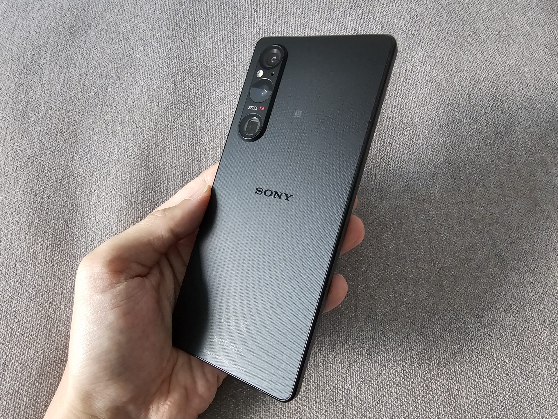
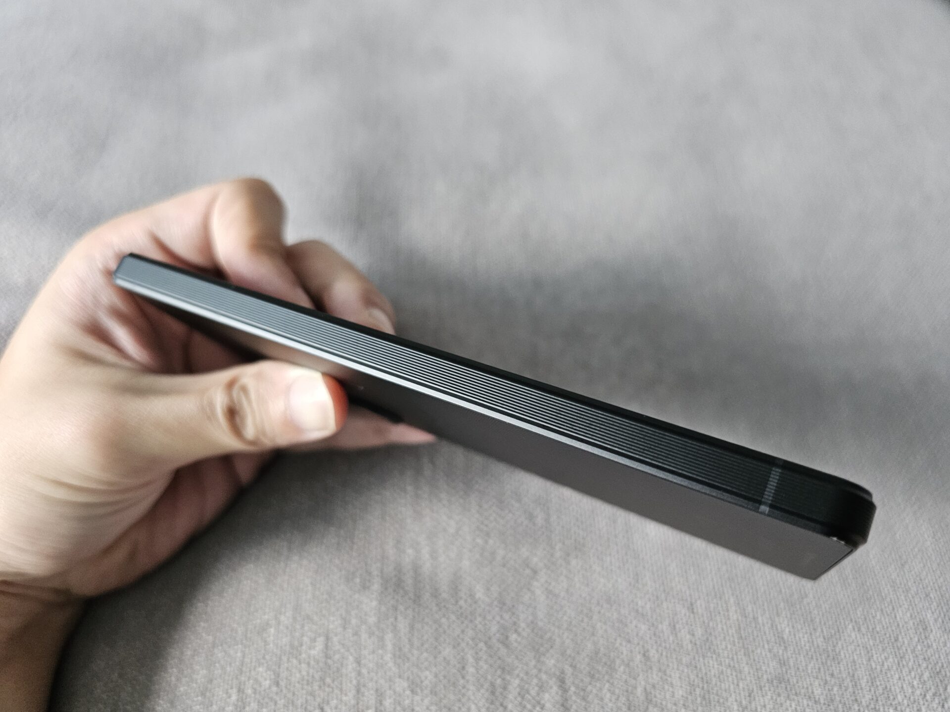
The biggest change this year is the Sony Xperia 1 V’s switch to textured sides and back. I like this a lot. The fine mesh-like pattern is grippy without looking or feeling cheap, nor does it add heft.
The device is now even more fingerprint resistant, which is a win. In fact, the rear of the Xperia 1 V is actually Gorilla Glass Victus, but does not feel that way nor brittle. The aluminium sides are also ridged.
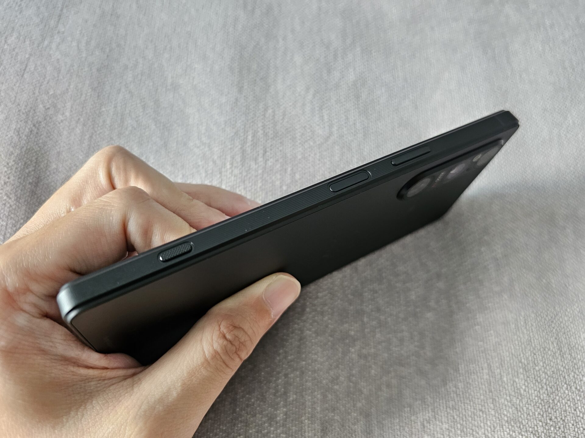
Also different is the choice of packing material. The Xperia 1 V comes in a very flat-packed corrugated paper box with very little within, no doubt part of Sony’s effort for the environment. The new phone’s SIM card compartment, as with earlier Xperias, can be conveniently opened without requiring a pin.

For a device that packs a phablet-like screen, the Xperia 1 V is compact and light, at 165 x 71 x 8.3 mm and weighing 187 grams – nearly 20 grams less than competitors. The corner of the phone has the same shaved sides to make the grip just as comfortable as past years.
Screen
The Xperia 1 V screen sports a high 120Hz refresh rate. The 6.5-inch, 1,644 x 3,840-pixel Quad HD OLED panel comes with a 21:9 aspect ratio. Colours are, frankly, as vibrant as ever.
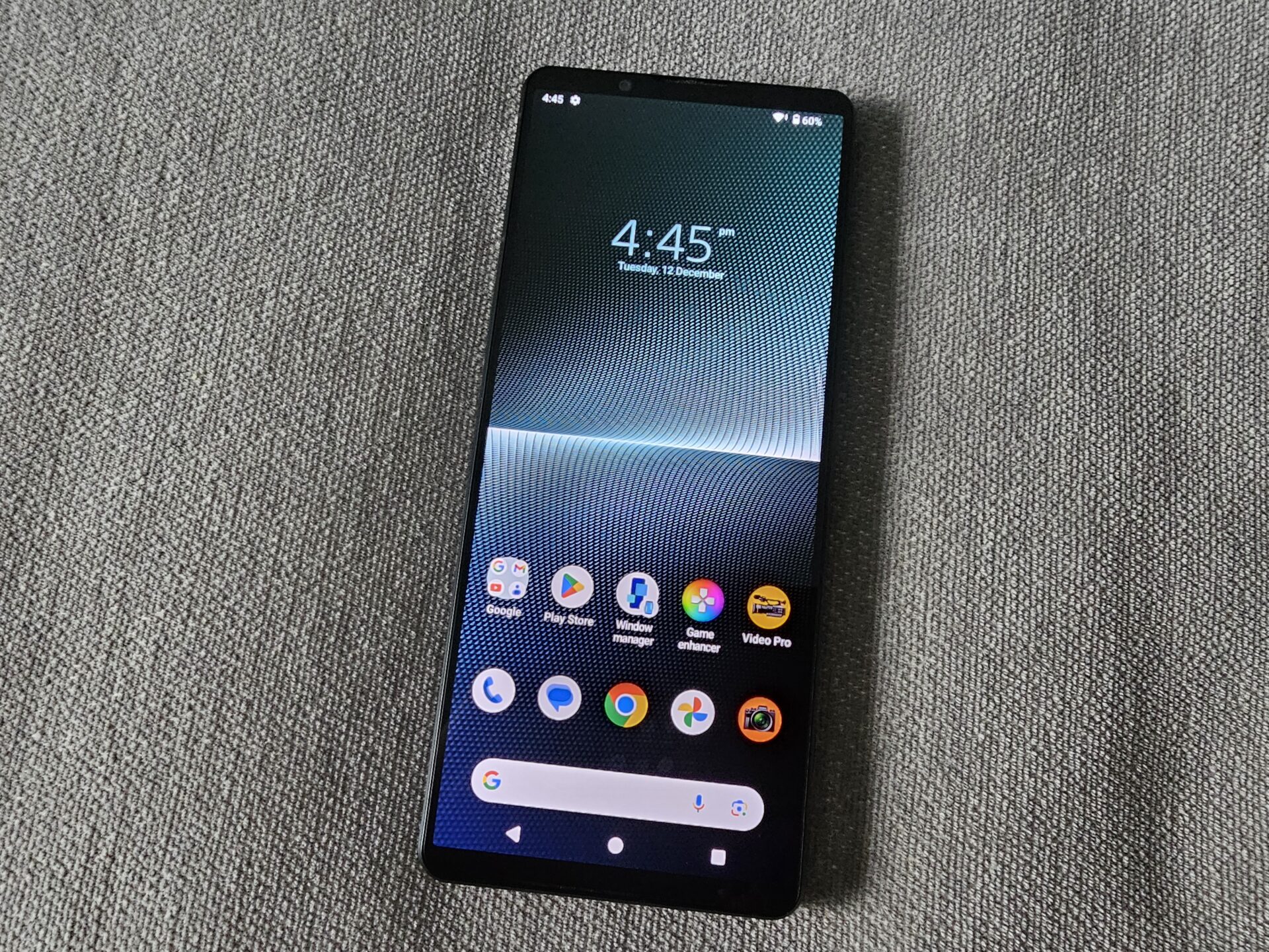
This is a solid Gorilla Glass Victus 2-reinforced display. There is nothing to fault, colours-wise. Sunlight legibility is on a par with the Xperia 1 IV last year – impressive but with not out-of-world maximum brightness.
We measured 1,250 nits from the display when manually adjusting the brightness slider to the maximum, and 1,850 nits when the device is left to automatically manage luminosity on a bright day.
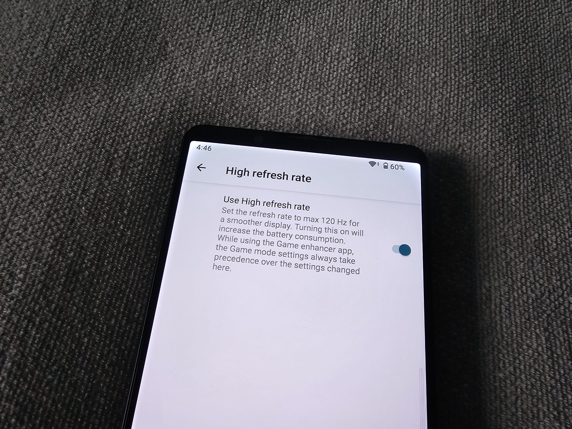
Refresh rates, in my tests, remain locked at 120Hz once the high refresh rate option is activated in the settings menu. An update to the latest OS did not change this. I will keep the high refresh rate display off until the refresh rate is more dynamic.
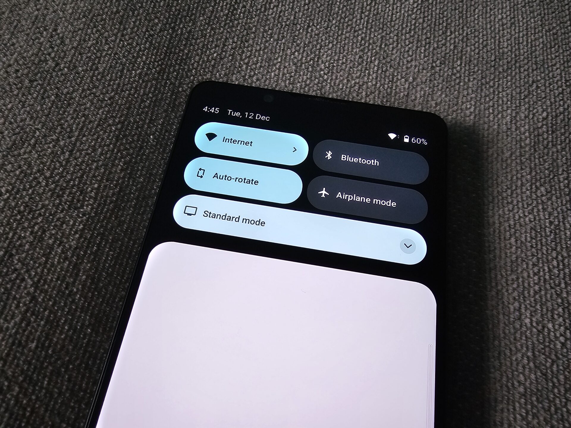
It is clear Sony is using the long aspect ratio to differentiate itself, or hopes to cater to a niche audience who wants to work with a cinematic aspect ratio.
Unfortunately, I am not one of them, and do not like the letterboxing when consuming media content of most kinds. I also do not find the narrower grip very helpful for handiness, as the upper reaches of the display remain a challenge for those with smaller hands.
The Xperia 1 V will be more attractive if it loses the unique screen aspect ratio.
Performance
Like every top-range Android smartphone this season, the Sony Xperia 1 V uses a Qualcomm 8 Gen 2 processor in an eight-core arrangement.
There is one high-performance 3.2GHz Cortex-X3 core and four performance cores – a pair of 2.8 GHz Cortex-A715, and two Cortex-A710 also running at 2.8GHz. Three efficiency Cortex-A510 cores running at 2.0GHz round up the processing complement, with an Adreno 740 graphics core.
I used PCMark 10 for Android’s Work 3.0 Professional to simulate day-to-day performance workloads like browsing the Web, editing photos and videos, and writing and manipulating data. The score averaged 15,650, on a par with other Snapdragon 8 Gen 2 devices.
To test gaming capabilities, I fired up Asphalt 9: Legends. Cutscenes were smooth and the resolution is crisp and the game is responsive.
The anti-aliasing is not perfect, but hardly noticeable when you are enjoying a smooth game. However, while the game adapted to the cinematic resolution, it still feels too wide and too short for gaming.
Testing the phone on 3DMark for Android (Wild Life Extreme), which measures the device’s handling of commonly-used game rendering engines, I got a score of 3,680. Framerates ranged from 20 to 27 frames per second.
Features and Battery
Unlike Apple and Samsung, Sony has retained on the Xperia 1 V the 3.5mm headphone jack, and microSDXC expansion support, courtesy of the second SIM card slot playing double duty. I hope Sony continues this tradition.
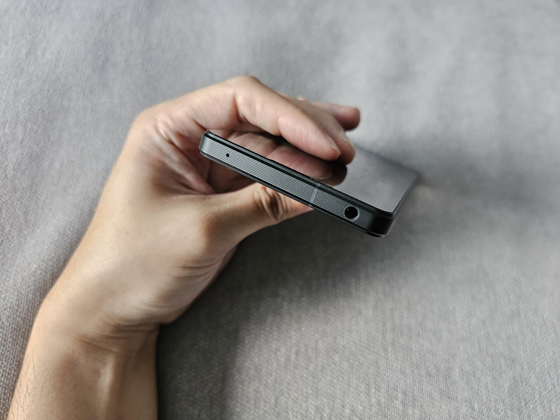
The fingerprint sensor is built into the power button. I find it accurate and quick, and positioned where one grips the device to unlock it. The button is just a little depressed, which feels great when I position my finger to use it.
The Sony Xperia 1 V is IP65- and IP68-rated for dust and water resistance respectively. There are devices that manage IP68 in both categories, but the Xperia 1 V’s rating is ample for everyday use.
The two speakerphones are to the top and bottom of its expansive widescreen, facing the user. This means the sound is more balanced and less likely to be blocked by one’s palms. The sound is loud and clear.
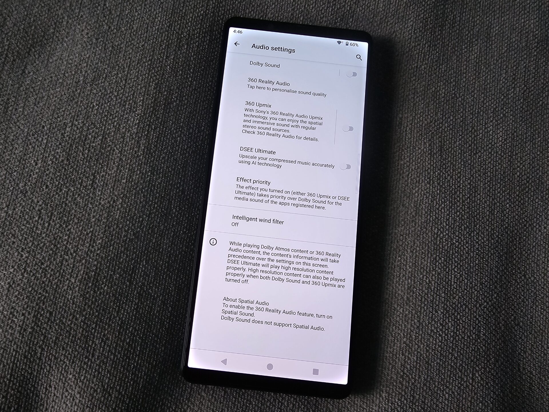
Within the audio settings menu, one is able to turn on Dolby Sound options, that enables aural enhancement features like 360 Reality Audio, 360 Upmix, among others. In my tests, speakerphone performance gets a slight boost, and the effect is most obvious with earpieces plugged in.
My very average pair of Sony earphones produced an audibly better Spotify experience with the enhancements turned on. Good enough for the layman, methinks.
Battery life from the 5,000mAh lithium polymer cell is decent if the high refresh rate is left off. I calibrated the screen to 200 nits brightness, and ran the PCMark 10 for Android’s Work 3.0 Battery Life test with Wi-Fi running throughout.
Results averaged 13 hours and 45 minutes at 60Hz display refresh rate. With high refresh rate turned on, the score came up to a pretty ho-hum 11 hours.
The Sony Xperia 1 V supports 30W wired charging on the USB Power Delivery 3 standard, but has no bundled charger.
Cameras
The Sony Xperia 1 V packs a significant upgrade on its main wide shooter over the Xperia 1 IV. The sensor is 1.7 times larger, and uses a new sensor that arranges its transistor pixels and photodiodes on different layers instead of side by side.
The ultrawide and variable zoom telephoto cameras in the triple-lens array remain unchanged over the predecessor.
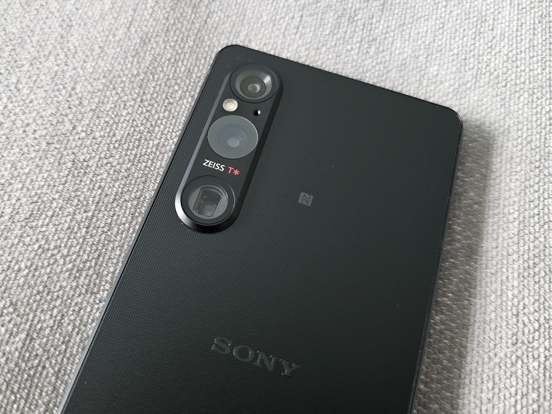
In use, I found the improvements in the main shooter to be most obvious, while the other cameras remain pretty similar to last year’s, including a tendency for Sony’s colour science to render some shots more washed out.
Wide: 48 MP, f/1.9, 24mm, 1/1.35″ sensor, 1.12µm pixels, Dual Pixel phase detect autofocus, optical image stabilisation
Telephoto: 12 MP, f/2.3, 85mm; f/2.8, 125mm; 1/3.5″ sensor, Dual Pixel phase detect autofocus, 3.5x-5.2x continuous optical zoom, optical image stabilisation
Ultrawide: 12 MP, f/2.2, 16mm, 1/2.5″ sensor, Dual Pixel phase detect autofocus
Selfie: 12 MP, f/2.0, 24mm, 1/2.9″ sensor, 1.25µm pixels


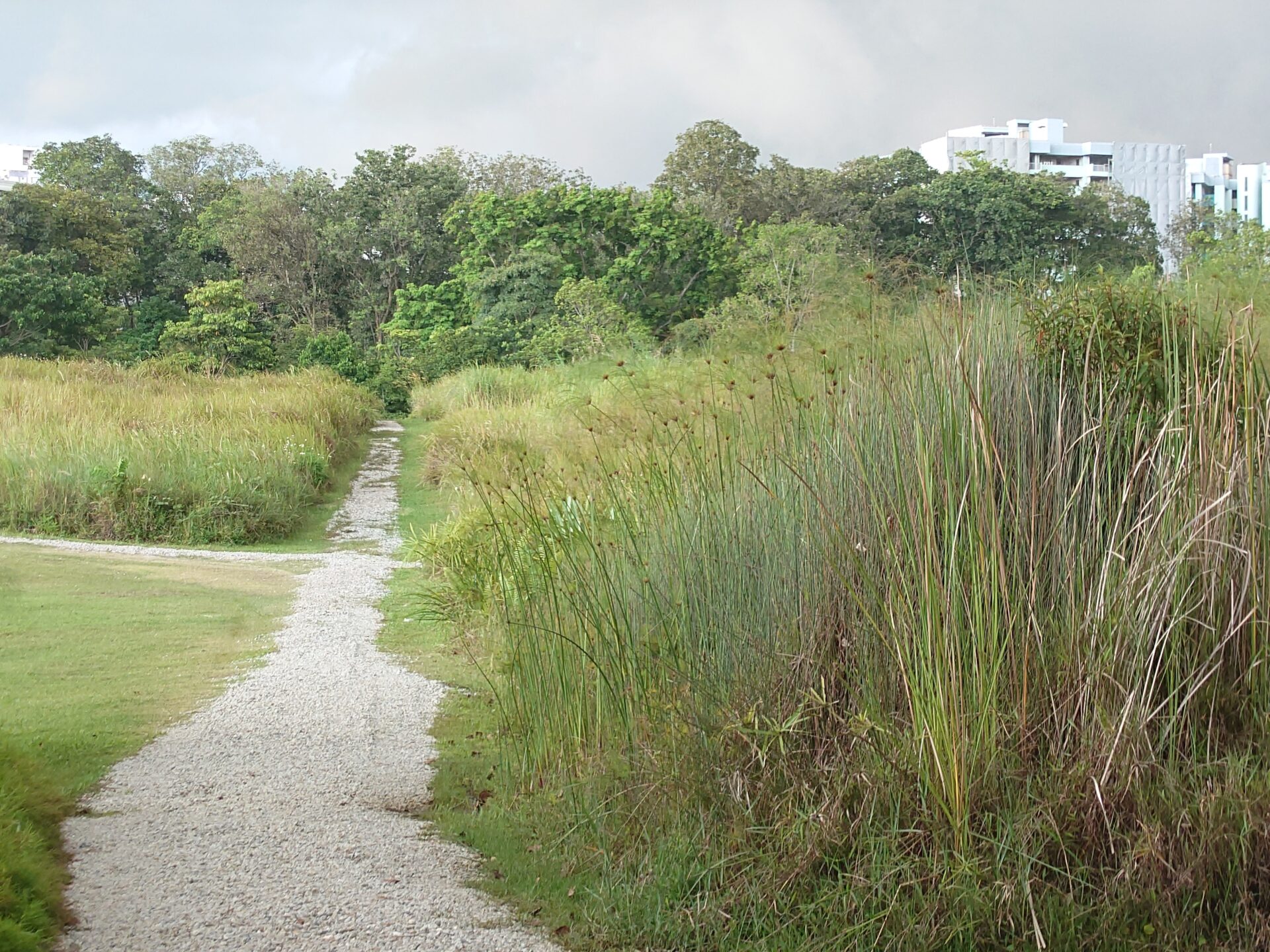

Clearing or Gathering – This is taken as the dark clouds rapidly gathered over sunny skies in the late afternoon, a very common occurrence this December. It may not be completely obvious from the pictures, but there was still plenty of light.
In the ultrawide shot, there is some softness in overall detail, but not much distortion. Resolved detail is perceptibly better in the wide and telephoto shots, especially among the tall grass.
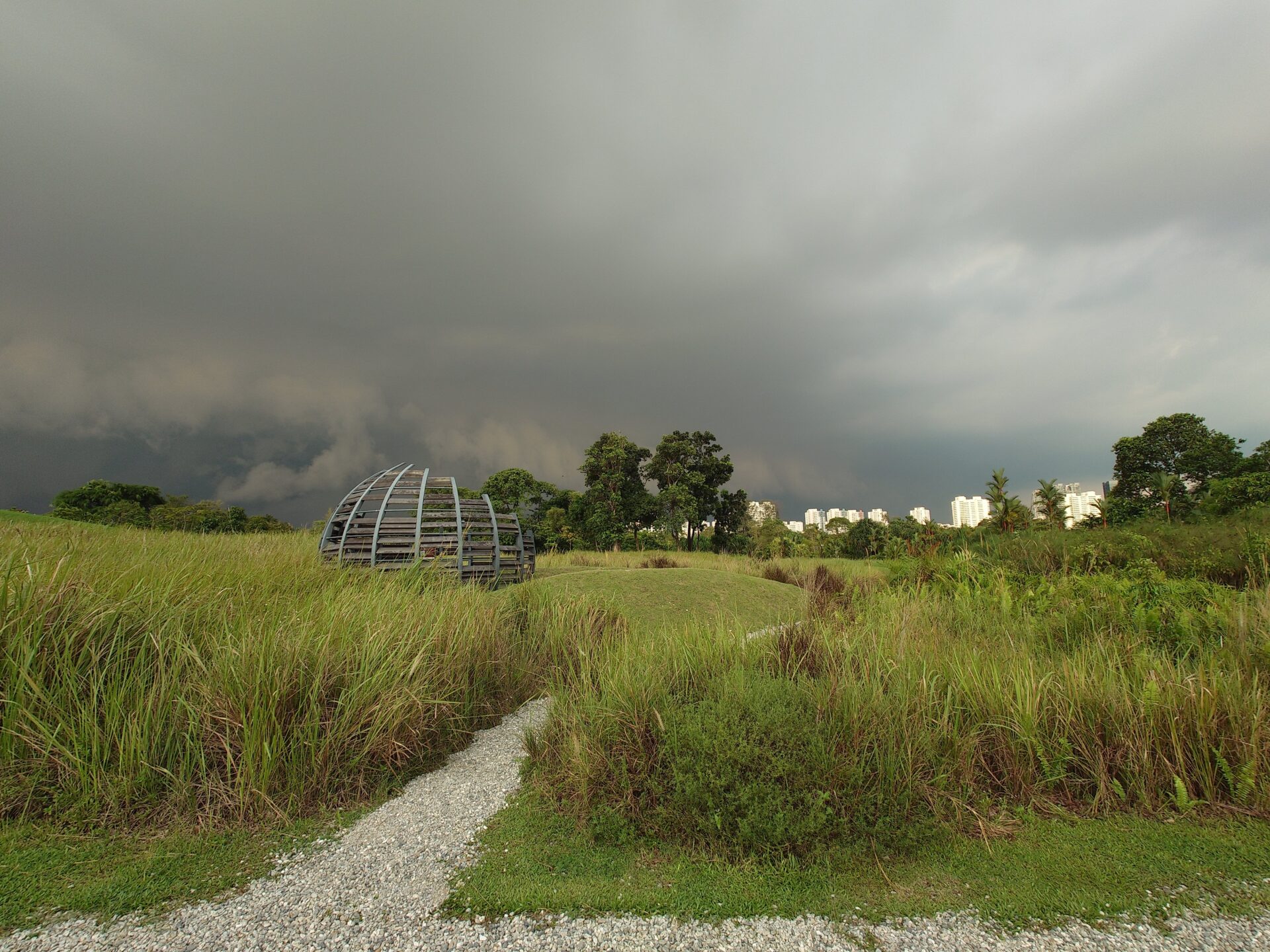


Hideout and Mounds – The ultrawide shot here fared better in detail resolution despite similar conditions as the earlier shots. For the wide shot, you are able to make out individual strands of tall grass and pebbles comfortably, as well as the weathering on the planks of the bird hide.
For the telephoto shots, you can almost feel that the cameras’ focus is on the tall grass rather than the hide. It appears that novice shooters like myself need to be careful which part of the shot to focus on.
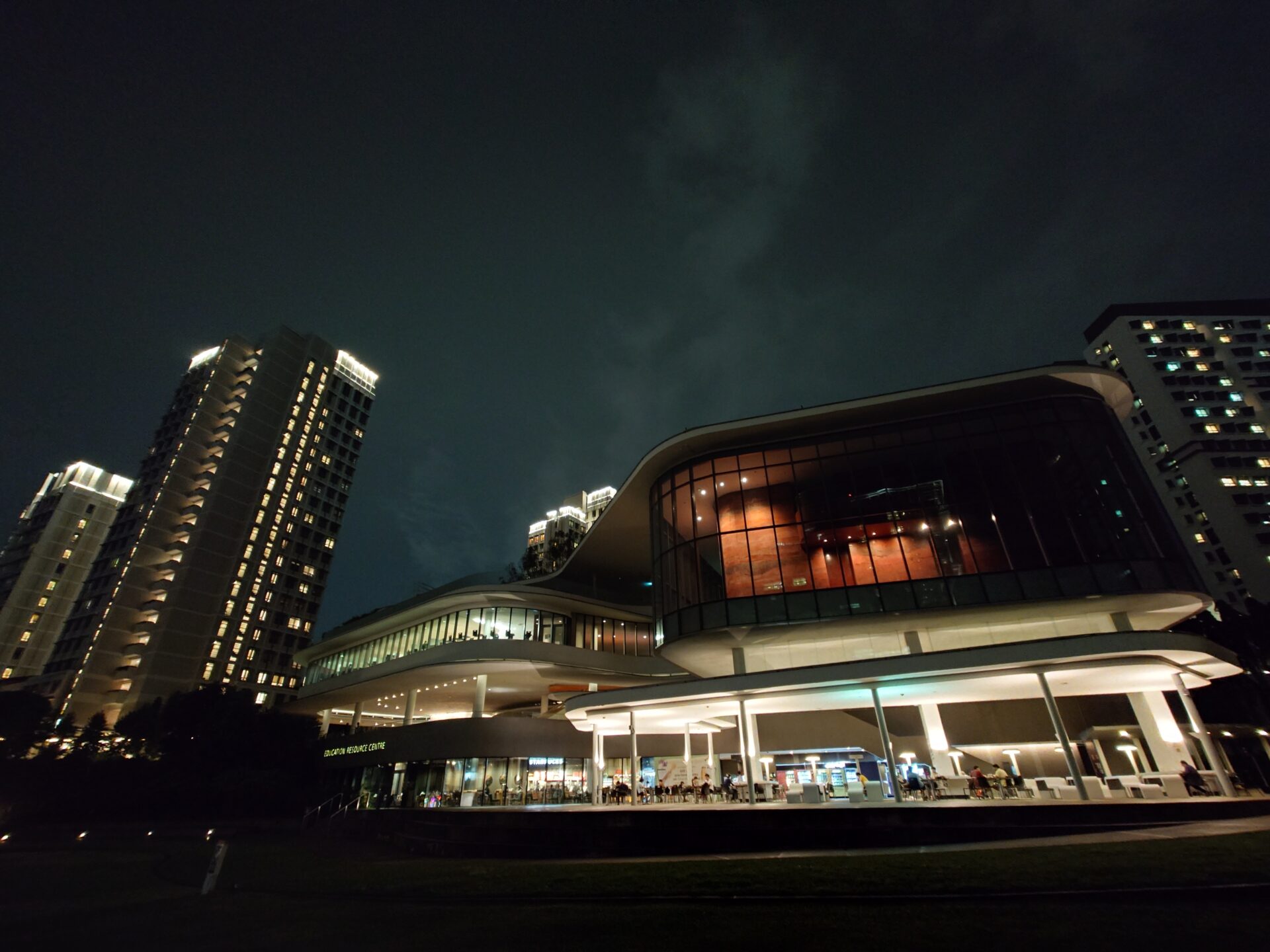
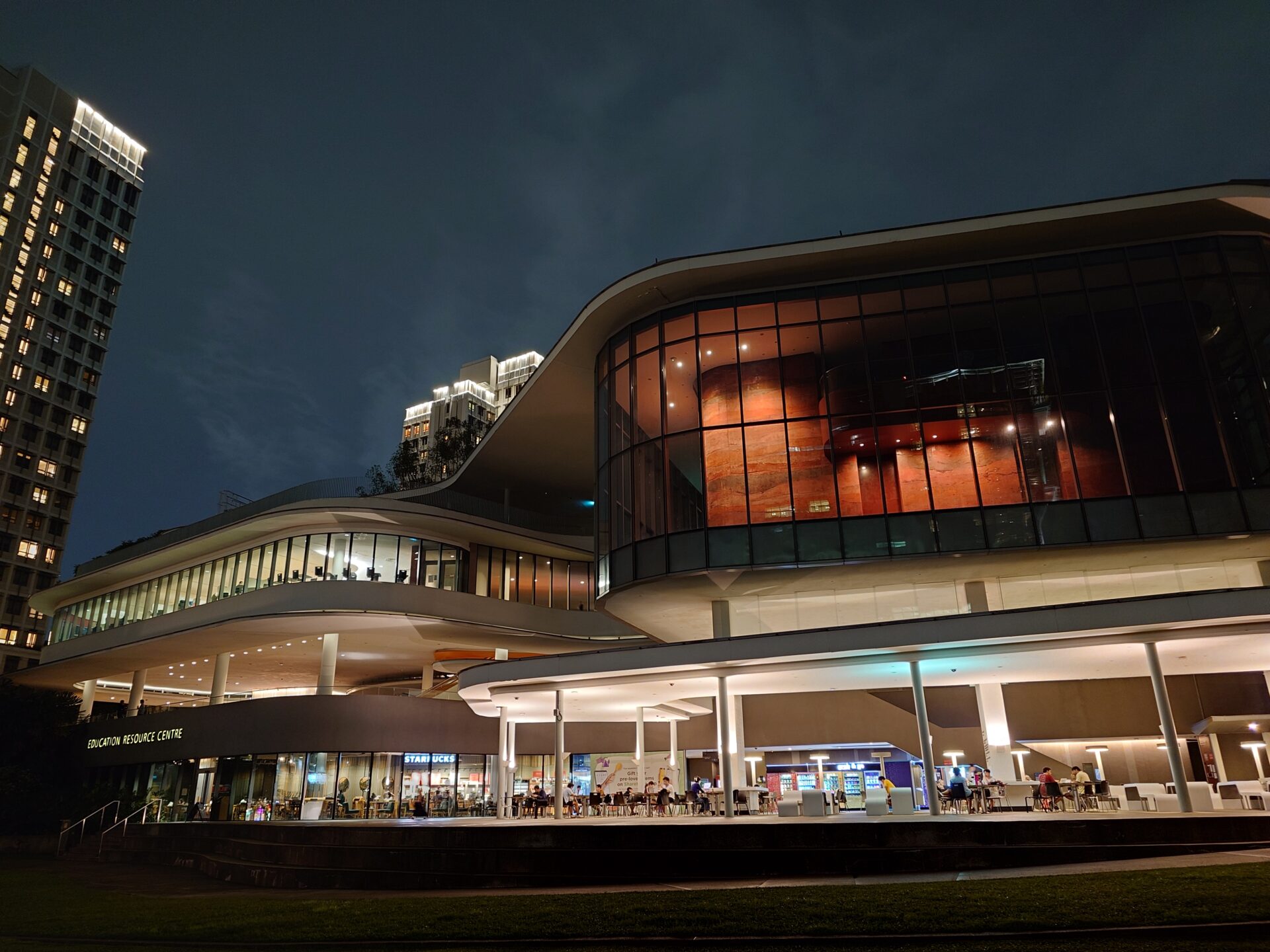


Midnight Mug – The ultrawide shot felt dark overall despite night-mode magic in play. The wide shot looked much better in comparison, with plenty of light, colours in good balance and good detail. The telephoto shots of the terracotta walls of the auditorium feels washed out, worse on the 5x telephoto shot as details feel blurrier on it than on the 3x shot.
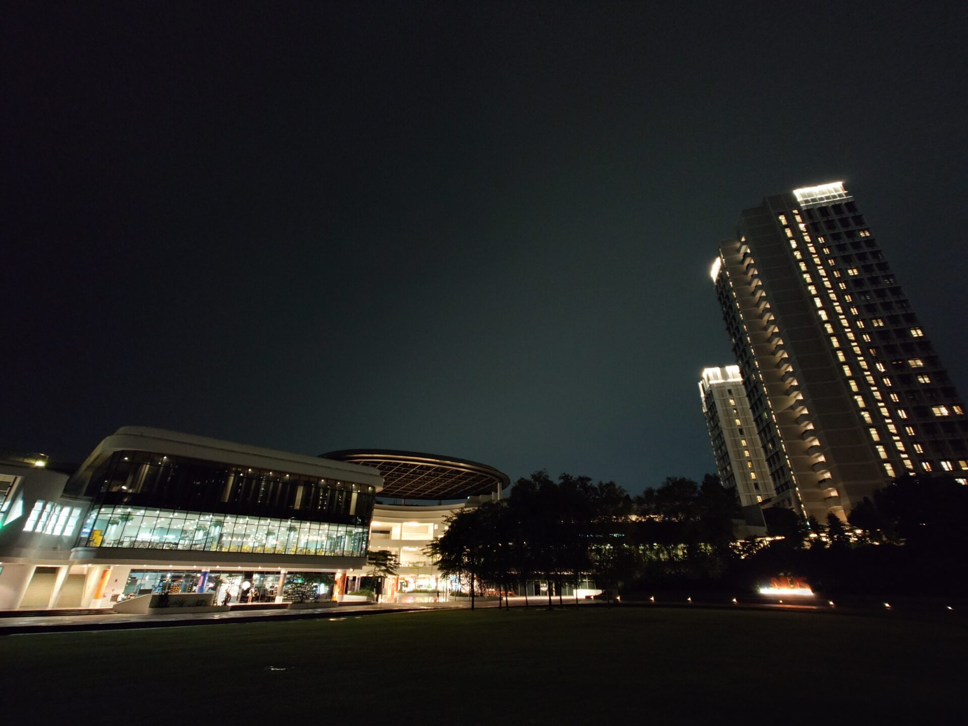
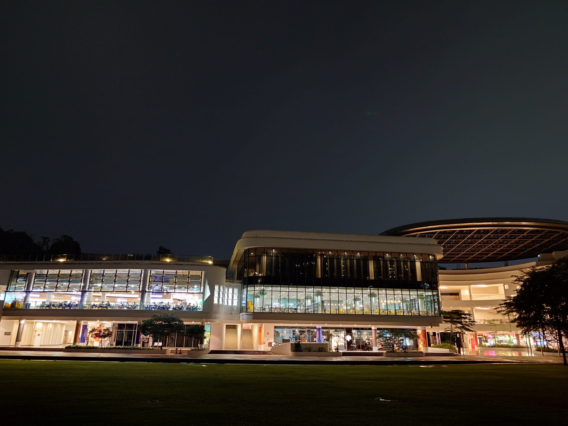
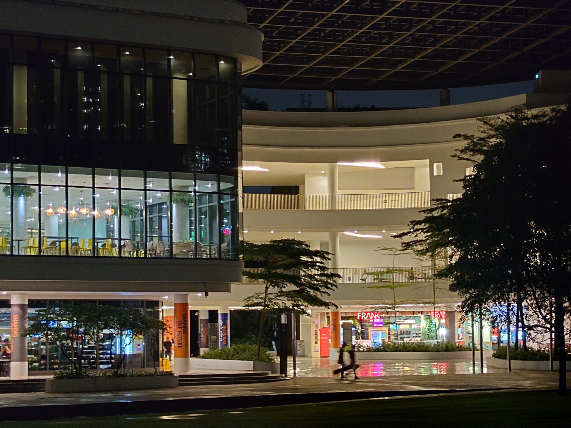
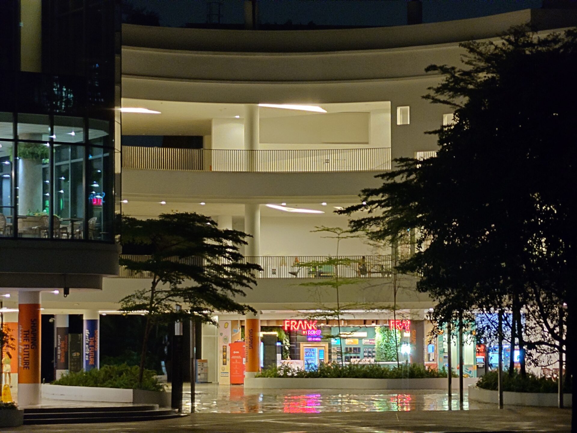
Twilight Green – I thought the ultrawide did a pretty good job in detailing the lit food court seating area on the left of shot, though sharpness of the warmer corridors to the right did suffer – perhaps again highlighting the need to pick the right area of focus.
The wide shot is again a tour de force of how to get a night shot right, presenting cool and warm colour balances tastefully without losing much detail. The telephoto shots sacrifice detail for proper lighting and balance.
Conclusion
On the whole, the display and responsiveness of the Sony Xperia 1 V are top notch. The device feels premium to touch and comfortable to grip, in a way that recognises the ergonomics of how one holds a phone. You can almost feel (literally) the Japanese dedication to refinement.
There is also a 3.5mm audio jack and microSDXC slot, and the new Sony phone is among the lightest of its type.
At the same time, the cinematic aspect ratio remains polarising – I’d rather Sony drop it in future models. The camera improvements are also not drastic – I wish the variable zoom goes beyond the narrow 3x to 5x band. Neither is the new phone the cheapest around.
To be sure, this is a phone I can recommend if you can find it for a lot less than the sticker price. However, after trying many variants of Xperias over the years, I hope Sony will rethink some features of the line in the next model.
The Sony Xperia 1 V has gotten better – that’s for sure – and I wish it came at a good price and aspect ratio to recommend heartily to anyone opposed to the Apple-Samsung near-duopoly.
