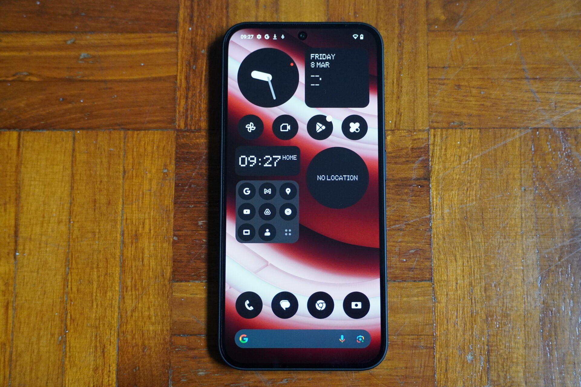
Pardon the unconventional names here but there’s obviously a formula that works for the new Nothing Phone (2a) from the British-based electronics company started by Carl Pei, once of rival OnePlus.
The company certainly expects its fans to like this mid-priced model, which is a followup to the earlier Phone (2) flagship out last year.
Unveiled earlier this month, the S$498 Nothing Phone (2a) looks to retain the best of its bigger brother while dropping non-essential bells and whistles.
Notably, the new phone has a wide-ultrawide camera setup, which is not that common at this price range unless it’s from a fiercely competitive mainland Chinese brand.
Design
Without picking up the Phone (2a), you’d find that the flat front and rounded sides share an uncanny resemblance to an Apple iPhone 15 Pro Max. Yes, down to its 161.7 x 76.3 x 8.6 mm dimensions (the iPhone 15 Pro Max is just 2cm taller).
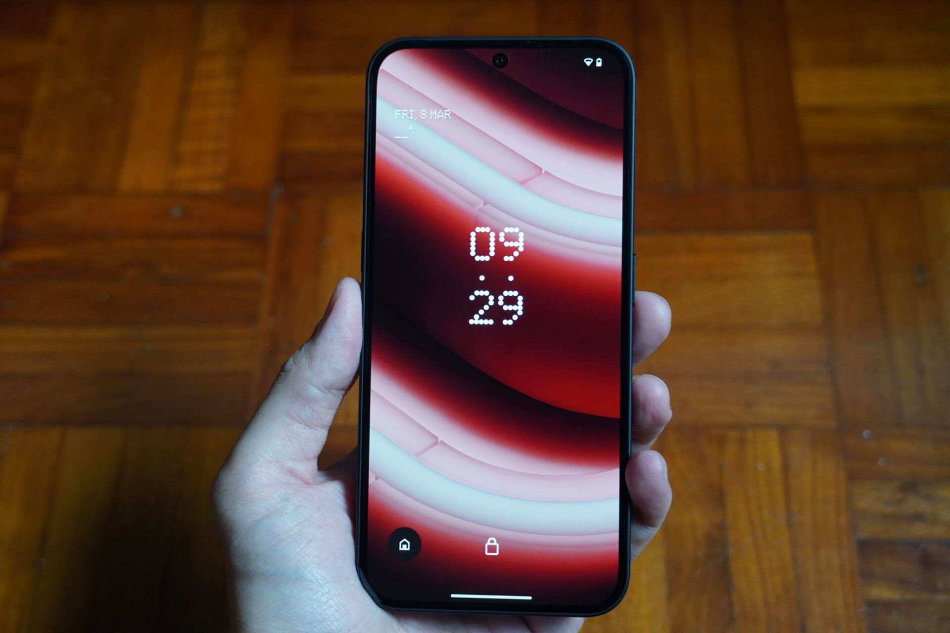
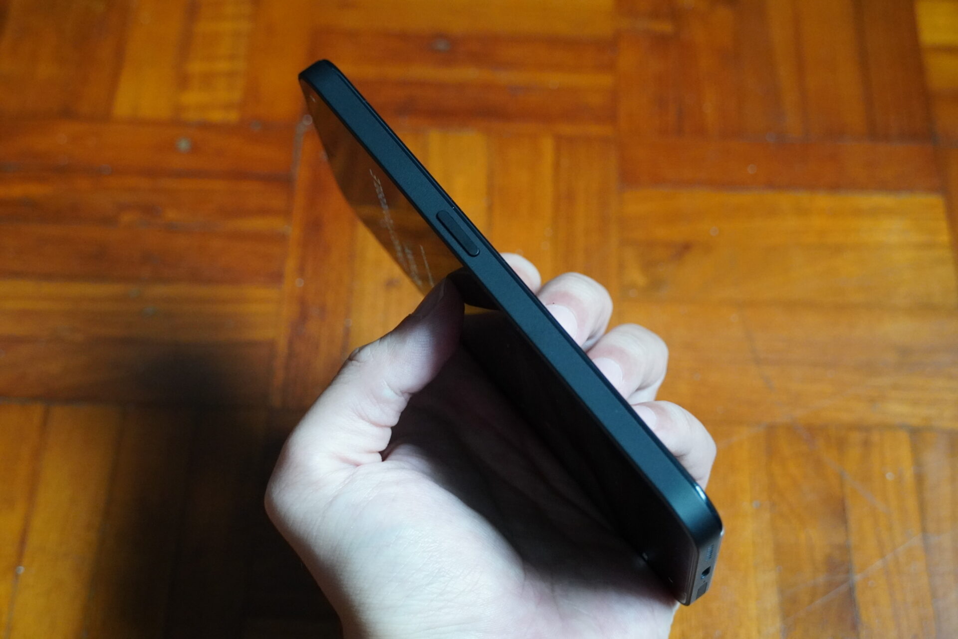
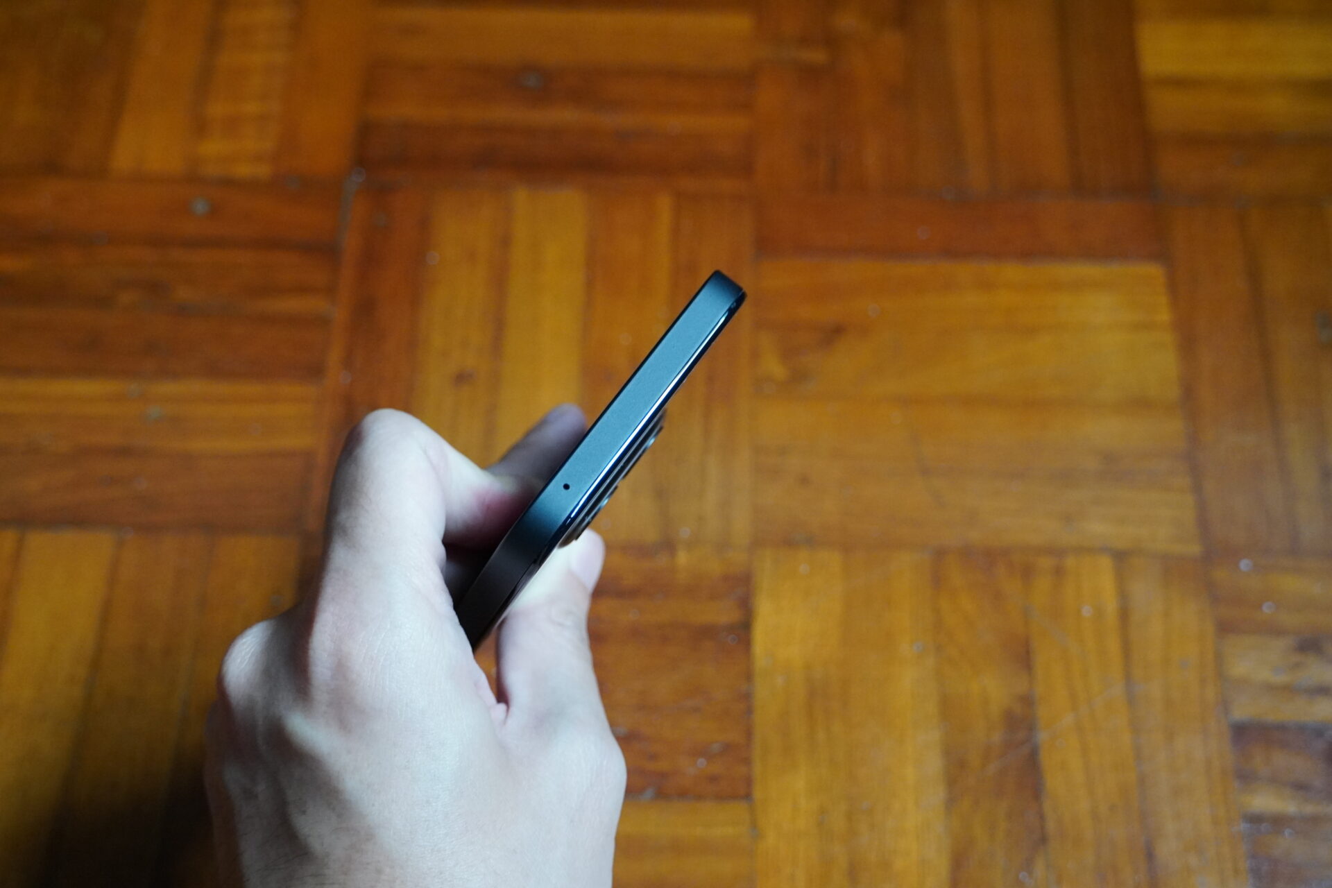
Pick up the 190-gram device, however, and the difference is clear. The sides of the phone carry a powdered matte finish that is fingerprint resistant.
It is actually plastic, but neither glossy nor cheap. I prefer this over a slippery metal or glass finish on flagships, anytime.
The Apple-esque curvature on the corners also means the Phone (2a) does not cut into your palms. The hand-feel of the device is incredible, and I love it.
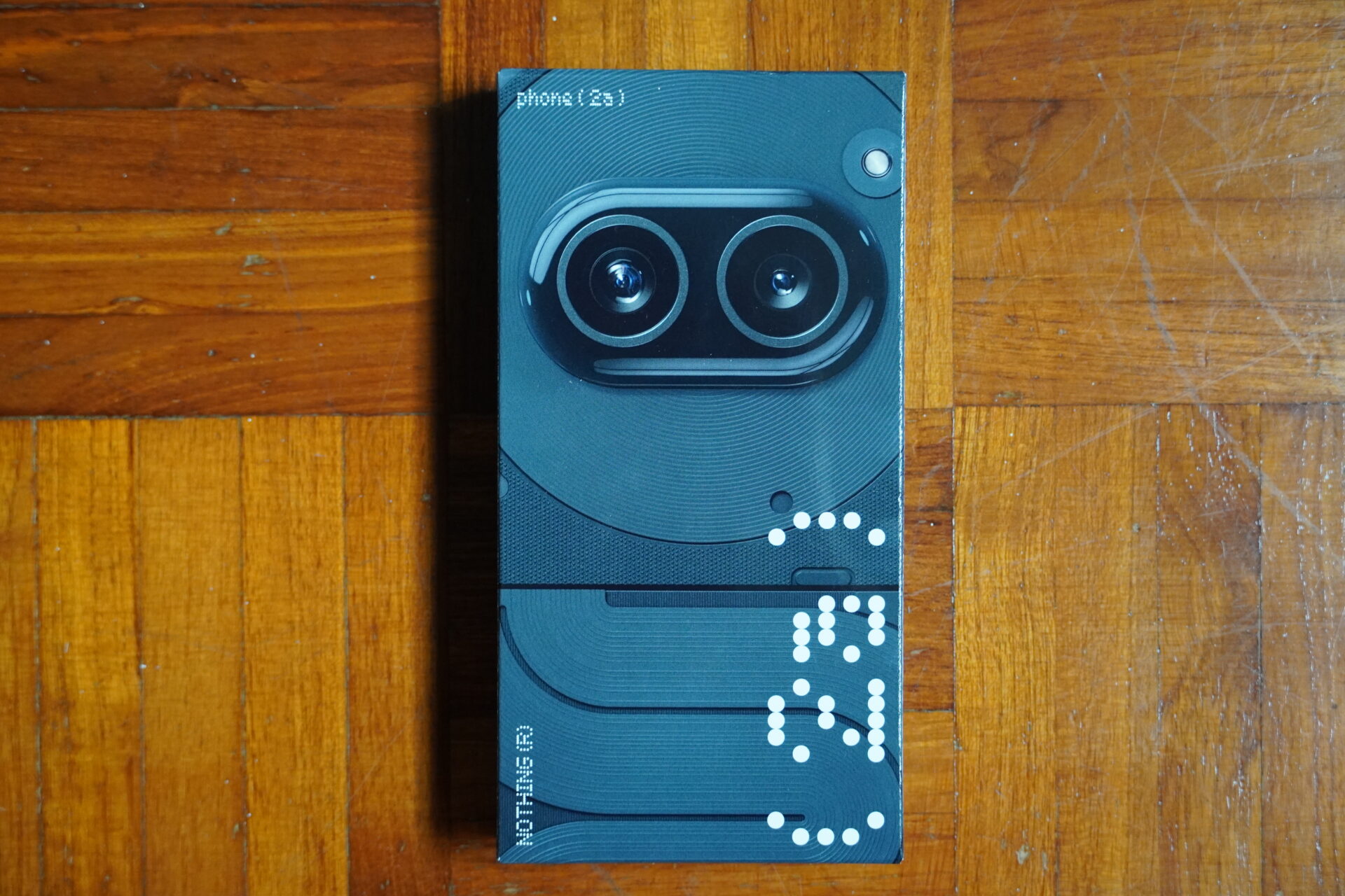
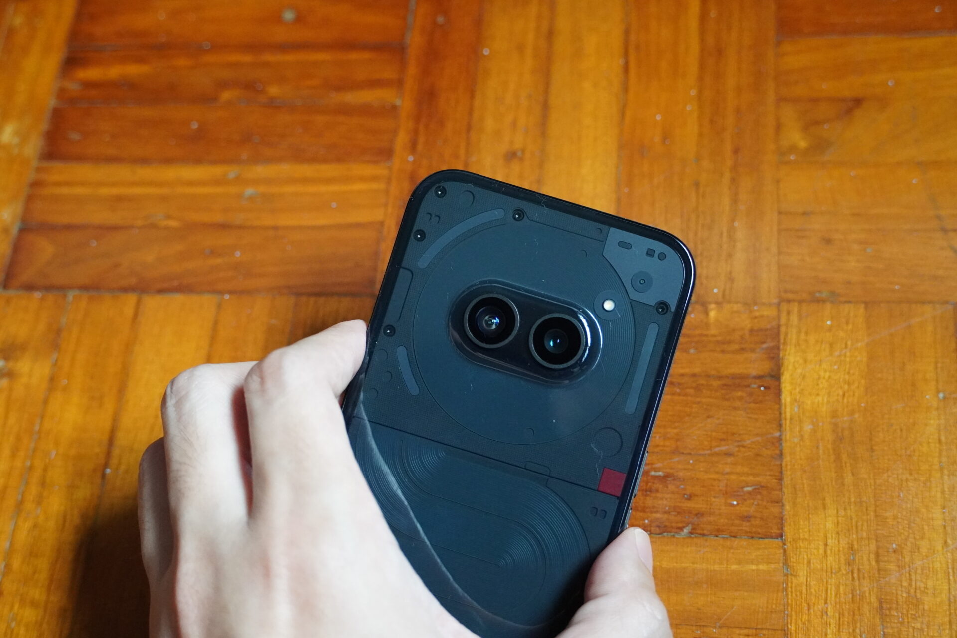
The back of the phone is covered in a semi-translucent clear plastic and tinted black on our review unit. This facilitates Nothing’s trademark Glyph functionality.
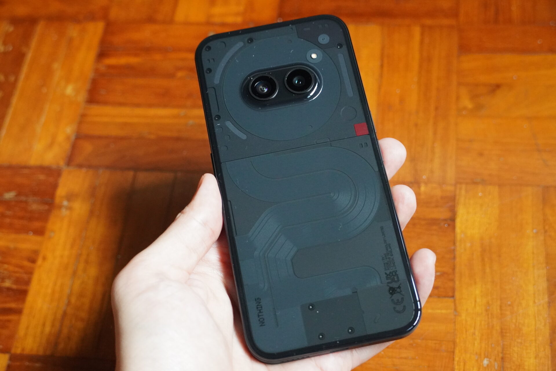
The wire coil setup on the back of Phone (2a) is shaped like a cute droid robot, and the two-lens camera unit is positioned in the upper orb where its face is.
The eyes of the droid are thus effectively represented by the camera module. Brownie points here for the cute design.
Our review unit came with a clear case from Nothing itself. It offers ample side protection without being too bulky, and is well worth considering.
Screen
The Nothing Phone (2a) packs a 6.7-inch Full HD AMOLED screen with 120Hz refresh rate. The aspect ratio is a standard-but-longish 20:9 with 1080 x 2412 pixels.
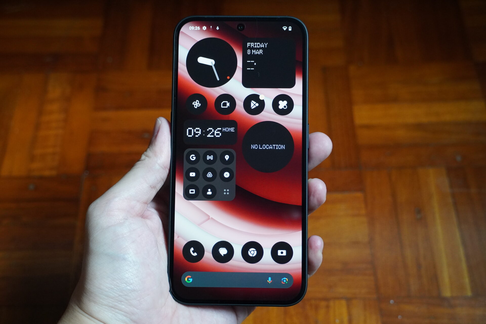
It is excellent for a smartphone costing less than half a grand (in Singapore dollars). Viewing angles and colours are every bit as great as it is on the Nothing Phone (2) that costs twice as much.
The new phone is not the brightest, though. I tested 1,430 nits with the display set to maximum brightness, adaptive brightness or otherwise.
While higher than the levels claimed by Nothing, the screen under direct sun remains a shade dim with its reflectivity, especially next to top performers.
The screen is angled at the very edges where the bezels are, so the glass does not cut into one’s palms. The display is protected with Corning Gorilla Glass 5. Very decent, even if not the latest and greatest.
As for dynamic refresh rates, in my tests, the Phone (2a) would mostly remain at 120Hz, except when playing games and YouTube videos where it drops to 60Hz. The device defaults to 90Hz when scrolling websites and social media.
Performance and Glyph
Instead of a top-range Qualcomm Snapdragon 8+ Gen 1, the Nothing Phone (2a) packs a “middle-upper” Mediatek Dimensity 7200 Pro processor with a Mali-G610 MC4 graphics core.
The device is surprisingly responsive for a mid-range phone. At no point did I feel I had to wait for the phone to pull up something I tapped on, except when it optimised images taken by the camera. Kudos to the Nothing team for doing a great job with the software.
To test gaming capabilities, I fired up Asphalt 9: Legends. Cutscenes were smooth. The anti-aliasing is not perfect, but the game played very smoothly and without hiccup.
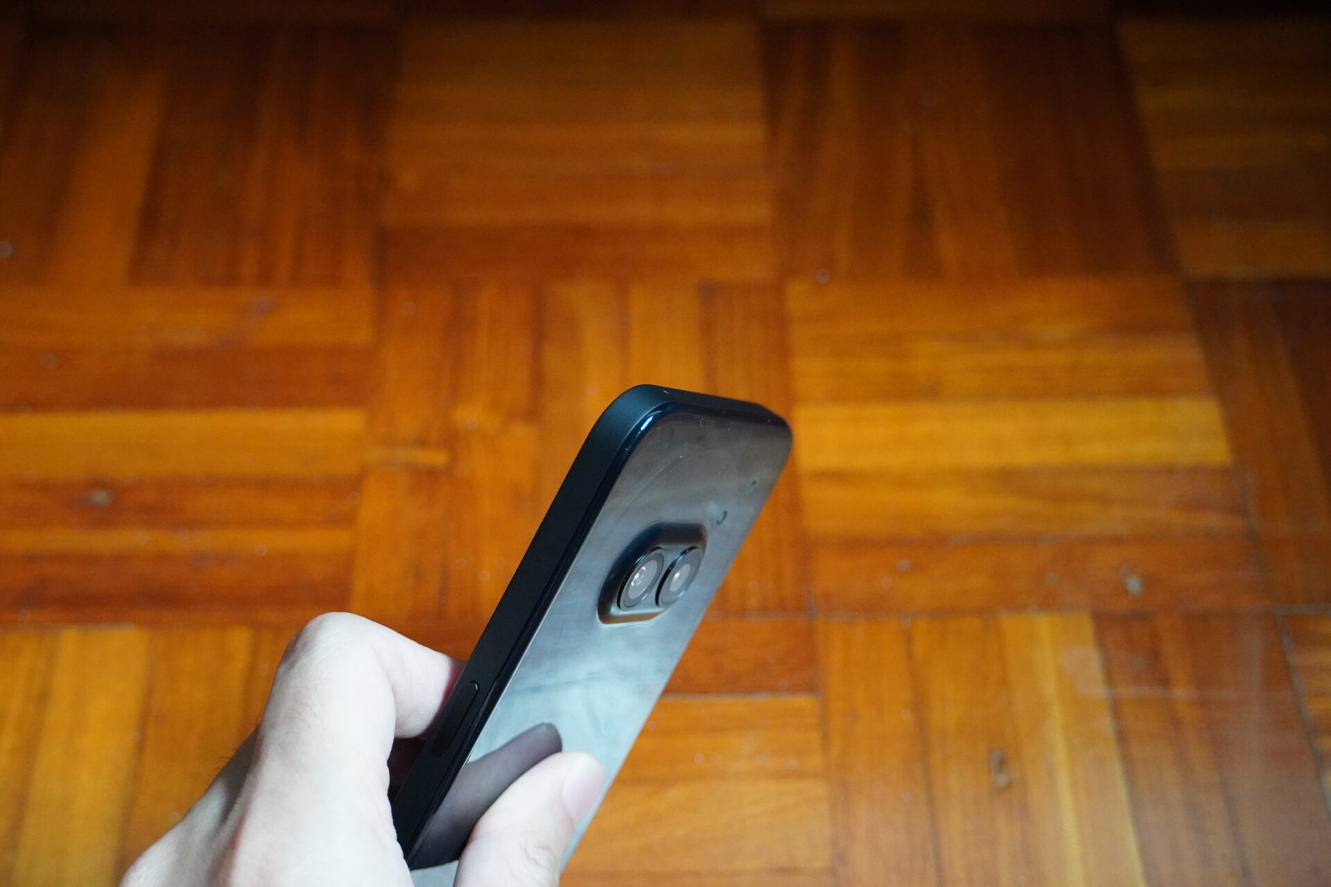
The Glyph setup here is similar to the implementation on Phone (2) except just three LED strips remain. They make up the outline of the “robot droid’s” head.
These are good to complement ring notifications, and as a countdown timer and volume indicator.
The design also continues to be a unique differentiator when used as a brighter-yet-less-glaring fill light for photos and videos.
Features and battery
A word on the Nothing OS interface. I love the monochrome, digital look and feel of it, and it also runs light without bloat.
However, Nothing should automatically skin all app icons into a black and white palette and not just the compatible ones, so the app drawer does not carry a jarring mix of monochrome and multi-colour icons.
A simple tool to edit different parts of an app icon into black or white will be all one needs to modify things, if the software did not do so properly.
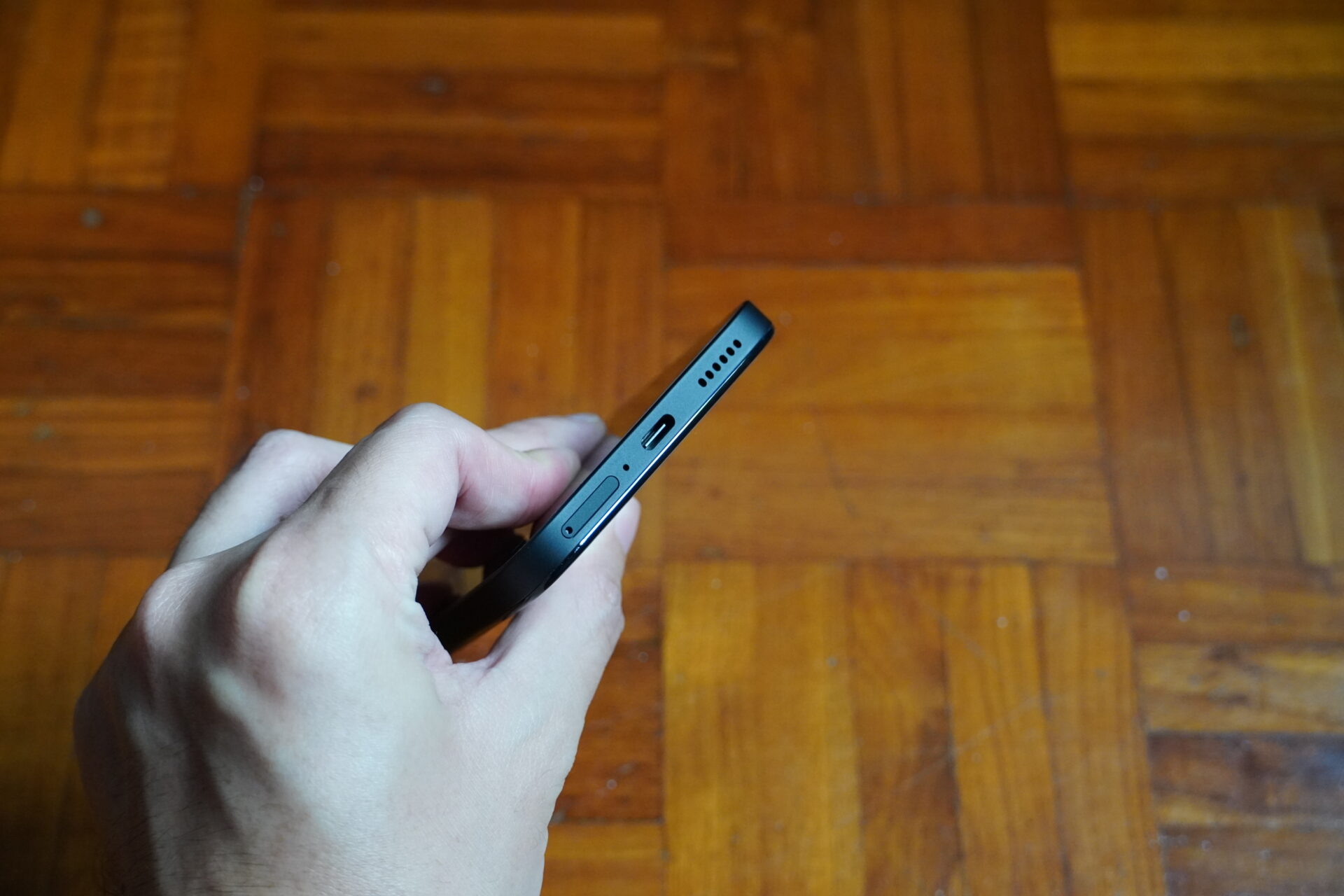
Nothing is conventional with the layout on the bottom rail. The new Nothing phone’s SIM card tray holds two SIM cards, no microSD card, and needs to be ejected with a pin.
The bottom speakers share the space with the USB-C charging port. The sound was loud, and crisper than the flagships I have tested. There is no 3.5mm jack.
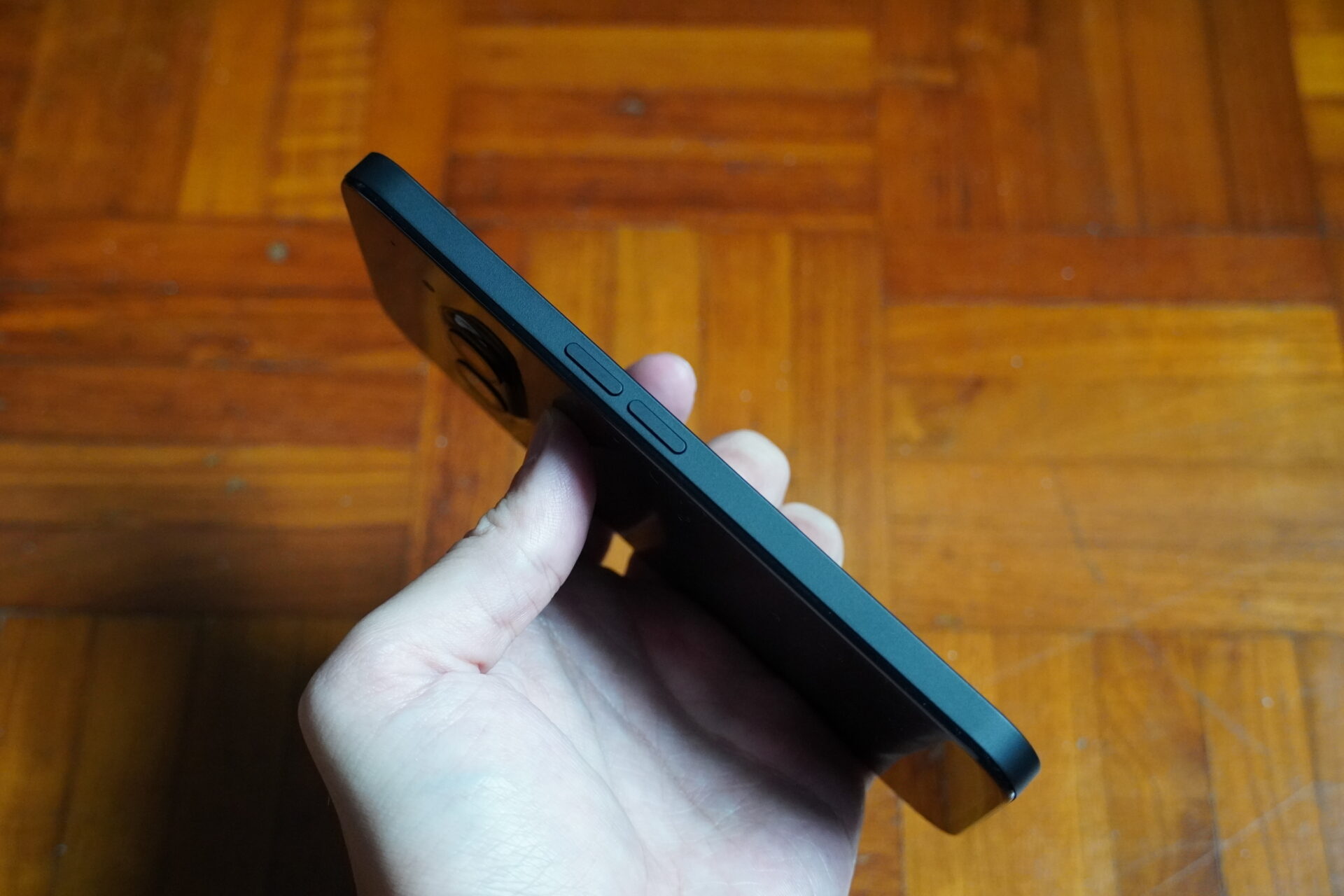
The fingerprint sensor is fitted into the lowest decile of the display. It is accurate and quick, just not the best position when you’re holding onto the phone.
The phone is IP54-rated for splash, water and dust resistance. It cannot be submerged like more expensive flagships, but has ingress ratings comparable to rival phones in the same price class.
Battery life from the 5,000mAh lithium polymer cell is good thanks to the mid-range processor.
I calibrated the screen to 200 nits brightness, and ran the PCMark 10 for Android’s Work 3.0 Battery Life test with Wi-Fi running throughout. With dynamic refresh turned on, the device lasted 14h 35mins.
The Phone (2a) supports 45W wired charging on the USB Power Delivery 3 standard and includes a USB-C cable, but has no bundled charger.
Cameras
Here’s where the Phone (2a) differs from its more expensive flagship brethren. The two-camera setup on the Phone (2a) is more basic compared to the Phone (2).
The new phone comes with the following imaging setup:
- Wide: 50 MP, f/1.9, 1/1.56″ sensor, PDAF, OIS
- Ultrawide: 50 MP, f/2.2, 114˚ field-of-view, 1/2.76″ sensor, 0.64µm pixels
- Selfie: 32 MP, f/2.2, 1/2.74″ sensor
The cameras do a great job getting images in focus, more than ample for one to see what was shot without issue. Still, the smaller sensors captured noticeably less detail than those produced by flagship cameras.
I also wonder why the shots looked saturated on the phone, but dark on a computer screen. Perhaps this is something that can be improved with software.
The night mode works great, though, producing very good pictures at dusk for a mid-range device.
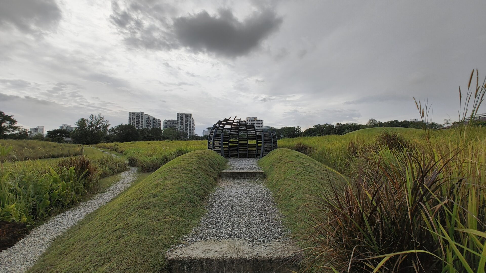
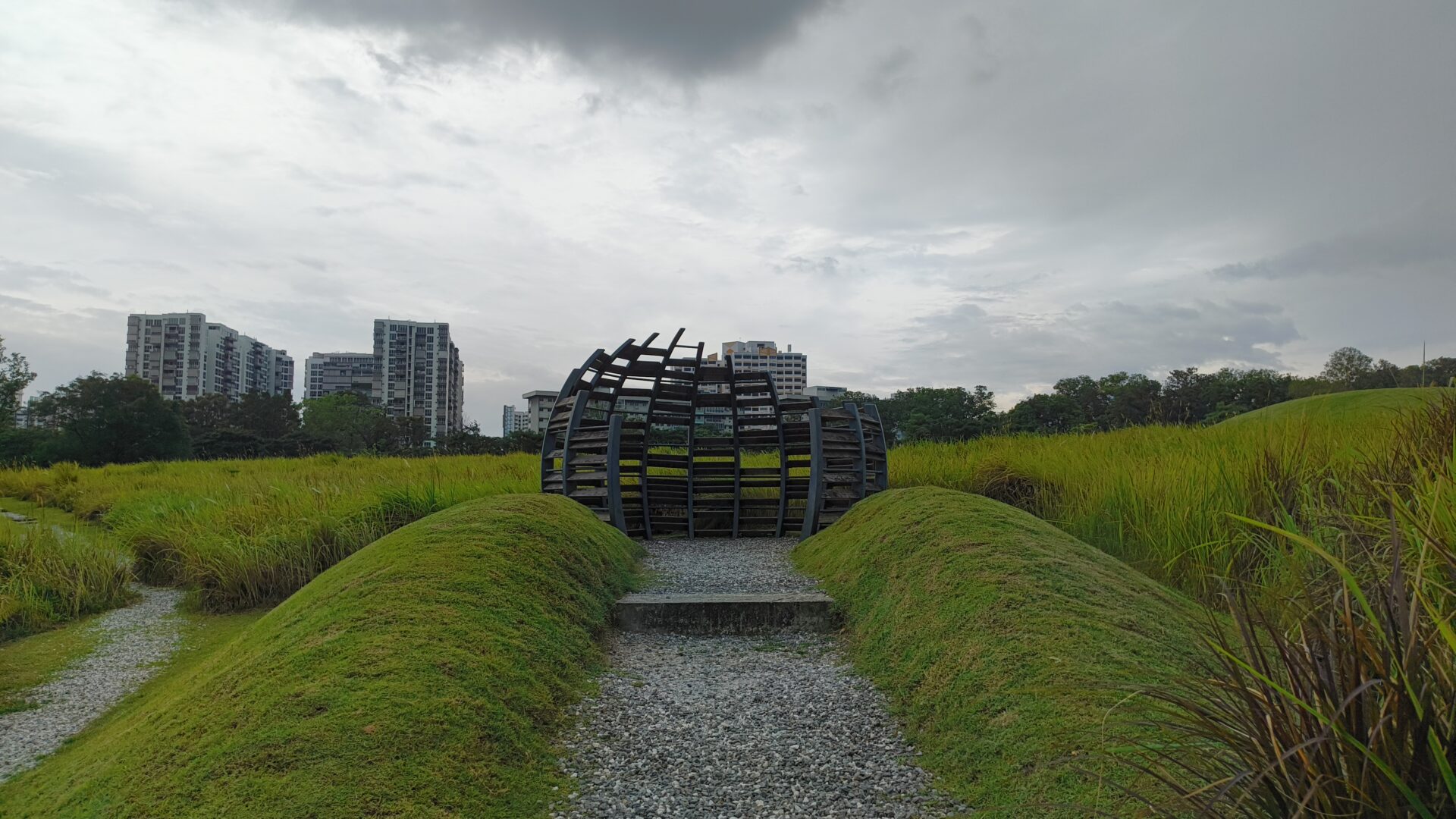

In the first set of shots near the bird hide at Jurong Lake Gardens, while the sky was overcast that fateful late afternoon, it was nowhere as dark as renditioned by these shots.
While the ultrawide picture has good sharpness, a look at the detail on the grass field will show the limits of the mid-range sensor.
The wide shot improved the amount of detail captured while maintaining sharpness, but was otherwise similar to the ultrawide. I also snapped a 2x zoom shot, which is clearly a crop from the wide sensor that amplified the limited detail from the sensor.
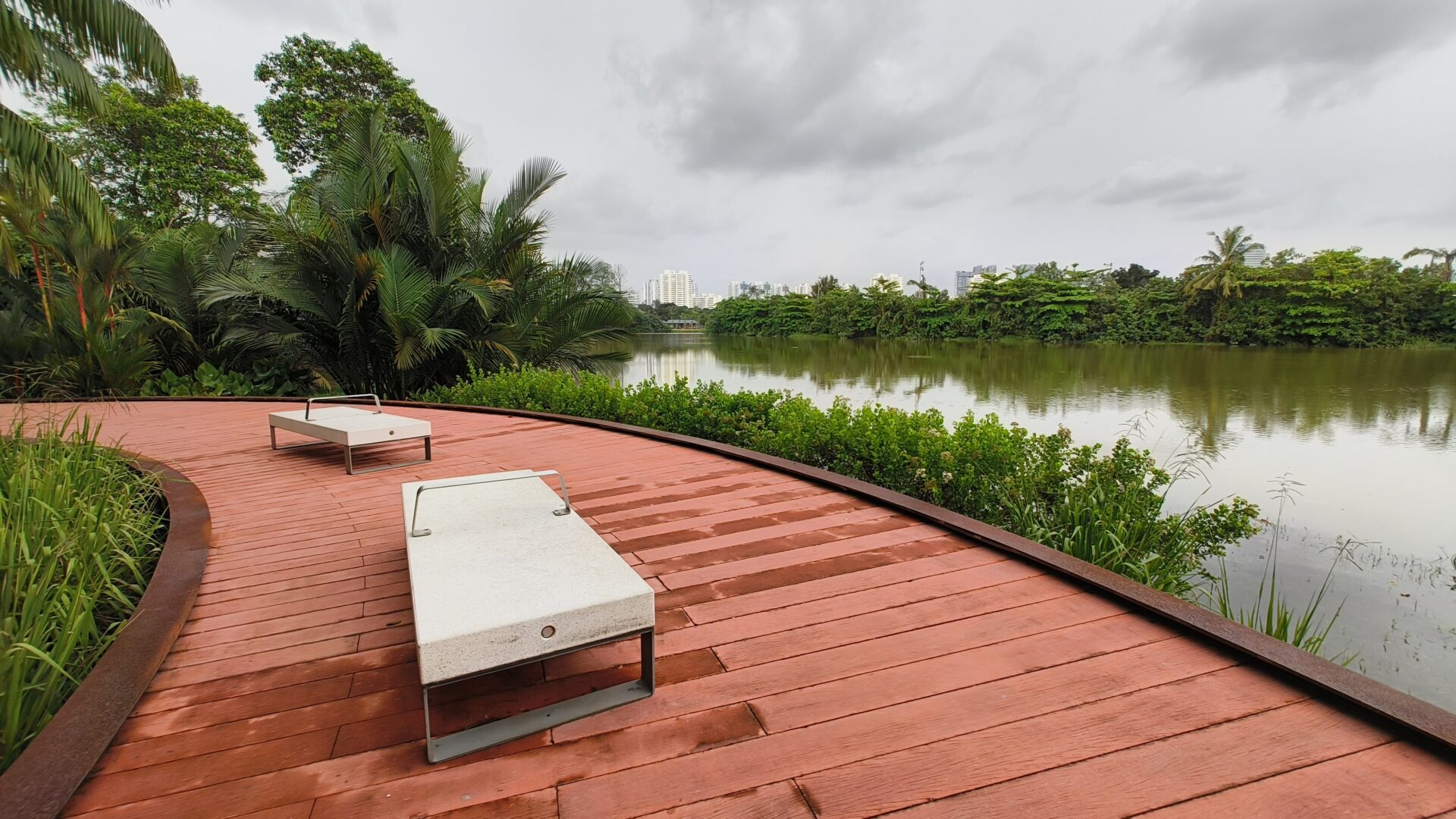
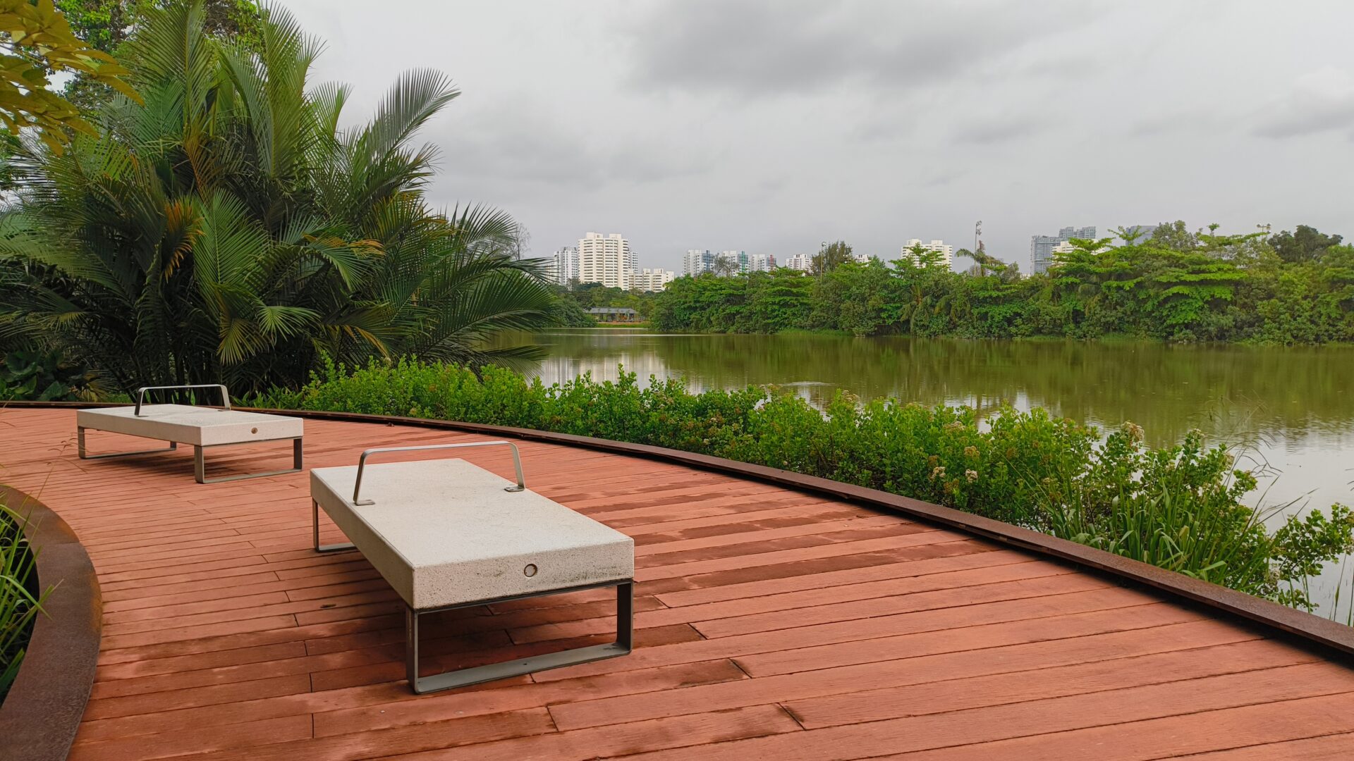
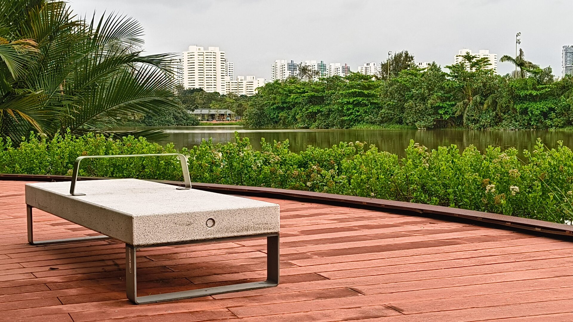
Along Rasau Walk overlooking Jurong Lake, there is good focus, though I could pick up purple fringing where the greenery met the water and skies to the middle and top left of the shot.
The picture from the wide shooter minimised those issues and the seats in the foreground have good detail. The 2x shot, however, was clearly a digital crop and not good.
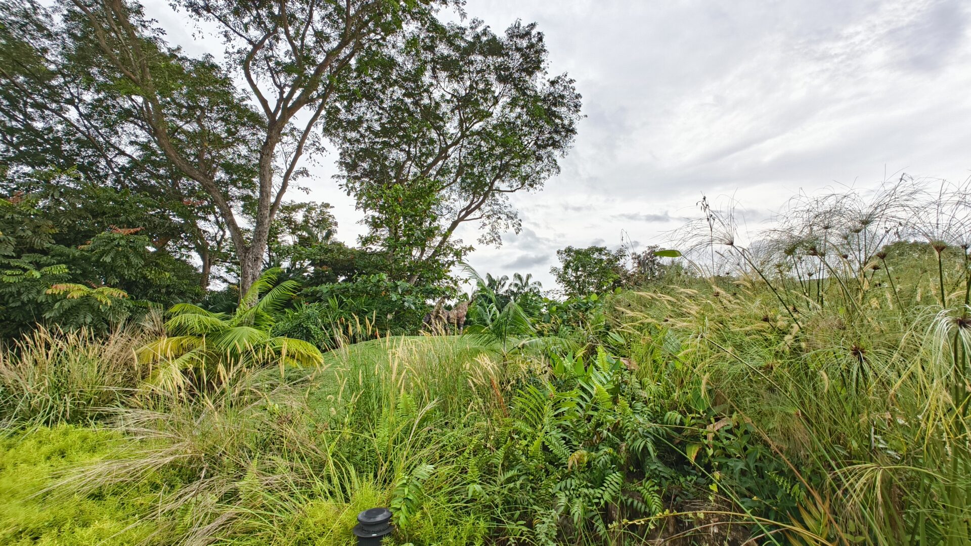
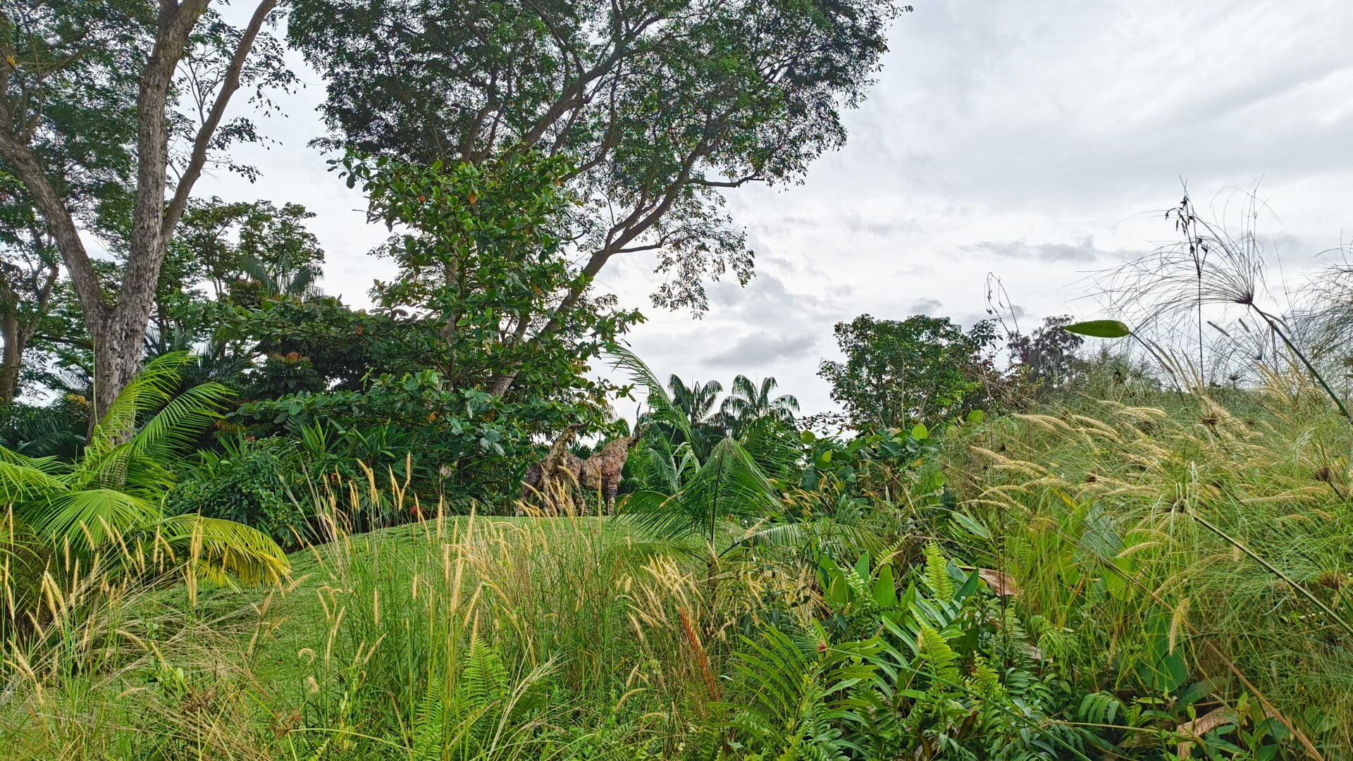

Turning my attention to the pair of mythical deer overlooking the Gardens, I thought the output from the ultrawide shooter was a mixed bag, with purple fringing on the trees set against the skies and loss of detail on our pair of deer in the middle.
The wide shot made the foreground greenery that much more detailed, but the detail captured on the deer remain average.
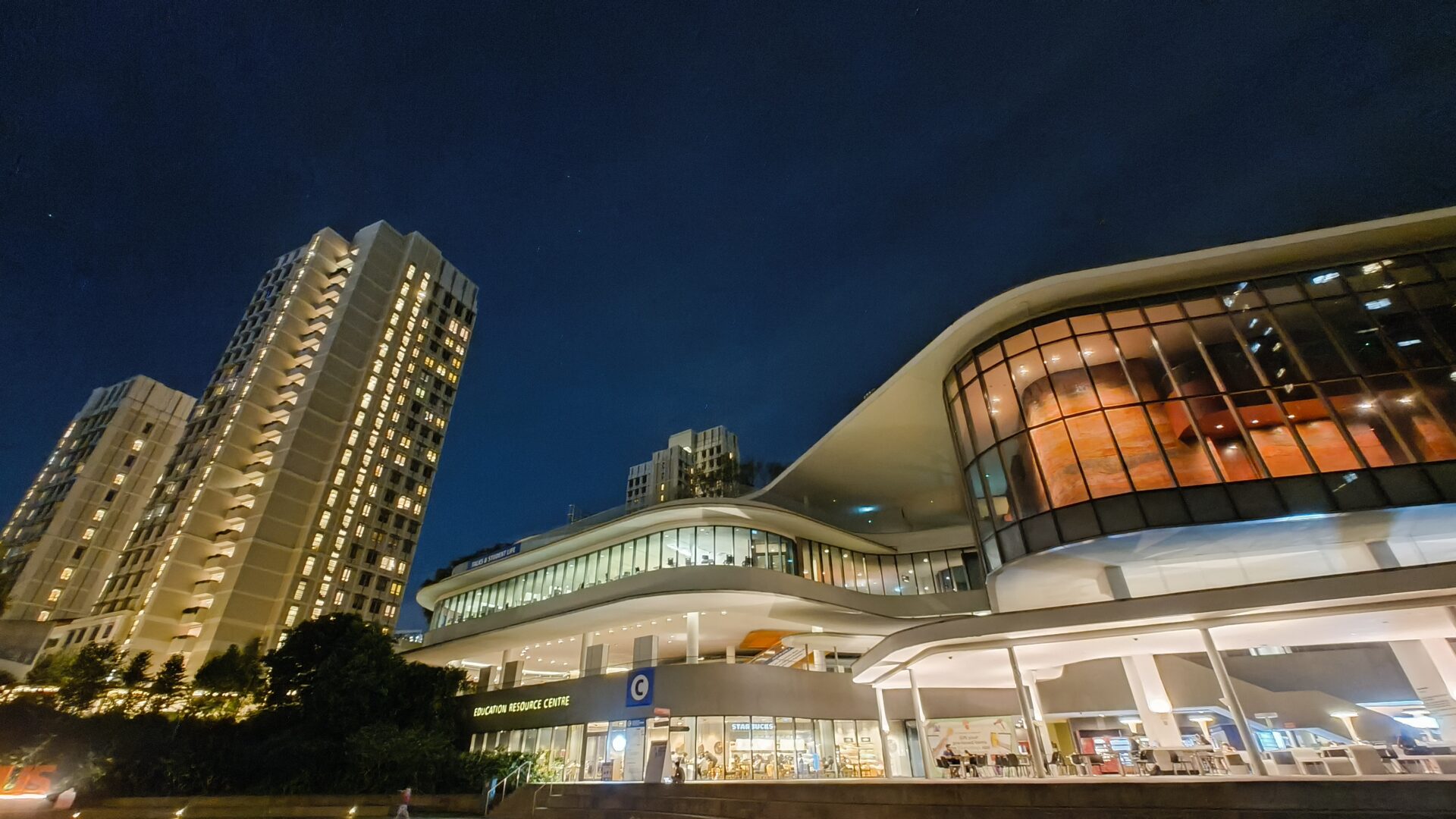
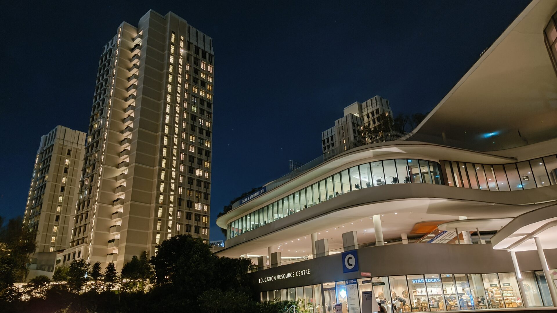
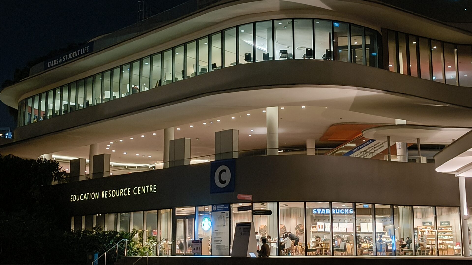
The night mode functionality is actually decent, producing a well-lit, colour-balanced ultrawide shot of the Education Resource Centre at the National University of Singapore. Good detail on most fronts, except the corners of the shot.
The image captured by the wide shooter managed good clarity across the different lit surfaces. Nevertheless, a 2x zoom shot exposes limited sensor data, judging by the text on the escalator on the second floor leading to the third.
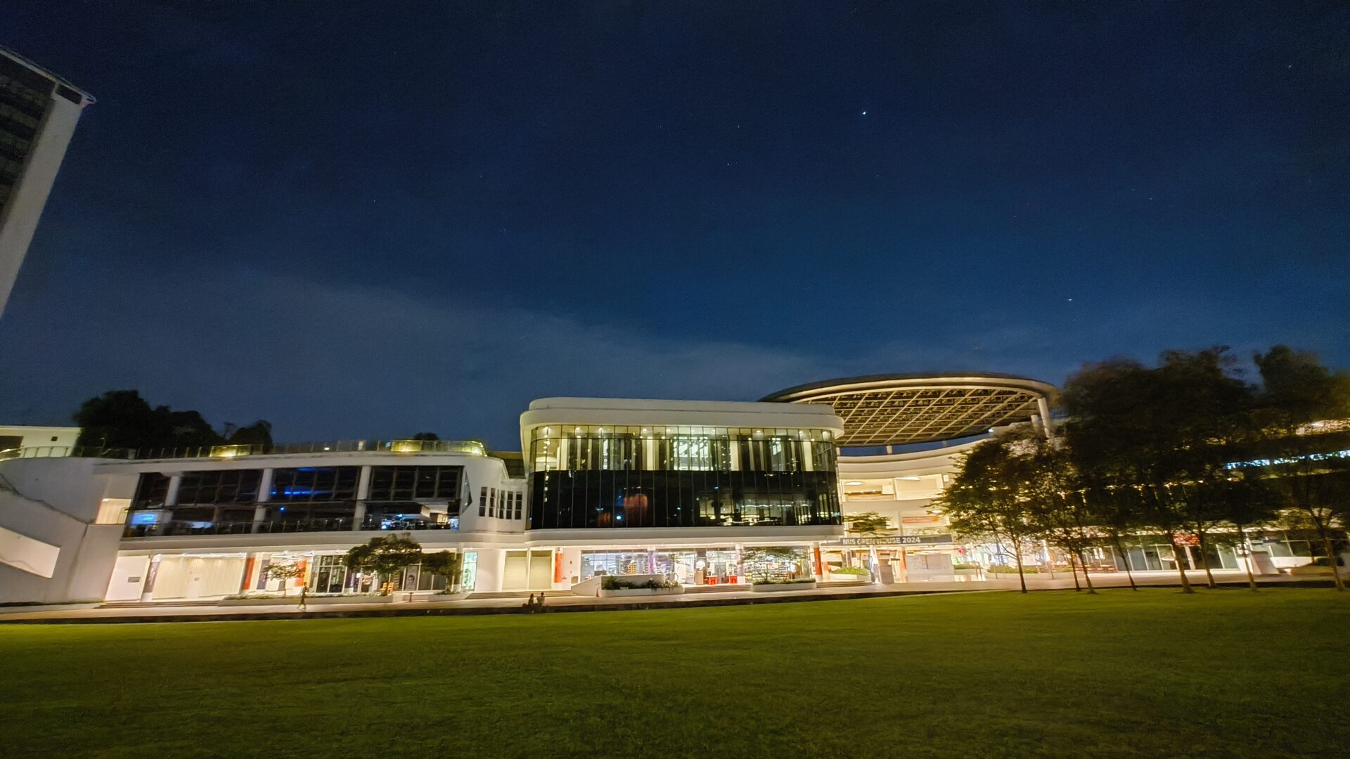
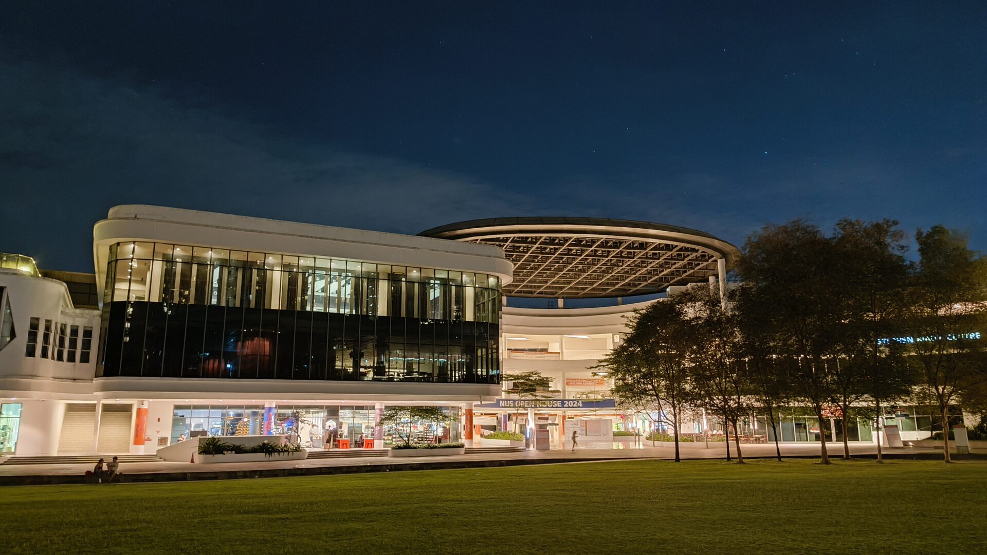
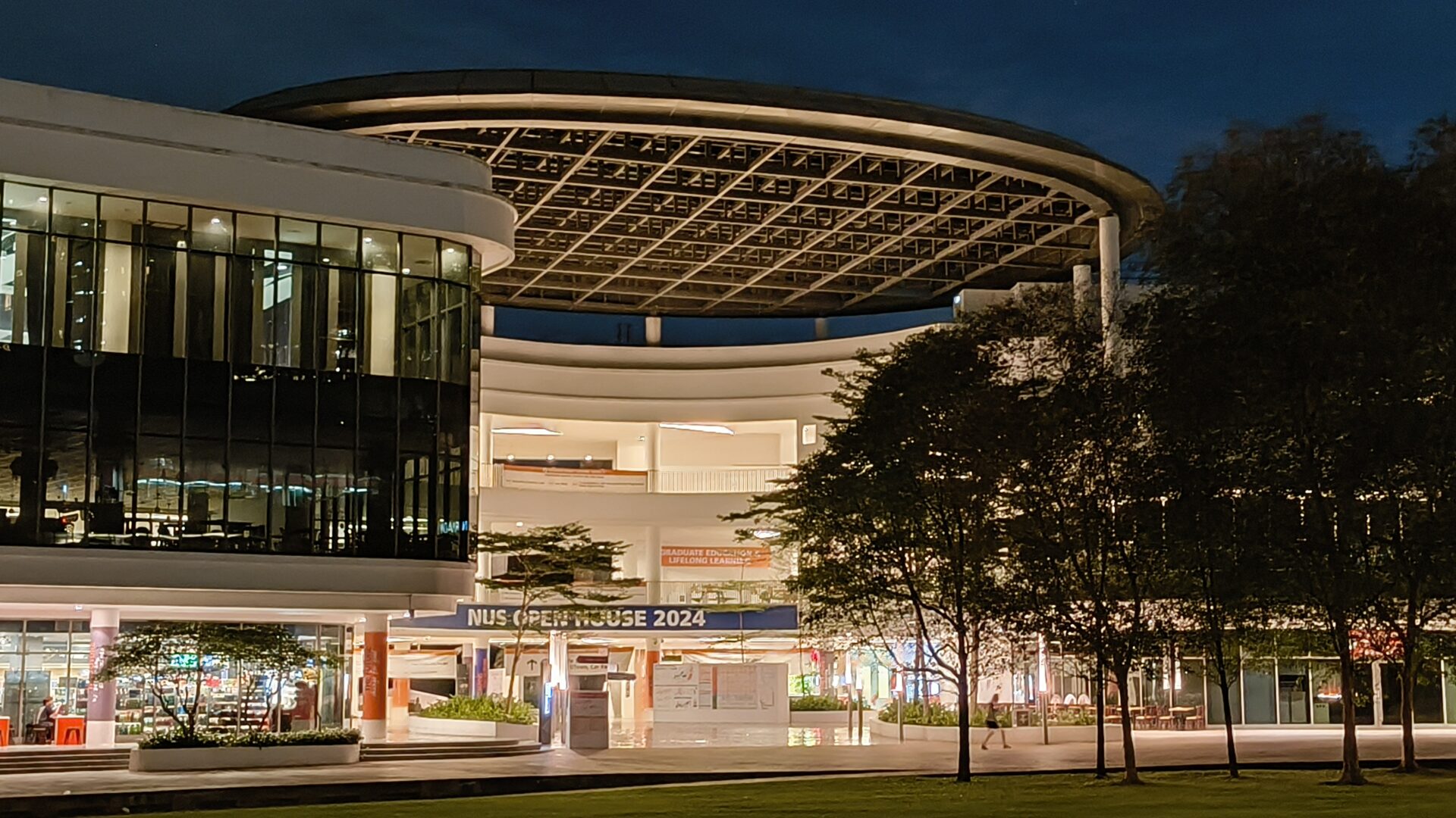
The ultrawide shot of the Stephen Riady Centre had a cooler colour temperature, though decent except for the lack of detail on the trees in the shadow on the right. The wide shot did not exhibit the same blurriness on the trees.
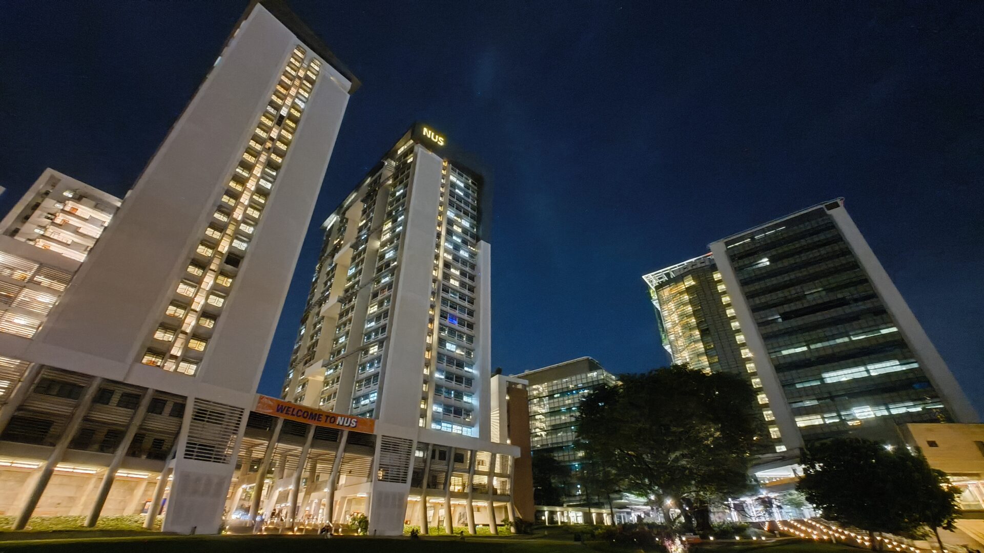
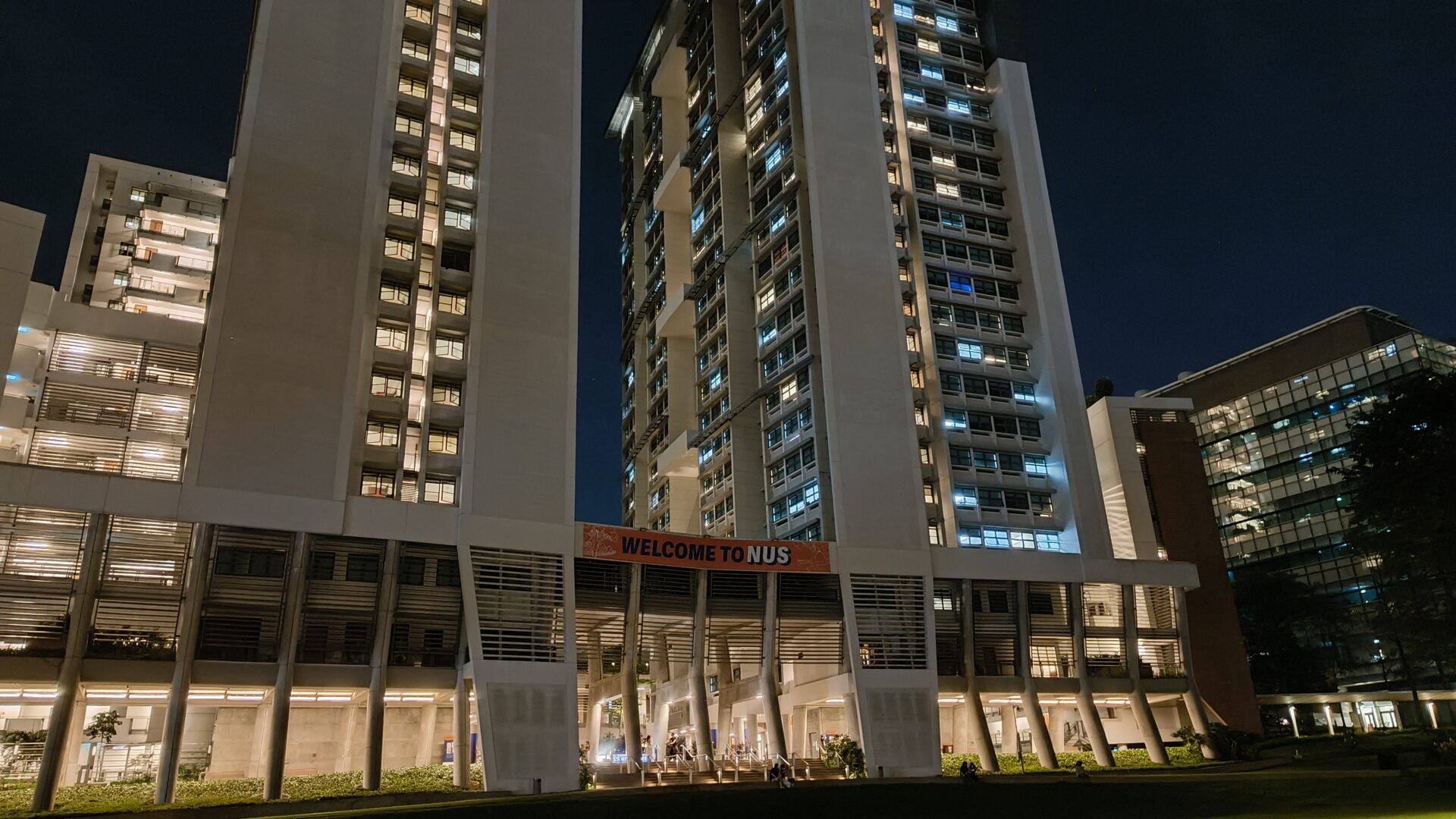

In this night view of the Town Plaza taken with the ultrawide shooter, there is obvious softness across the entire image, likely due to the lack of light. The wide shot is not as soft, but felt rather dark compared to earlier shots.
Conclusion
Launch a mid-range smartphone range with a cut-throat price, then raise the price one hundred dollars at a time across future generations. This modus operandi is playbook for phone manufacturers trying to grab market share, and the Nothing Phone (2a) is no exception.
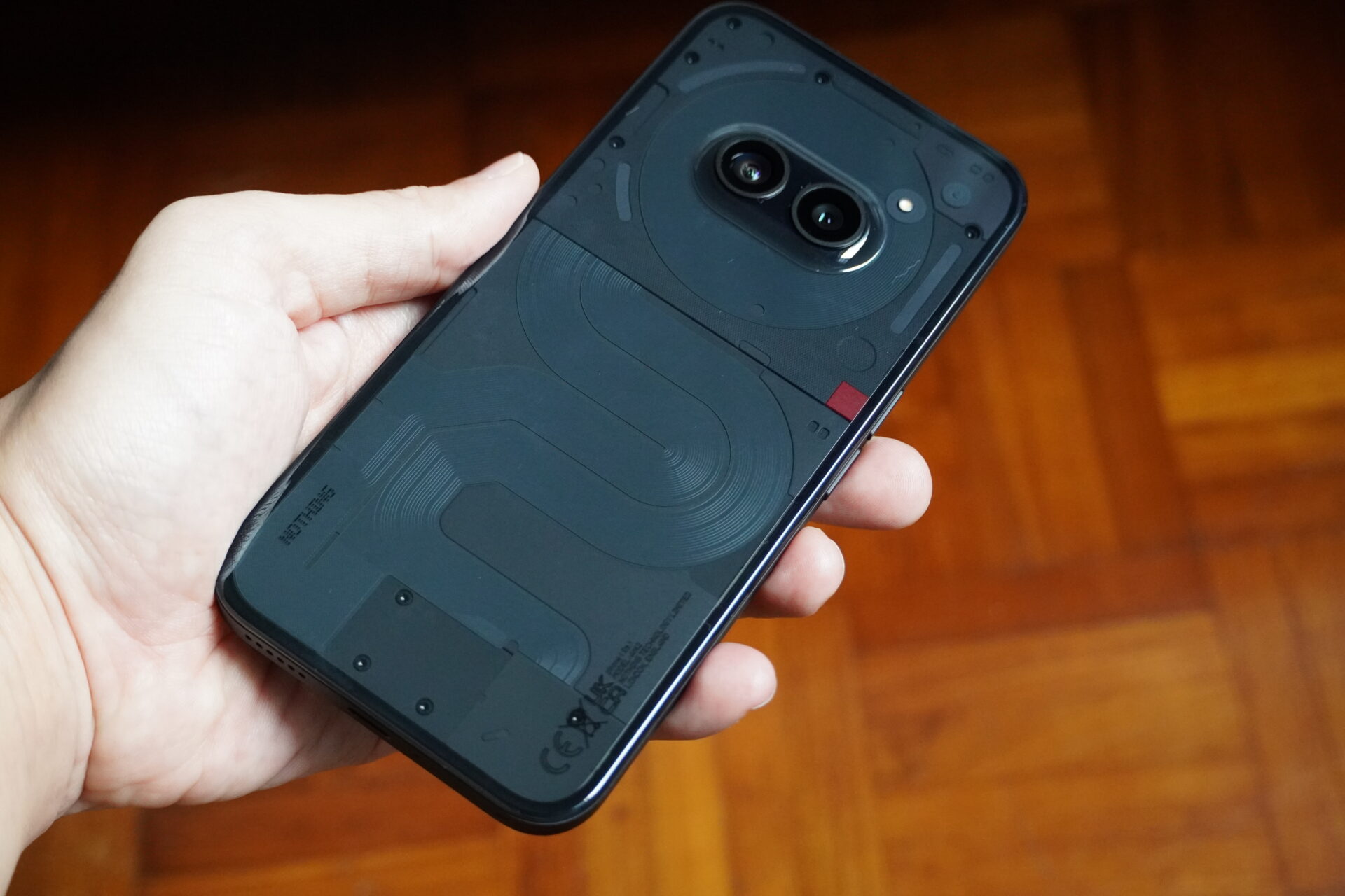
The first mid-range phone from Nothing is well-built, nice to hold, has a great screen, and offers flagship-grade responsiveness and use experience despite not using top-class silicon.
Its chief weakness is the camera array. The imaging, in my tests, tends to be dark and can benefit with manual adjustment. Good thing is the phone always kept its shots in focus. A comparison to the Google Pixel 7a (with better cameras) even seemed unfair, considering the Pixel cost S$749.
To sum up, enjoy this phone and all that it offers at the bargain price while it lasts, for you can count on upcoming followup models to cost more.
