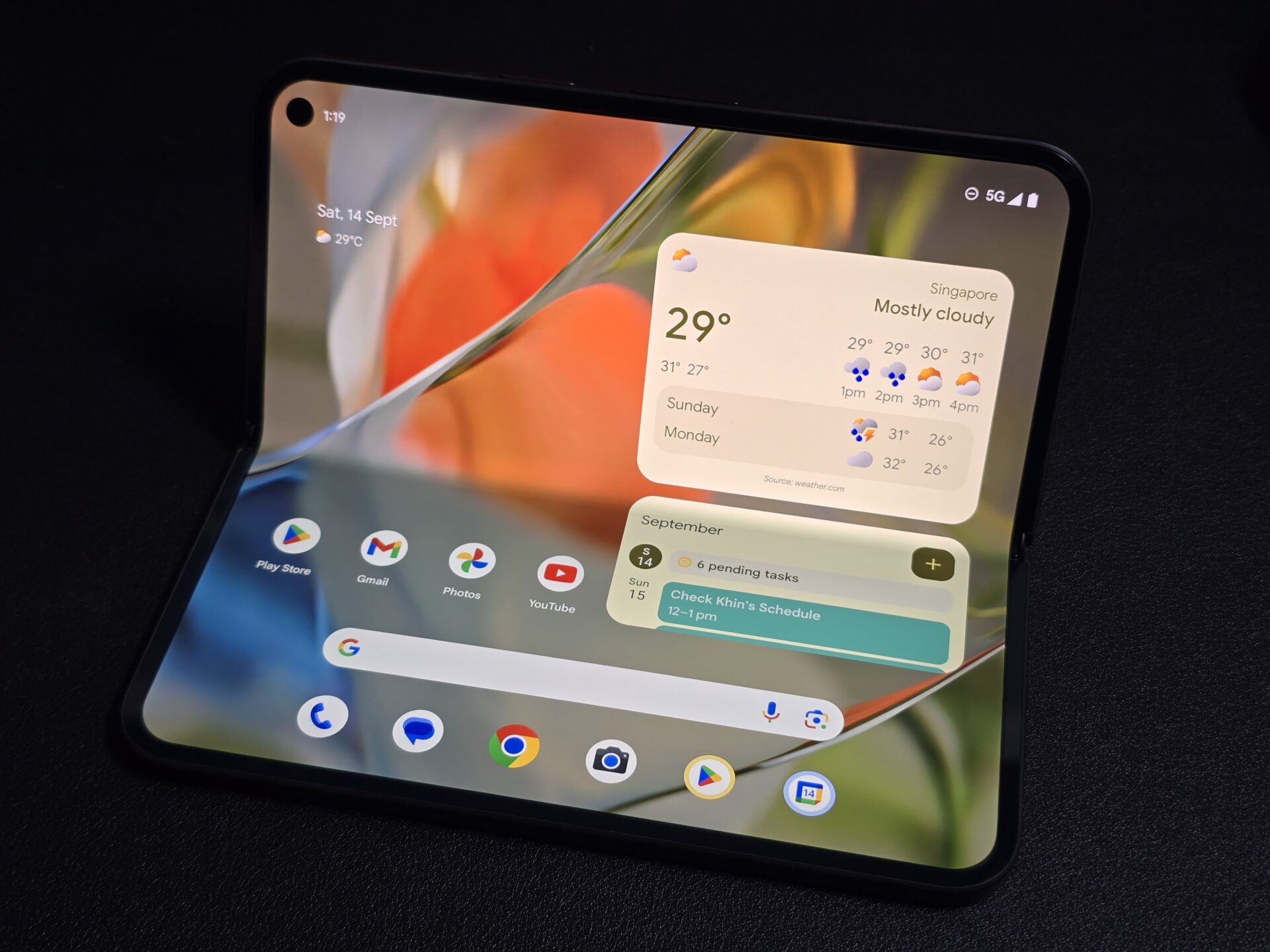
The Google Pixel 9 Pro Fold is the Internet giant’s second foldable phone and it’s clear from first impressions this is a sleeker, slimmed-down version. Starting at S$2,399 with 256GB of storage, the phone features bezels that have definitely shrunk from the first Pixel Fold.
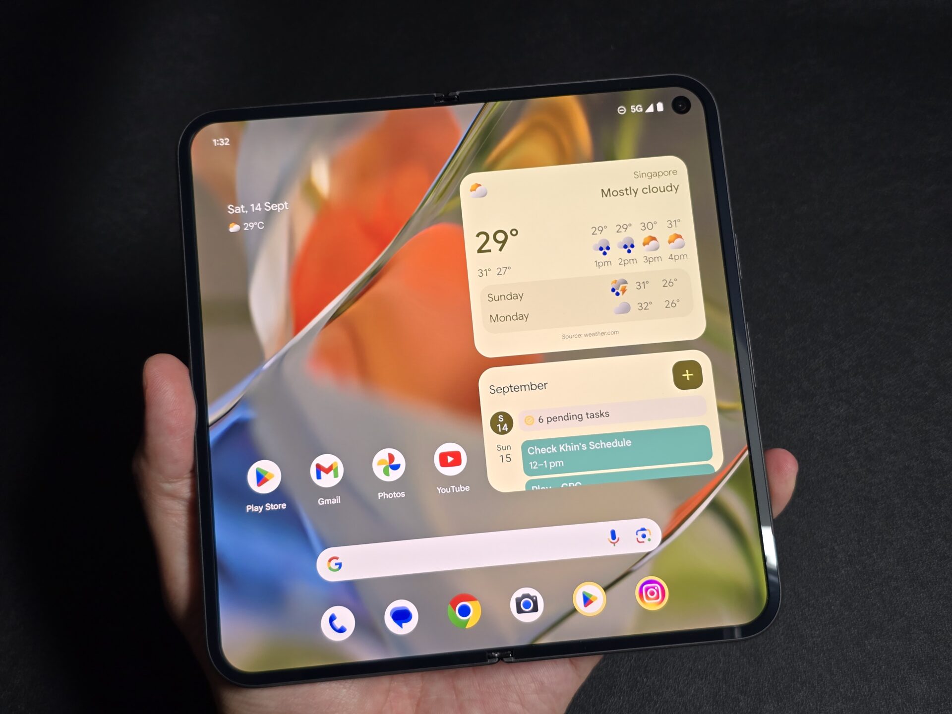
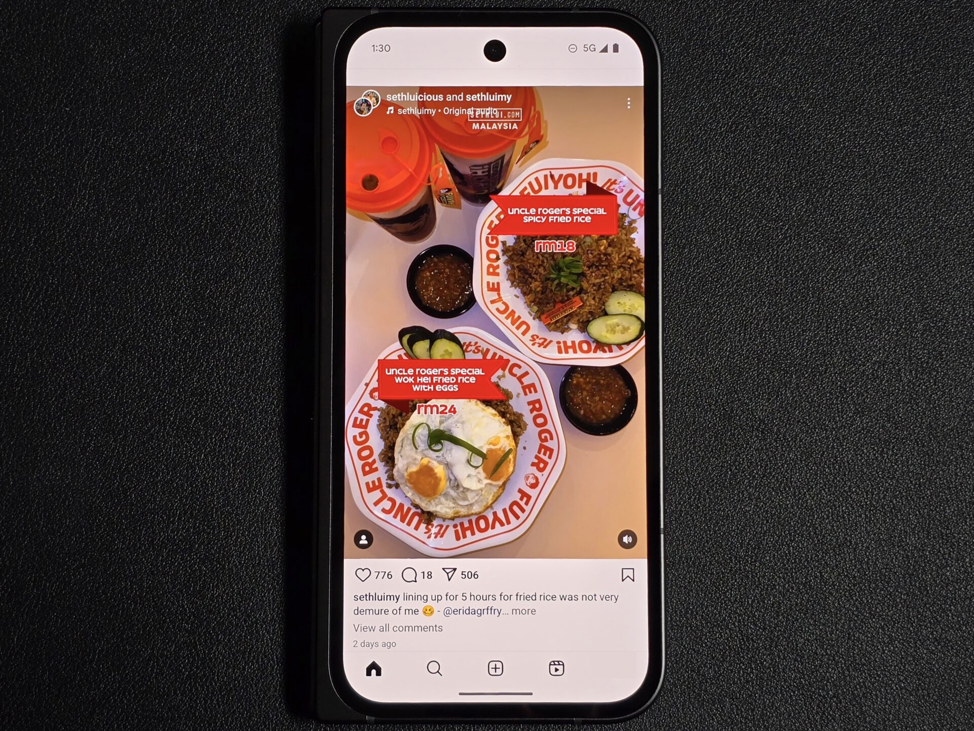
The displays are also a little larger than before. The 6.3-inch outer display retains a 20:9 aspect ratio that makes it little different from an average smartphone screen. The 8-inch inner display has a squarish 1:1 form factor, so most apps can stretch and fill up the entire screen without tweaks.
In use, the two displays are more practical than the rather narrow outer display and letterboxed folding display on the standard-bearing Samsung Galaxy Z Fold 6. But, how does the Google foldable measure in other aspects?
Design
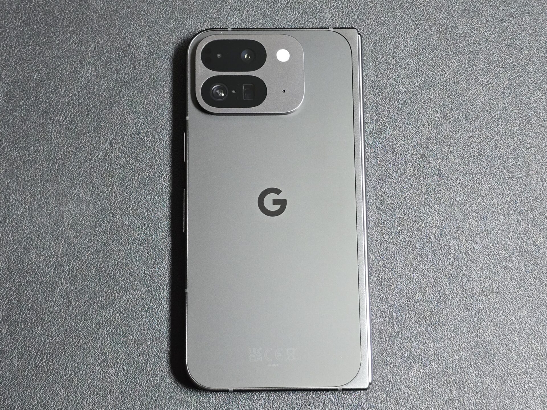
Like the Pixel 9 Pro XL we reviewed recently, the rear camera bar that has been a trademark since Pixel 6 no longer extends to the edges of the phone. On the Pixel 9 Pro Fold, the camera bar is a rounded rectangle on the top left of its rear.
The overall outlook of the new foldable phone is similar to the Pixel Fold otherwise, with flat side rails (thankfully matte unlike on the Pixel 9 Pro XL) and rounded corners.
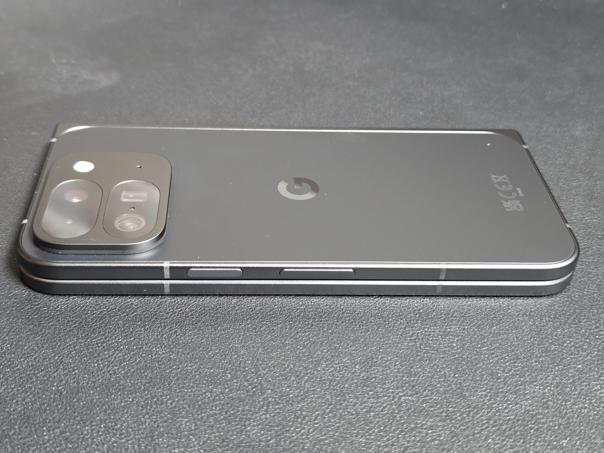
The back of the device is also in a smooth matt finish that is pleasant to touch and fingerprint-resistant. However, given the amount of body covered with display glass, the device is nonetheless slippery and can attract fingerprints.
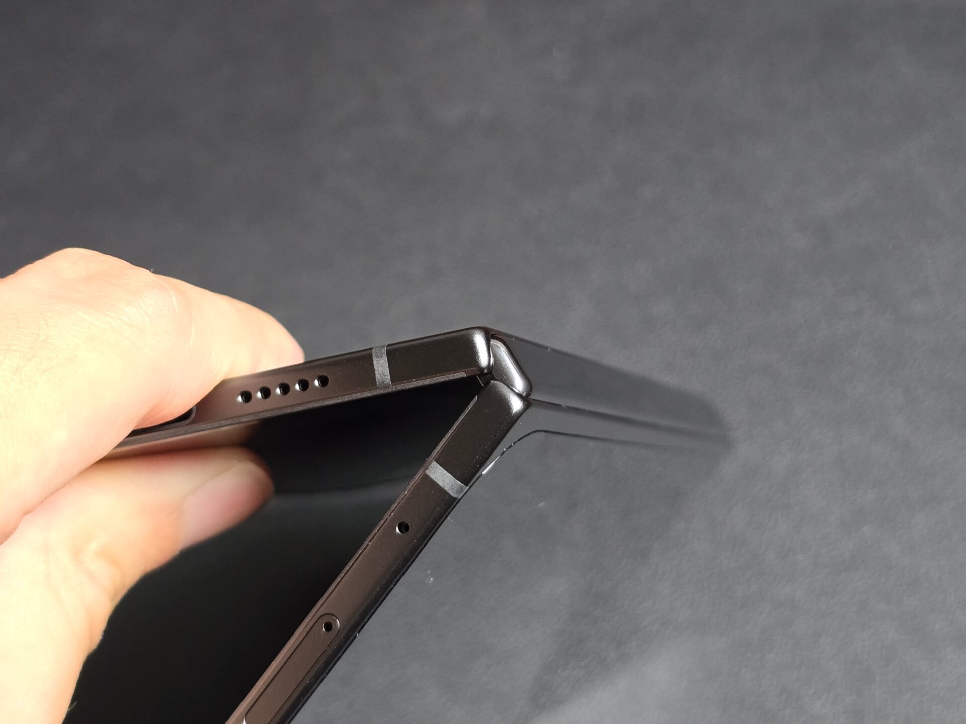
The folding mechanism here has less of a click than that on the Samsung Galaxy Z devices, but is sturdy and satisfying, nonetheless. The Google foldable phone closes up completely without a gap, and looks pleasant without obvious gears or moving parts.
Screen
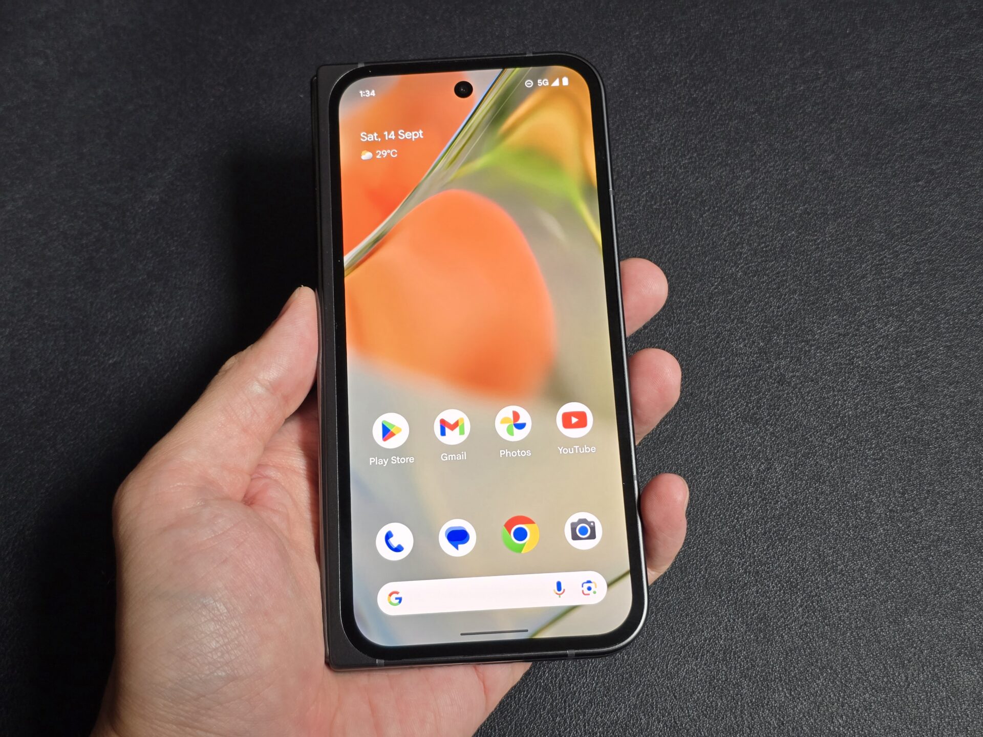
The Pixel 9 Pro Fold has carried over the rather pleasant display aspect ratios from the Pixel Fold – a Full HD outer display in 20:9 form that opens up to a 1:1 square folding display.
This allows both screens to not cripple each other in their intended use cases – the outer unit for messaging and light browsing, and the folding display for reading and media consumption.
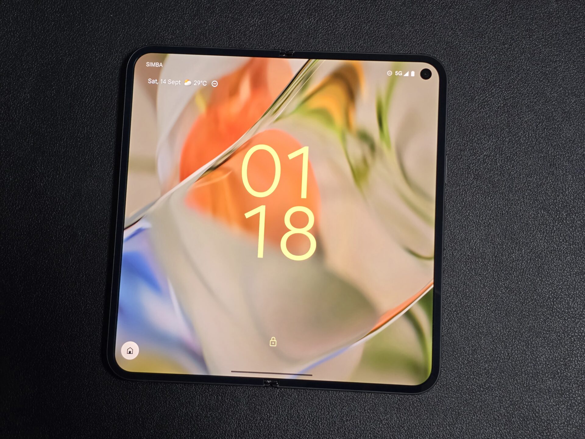
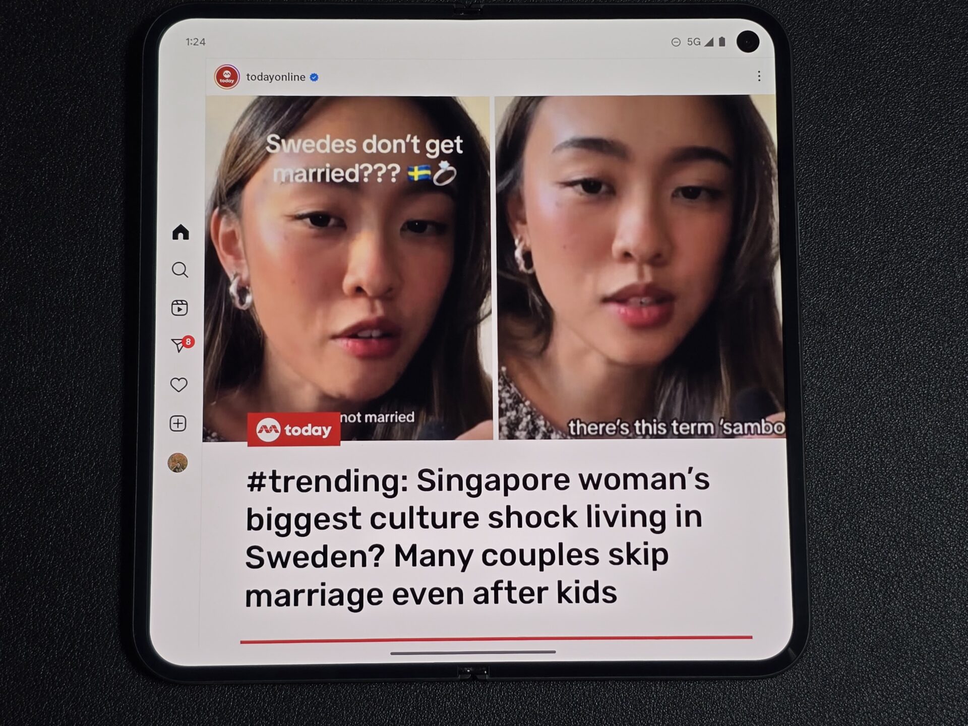
The squarish folding display means there is more letterboxing while watching widescreen videos than Samsung’s Galaxy Z Folds. I find it a small price to pay, however, because one generally spends more screen time on apps, and nearly every app I tried filled up the screen nicely.
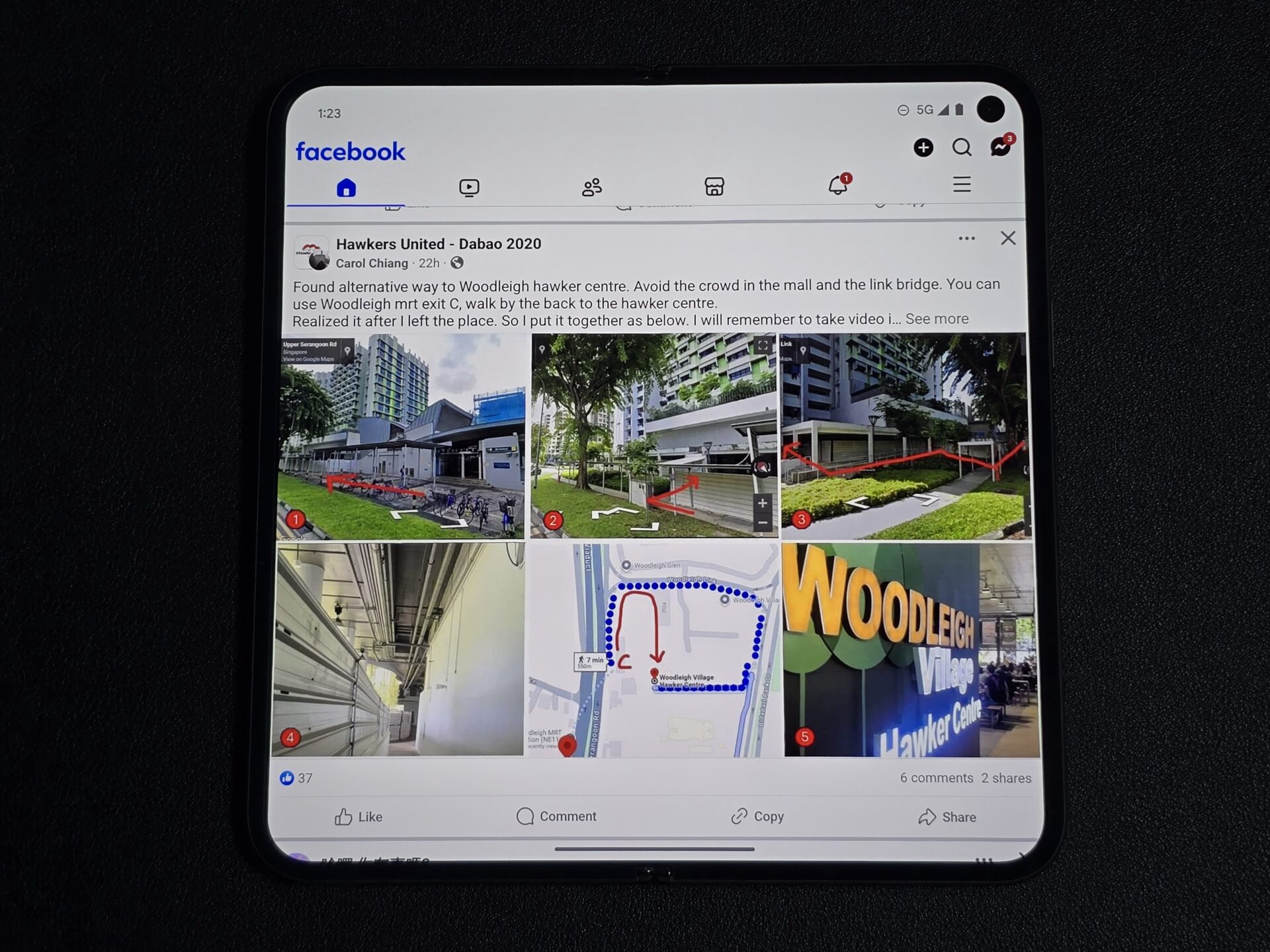
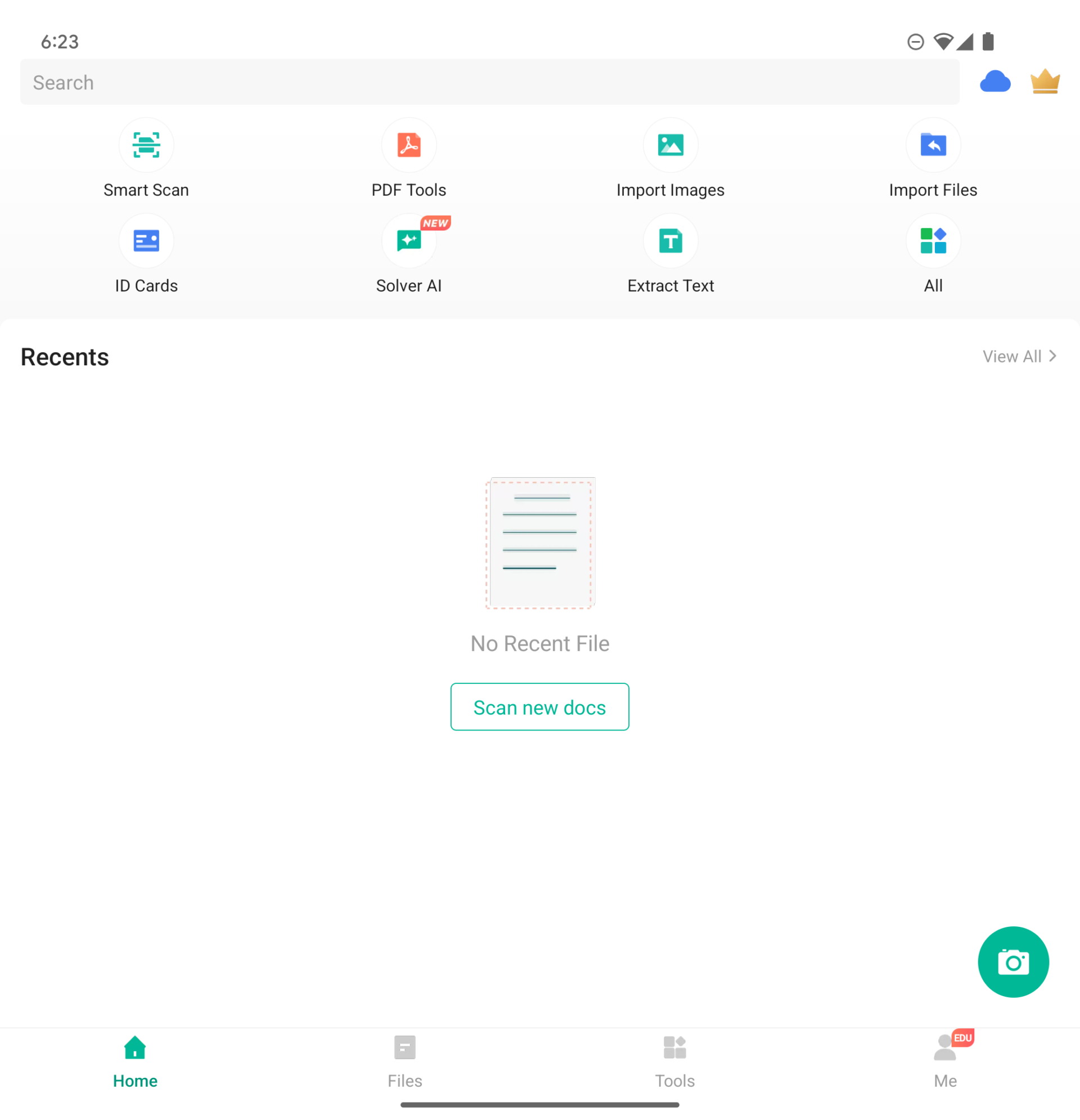
These ranged from banking apps to travel and shopping apps, to OneMap and CamScanner, to games.
In my tests, the outer display topped out at 1,050 nits on both adaptive and manual brightness control, and 950 nits on the folding display likely due to its protective film.
This is considerably dim, and I wondered if my review unit was buggy. A pity, as the display is otherwise sharp and colourful with good viewing angles.
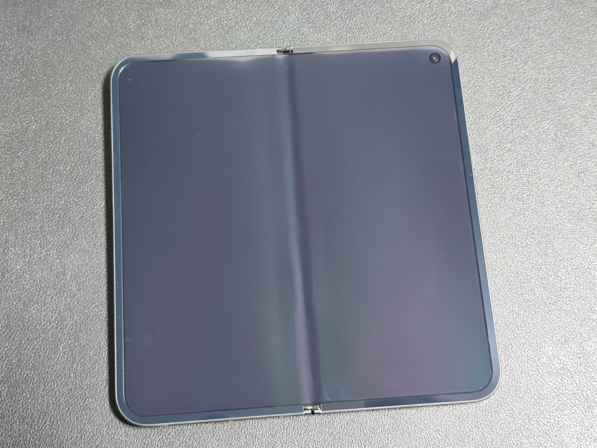
Also a pity is its rather deep screen crease. I was able to make the crease less visible on the Samsung Galaxy Z Fold 6 by turning off dark mode, but the indentation on our review unit of the Pixel 9 Pro Fold is visible, with screen content looking physically bent in. The darker the screen, the more visible this became.
With high refresh rate turned on, the outer display stuck to 120Hz most times, dropping to 60Hz only on some social media apps, and even then sporadically. The folding display is a lot more dynamic – It danced nimbly between refresh rates of 1Hz to 12Hz, 24Hz, 30Hz, 60Hz and 120Hz.
Performance
Google has stuck to its in-house silicon, the Google Tensor G4 built on a 4-nanometre process. The Tensors are known to not match the raw performance of the best from Qualcomm, but make up for it with native Google artificial intelligence (AI) optimisations.
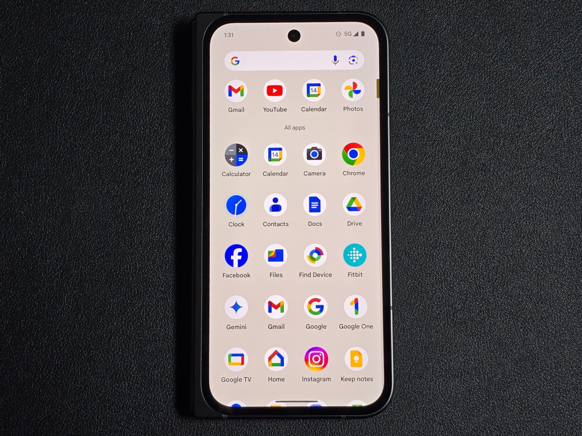
Needless to say, Google’s “vanilla” stock Android is quick and clean in my use, even if benchmarks were not chart-topping.

I used PCMark 10 for Android’s Work 3.0 Professional to simulate day-to-day workloads like browsing the Web, editing photos and videos, and word processing. The score averaged 13,100, on a par with the Pixel 9 Pro XL and in line with flagships from last year or the year before.
With gaming benchmark 3DMark for Android, the Pixel 9 Pro XL got through the Wild Life Extreme benchmark, averaging 15 frames per second and clocking a score of 2,580 over three runs on the device. The best Samsungs and Apples will typically clock above 3,000.
Scores are similar on both the folding and outer display over a few runs each.
AI features
Google usually does a fine job cooking up AI features. This time, some features are standout, while others feel like catch-up. None are truly gimmicky, just whether it is useful to you.
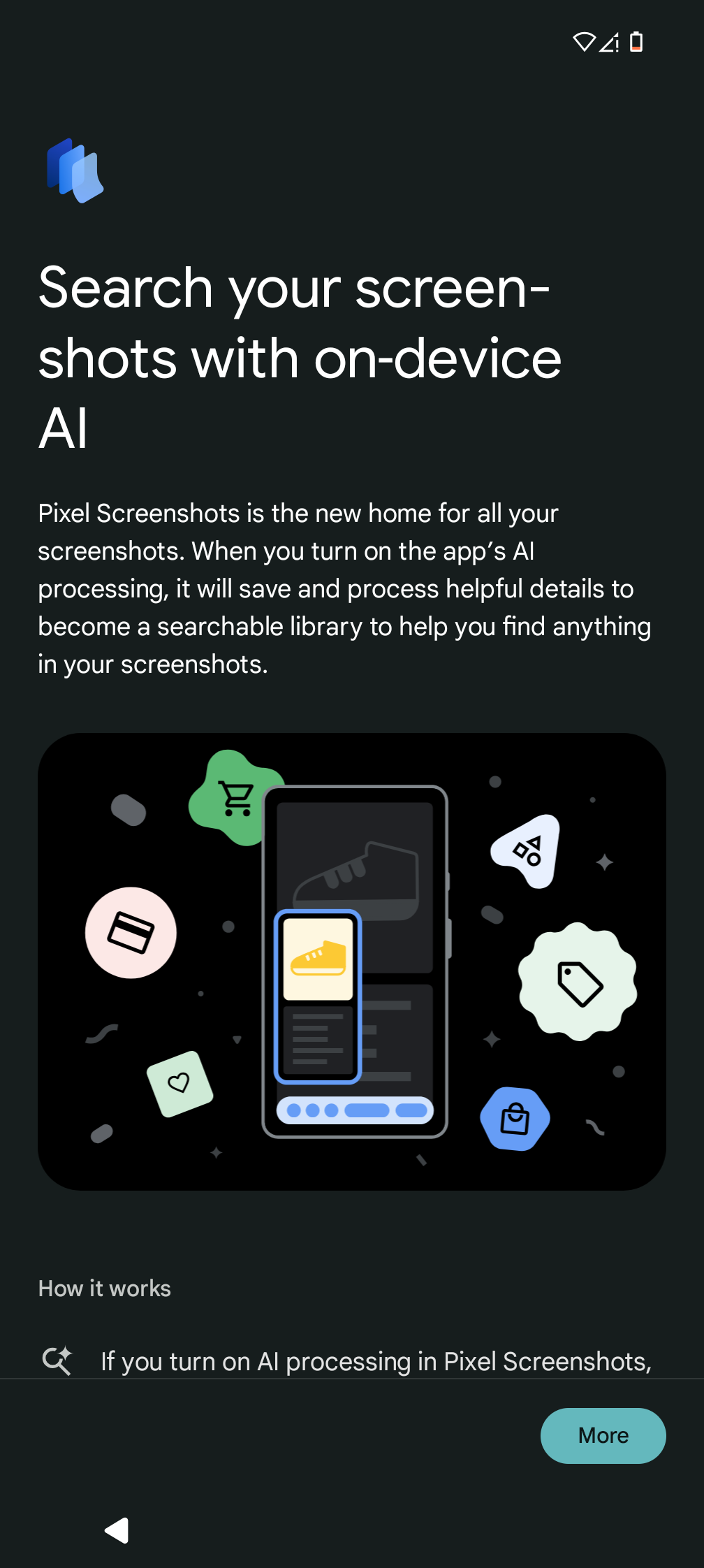
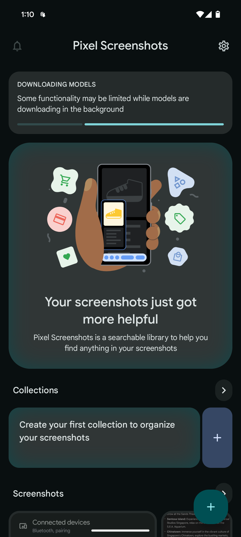
Pixel Screenshots is where the potential is, in my opinion, by using AI to make them much more searchable. I take a lot of screenshots to help me remember things or to share something interesting, but have a hard time finding them again after or to look up things in them.
I imported some old screenshots of chats and notes into the app. The current app does not allow selecting an entire album’s contents at once, and can only accept 100 imports at a time. Still, it is picking out keywords from the images that Google Photos would have missed.
I hope this feature gets much better and not stuck in beta, and becomes integrated into Google Photos at some point.
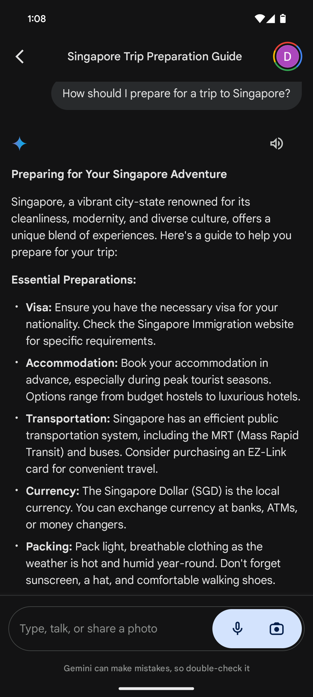
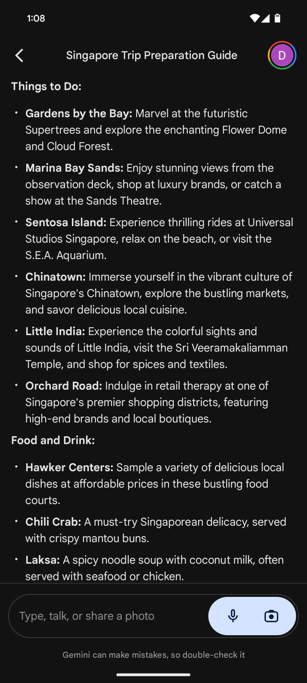
Gemini AI feels like Google’s answer (literally) to ChatGPT. It can help prepare for interviews, write e-mails and summarise conversations – basically a smarter Google Assistant. In my tests, it is not vastly different from other AI assistants, except perhaps tighter integration for reminders and calendar.
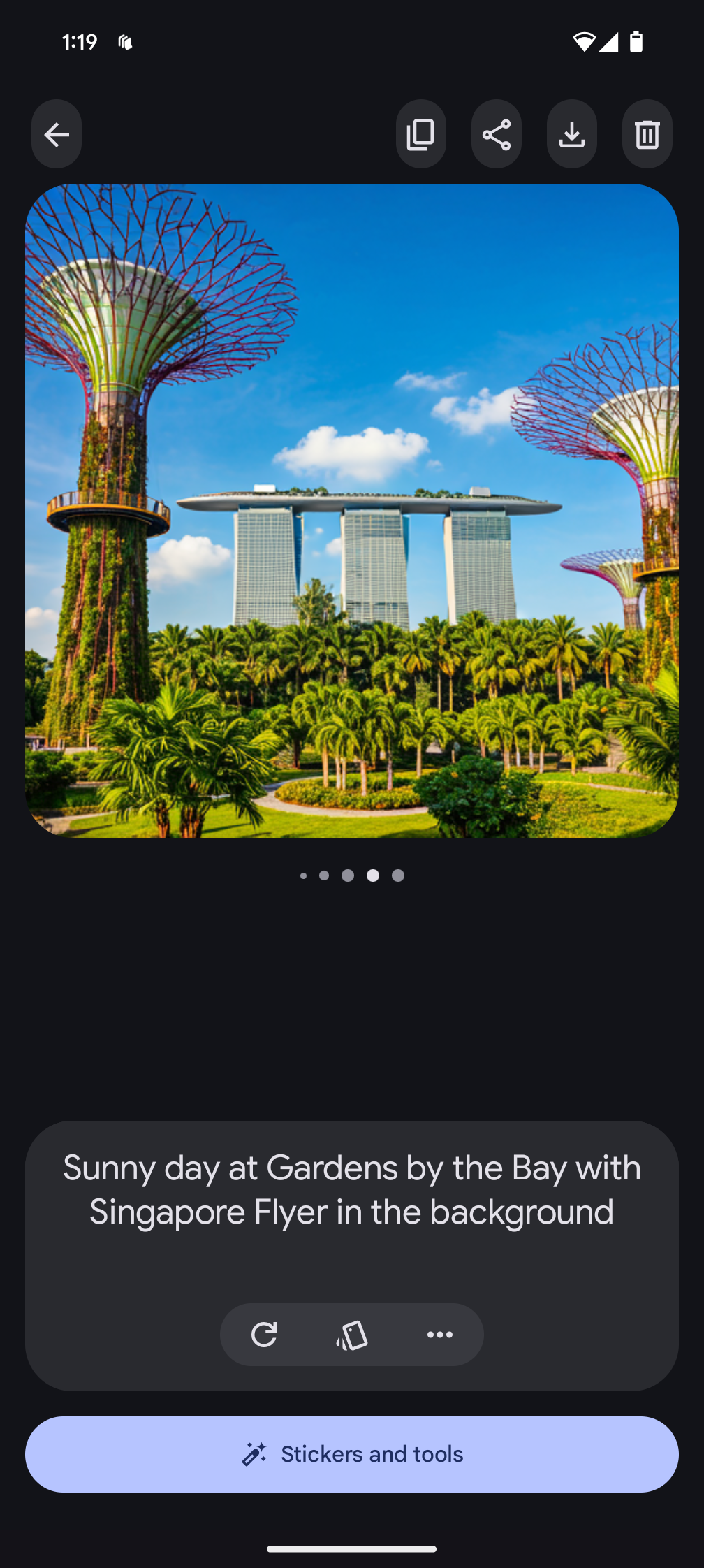
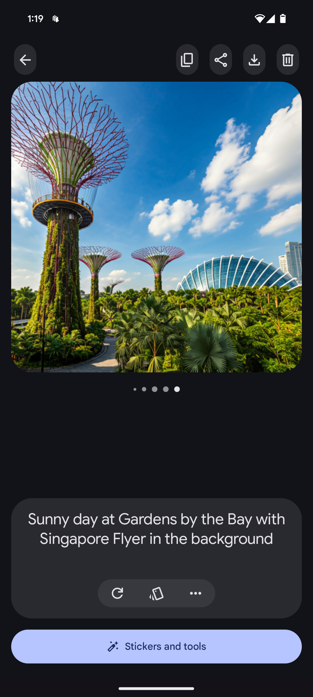
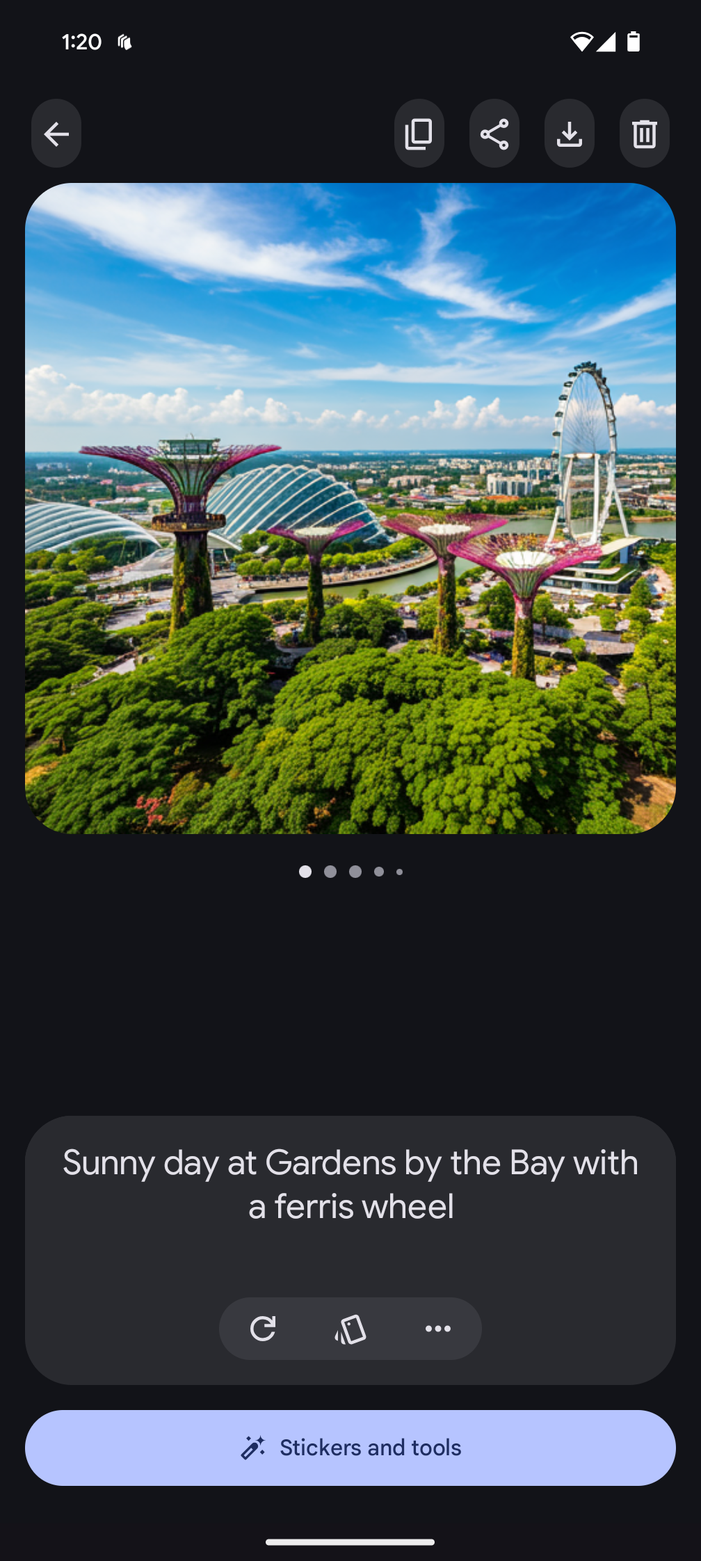
Pixel Studio works like Microsoft Designer. Provide a text prompt, get a nice graphic that you can keep refining without having to pay for credit. Image resolution limited to a 2,048 x 2,048 square, though, and no human renders for now.
There is also the Magic Editor, also available on Samsung devices. It is a perceptibly improved “magic eraser”, among other functions to make photos less blurry or enhance zoom.
I shouldn’t forget Circle to Search. It lets you take a screenshot, draw a circle around it and have Google get to work telling you more about what you’re looking at.
There are also a few photography features like Add Me and Action Pan that you may check out on our Pixel 9 Pro XL review.
Other features and battery life
The Pixel 9 Pro Fold has speakers on both the bottom left rail and upper left rails. They are loud and they work, but I found the sound coming through kind of muffled, made worse with a protective case on.
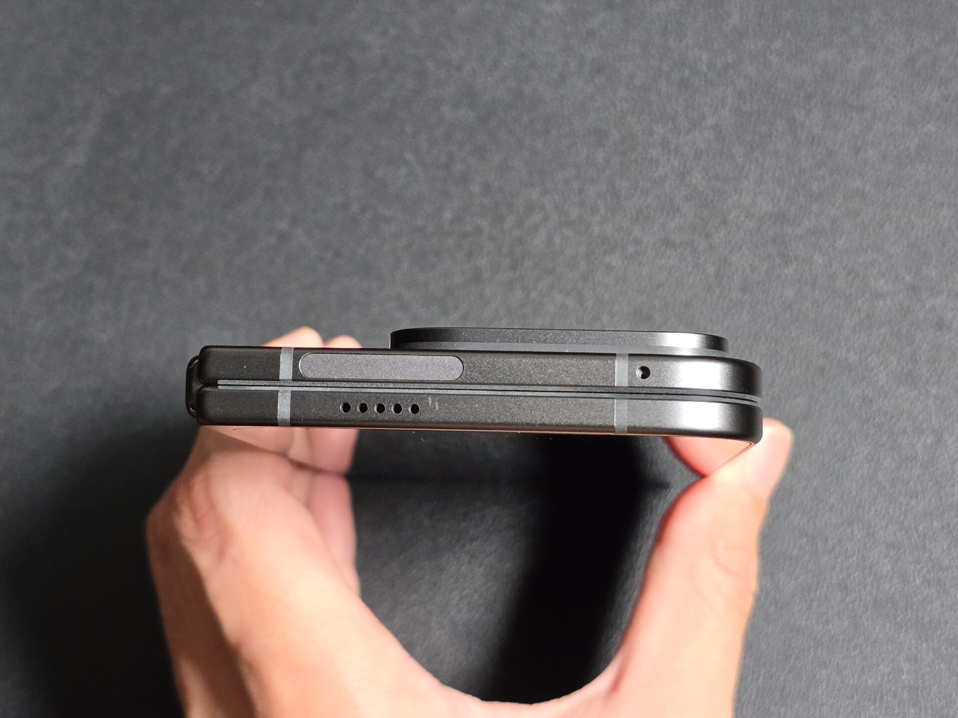
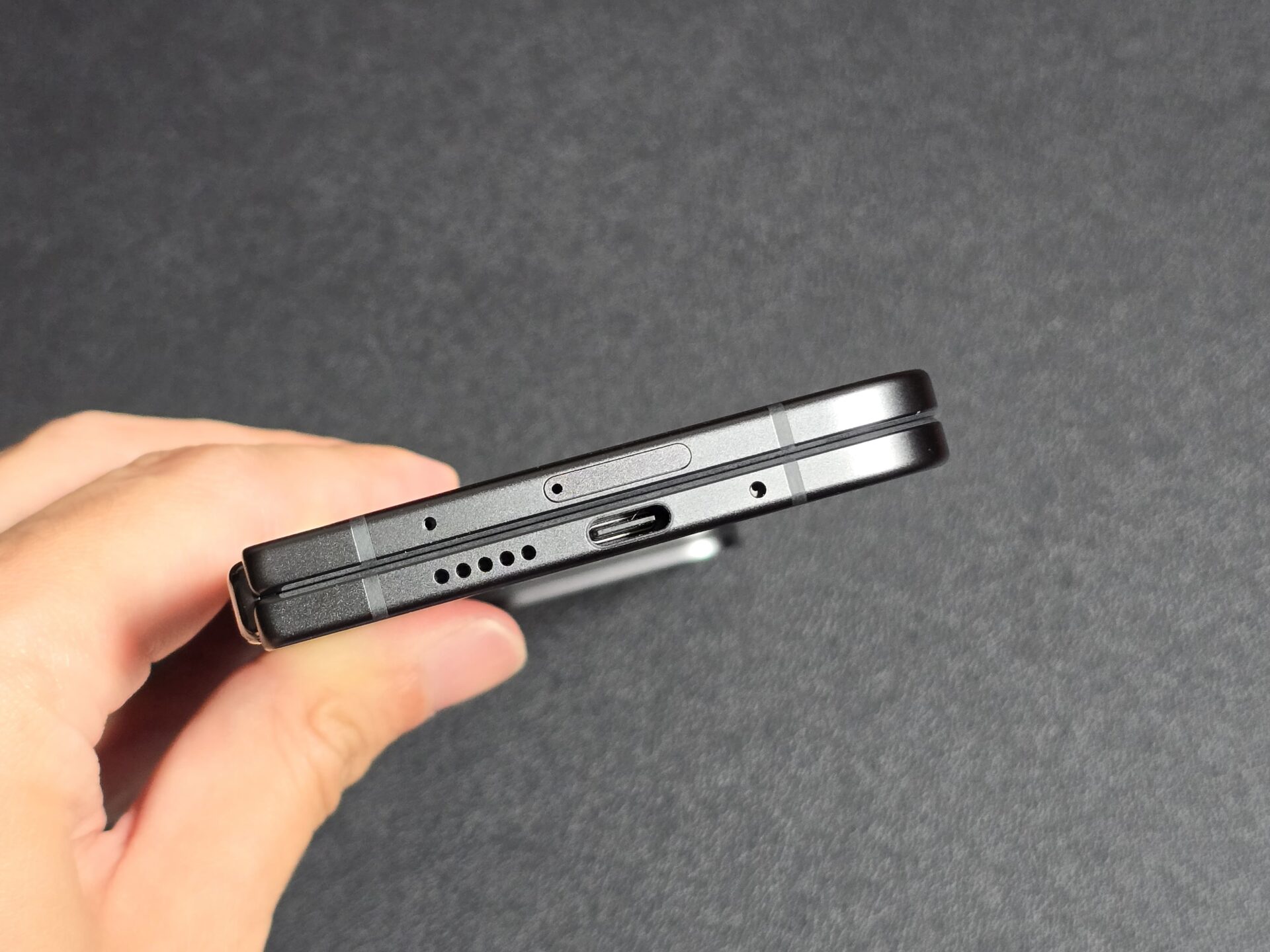
The fingerprint sensor is placed on the power button so it can be accessed from both the outer and folding screens. The matt finish of the button and its corners are nice to touch and get the job done.
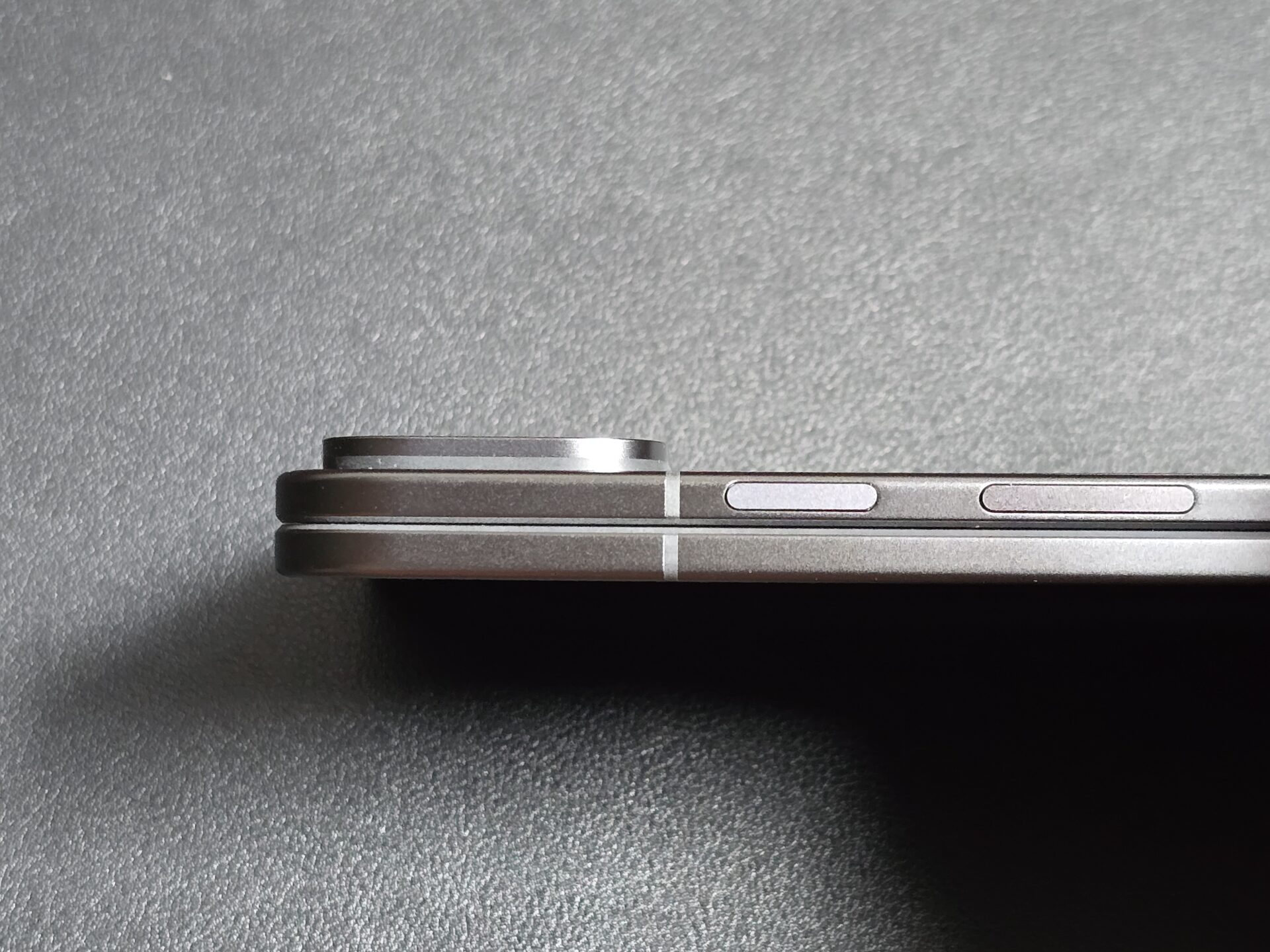
The phone is IPX8 rated for dust and water resistance. There is basically no dust ingress rating like most foldable phones, but the Pixel 9 Pro Fold can certainly handle a dip in the pool.
The phone features a 5,060mAh cell that was decidedly average. I ran the PCMark 10 for Android’s Work 3.0 Battery Life test with Wi-Fi and dynamic display refresh on throughout. It lasted 13 hours 15 minutes on the outer display, and 9 hours 30 minutes on the folding display.
The Pixel 9 Pro Fold supports 21W wired charging, which is also average. There is a USB-C cable, but no bundled charger. Wireless charging tops out at a mere 7.5W.
Cameras
- Wide camera – 48 MP, f/1.7, 25mm, 1/2.0″ sensor, 0.8µm pixels, dual pixel PDAF, OIS
- Telephoto camera – 10.8 MP, f/3.1, 112mm, 1/3.2″ sensor, dual pixel PDAF, OIS, 5x optical zoom
- Ultrawide camera – 10.5 MP, f/2.2, 127˚ field-of-view, 1/3.4″ sensor
- Selfie camera – 10 MP, f/2.2, 23mm, 1/3.94″ sensor, PDAF
The Pixel 9 Pro Fold’s camera system is similar to last year’s Pixel Fold, except both selfie cameras have been upgraded to 10-megapixels.
The setup is similar to other folding phones, but is definitely a class below the 50- and 48-megapixel array on the regular-shaped Pixel 9 Pro XL.
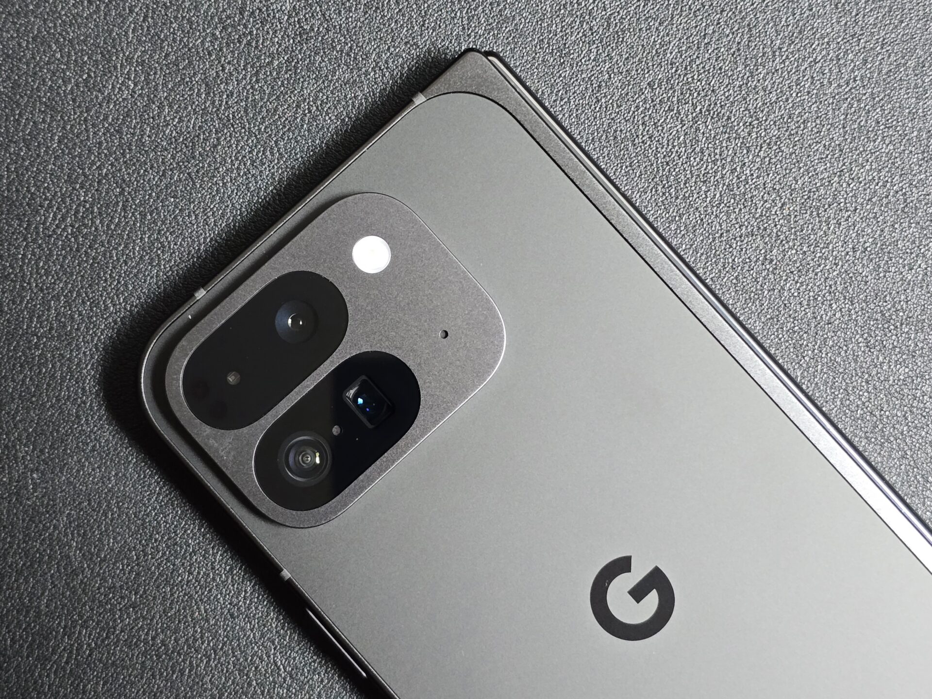
The picture quality reflects the difference. The outputs are satisfactory, just not class leading. Images are overall darker than the Pixel 9 Pro XL, and there is more distortion on the edges of ultrawide shots. The telephoto shots are also less detailed.
Among daytime shots, the ultrawide photos have good colour and focus. Shadowy parts tend to be darker, though, and the corners of the pictures tend to be blur. Corners of the shots can also have purple fringing, like the picture overlooking Alexandra Arch from the HortPark entry sign.
The main shooter produces images with more clarity, but the poorer detail capture is obvious, especially against other flagship devices. Notice the slight blurriness on the greenery in the background of the pavilion with floral prints, and around the buggy at the drop off point.
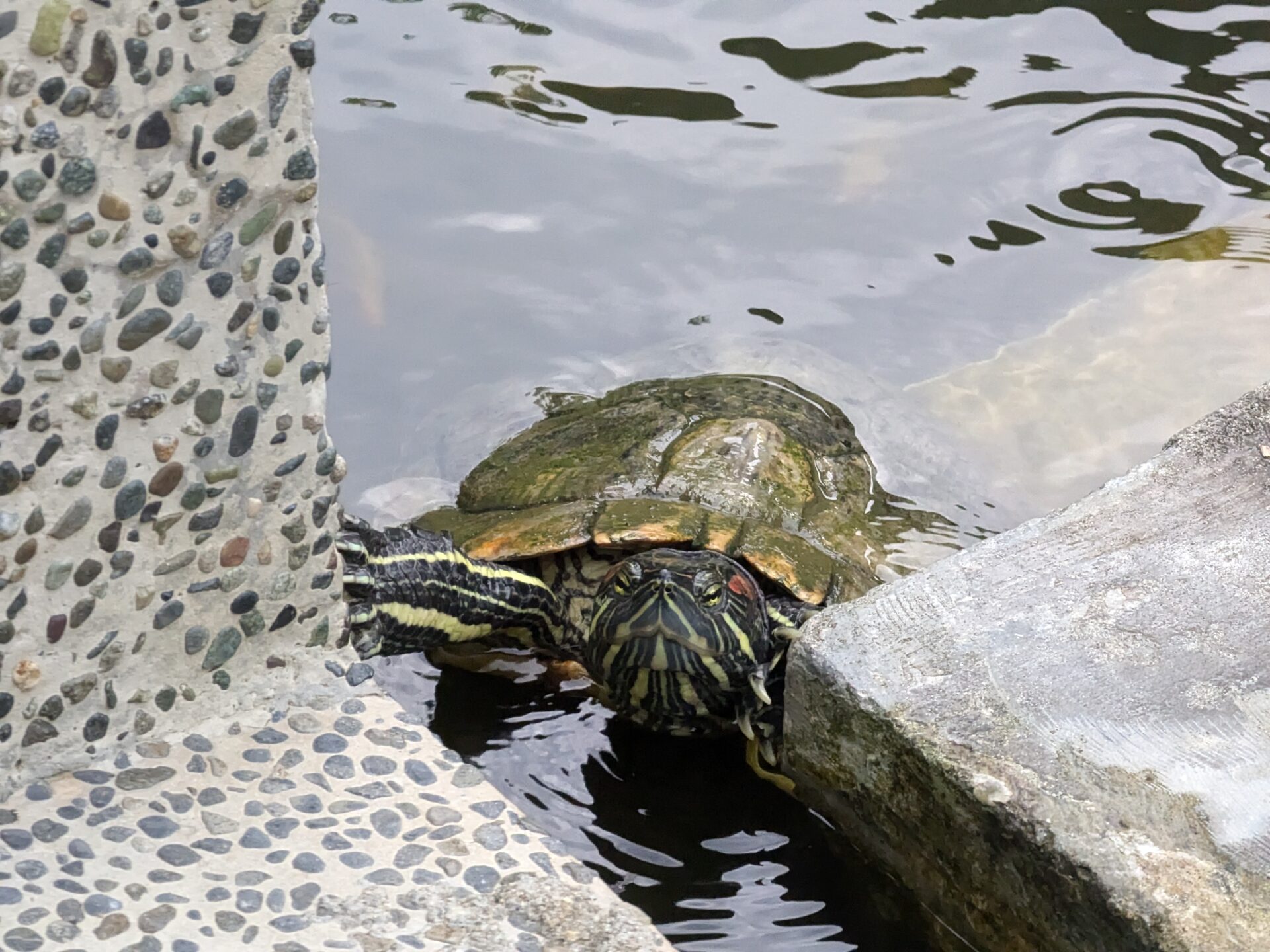
The telephoto has a native 5x-equivalent zoom, and is also considerably decent. However, it would be plain to see that the shooter does not get the same details as the Pixel 9 Pro XL did. Just have a look at the shot of the turtle catching a breather from the edge of the pond.
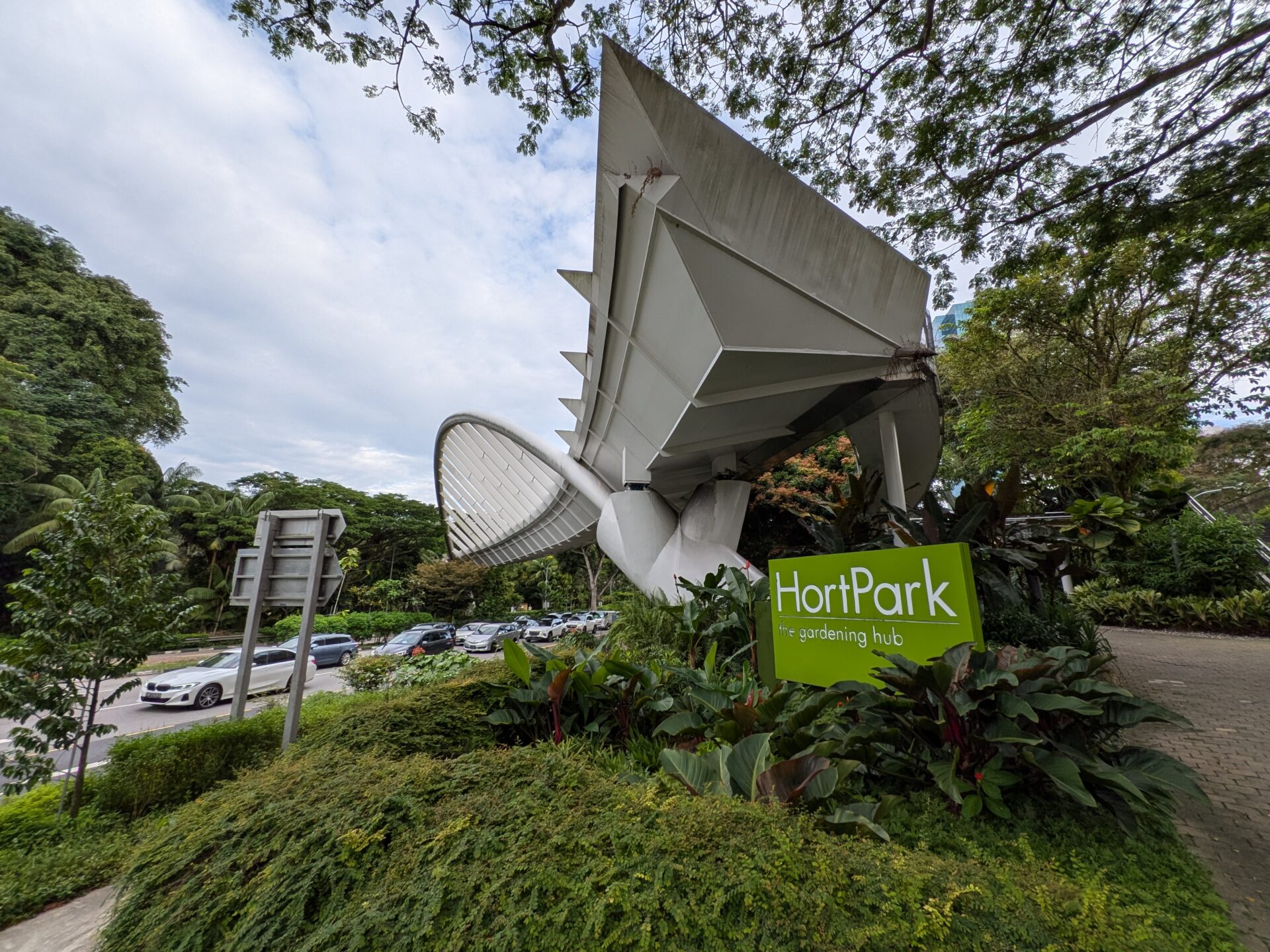
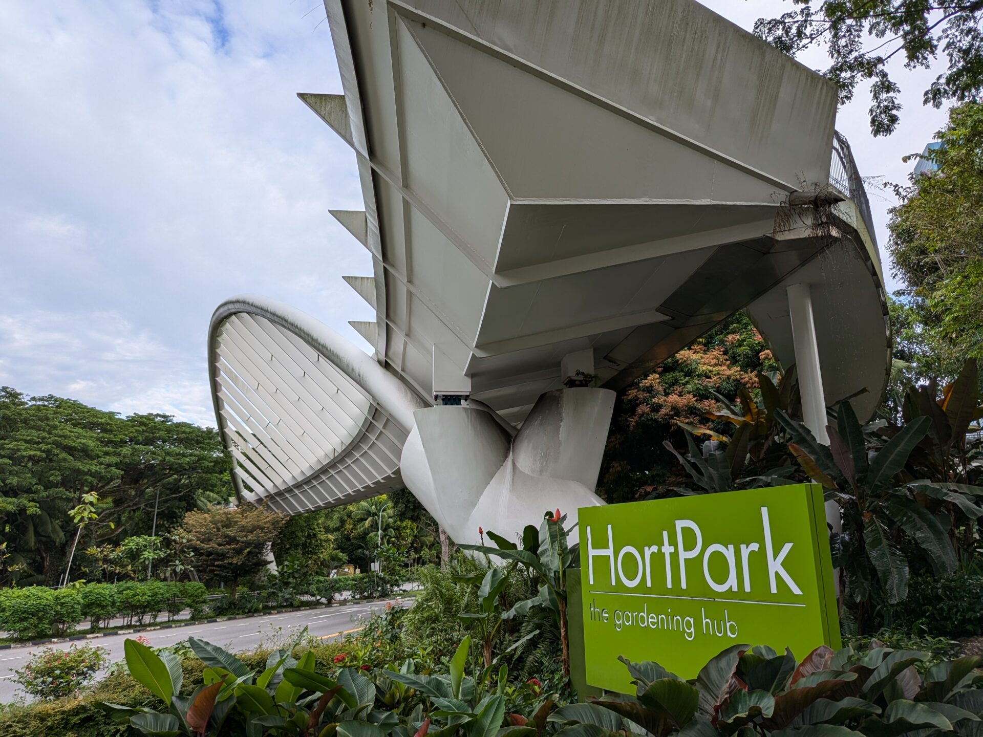
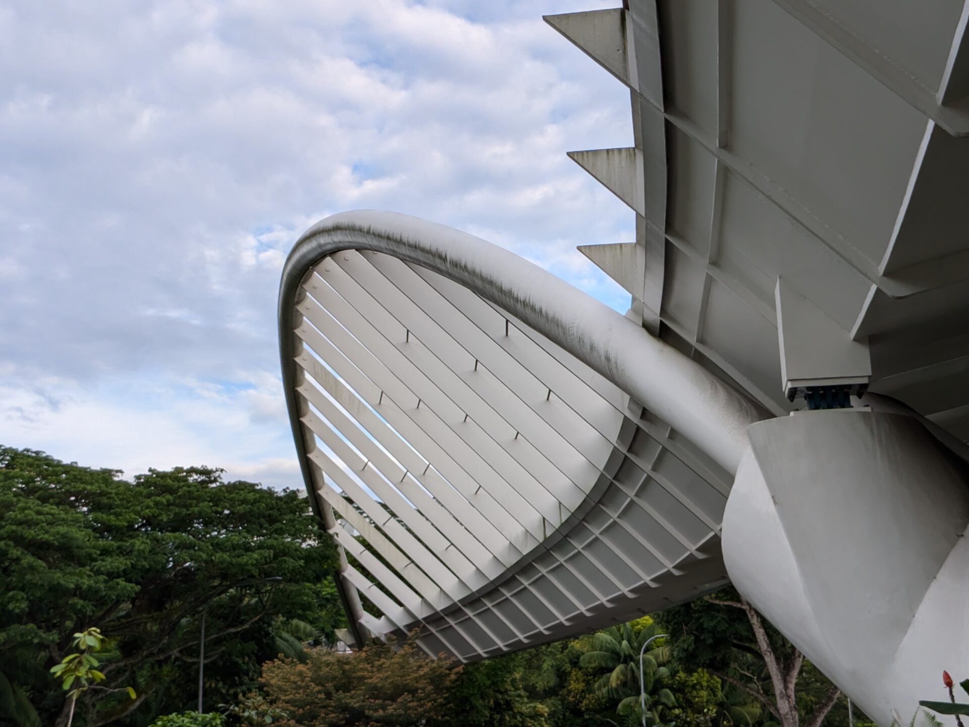
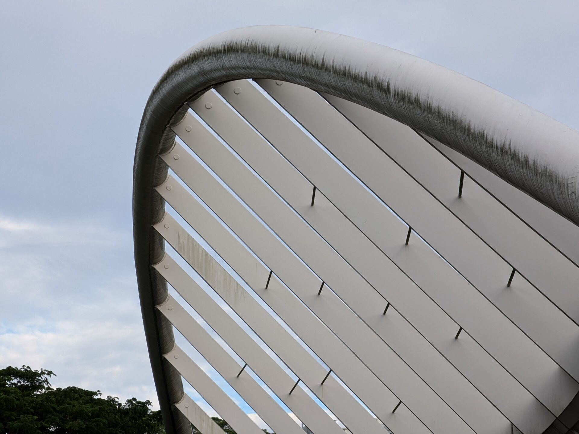
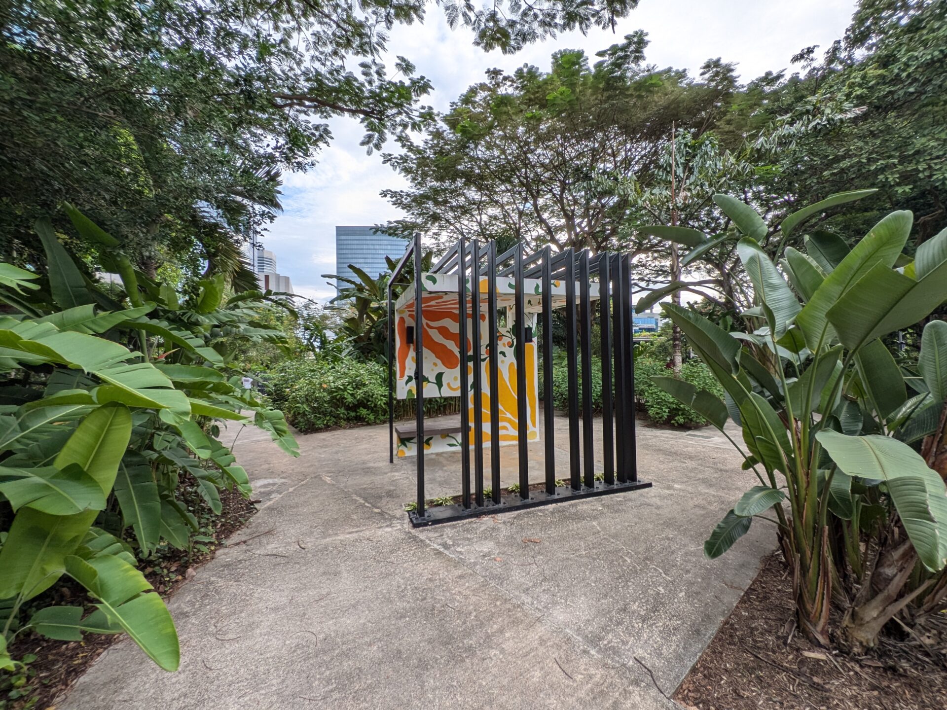
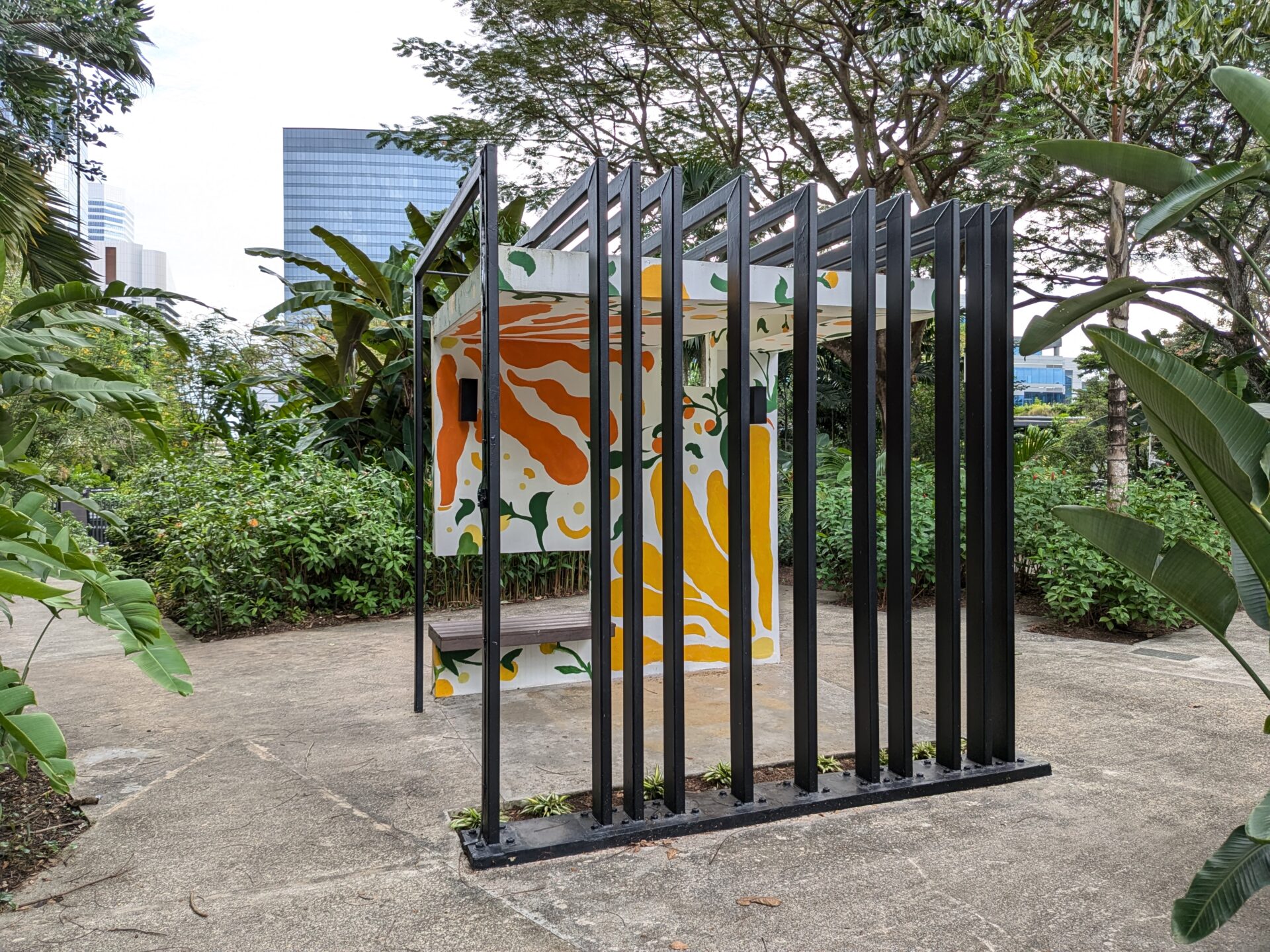
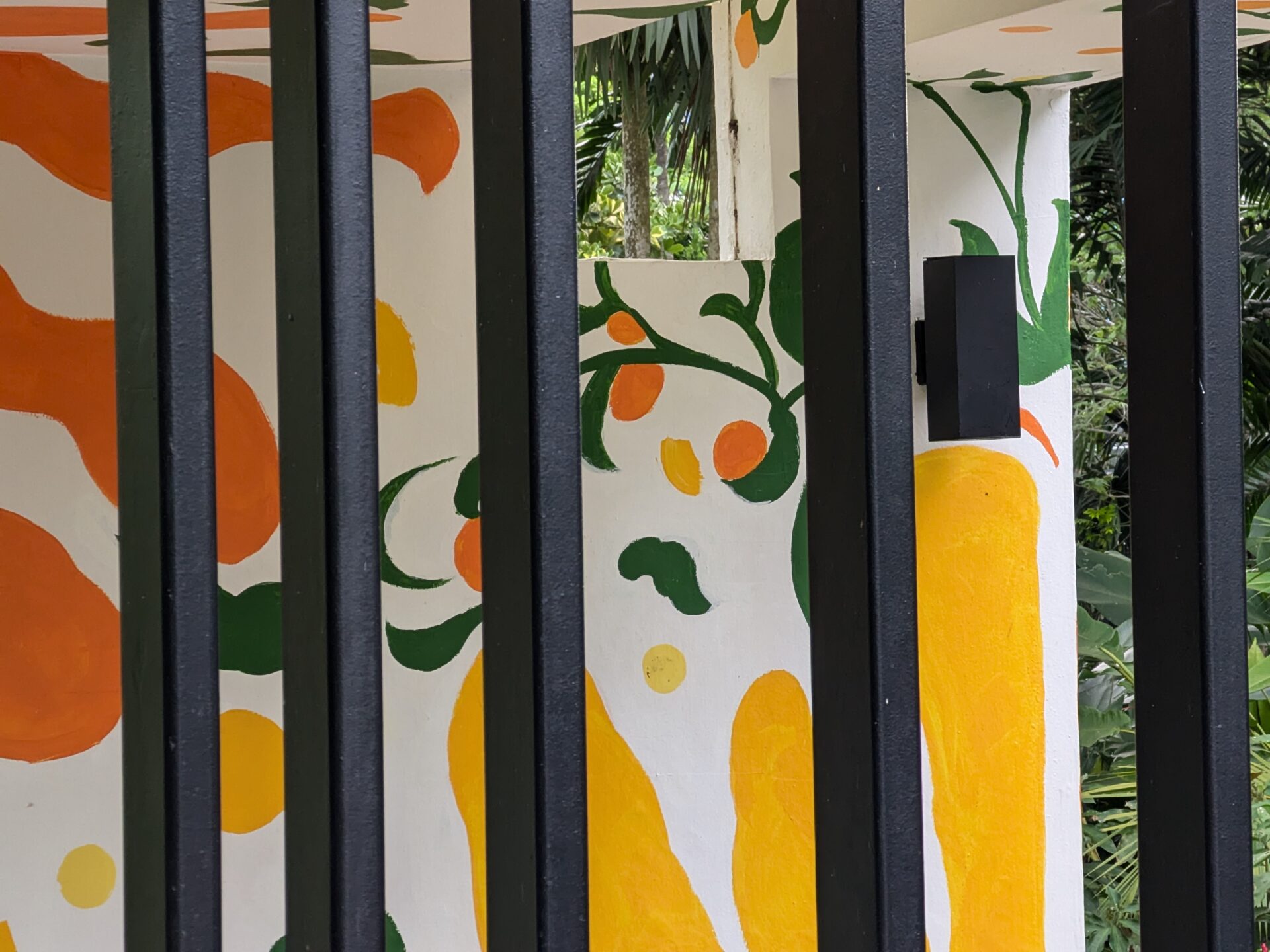
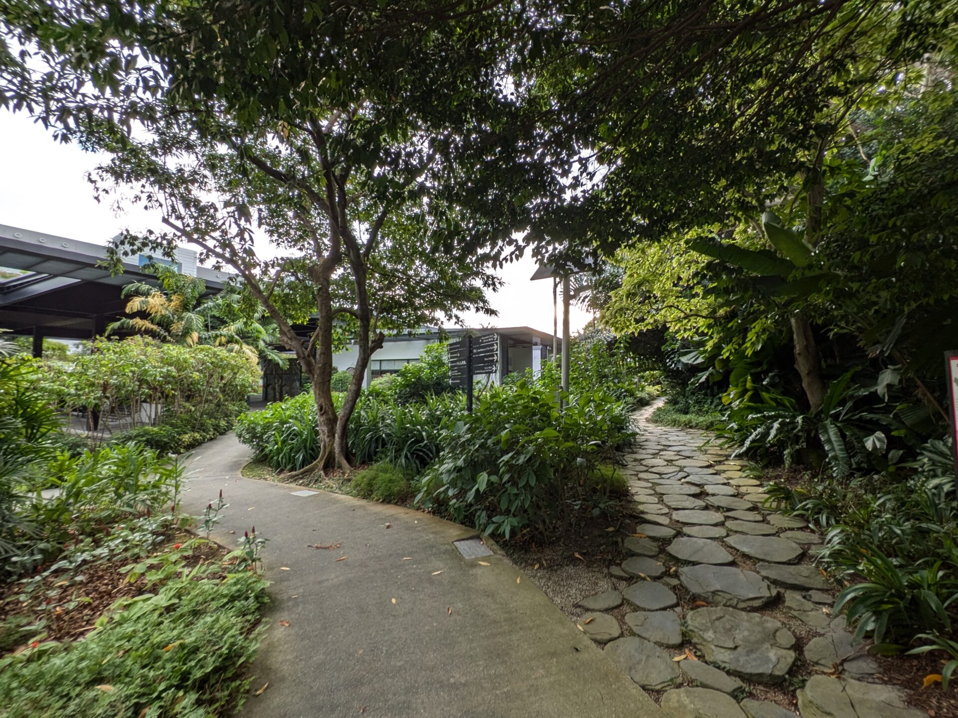
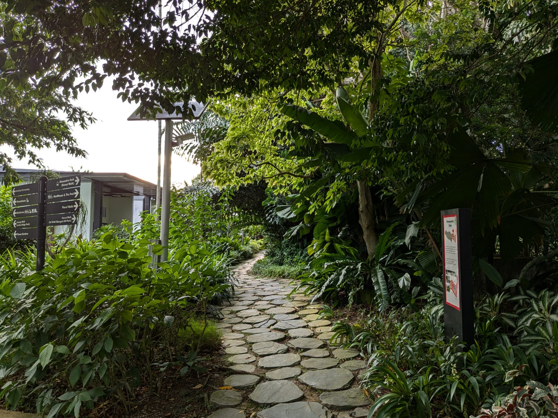
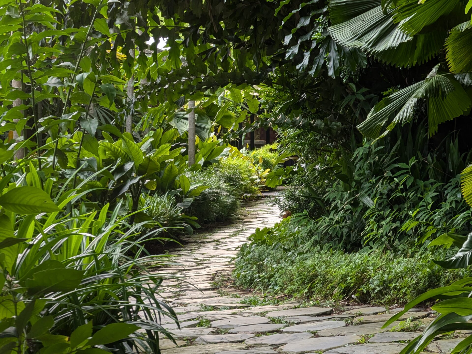
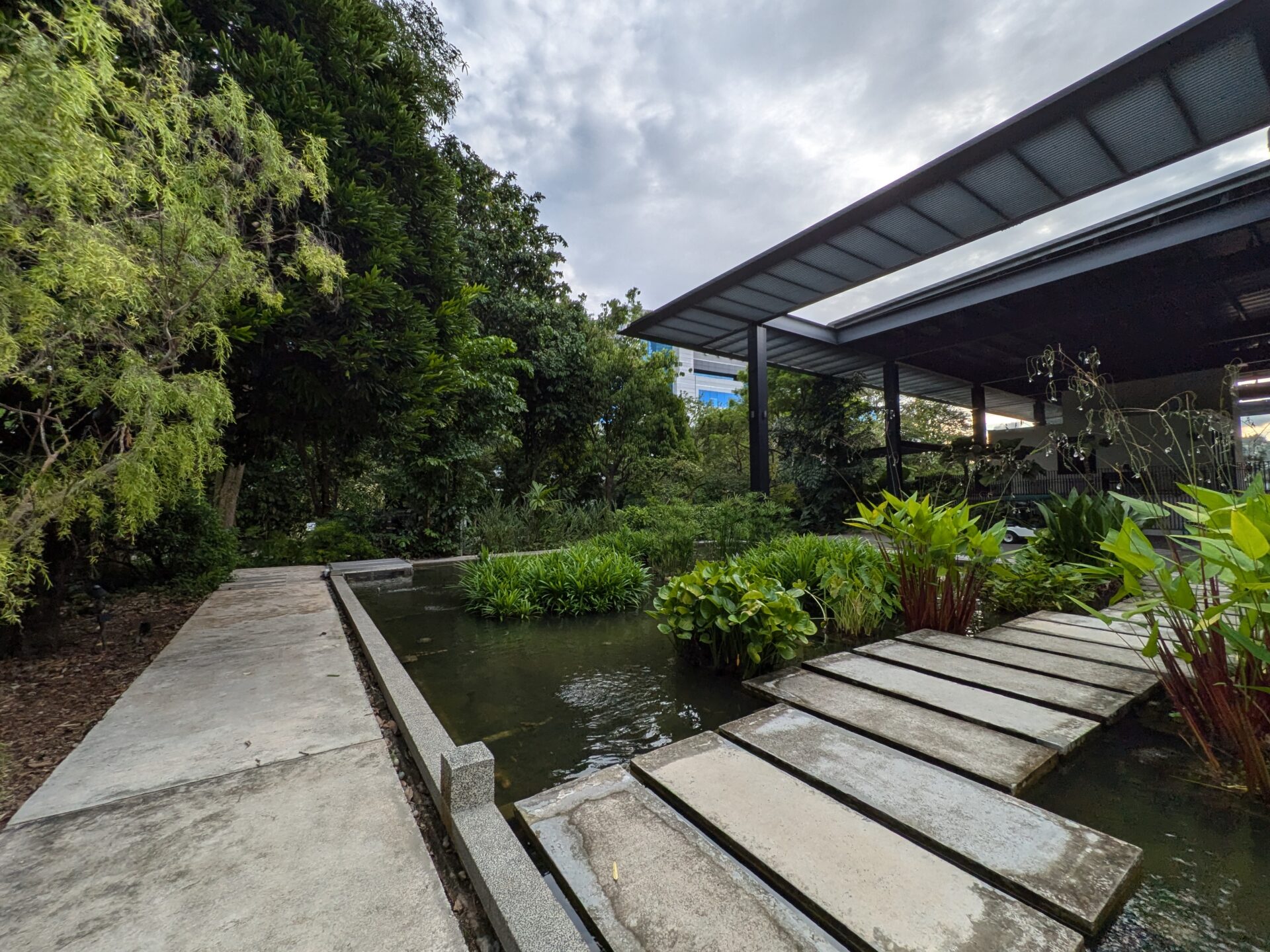
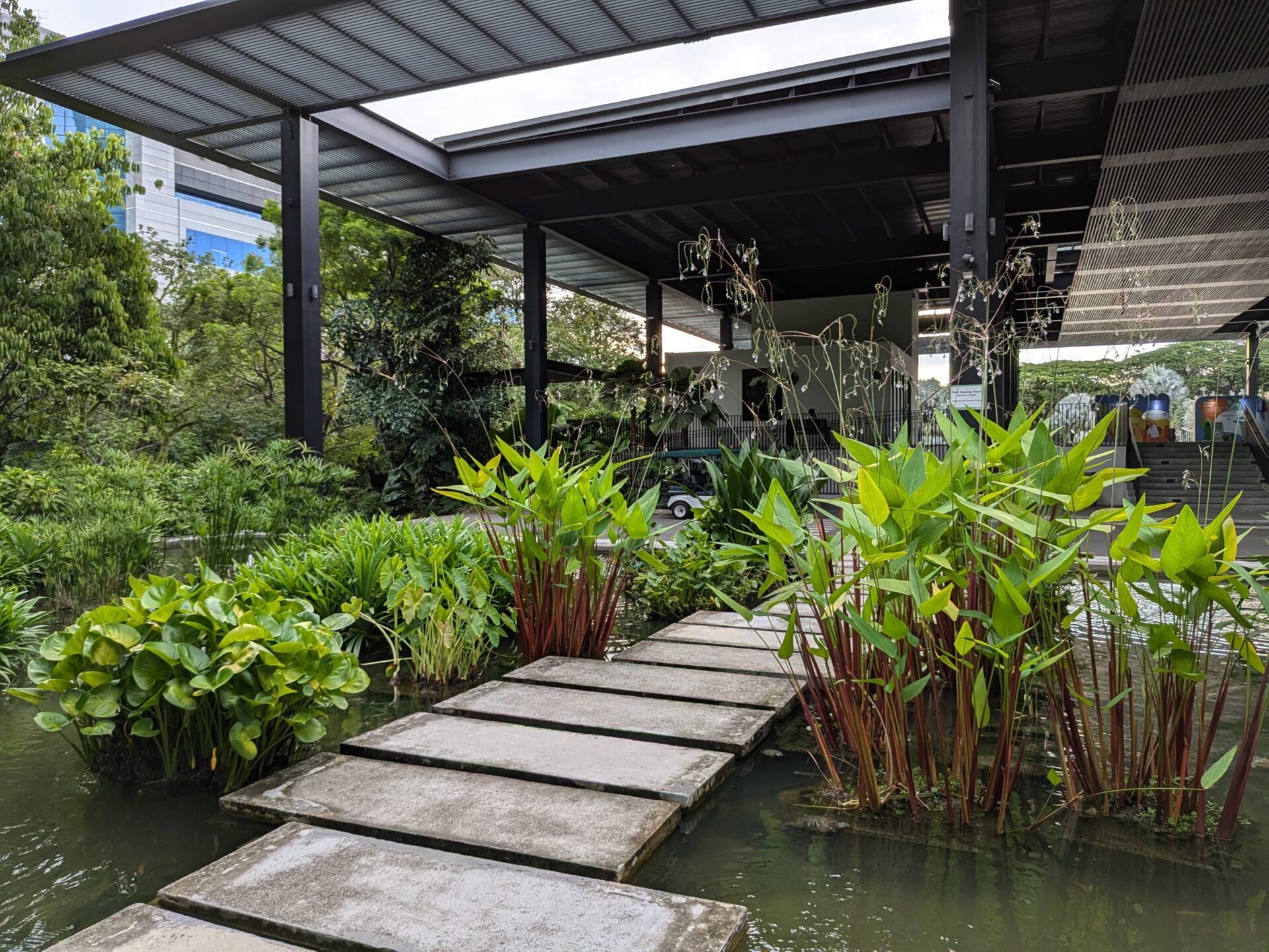
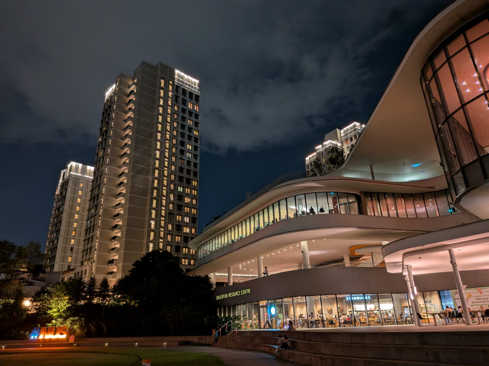
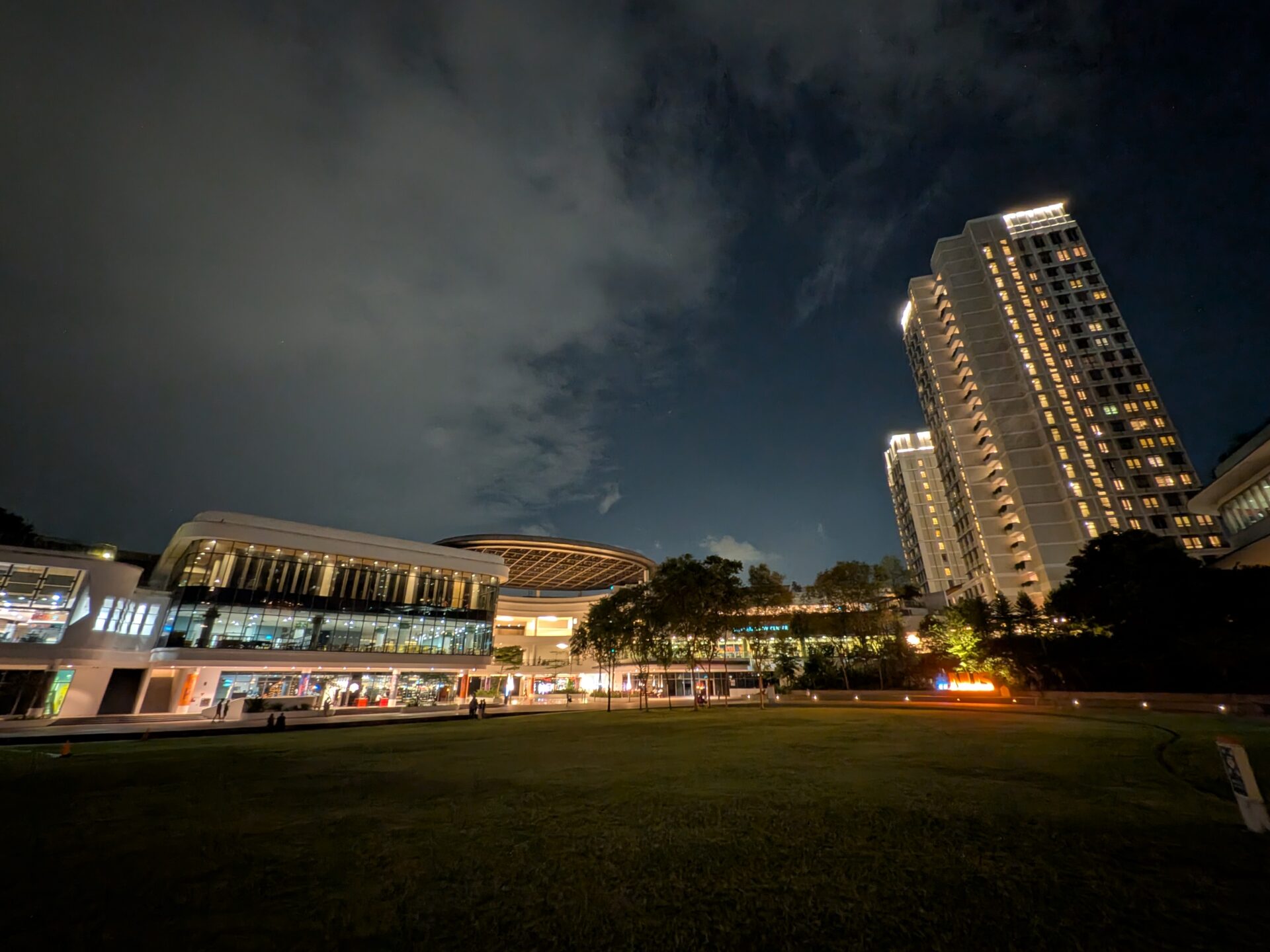
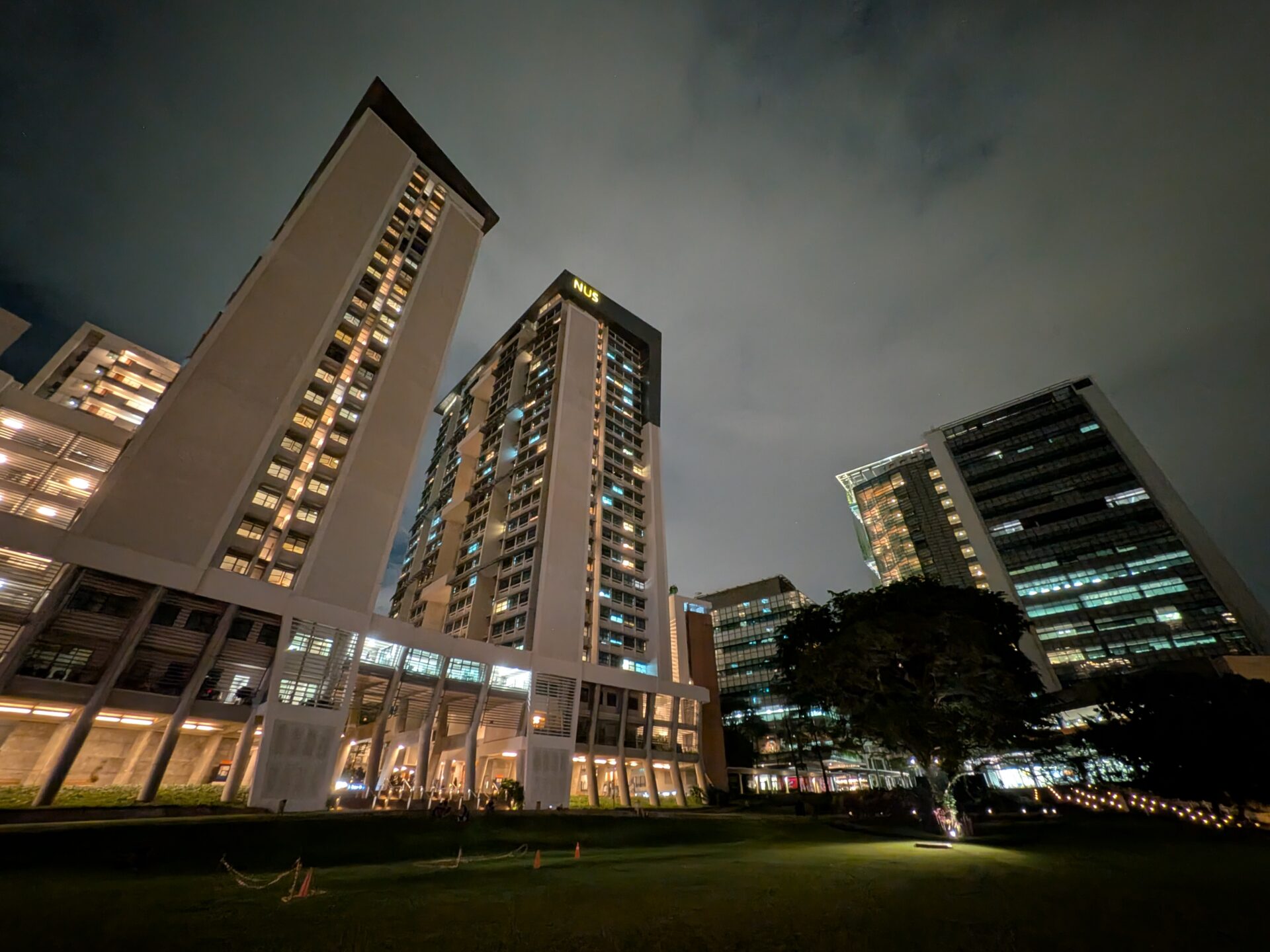
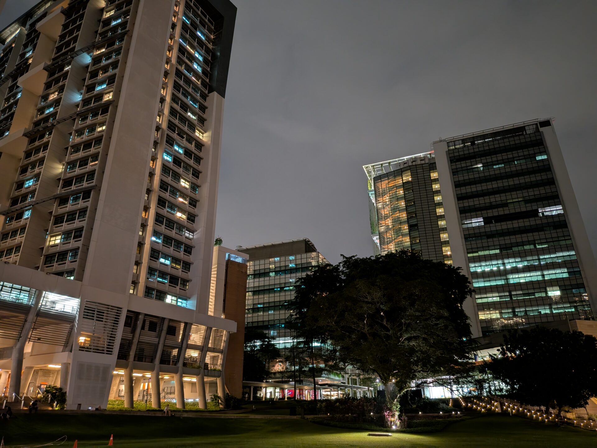
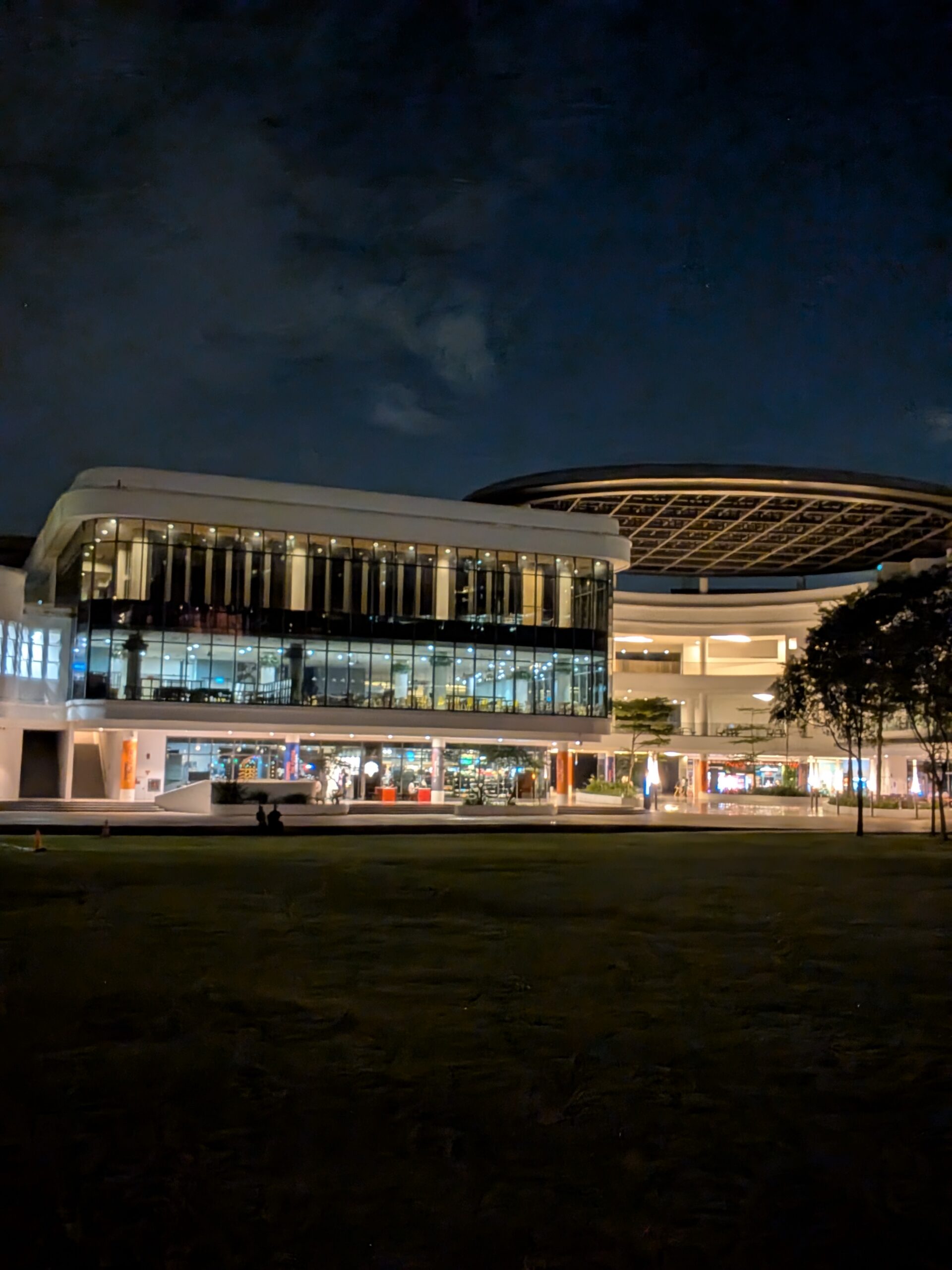
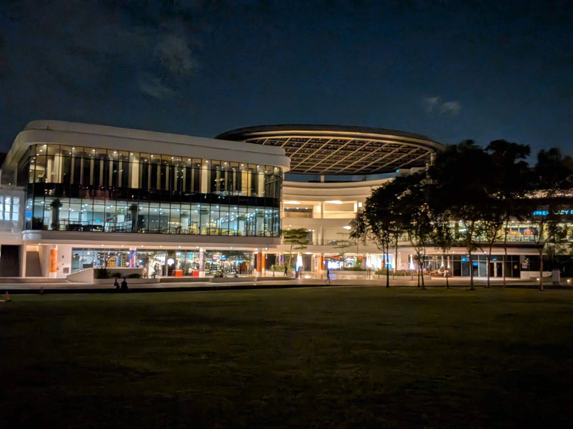
When it comes to night shots, the ultrawide shooter turns out images that have visible muddiness, especially at the edges between dark and lit parts of the shots. This is especially true in the challenging shot overlooking the twin UTown Residences and research towers from Town Green.
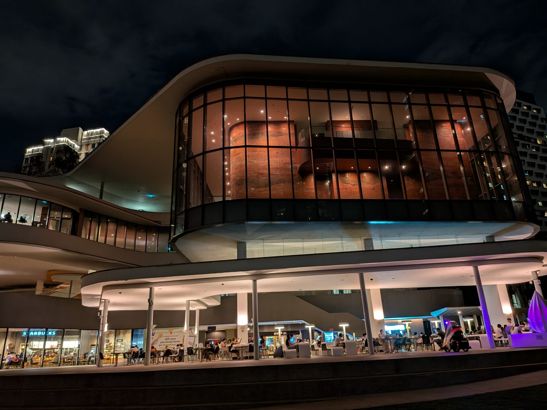
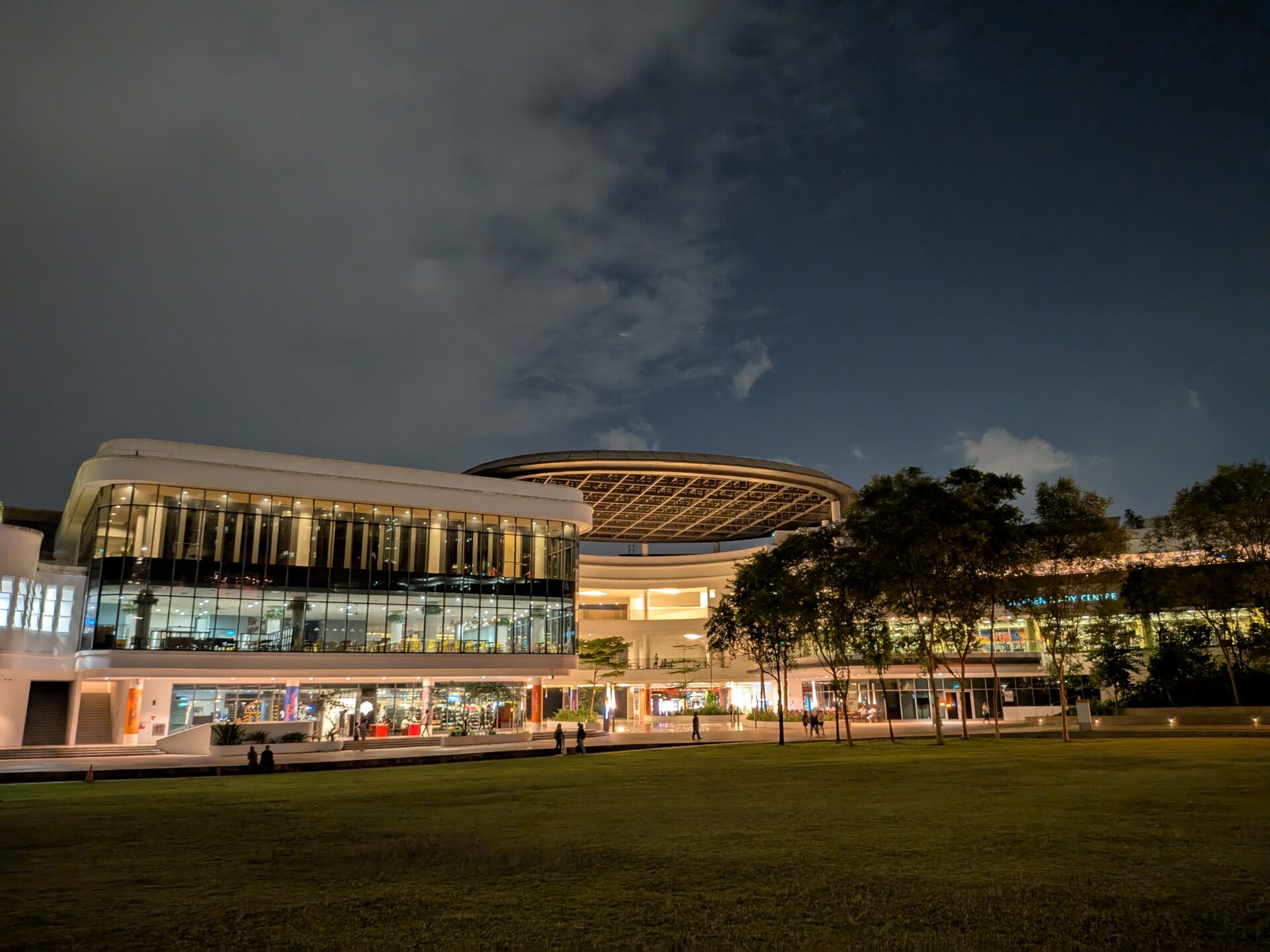
The main shooter gets more details, focus, and colours right, but some struggle with detail persists (albeit mildly) in crowds. Just have a look at the outdoor seating area of Starbucks.
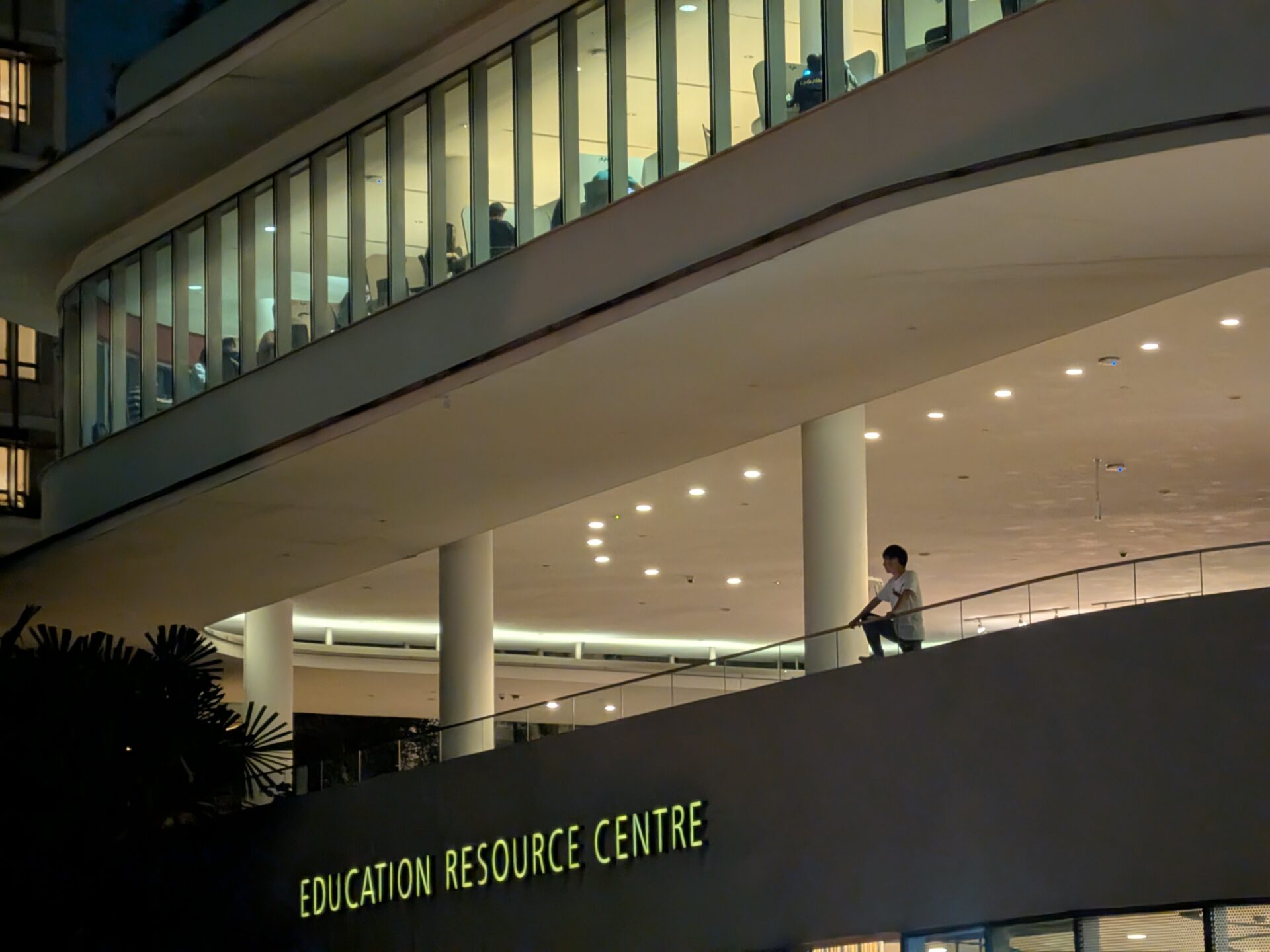
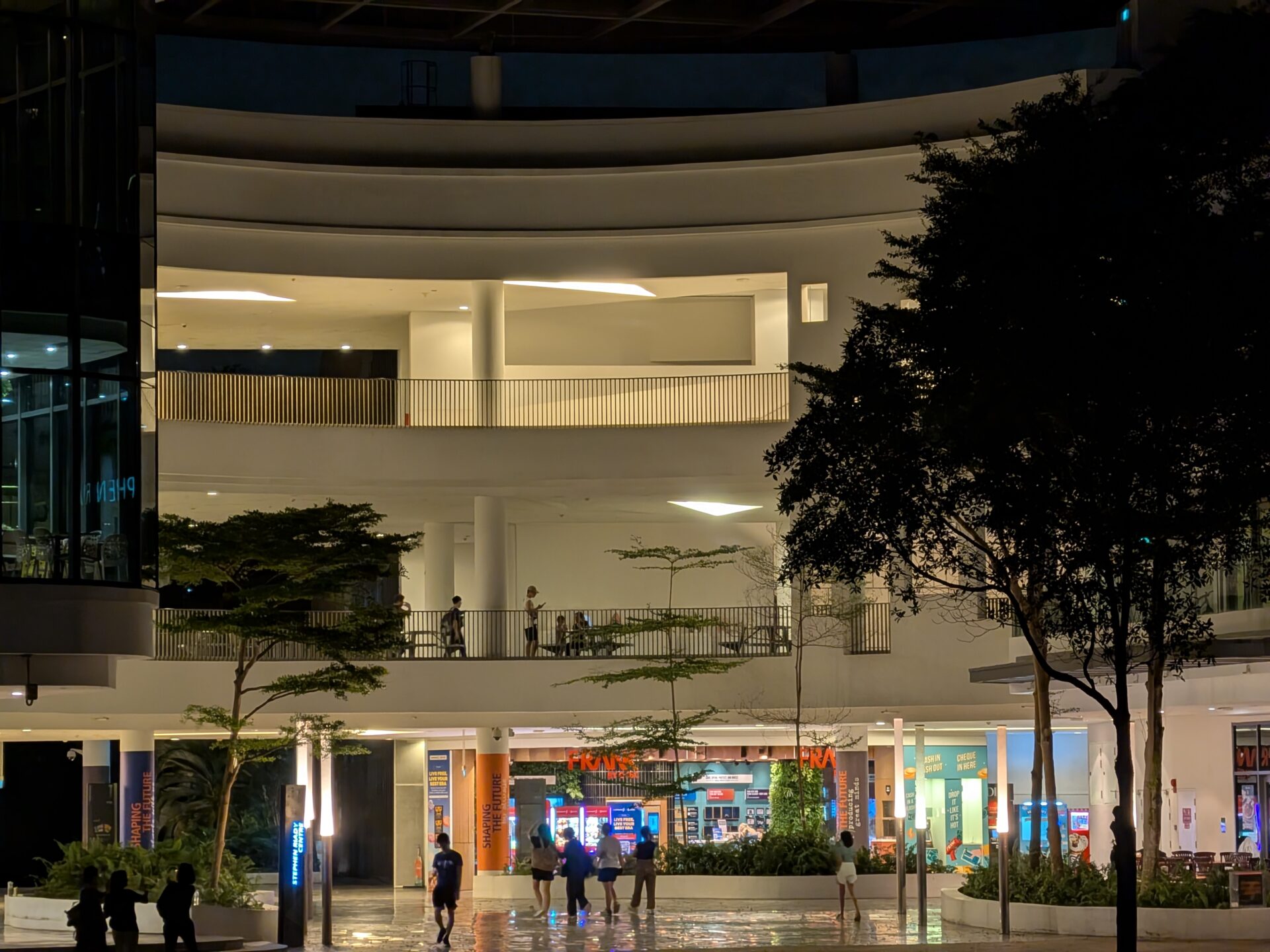
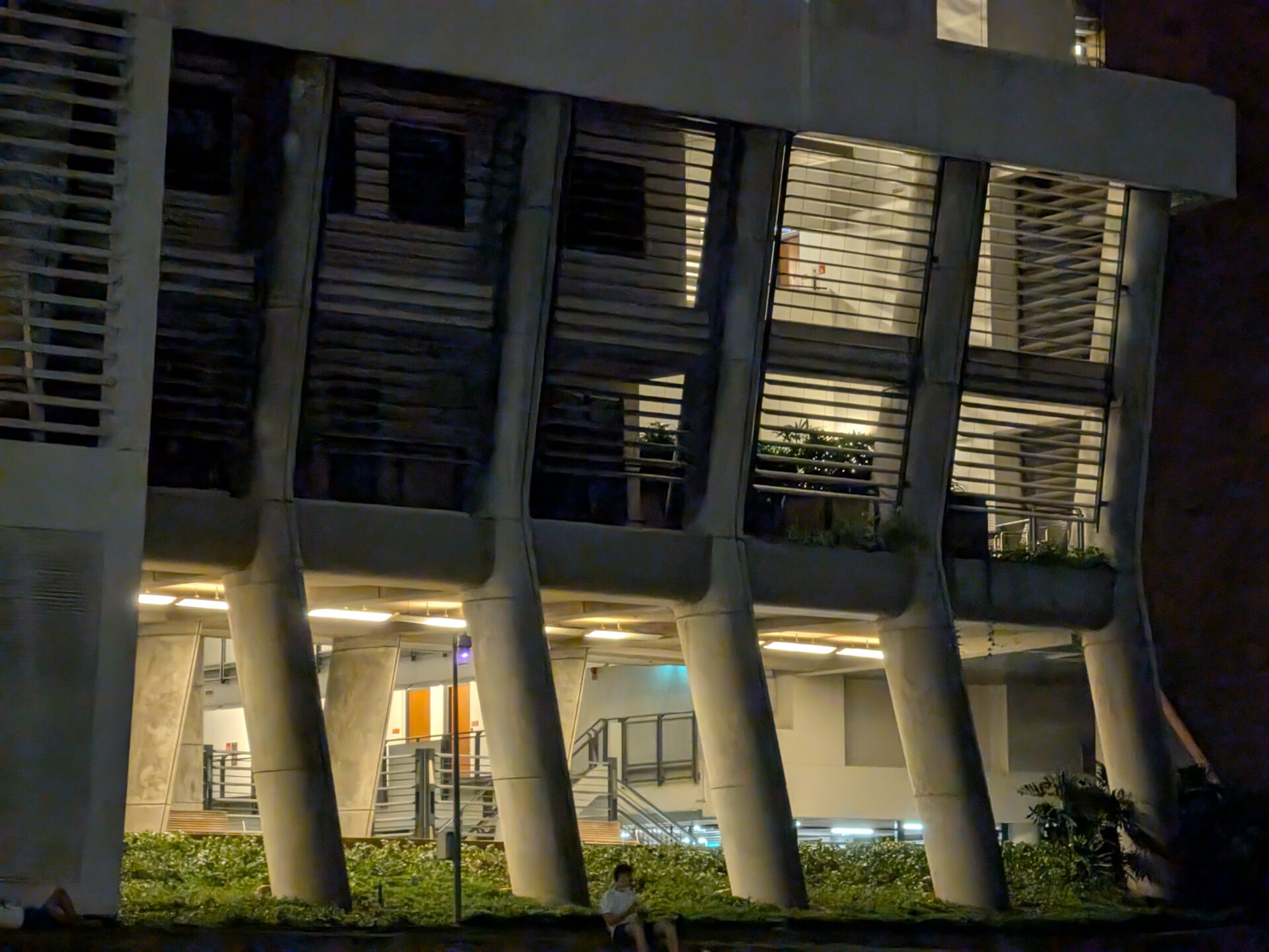
As for the telephoto, the focus is definitely there, but dark parts of the trees under the shadow are completely black. There are also parts of the shots that can look soft, such as the structural pillars of the UTown Residence and Education Resource Centre.
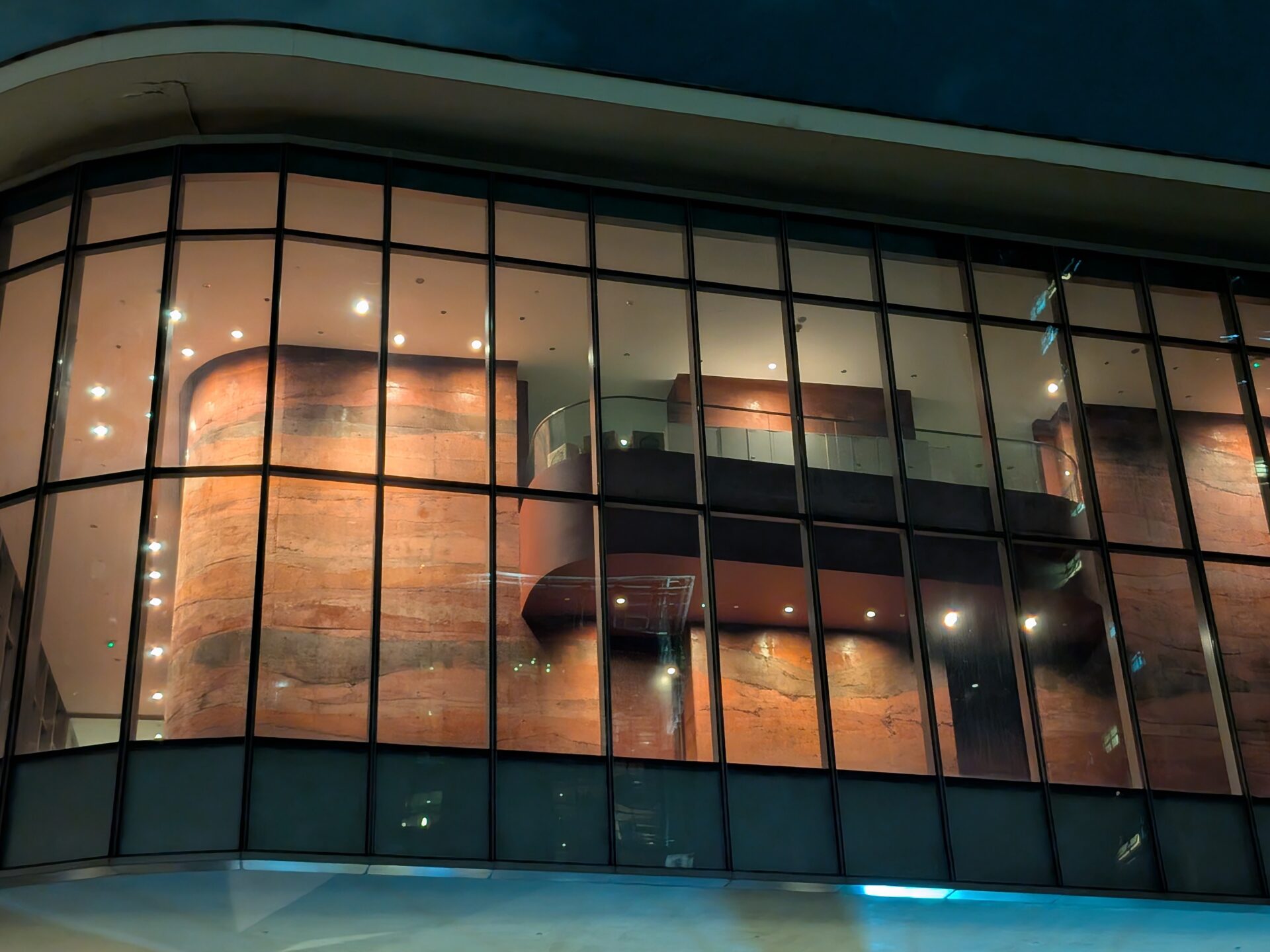
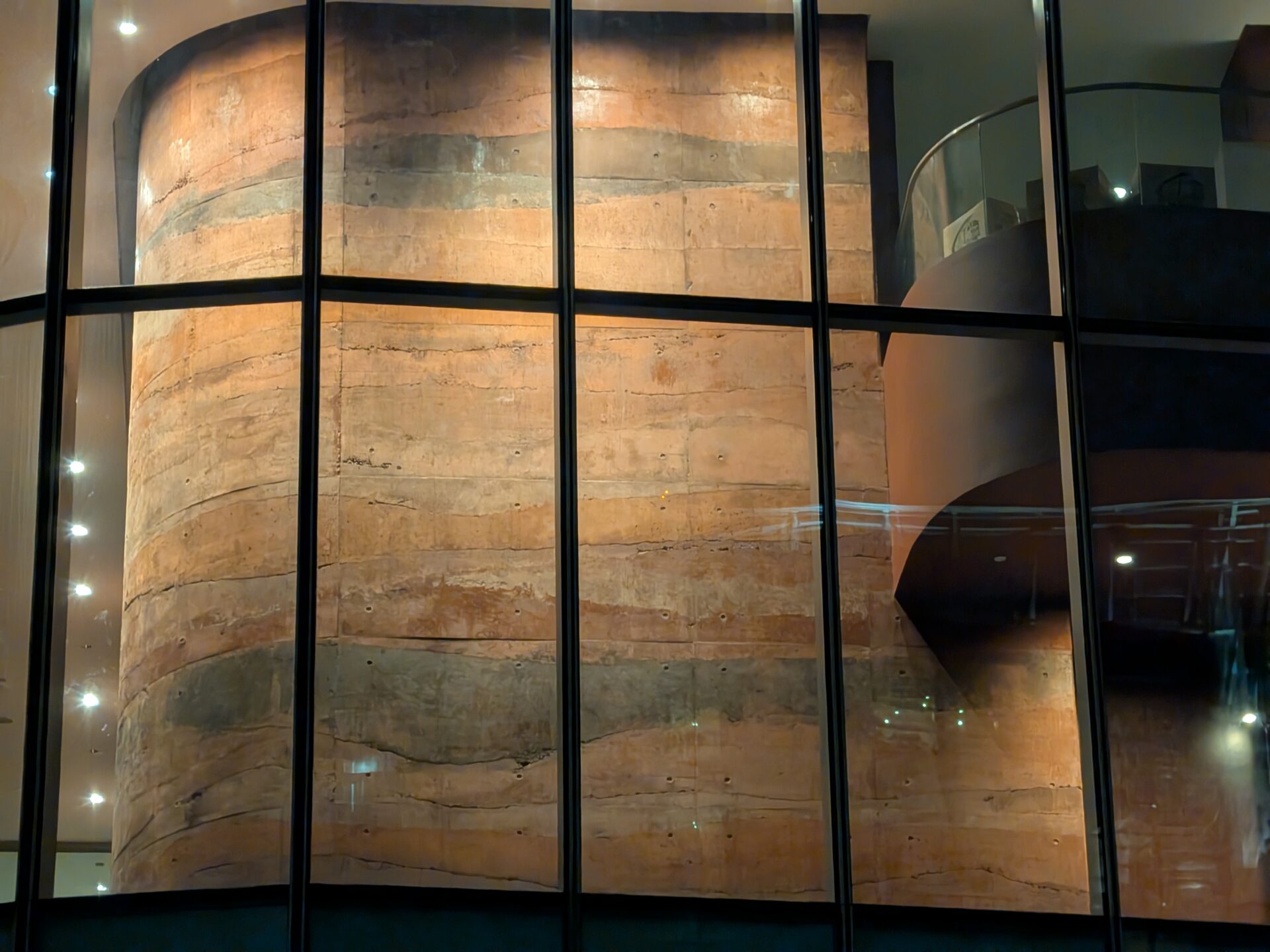
A 2x and 5x shot of the geological feature wall turned out average.
I tried both selfie cameras too, they have the same image quality at 100% crop, but nothing to write home about.
Conclusion
The aspect ratio of the two screens on the Google Pixel 9 Pro Fold is one of my personal favourites. The folding screen has gained a much smaller bezel, but competitors have yet narrower ones.
The display is frankly not the brightest and I wonder if there is a bug, though they are colourful and do not wash out at odd angles. The screen crease can also be improved.
Google’s software also never disappoints, be it in terms of stability and fluidity, and the camera optimisations. The AI features this round can also be compelling. However, the camera setup here is definitely only middle-of-road.
Overall, the Pixel 9 Pro Fold remains a competent foldable phone but doesn’t clearly outshine its competitors. The Pixel 9 Pro Fold impresses with an outer screen that’s is easy and usable, plus the folding display fits most apps, but in other areas, it doesn’t objectively perform better than rivals that have upped their game of late.





Alright folks, we left the folding display opened for nearly 24 hours. The crease is barely better, and even then it could well be psychological. We also continue to observe screen content dip.
Fully agree no folding display today is without a crease, but there are perceptible differences in implementation between different makers. We stand by our observations.
We also repeated display brightness tests. They are very similar to what is in our review, which we qualified may be a bug.
The dust resistance is pointed out for information. As rightfully highlighted, only recent Samsung Galaxy Z devices have a basic dust rating among foldables.
You can only report what you find with your unit. I just don’t see the same thing on mine, even side by side with a Z Fold 6 the Z Fold has a much more pronounced crease. I don’t have my OnePlus Open anymore to compare, but I feel that was the best. The Pixel displays are rated brighter and scored much better on brightness and color than the Z Fold in DxoMark tests, so the Pixel should definitely be brighter, maybe there are inconsistencies in the actual units. Thank you for your review and your follow up.
I have owned the Z Fold 3,4, and 5, and The OnePlus Open, and have a coworker with the Z Fold 6 (did not buy that one). I now have the Pixel Pro 9 Fold and I have to disagree with a few statements, especially the crease. I cannot see the crease when using the phone, and I see no distortion whatsoever. The crease is MUCH less noticeable than the ANY of the Z Folds, including the 6. The OnePlus Open is less noticeable because of the anti-reflective coating but otherwise I would say the Pixel and OnePlus are pretty similar. I always use dark mode and I just can’t see the crease at all on the Pixel. The other 2 points I disagree with are the brightness, the Pixel is just as bright as the OnePlus and brighter than the Z Fold in my experience. I am with my coworker and have the same photo on full bright and my Pixel is clearly brighter and the crease is less visible. The other point is that the Z Fold 6 is the ONLY folding phone sold in North America that has a dust rating, and looking at the Chinese foldable I dont see dust ratings either, so I dont think it is common for a foldable to have a dust rating since I can only find 1 that has one (and that dust rating on the Z Fold is not good either, but it does have one).
100% Agreed
Makes no sense these reviewers still complaining about a crease, all foldables have a crease ( all all are visible)… until tech changes, it’s just how it will be!
The crease actually settles after a few days. it’s crazy look at this video https://youtu.be/4kC0tanzFXQ?si=hWShXR3VfYJEwDkl
Hey Manny, we tested the phone for two weeks. Shots of the physical phone in the review were taken a week in. In our experience, though, the crease did not become less obvious.
Good point, nevertheless. We can keep the phone screen opened up for a few days, and update the review if we see differences.